Showcase for Your HCWP's

Boys on the block

A
Boys on the block

  • 3
  • 1
  • 93
Sonia..jpg

A
Sonia..jpg

  • 3
  • 1
  • 215
A young woman

A
A young woman

  • 5
  • 4
  • 182
sketch

A
sketch

  • 4
  • 0
  • 180
Foucaultery

D
Foucaultery

  • 1
  • 1
  • 136

Forum statistics

Threads
188,093
Messages
2,622,321
Members
96,920
Latest member
Luc_b
Recent bookmarks
0

awty

Subscriber
Joined
Jul 24, 2016
Messages
3,425
Location
Australia
Format
Multi Format
Hi, awty:

Is that like the parchment paper as it is known in the US. At least the one I have is very non-absorbent to water (I think it is silicone coated.) Is yours similar and if so, did you have to do anythig to make the paper take the sensitizer well? Also is it translucent enough for the gold foil to come through or did you have to apply some wax or similar to make it more so?

:Niranjan.

Hi, you need semi transparent paper that will hold the emulsion. This was done a few years ago and from memory most wont. I think I found a cheap paper that kinda worked. You cant size it cause it goes all crinkly. The next thing is that you dont want it falling apart when washing, so be careful. Once processed, you need to apply gilding glue to the back and apply the gold leaf. Then iron it flat, then spray the front with varnish. The process is a PITA, but cheap to do if you have the time and patience.
 

awty

Subscriber
Joined
Jul 24, 2016
Messages
3,425
Location
Australia
Format
Multi Format
@awty is this the same as your grease proof paper? Without the printing, of course.

Yes, as long as it hasnt any wax or silicone or anything else on the paper to prevent the emulsion from sticking. I think the masters of this technique use animal parchment and real gold leaf.
 
OP
OP

nmp

Member
Joined
Jan 20, 2005
Messages
1,828
Location
Maryland USA
Format
35mm
Hi, you need semi transparent paper that will hold the emulsion. This was done a few years ago and from memory most wont. I think I found a cheap paper that kinda worked. You cant size it cause it goes all crinkly. The next thing is that you dont want it falling apart when washing, so be careful. Once processed, you need to apply gilding glue to the back and apply the gold leaf. Then iron it flat, then spray the front with varnish. The process is a PITA, but cheap to do if you have the time and patience.

Thanks for the additional details - it sure is an elaborate process but the end results can be very lovely - I have seen pieces made by Dan Burkholder (who I believe was the first one do it on vellum with gold/Pt/Pd) that were quite something.

:Niranjan.
 
OP
OP

nmp

Member
Joined
Jan 20, 2005
Messages
1,828
Location
Maryland USA
Format
35mm
Thanks..

I knew they all used silver but didn't know why they were different. I did a dive last night so now I know the sensitizers are different. I guess the only real way to know is to buy some chems and have at it.

From cyanotype, VDB will be a natural jump - they both use FAC and water development. The latter has an added fixing step to remove any residual silver salts. Kallitype uses FO which requires a "developer" and also relatively more rigorous clearing step since FO is more prone to hang around in the paper. It also needs fixing as in VDB. And finally salt does not use any iron sensitizer, and no development as the image is already formed on exposure (printed-out) but requires more diligent fixing as the paper contains higher levels of silver salts remaining. Additionally, it also requires negatives with greater maximum density than those in the other processes to achieve paper-whites because of the long tonal scale.

:Niranjan.
 

TheFlyingCamera

Membership Council
Advertiser
Joined
May 24, 2005
Messages
11,386
Location
Washington DC
Format
Multi Format
Hi, awty:

Is that like the parchment paper as it is known in the US. At least the one I have is very non-absorbent to water (I think it is silicone coated.) Is yours similar and if so, did you have to do anythig to make the paper take the sensitizer well? Also is it translucent enough for the gold foil to come through or did you have to apply some wax or similar to make it more so?

:Niranjan.

I'm not sure what paper awty is using, but I've done gold leaf on vellum before.
 

awty

Subscriber
Joined
Jul 24, 2016
Messages
3,425
Location
Australia
Format
Multi Format
2023-09-01_09-32-38.jpg

Vandyke Brown.
8x10 contact print on cotton rag.
Orbit 8x10 camera, Linhof 210mm lens. orange filter.
rollie 100 iso. pyro hd 2+2+100
 
OP
OP

nmp

Member
Joined
Jan 20, 2005
Messages
1,828
Location
Maryland USA
Format
35mm
View attachment 347961
Vandyke Brown.
8x10 contact print on cotton rag.
Orbit 8x10 camera, Linhof 210mm lens. orange filter.
rollie 100 iso. pyro hd 2+2+100

Almost looks like a Polaroid transfer...is it in the negative or is it in something on the paper.

Like the sense of a lone desolate tree in the graveyard going on here.

:Niranjan.
 

Mr Negative

Member
Joined
Dec 20, 2018
Messages
26
Location
denver, co
Format
4x5 Format
This is such a great thread. I haven’t tried any of these processes myself, but the results are amazing and inspirational. Thank you for sharing!
 

Vaughn

Subscriber
Joined
Dec 13, 2006
Messages
9,707
Location
Humboldt Co.
Format
Large Format
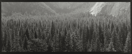
Here is one of my many favorite platinum/palladium prints -- from a 4x10 negative, 300mm lens probably. Upper Yosemite Valley
Breaking the 'rules' by pointing the camera towards the sun, but I loved what the light was doing with the trees.

Print: a 1:2 ratio of platinum to palladium (no contrast agents used), on COT320, developed in warm Potassium oxalate
 

Attachments

  • UpperYoseA copy.jpg
    UpperYoseA copy.jpg
    1.2 MB · Views: 53
Joined
Jul 31, 2012
Messages
2,982
Format
35mm RF
Not sure why but this last batch of cyanotypes I did turned out meh. I think I added too much LFN or something. Dmax was terrible. Then the toning just dulled them right out which was odd too. Oh well. Onwards and backwards I guess. I think I'll try some cuprotypes this weekend. Or maybe some gumovers.

On Canson XL Bristol.

2019-024-18_CanBr_10.10.10.5_GP_ps_cc_02.jpg
 

KYsailor

Subscriber
Joined
Oct 29, 2021
Messages
65
Location
Louisville, KY
Format
Digital
Not sure why but this last batch of cyanotypes I did turned out meh. I think I added too much LFN or something. Dmax was terrible. Then the toning just dulled them right out which was odd too. Oh well. Onwards and backwards I guess. I think I'll try some cuprotypes this weekend. Or maybe some gumovers.

On Canson XL Bristol.

View attachment 348534

Despite your complaints I liked this print a lot - what did you tone it with? Interesting - I was also doing some cyanotypes after a couple of weeks layoff. While mine were generally OK, my Dmax seems to have dropped off compared to past prints. My chemicals were only a about 2 months old - don't think that contributed. Perhaps I need more solution - was using about 3 ml per 8.5x11 on Arches WC. BTW what is LFN?

Thanks for posting

Dave


fgorga

Member
Joined
Aug 31, 2015
Messages
543
Location
New Hampshire
Format
Multi Format
Not sure why but this last batch of cyanotypes I did turned out meh. I think I added too much LFN or something. Dmax was terrible. Then the toning just dulled them right out which was odd too. Oh well. Onwards and backwards I guess. I think I'll try some cuprotypes this weekend. Or maybe some gumovers.

On Canson XL Bristol.

View attachment 348534

A very nice print despite your problems!

As for you problem, this could be due to seasonal changes in the alkalinity of your water... especially if you are not on a municipal water system.

Prussian blue is susceptible to alkaline hydrolysis. This fact can lead to exactly what you describe... a nice print right out of the frame and loss of density when it hits the water. Adding a small amount of vinegar to your washes is helpful if this is the problem.

See this post of mine from a few years ago for a more complete exposition on this topic!
 
Joined
Jul 31, 2012
Messages
2,982
Format
35mm RF
I think it is just a little of a few things Frank. The only thing that changed really in processing is I accidentally added more LFN to the mix. Otherwise I think it is just the papers and who knows, maybe I screwed something up in the mix. I've done so many cyanotypes now I might not have been paying attention. I also might have not saturated the paper enough.

I do have city water and also always keep everything acidic. The water issue isn't an issue.
 
Joined
Jul 31, 2012
Messages
2,982
Format
35mm RF
Despite your complaints I liked this print a lot - what did you tone it with? Interesting - I was also doing some cyanotypes after a couple of weeks layoff. While mine were generally OK, my Dmax seems to have dropped off compared to past prints. My chemicals were only a about 2 months old - don't think that contributed. Perhaps I need more solution - was using about 3 ml per 8.5x11 on Arches WC. BTW what is LFN?

Thanks for posting

Dave


Toned with tea.

You do need to keep them acidic so if you aren't using acid in your first wash you need to do that. I get no fade in my first wash. One tablespoon of citric acid does the trick.
 
Joined
Jul 31, 2012
Messages
2,982
Format
35mm RF
Gave cuprotypes a try over the weekend thanks to the easy peasy instructions that Frank wrote (https://www.alternativephotography.com/cuprotype-process/). It took me a while to wrap my head around the aesthetics of them but I redid some negs and eventually ended up with this. It is a 30 minute exposure through a neg that if it was suntan lotion would be rated at spf10000. Then toned in Ferri and citric acid. I'm satisfied with it for a first go.

1999-019-07_Cupro_FabArt_AC_D3_Matte_ps_cc_01.jpg
 

fgorga

Member
Joined
Aug 31, 2015
Messages
543
Location
New Hampshire
Format
Multi Format
Gave cuprotypes a try over the weekend thanks to the easy peasy instructions that Frank wrote (https://www.alternativephotography.com/cuprotype-process/). It took me a while to wrap my head around the aesthetics of them but I redid some negs and eventually ended up with this. It is a 30 minute exposure through a neg that if it was suntan lotion would be rated at spf10000. Then toned in Ferri and citric acid. I'm satisfied with it for a first go.

View attachment 348781

Very nice... especially for an early attempt.

And yes, the aesthetics (pinkish highlights and red-brown hue) don't work with every image but they do work well for some, including this one.

I am about to revisit the iron toning described in my article. It gives a really nice blue-black tone that is a generally more useful color for many images. I really just barely scratched the surface of this toning method previously.

Interestingly, I think that I recently found what is probably the first reference to the iron toner in a 1894 article by J. Vincent Elsden in "The British Journal of Photography" (p 249). There is not any real detail (as is often the case with old articles) but it clearly refers to toning cuprotype with a mixture of ferrous sulfate and ferric chloride.
 

Rolleiflexible

Subscriber
Joined
Mar 22, 2005
Messages
1,963
Location
Mars Hill, NC
Format
Multi Format
Not sure why but this last batch of cyanotypes I did turned out meh. I think I added too much LFN or something. Dmax was terrible. Then the toning just dulled them right out which was odd too. Oh well. Onwards and backwards I guess. I think I'll try some cuprotypes this weekend. Or maybe some gumovers.

On Canson XL Bristol.

View attachment 348534

Patrick, could it be the paper? Have you ever gotten good Dmax on Canson Bristol? I've read that Canson papers have poor Dmax with kallitypes. This is just hearsay for me -- I've never used the paper.
 
OP
OP

nmp

Member
Joined
Jan 20, 2005
Messages
1,828
Location
Maryland USA
Format
35mm
Very nice... especially for an early attempt.

And yes, the aesthetics (pinkish highlights and red-brown hue) don't work with every image but they do work well for some, including this one.

I am about to revisit the iron toning described in my article. It gives a really nice blue-black tone that is a generally more useful color for many images. I really just barely scratched the surface of this toning method previously.

Interestingly, I think that I recently found what is probably the first reference to the iron toner in a 1894 article by J. Vincent Elsden in "The British Journal of Photography" (p 249). There is not any real detail (as is often the case with old articles) but it clearly refers to toning cuprotype with a mixture of ferrous sulfate and ferric chloride.

Here is an even older reference from Burnett himself ca. 1857:


:Niranjan.
 
Joined
Jul 31, 2012
Messages
2,982
Format
35mm RF
Very nice... especially for an early attempt.

And yes, the aesthetics (pinkish highlights and red-brown hue) don't work with every image but they do work well for some, including this one.

I am about to revisit the iron toning described in my article. It gives a really nice blue-black tone that is a generally more useful color for many images. I really just barely scratched the surface of this toning method previously.

Interestingly, I think that I recently found what is probably the first reference to the iron toner in a 1894 article by J. Vincent Elsden in "The British Journal of Photography" (p 249). There is not any real detail (as is often the case with old articles) but it clearly refers to toning cuprotype with a mixture of ferrous sulfate and ferric chloride.

I'll be interested to see what you come up with.
 
Photrio.com contains affiliate links to products. We may receive a commission for purchases made through these links.
To read our full affiliate disclosure statement please click Here.

PHOTRIO PARTNERS EQUALLY FUNDING OUR COMMUNITY:


Ilford ADOX Freestyle Photographic Stearman Press Weldon Color Lab Blue Moon Camera & Machine
Top Bottom