Colour Negative / Slide and the Zone System

Recent Classifieds

Forum statistics

Threads
198,753
Messages
2,780,405
Members
99,698
Latest member
Fedia
Recent bookmarks
3

FujiLove

Member
Joined
Jun 13, 2014
Messages
543
Location
UK
Format
Multi Format
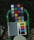
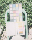
Let me clarify or rather correct something here. The above scans were done at exactly the same settings on the scanner with no correction.

Here are some others. They are scans of prints of the above negatives which were scanned. The prints had a constant filtration and exposure time but varied only in f stop. Do you see a significant shift in color or any color error? Color neg maintains its balance from the toe to the shoulder. at the extremes, some shadow or highlight detail is lost. But the good range is pretty broad. I've done the same with Portra 400.

PE

Thanks for posting these examples PE. It's very interesting to see side-by-side examples. Looking at these prints makes me wonder whether the colour shifts I experienced with my 2 stop over-exposed Ektar was simply caused by the scanner having problems with the density of the negative. Trying to think back, but I can't recall wet printing any of them. I need to revisit those negatives when I finally have my darkroom set up again. Perhaps I've had the wrong idea about Ektar all this time?
 

Bill Burk

Subscriber
Joined
Feb 9, 2010
Messages
9,290
Format
4x5 Format
I wanted to offer a critique of the graph on the very first post of this thread.

Black and White gets a very short line compared to Color Negative, which doesn't make sense. It should have a long line similar to color negative film.

The only reason I might think justifies a shorter line on black and white is that the negative image is silver, and a greater build-up of silver deposit degrades the image quality in black and white negatives. While color negative images are dye, and can tolerate a greater build-up.

If that's the reason, then Chromogenic Black and White would have similar long line, and it would be a reason to choose that kind of film.
 

Photo Engineer

Subscriber
Joined
Apr 19, 2005
Messages
29,018
Location
Rochester, NY
Format
Multi Format
Bill, if you look at the B&W curves from Kodak film, you will observe that many of them have higher contrast and shorter latitude for common development times. This is done (I think) to improve perception in the absence of color.

PE
 

Bill Burk

Subscriber
Joined
Feb 9, 2010
Messages
9,290
Format
4x5 Format
When I look at B&W curves from Kodak film, I see nothing but straight lines stretching out for as far as the eye can see...

My graph shows about ten stops of exposure possibilities, and I believe the straight lines continue several more stops.

So my criticism of the graph in the first post of this thread might still stand... I can get ten stops according to my graphs, so why does the graph on the first post of this thread show only eight and a half stops for black and white?

That's either a mistake...

Or a commentary that color negative dye density is cleaner and has no grain, which continues to give consistently high quality prints as you continue towards overexposure, while the grain which increases with black and white negative film density towards overexposure may be said to degrade print quality.

What do you think? Did the person who drew up that graph on post 1 misunderstand latitude of black and white? Or did that person understand it full well?

tmxfamily.jpg
 
Last edited:

Photo Engineer

Subscriber
Joined
Apr 19, 2005
Messages
29,018
Location
Rochester, NY
Format
Multi Format
Bill, try what I did. Expose a B&W film at -2, -1, N, +1 and +2 and process it at the recommended times in a given developer. Scan them and print them with 1 stop increments as I did and then compare them. That is a real-world test. It is the best I can suggest and I have done it for years, but with color.

PE
 

Adrian Bacon

Subscriber
Joined
Oct 18, 2016
Messages
2,086
Location
Petaluma, CA.
Format
Multi Format
Attached is two sets of images. This was a scene shot at noon with Ektar 100 120 roll film in a Fujica GW690. The negatives where scanned in on a Canon 9000F MkII and Vuescan as a positive image and saved as a raw tiff with gamma 1.0. The first 8 images have been inverted and the red, green, and blue channels were gamma adjusted so that the grey card for each channel is sitting about in the middle of the histogram. These are not finished images, but are included so those that are interested can see how Ektar responds over the exposure range. Since the gray card was normalized, the bulk of the color shifts at the extremes of the range are in the highlight and shadows, as expected. -4 is losing a pretty significant chunk of shadow to the film base for this amount of scene contrast, and for that reason, qualifies as unusable.

The second set of images is the same scanned in positives as the first set, but run through my standardized Ektar post process. I didn't include -4 because I can only upload 15 images. What specifically is done to each image is the purview of dpug, so we'll not go there. There's a giant swath where all I'd have to do is a simple exposure adjustment to put the gray card where I want it followed by tweaks to aesthetic. With the exception of -4, none of them are really what I'd call problem images, though the more you get under exposed the more your shadows are going to suck, and the higher your scene contrast is, the faster you'll start losing shadows when under exposing.

Drew: Hmm... OK. That hasn't been my experience. Perhaps you're doing something wrong? I'm a long time photoshop and lightroom user. It's only painful if you don't understand whats happening under the covers or don't know how to use what's available to you. I do agree that you should aim for correct exposure, however, as I stated before, +-2 generally isn't a problem for most SBRs, and +-3 could be made to work, though on higher contrast scenes, you're way better off exposing for the important shadows just to get enough exposure density so that you've got something to work with.

2016-10-28-0001.jpg
2016-10-28-0002.jpg
2016-10-28-0003.jpg
2016-10-28-0004.jpg
2016-10-28-0005.jpg
2016-10-28-0006.jpg
2016-10-28-0007.jpg
2016-10-28-0008.jpg
5991_0002.jpg
5991_0003.jpg
5991_0004.jpg
5991_0005.jpg
5991_0006.jpg
5991_0007.jpg
5991_0008.jpg
 

MattKing

Moderator
Moderator
Joined
Apr 24, 2005
Messages
52,878
Location
Delta, BC Canada
Format
Medium Format
I don't think those are tests of the film.
I think they are tests of how your scanner and your software interact with the film.
 

Adrian Bacon

Subscriber
Joined
Oct 18, 2016
Messages
2,086
Location
Petaluma, CA.
Format
Multi Format
I don't think those are tests of the film.
I think they are tests of how your scanner and your software interact with the film.

As opposed to tests of how a wet darkroom interacts with the film. Either way, the film was exposed over an 8 stop range.
 

Adrian Bacon

Subscriber
Joined
Oct 18, 2016
Messages
2,086
Location
Petaluma, CA.
Format
Multi Format
Mine had no adjustment at all. They were all scanned in one strip. No post process.

Interesting results.

PE

In hybrid land there's a million and one ways to post process. Some ways are better than others. I care about the mids more than anything else, so my post is geared to making acceptable mids over a fairly wide range of exposure.
 

Bill Burk

Subscriber
Joined
Feb 9, 2010
Messages
9,290
Format
4x5 Format
I'll try the test PE suggests, but I'll print best I can (instead of no adjustments I reserve the right to try to make each print look the best I can make it). That's how I believe the old "Willow Tree" tests were done.
 

Photo Engineer

Subscriber
Joined
Apr 19, 2005
Messages
29,018
Location
Rochester, NY
Format
Multi Format
Bill, I made no adjustments with the scanner, just scanned one strip of 120 film. I used an RZ for this with 120 Portra. The prints did not vary except for f stop.

PE
 

Photo Engineer

Subscriber
Joined
Apr 19, 2005
Messages
29,018
Location
Rochester, NY
Format
Multi Format
Well Alan, using Portra I see no color shift from over to under exposure. I see good latitude and I see loss in shadows or highlights depending on exposure. All as expected. However, what is not seen is what can be done if one dodges, burns or otherwise adjusts exposure when working on-easel. And then there is PS which we shall not discuss but certainly adds a huge other dimension to this many factored equation.

I must add of course, that this is not the first time I have done this professionally at EK. In fact, I have a whole box of pictures I saved from a garbage can that replicates this with C41 and E6 from about 1990 or thereabouts.

PE
 

MattKing

Moderator
Moderator
Joined
Apr 24, 2005
Messages
52,878
Location
Delta, BC Canada
Format
Medium Format
As opposed to tests of how a wet darkroom interacts with the film. Either way, the film was exposed over an 8 stop range.
For clarity, I have no problem with those who use a hybrid approach, although I am unhappy when discussions about that approach make their way into APUG, in conflict with APUG's focus and rules.
What I was attempting to indicate with my earlier approach is that the film will give very consistent results - both respect to colour and contrast - over a wide range of exposures. If you print optically, you can realize that consistency with nothing more than changes in printing exposure time.
If you use a scanning process to evaluate your results, that process tends to add an additional set of variables that relate to how the scanner and scanning software respond to the negative. If your system is evaluating each scan separately, the consistency of the results will almost entirely result from how that scanner and your software are calibrated to deal with the variation in your negatives.
 

Bill Burk

Subscriber
Joined
Feb 9, 2010
Messages
9,290
Format
4x5 Format
Bill, I made no adjustments with the scanner, just scanned one strip of 120 film. I used an RZ for this with 120 Portra. The prints did not vary except for f stop.

PE
PE,

I still think your set of individual frames were adjusted for brightness. Scanner is trying to make each frame look good.

Your contact prints reveal what a prints made with "no adjustment" would really look like.

If the individual shots were not adjusted the set would vary in brightness, like this... Screenshot 2016-10-30 at 12.17.03 AM.png Screenshot 2016-10-30 at 12.17.20 AM.png Screenshot 2016-10-30 at 12.17.29 AM.png

But... Your contact prints are great, they show what you get when you...

Vary negative exposures on a roll (so you have different densities on each negative), and you make several contact prints under an enlarger and varying the f/stop on that enlarger lens (so you have different print exposures)...

The result is proof of the idea of latitude. You can make a good print from a wide variety color negative exposures... as long as you are leaning towards overexposure.
 

Adrian Bacon

Subscriber
Joined
Oct 18, 2016
Messages
2,086
Location
Petaluma, CA.
Format
Multi Format
For clarity, I have no problem with those who use a hybrid approach, although I am unhappy when discussions about that approach make their way into APUG, in conflict with APUG's focus and rules.
What I was attempting to indicate with my earlier approach is that the film will give very consistent results - both respect to colour and contrast - over a wide range of exposures. If you print optically, you can realize that consistency with nothing more than changes in printing exposure time.
If you use a scanning process to evaluate your results, that process tends to add an additional set of variables that relate to how the scanner and scanning software respond to the negative. If your system is evaluating each scan separately, the consistency of the results will almost entirely result from how that scanner and your software are calibrated to deal with the variation in your negatives.

No disagreement from me. I've purposely attempted to not get too DPUG here, and kept it talking about the film as much as I could.

For clarification, I always scan a given film type with the same scanner settings (for a given scanner, I have multiple scanners). It doesn't matter if it's over or under exposed, every frame of Ektar I scan is always scanned as a positive gamma 1.0 image with the same scanner exposure settings in vuescan. The second set of images I supplied was also processed the same way (with the same adjustments) to arrive at what I call a baseline density correction. This is why the second set of images go from dark to bright over the exposure range. The second set of images has the least amount of variation in the scanning/post process, which is why I included them.

With all that being said, looking at the second set of images, the color checker chart is pretty telling as to what Ektar can do over the exposure range. I've also done this exercise with Portra 160, Portra 400, TMAX 100, and TMAX 400 with similar results.
 

benjiboy

Subscriber
Joined
Apr 18, 2005
Messages
11,970
Location
U.K.
Format
35mm
In hybrid land there's a million and one ways to post process. Some ways are better than others. I care about the mids more than anything else, so my post is geared to making acceptable mids over a fairly wide range of exposure.
We are in analog land Adrian this is Analog Photography User Group, hybrid photography should be in D.P.U.G. land http://www.dpug.org/forums/home.php
 

Bill Burk

Subscriber
Joined
Feb 9, 2010
Messages
9,290
Format
4x5 Format
Bill, try what I did. Expose a B&W film at -2, -1, N, +1 and +2 and process it at the recommended times in a given developer. Scan them and print them with 1 stop increments as I did and then compare them. That is a real-world test. It is the best I can suggest and I have done it for years, but with color.

PE

I took a series in bright sun at 1/250 and f/11 and then considering that normal I increased exposure by two stops for each successive shot and exposed Normal, +2 stops, +4 stops, +6 stops, +8 stops, +10 stops. I'm afraid my +10 stops will suffer from camera blur but otherwise let's see what I get...
 

markbarendt

Member
Joined
May 18, 2008
Messages
9,422
Location
Beaverton, OR
Format
Multi Format
PE,

I still think your set of individual frames were adjusted for brightness. Scanner is trying to make each frame look good.

Your contact prints reveal what a prints made with "no adjustment" would really look like.

If the individual shots were not adjusted the set would vary in brightness, like this... View attachment 166266 View attachment 166267 View attachment 166268

But... Your contact prints are great, they show what you get when you...

Vary negative exposures on a roll (so you have different densities on each negative), and you make several contact prints under an enlarger and varying the f/stop on that enlarger lens (so you have different print exposures)...

The result is proof of the idea of latitude. You can make a good print from a wide variety color negative exposures... as long as you are leaning towards overexposure.
I think what you are expressing Bill is an equipment centric POV, and you are very much right in that sense.

There are other ways to think about it though, for example:

When printing from negatives of any type it is IMO a given that every frame needs at least a baseline exposure adjustment to peg at least one point. As far as I'm concerned that first adjustment is a gimme because it is simply the nature of the system.

If I use, for example, a forehead highlight as a specific measured reference point for a specific measured paper exposure, and I maintain that specific measured paper exposure for the forehead highlights in every frame then every frame prints the same. This is the 'printer's equivalent' of metering the scene and adjusting camera exposure to our preferred EI, nothing more.

When following this method subjects print remarkably consistently with regard to luminance and without color shifts regardless of the specific camera exposure.

Using the same negative strip on the digital side there are a bunch of ways to mess it up, but one can essentially do the same thing.

My point is that expecting a negative to straight print properly without that first gimme adjustment is like expecting every lotto ticket to win.
 

Photo Engineer

Subscriber
Joined
Apr 19, 2005
Messages
29,018
Location
Rochester, NY
Format
Multi Format
Guys, I was saying that a good scanner will adjust properly to over and under exposures just as we would with printing. And, you can do more with software as well as with dodging and burning. Bottom line? You get good results with color negative film over a wide exposure range and you have little to no color shift.

PE
 

Alan Klein

Member
Joined
Dec 12, 2010
Messages
1,067
Location
New Jersey .
Format
Multi Format
No disagreement from me. I've purposely attempted to not get too DPUG here, and kept it talking about the film as much as I could.

For clarification, I always scan a given film type with the same scanner settings (for a given scanner, I have multiple scanners). It doesn't matter if it's over or under exposed, every frame of Ektar I scan is always scanned as a positive gamma 1.0 image with the same scanner exposure settings in vuescan. The second set of images I supplied was also processed the same way (with the same adjustments) to arrive at what I call a baseline density correction. This is why the second set of images go from dark to bright over the exposure range. The second set of images has the least amount of variation in the scanning/post process, which is why I included them.

With all that being said, looking at the second set of images, the color checker chart is pretty telling as to what Ektar can do over the exposure range. I've also done this exercise with Portra 160, Portra 400, TMAX 100, and TMAX 400 with similar results.

"Show us the money." Could we see some real world results from different exposures of the same scene? Comparing color test charts pictures proves little. That's pixel peeping. Show us some shots that have people and landscape objects like a blue sky and green forests so we can see the differences in what our brain will actually accept. For example, our brains will accept a lot of variations from a color chart that it will not accept when looking at flesh tones that have any non-flesh hues in them.

Also, in the process of correcting a picture that was exposed incorrectly, in order to get the colors "acceptable", contrast changes substantially, as could luminance. You lose dynamic range. So yeah, you get a shot that you can call OK. But you lost the range of tones that were possible in a really rich picture. You're settling for less than you could have gotten if your shot was exposed correctly.

There is no free lunch.
 

Photo Engineer

Subscriber
Joined
Apr 19, 2005
Messages
29,018
Location
Rochester, NY
Format
Multi Format
There are, however, several stops of GOOD latitude in color neg, on each side of normal. And, I have done it with people in it with a color chart included in the scene. So, I'm not giving you smoke and mirrors here. This IS a real test. And the prints were "locked balance and exposure time" with only f stop as the variable.

PE
 

Alan Klein

Member
Joined
Dec 12, 2010
Messages
1,067
Location
New Jersey .
Format
Multi Format
Ok I believe you although it would be nice if you posted those people comparisons. Maybe my problem is that when I scanned Ektar 100, I just had problems, period, getting the right color results even wioth properly exposed shots which is why I went back to Velvia positive film. But I do remember shooting a roll of Portra, bracketing, and comparing the scans. Although all could be adjusted to acceptable results, the colors were different, if only slightly.
 
Photrio.com contains affiliate links to products. We may receive a commission for purchases made through these links.
To read our full affiliate disclosure statement please click Here.

PHOTRIO PARTNERS EQUALLY FUNDING OUR COMMUNITY:


Ilford ADOX Freestyle Photographic Stearman Press Weldon Color Lab Blue Moon Camera & Machine
Top Bottom