Colour Negative / Slide and the Zone System

about to extinct

D
about to extinct

  • 2
  • 0
  • 81
Fantasyland!

D
Fantasyland!

  • 9
  • 2
  • 128
perfect cirkel

D
perfect cirkel

  • 2
  • 1
  • 125

Recent Classifieds

Forum statistics

Threads
198,748
Messages
2,780,355
Members
99,696
Latest member
TommyMay
Recent bookmarks
0

FujiLove

Member
Joined
Jun 13, 2014
Messages
543
Location
UK
Format
Multi Format
Personally, I'd completely ignore the zone system with colour film. Here's what I do:

(most) Colour negative films --> I either take an incident reading in a shadow area (dome pointed toward the camera, obviously), or shade it with my hand if I'm taking a landscape and can't get into the important shadows. With high latitude film such as Portra 400 or the Kodak movie stocks I'll also rate the film at half box speed to make sure it gets plenty of exposure. I find the negatives are nicely exposed like this and easy to print from.

Ektar negative film --> I meter at box speed and take an incident reading in a shadow area (not deep shadow). With this film I often take a couple of measurements in the full light and shadows and maybe expose somewhere between the two. I don't like how the colours shift with Ektar when it's over-exposed.

Slide film --> Generally, I take a bog-standard incident reading in the light so I'm exposing for the highlights. Obviously, I use common sense, and if the important part of the image resides in a shadow area I'll meter that and deliberately blow out the highlights.

With slide film you have to decide what's important before you press the shutter. With negative film you can generally decide later if you give the film plenty of exposure.
 

Adrian Bacon

Subscriber
Joined
Oct 18, 2016
Messages
2,086
Location
Petaluma, CA.
Format
Multi Format
The Sunny 16 rule is for light between 10am and 2pm. How do you know exposure without a meter when shooting when the light changes the most - during the magic hour? Especially if you're shooting slides?

That's easy. Wikipedia is your friend: https://en.m.wikipedia.org/wiki/Sunny_16_rule

The sunny 16 rule is one rule out of a few. There's an exposure guide table for different lighting conditions in the link above. Early morning and evening hours are f/4. When in doubt, I open it up a stop. This is not an exact science. Lots of older film cameras only give you full stop exposure control, so you can meter all you want, but the best you can do is get it within a stop of what the meter says. This is why I don't bother with a meter. Roughly following the sunny 16 guide gets me within a stop most times. Slides are more touchy about this, but with CN film, unless you're shooting something super high contrast you've got miles of exposure latitude. The only thing you have to worry about is getting enough exposure density for the shadow details that are important to you (hence, open up a stop when in doubt). Kodak Ektar 100? Pretty good. Portra 400? Lots more, though I prefer Ektar's colors. Tmax 400 (TMY-2)? It's ridiculous. I've shot that 4 stops under and 3 stops over, didn't push or pull during development, scanned it in, set the levels, then the gamma, then threw a curve on it. It looked like I shot it normally.
 

DREW WILEY

Member
Joined
Jul 14, 2011
Messages
13,928
Format
8x10 Format
Ektar is a color neg film that you should really expose with just as much care as a chrome or you'll have problems with color reproduction per se.
But if you understand this, as well as how to correctly balance it for scene color temperature, there are certain categories of hues it will bag better
than most other color neg films, which are traditionally more oriented to portraiture.
 

Adrian Bacon

Subscriber
Joined
Oct 18, 2016
Messages
2,086
Location
Petaluma, CA.
Format
Multi Format
Ektar is a color neg film that you should really expose with just as much care as a chrome or you'll have problems with color reproduction per se.
But if you understand this, as well as how to correctly balance it for scene color temperature, there are certain categories of hues it will bag better
than most other color neg films, which are traditionally more oriented to portraiture.

I would say that's probably true if you have an all analog workflow, but a lot less of an issue in a hybrid workflow. A while back I shot a test scene of Ektar over an 8 stop range (4 under, 3 over), and in all honesty, +-2 in my hybrid workflow was ok without any real modifications, and all 8 exposures could be made usable, it was just a more extreme adjustment the further away you got from correct exposure.
 

FujiLove

Member
Joined
Jun 13, 2014
Messages
543
Location
UK
Format
Multi Format
I would say that's probably true if you have an all analog workflow, but a lot less of an issue in a hybrid workflow. A while back I shot a test scene of Ektar over an 8 stop range (4 under, 3 over), and in all honesty, +-2 in my hybrid workflow was ok without any real modifications, and all 8 exposures could be made usable, it was just a more extreme adjustment the further away you got from correct exposure.

That's interesting Adrian. Did you not find the reds moved towards purple when your Ektar was over-exposed? I'm wet printing, so like you said, it may be less sensitive in a hybrid workflow.
 

derelict

Member
Joined
Jun 6, 2016
Messages
139
Location
Virginia
Format
Multi Format
Personally, I'd completely ignore the zone system with colour film. Here's what I do:

(most) Colour negative films --> I either take an incident reading in a shadow area (dome pointed toward the camera, obviously), or shade it with my hand if I'm taking a landscape and can't get into the important shadows. With high latitude film such as Portra 400 or the Kodak movie stocks I'll also rate the film at half box speed to make sure it gets plenty of exposure. I find the negatives are nicely exposed like this and easy to print from.

Ektar negative film --> I meter at box speed and take an incident reading in a shadow area (not deep shadow). With this film I often take a couple of measurements in the full light and shadows and maybe expose somewhere between the two. I don't like how the colours shift with Ektar when it's over-exposed.

Slide film --> Generally, I take a bog-standard incident reading in the light so I'm exposing for the highlights. Obviously, I use common sense, and if the important part of the image resides in a shadow area I'll meter that and deliberately blow out the highlights.

With slide film you have to decide what's important before you press the shutter. With negative film you can generally decide later if you give the film plenty of exposure.

I enjoyed reading this. I meter for the shadows and 1/2 box speed for Portra or Gold. I am about to purchase my first rolls of Ektar to play with and liked your method (which, coincidentally, is how you would meter for digital shooting as well) and will give it a shot. I am going to shoot some Velvia this weekend and will shoot it for highlights.
 

FujiLove

Member
Joined
Jun 13, 2014
Messages
543
Location
UK
Format
Multi Format
I enjoyed reading this. I meter for the shadows and 1/2 box speed for Portra or Gold. I am about to purchase my first rolls of Ektar to play with and liked your method (which, coincidentally, is how you would meter for digital shooting as well) and will give it a shot. I am going to shoot some Velvia this weekend and will shoot it for highlights.

Definitely don't stress too much over it. If you meter slide for the highlights (incident meter) you can't go far wrong as long as you use your eyes and engage brain before shooting. I stressed a lot over the slide film I took to Iceland recently, having not shot any for years, and it all turned out fine. The only shots that were not perfectly exposed (based on how they look projected) were the ones I deliberately bracketed and a couple I messed up by trying to grab a quick shot without metering.

The more film I shoot, the simpler it seems. Imagine having to stare at a histogram every 5 seconds! Now that's something to make you stressed :smile:
 

Adrian Bacon

Subscriber
Joined
Oct 18, 2016
Messages
2,086
Location
Petaluma, CA.
Format
Multi Format
That's interesting Adrian. Did you not find the reds moved towards purple when your Ektar was over-exposed? I'm wet printing, so like you said, it may be less sensitive in a hybrid workflow.

Without any correction, yes, the rgb relative relationships change over the exposure range, which is what induces the color shifts that you see. There's a sweet spot around correct exposure where that relationship is about the same, and outside of that sweet spot the density range of one or more channels is more or less compressed (depending on if you're over or under) than the others. In an analog workflow, visually, this manifests as a color shift because the rest of your analog workflow is expecting the sweet spot density ranges. In hybrid land, you can see what the channels are doing on the histogram and simply correct it with either a levels or curve adjustment layer. Once you understand how a particular CN film responds to over and under exposure, it doesn't really matter how you expose it (within reason) in a hybrid workflow as long as you got enough density in the important parts. The rest is totally correctable. Again, the further away from correct exposure you are, the more agressive you have to get to pull everything back to normal and the more you have to monkey with it, so you do want to generally aim for the sweet spot just to save time in post, but outside of that, very few exposures are so over or under exposed that they're unusable.
 

markbarendt

Member
Joined
May 18, 2008
Messages
9,422
Location
Beaverton, OR
Format
Multi Format
That's interesting Adrian. Did you not find the reds moved towards purple when your Ektar was over-exposed? I'm wet printing, so like you said, it may be less sensitive in a hybrid workflow.
My question here is, which reds?

Reds in the shadows, mid-tones, Highlights...
 

Adrian Bacon

Subscriber
Joined
Oct 18, 2016
Messages
2,086
Location
Petaluma, CA.
Format
Multi Format
My question here is, which reds?

Reds in the shadows, mid-tones, Highlights...

If your initial density correction put the mids in the same range, then it will always be both the highlights and shadows that are off. If you initially put the shadows in the same range, then the mids and highlights are off. If you initially put the highlights in the same range, then the mids and shadows are off. I generally start by putting the mids in the same range, then correct the highlights and shadows as needed.

I'll go pull the test negatives I shot out of archives re-scan them in and post them here so you can see what Ektar does as you over and under expose it. I'll stick the mids in the same range and not correct the highlights or shadows. It'll either be really late today or some time over the weekend.
 

markbarendt

Member
Joined
May 18, 2008
Messages
9,422
Location
Beaverton, OR
Format
Multi Format
What I am getting at is that the only time I see color shifts that are caused by film exposure with negative films is when trying to print from the negative's toe. If the tones are on the straight line of the negative I see no shift.
 

DREW WILEY

Member
Joined
Jul 14, 2011
Messages
13,928
Format
8x10 Format
Adrian, I'd have to disagree with you. If you don't have Ektar properly color balanced at the correct level of exposure in the first place, you're going to have some distinct color errors that are difficult if no impossible to post-correct afterwards. I'd heard this over and over and over again - Look,
I can fix it in PS... Well, maybe you allegedly can if you don't understand what this film is actually capable of correctly exposed. There will be crossover errors, muddied hues outside the normal boundaries. Analog workflow doesn't differ in this respect whatsoever. If it's on the film, it can
be retrieved in the darkroom by any advanced printer. If parts of the dye curves have overlapped due to gross exposure errors, PS isn't going to
unmix the mud. You might be able to dither or "paint" in corrected hues, or jump through some other kinds of ridiculous torture. It's just far far easier
to shoot it right in the first place. I obviously don't know your personal skill level, but every time I hear someone say they can correct anything in
Photoshop, I look at the hokey result and try to remain polite.
 

DREW WILEY

Member
Joined
Jul 14, 2011
Messages
13,928
Format
8x10 Format
Let me clarify this a tad... The hues that won't resolve in the toe due to underexposure relative to the dominant colors in the subject down there, and specifically relative to which dyes curves overlap and to what degree, or else at which point the intended curve geometry between all three respective dye layers is no longer in harmony. If you look at the published dye sensitivity profile for Ektar, you will note that the individual dye curves
are relatively steep spikes, characteristic of both the higher contrast of this film and greater saturation, and reminiscent of chrome film rather than typical low-contrast color neg film like Portra. This also means color casts in deep shadows will be more likely to cause problems. I sure learned all
this the hard way, meaning through the use of 8x10 Ektar film, where any mistakes are $$.
 

Photo Engineer

Subscriber
Joined
Apr 19, 2005
Messages
29,018
Location
Rochester, NY
Format
Multi Format
Let me clarify or rather correct something here. The above scans were done at exactly the same settings on the scanner with no correction.

Here are some others. They are scans of prints of the above negatives which were scanned. The prints had a constant filtration and exposure time but varied only in f stop. Do you see a significant shift in color or any color error? Color neg maintains its balance from the toe to the shoulder. at the extremes, some shadow or highlight detail is lost. But the good range is pretty broad. I've done the same with Portra 400.

PE
 

Attachments

  • f8.jpg
    f8.jpg
    97.2 KB · Views: 95
  • f11.jpg
    f11.jpg
    126.5 KB · Views: 93
  • f16.jpg
    f16.jpg
    142.3 KB · Views: 100
  • f22.jpg
    f22.jpg
    136.1 KB · Views: 93

DREW WILEY

Member
Joined
Jul 14, 2011
Messages
13,928
Format
8x10 Format
Ektar versus all species of Portra is quite a different ballgame if one is trying to peg color repro as closely as possible.
 

DREW WILEY

Member
Joined
Jul 14, 2011
Messages
13,928
Format
8x10 Format
A lot less forgiving with respect to exposure and printing. But generally easier than chromes. Comes with the territory of higher contrast and more
saturation. Portra and Ektar might have come out of the same automobile factory, but the latter is like driving with power steering instead of conventional.
 

Photo Engineer

Subscriber
Joined
Apr 19, 2005
Messages
29,018
Location
Rochester, NY
Format
Multi Format
Ektar top and Portra bottom. The speed difference is obvious due to the shifted curves.

upload_2016-10-28_19-2-50.png


upload_2016-10-28_19-6-52.png


This tiny difference makes little difference in printing or scanning.
 

markbarendt

Member
Joined
May 18, 2008
Messages
9,422
Location
Beaverton, OR
Format
Multi Format
One thing that many people miss is the color temperature in the scene. The log exposure value of red green and blue regularly varies locally within a scene as well as with the lighting sources.
 
Last edited:

Photo Engineer

Subscriber
Joined
Apr 19, 2005
Messages
29,018
Location
Rochester, NY
Format
Multi Format
Very true Mark and since these two films differ in spectral sensitivity, this is true in direct comparisons of these two films I have shown. But that causes a different sort of problem.

PE
 

Alan Klein

Member
Joined
Dec 12, 2010
Messages
1,067
Location
New Jersey .
Format
Multi Format
All I know is when I had Portra developed and ask the pro shop to provide a contact sheet, the colors were different between the 1 stop brackets I did. Not enough to matter if you only looked at any one of them. All could be used for final printing. But you could see the difference when comparing all three at the same time.
 

Alan Klein

Member
Joined
Dec 12, 2010
Messages
1,067
Location
New Jersey .
Format
Multi Format
Let me clarify or rather correct something here. The above scans were done at exactly the same settings on the scanner with no correction.

Here are some others. They are scans of prints of the above negatives which were scanned. The prints had a constant filtration and exposure time but varied only in f stop. Do you see a significant shift in color or any color error? Color neg maintains its balance from the toe to the shoulder. at the extremes, some shadow or highlight detail is lost. But the good range is pretty broad. I've done the same with Portra 400.

PE
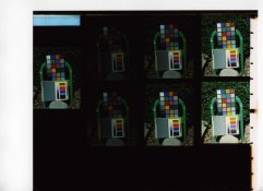
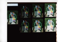
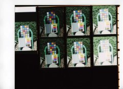
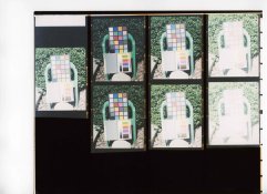
How can you say there were no corrections? In order to get positive colors from scanning a negative, the program has to "complement" the colors from the negative. That's correction "ipso facto". The scanner had to apply some curve or formula. There has to be some correction going on. I think a better test would be to contact print the negative film directly to see the color differences between the bracketed shots. Then, you're only scanning the final results from a single print and the differences in colors among the bracketed shots will be more reliably shown.

All I know is when I had Portra developed and ask the pro shop to provide a contact sheet, the colors were different between the 1 stop brackets I did. Not enough to matter if you only looked at any one of them. All could be used for final printing. But you could see the differences when comparing all three at the same time.
 

markbarendt

Member
Joined
May 18, 2008
Messages
9,422
Location
Beaverton, OR
Format
Multi Format
All I know is when I had Portra developed and ask the pro shop to provide a contact sheet, the colors were different between the 1 stop brackets I did. Not enough to matter if you only looked at any one of them. All could be used for final printing. But you could see the difference when comparing all three at the same time.
Part of the issue is that to get matching colors the tone luminance needs to match too. as does the clipping points.
 
Photrio.com contains affiliate links to products. We may receive a commission for purchases made through these links.
To read our full affiliate disclosure statement please click Here.

PHOTRIO PARTNERS EQUALLY FUNDING OUR COMMUNITY:


Ilford ADOX Freestyle Photographic Stearman Press Weldon Color Lab Blue Moon Camera & Machine
Top Bottom