Shoot slides using incident metering.
That is the best training you can get.
Actually I take the view that is not good training. The reason is that an incident reading does not take into account any of the range of luminances within the scene, and their
individual values. The incident assumes the entire scene is the same single value, irrespective of shadow and highlights. For slide film I have seen how this (incident metering without explicit measurement) has resulted in more strife than any other single task in the execution of a photograph. Yes, there
is a role for incident metering in specific presenting backlight situations, but it is largely problematic in the wider landscape format where there are critical elements that slide film depends on to get right -- there and then, in-camera, not in Fauxtoshoppe.
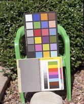
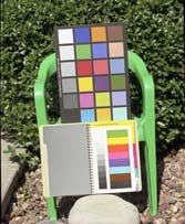
Transparency film delivers excellent results spot metered, and when the meter has been calibrated to the known characteristics of one or two particular films (this might be a problem with David Clapp not achieving consistent results, but I think there are bigger troubles about). The image posted by David of the building against a blue sky is underexposed, certainly it does not fit an expected "correct exposure" expectation. The subsequent image posted by
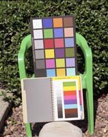
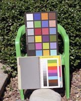
derelict cannot be commented on beyond the image obviously having some post work applied. The palette is incorrect for Velvia 100F.
[...]If you are not getting those sorts of results, your problem is with the digital parts of your workflow, and APUG isn't the place to discuss that.
That's right, I think that digital workflow is the cause of many problems (scanning changes
a lot!), but I also think there is a deficit in metering capacity, analysis and circumstantial change. I really do not know for sure. What I do know is that image at the top is underexposed, and is a very surprising result for an advanced meter such as the L758D, spot or incident. As for "how to meter this scene", spot it in 5 places (
do not meter the sky), average, then provide +1.0 to +1.5 additional.
Somebody mentioned clipping points on the L758D; I agree fully the defaults are fine as valid reference points and generally do not require any shifting. Typically Velvia is one, sometimes two points less than shown. It will vary with lighting conditions, which must be taken into account when using contrasty film such as RVP50, the lesser Provia 100F and lesser again Rollei CR 200 (this film is a quirk that does not require special attention for shadows).