AndrewBurns
Member
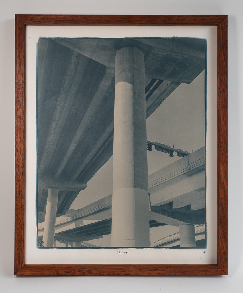
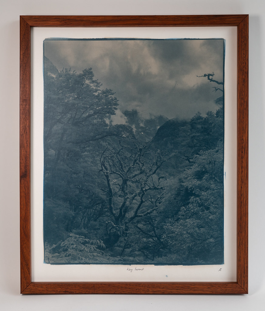
These turned out beautifully. Can you say more about how you toned these prints? And I really like your presentation. The (cherry?) wood frames really compliment the color of the toned cyanotypes nicely. Are these under glass with spacers?
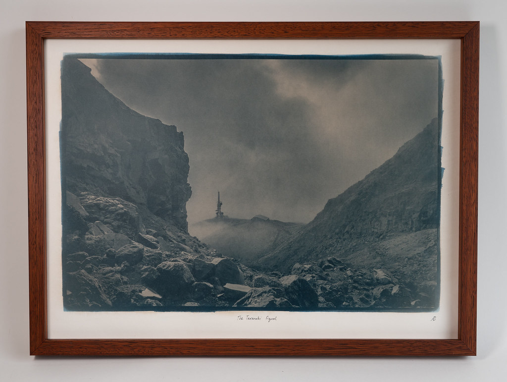
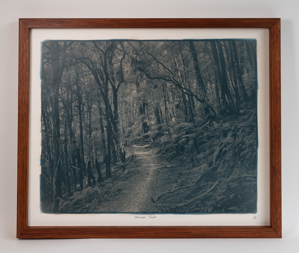
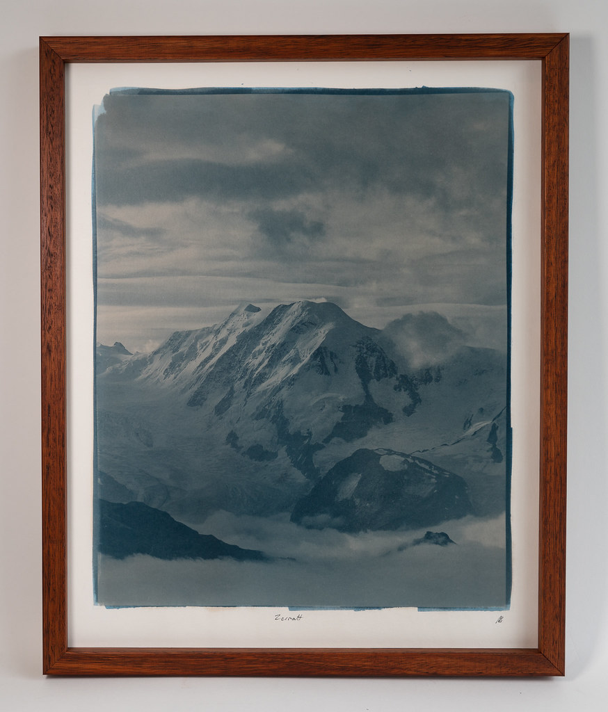
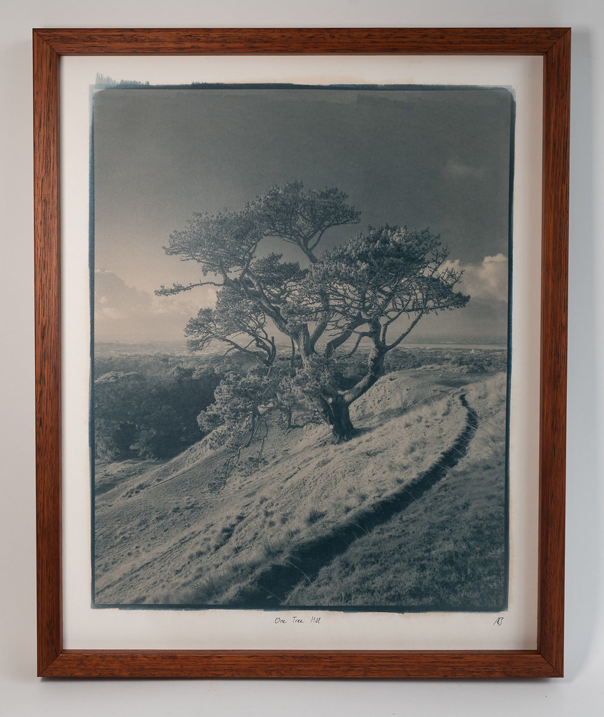
Thanks Drew. They're "blue sheet" cyanotype, which is the same as the classic formula except using potassium ferrocyanide rather than ferricyanide. The blue-sheet mix seems to be about three times faster than classic and has a much longer tonal scale but lower dmax. It also mostly forms prussian white when exposed, and so immediately after developing the image is very light but it darkens considerably over a few hours as it dries and oxidises. The reason I'm using this formula is primarily because I'm using a projector and so classic cyanotype would be a several hour exposure.
For toning I make a small amount of very strong instant coffee (about two tablespoons in 150 mL of water) and I brush that onto the surface of the print immediately after developing but before the print has dried and oxidised (I do use paper towel to soak up any excess water on the surface of the paper first). I let it sit like that for about 15 to 30 minutes, wash it, use paper towel to dry the surface slight and repeat one more time.