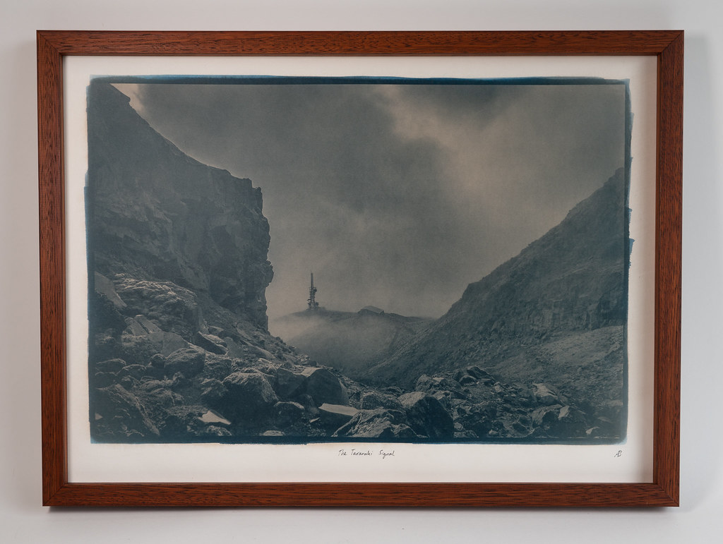
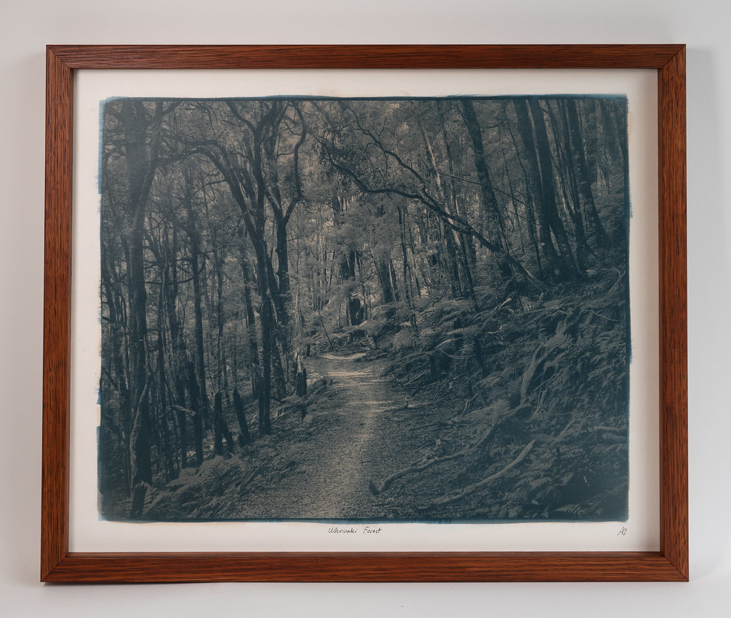
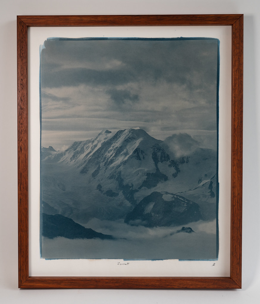
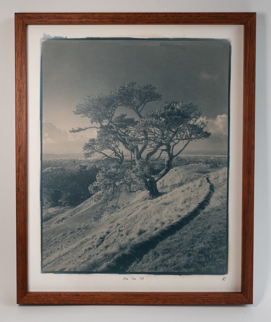
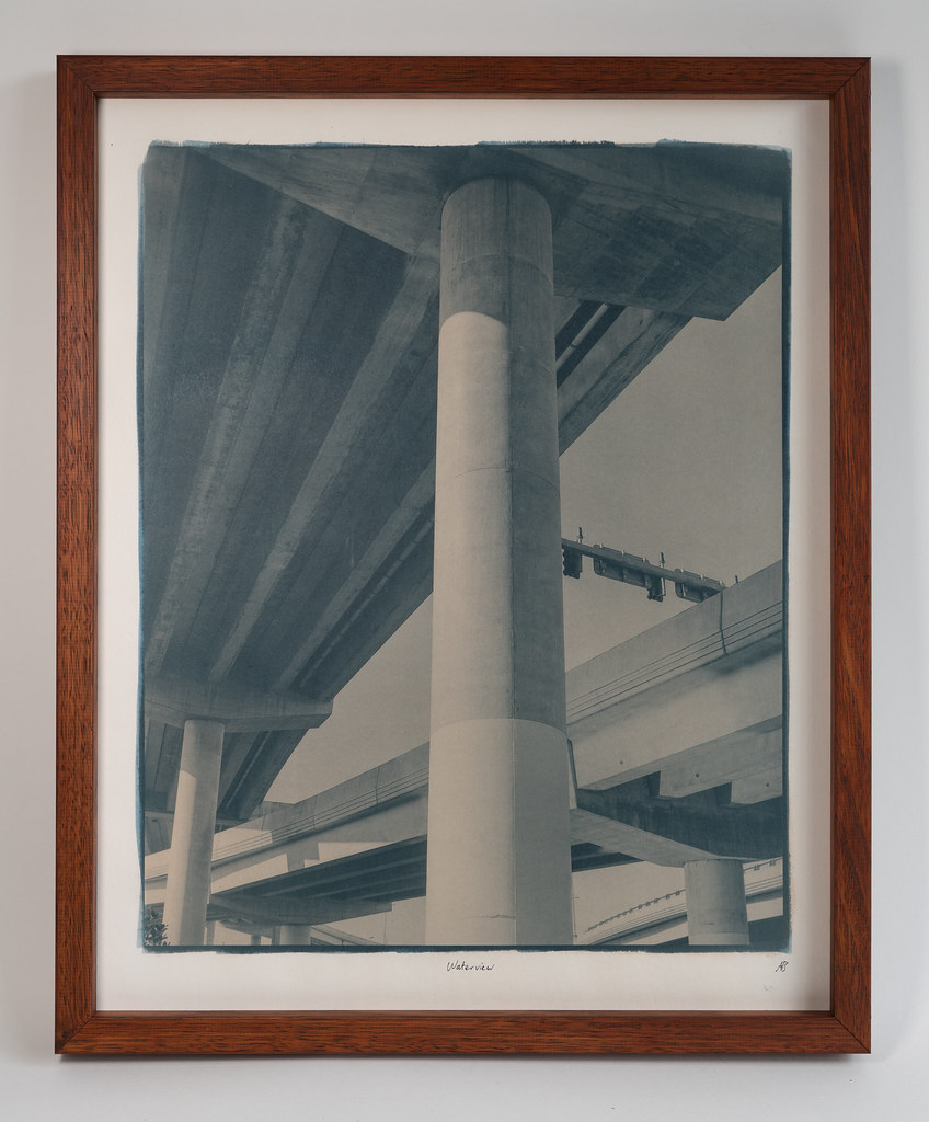
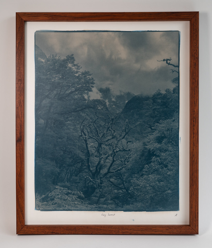
@Franswa thank you! The change in colour is quite dramatic after toning and I like it.
If you have Ferric Oxalate powder from B&S, you need to just follow their instructions for making 20% solution. I'm not sure if it involves anything more than dissolving (with some effort and difficulty) appropriate amount of Ferric Oxalate powder in appropriate amount of distilled water.
Living in a different geography, I am not in a position to order chemicals from B&S and hence I've synthesised Ferric Oxalate powder myself.

I just wanted to check if I am getting same pH as B&S sensitiser and hence my earlier request to you.


 , hence the dramatic color shift! It toned so quickly, about 20 seconds.....I still enjoy the result though. By the way, I don't intend to assume, but in the event that it's something you celebrate, Happy Diwali!