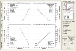
Print range versus negative.

Forum statistics

Threads
198,993
Messages
2,784,275
Members
99,763
Latest member
bk2000
Recent bookmarks
0
OP
OP
markbarendt

markbarendt

Member
Joined
May 18, 2008
Messages
9,422
Location
Beaverton, OR
Format
Multi Format
I don't know about anyone else, but I've been discussing the concept of communicating ideas and information in a graph, which I believe is the topic of this thread, not about whether photographic knowledge is a determent when shooting.

I don't believe anyone is seriously saying photographic knowledge is a bad thing.

I think what is being expressed s that there is a pretty low threshold of knowledge of the system needed to do truly nice work, beyond that point things might fall into the nice to know range or in the who cares range depending on the photographer.

Henri Cartier-Bresson is a reasonable example of this, he said in his own words (paraphrased here) that he did not care to know what happened after the film came out of the camera. He said of himself "I'm a hunter, not a cook".
 
Joined
Jan 7, 2005
Messages
2,616
Location
Los Angeles
Format
4x5 Format
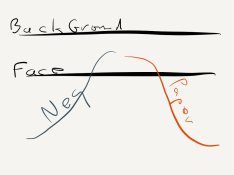
Stephen the single example below expresses my whole high-key placement idea, 2 lines and 2 squiggles in the sand with my finger.

View attachment 67458

Everything I need, to explain my idea to a companion on the beach with me is there.

It can even explain why I might want to use a highlight or mid-tone to peg exposure instead of a shadow.

The negative and print orientation are normally reversed from each other and those look like curves to me so until you actually define what they are I am assuming they are curves and so would anyone else looking at this. Now the upper part of the negative is the highlights and the upper part of the print are the shadows. I would read this as the highlights are somewhere over the film curve, and at the same time are beyond the paper D-max. So far none of this is making any sense to me. It would be helpful if you explain exactly what those curves are if they aren't film and paper curves.

If you look at my example, you will notice nothing falls off a curve. High key is just supposed to lighten the tones not to blow them out, which is what it appears to do in your example.
 
Last edited by a moderator:
Joined
Jan 7, 2005
Messages
2,616
Location
Los Angeles
Format
4x5 Format
I disagree with PE - I don't find these tone reproduction discussions over the top technical. In fact they are quite straight forward.

One thing I'd throw into the mix as far as over/extra and latitude goes is a consideration of image structure characteristics such as granularity, resolution etc. which may or may not contribute to the total subjective sense of print quality in addition to "macro" tone reproduction. As we know these characteristics are influenced to some extent by exposure.

If the Zone System is too crude and tone reproduction is too technical, I wonder where the Goldilock's spot falls.

I'm getting ready for work and don't have time to upload it, but there's an excellent example in Theory of the Photographic Process. I'll do it after work. Truthfully, I'm not exactly sure how to read it.
 
Last edited by a moderator:
OP
OP
markbarendt

markbarendt

Member
Joined
May 18, 2008
Messages
9,422
Location
Beaverton, OR
Format
Multi Format
The negative and print orientation are normally reversed from each other and those look like curves to me so until you actually define what they are I am assuming they are curves and so would anyone else looking at this. Now the upper part of the negative is the highlights and the upper part of the print are the shadows. I would read this as the highlights are somewhere over the film curve, and at the same time are beyond the paper D-max. So far none of this is making any sense to me. It would be helpful if you explain exactly what those curves are if they aren't film and paper curves.

If you look at my example, you will notice nothing falls off a curve. High key is just supposed to lighten the tones not to blow them out, which is what it appears to do in your example.

My intent is truly to blow out the background, it creates a perfect white, its a choice.

As to my squiggles looking like curves, they are mockups of curves yes. In my illustrations though conceptually highlights are at the top shadows at the bottom, so consider the print curve flipped. I don't necessarily care where the density is, I want to understand how the subjects carry through.

The intent of my illustrations is as a visualization tool.
 
Joined
Nov 22, 2004
Messages
226
Location
Bilthoven, T
Format
4x5 Format
If the Zone System is too crude and tone reproduction is too technical, I wonder where the Goldilock's spot falls.

I'm getting ready for work and don't have time to upload it, but there's an excellent example in Theory of the Photographic Process. I'll do it after work. Truthfully, I'm not exactly sure how to read it.

I do not understand that tone reproduction is too technical, at least not in the kodak publication 'kodak professional black and white films'., I referred to before in this thread. I would say: it is very simple and written for the practical photographer. It is far more simple than the zone system books. In this thread, it was oted that the book is not available. However, I see that it can be obtained via Amazon. There is ieven a choice from different editions. I have the 1976 edition. I do not know whether the later reprints are different.

Jed
 
Joined
Jan 7, 2005
Messages
2,616
Location
Los Angeles
Format
4x5 Format
My intent is truly to blow out the background, it creates a perfect white, its a choice.

As to my squiggles looking like curves, they are mockups of curves yes. In my illustrations though conceptually highlights are at the top shadows at the bottom, so consider the print curve flipped. I don't necessarily care where the density is, I want to understand how the subjects carry through.

The intent of my illustrations is as a visualization tool.

That helps. Thanks. Something conceptually similar is the gray scale comparison that Phil Davis uses in this program. It's basically the Dorst diagram but with colored in tones. From my perspecitve, you can get all that information and more from a tone reproduction diagram.
 
Last edited by a moderator:

Photo Engineer

Subscriber
Joined
Apr 19, 2005
Messages
29,018
Location
Rochester, NY
Format
Multi Format
All right. Too technical? Maybe and maybe not. Go back and look at the graphs I posted from Haist. There is nothing technical about that. Just simple logic and looking at a graph. Much simpler than other posts here, and no disrespect to those people, i am merely saying that the posts may go over some people's heads, thats all. Grant Haist has shown it with no math or fiddling. Just a simple film curve with "zones" showing print reproduction.

And, btw, negative films are shown increasing in density from left to right, as are paper densities. Print densities are shown decreasing in density from left to right. This convention is used throughout the photographic industry including "gasp" digital.

PE
 
Joined
Jan 7, 2005
Messages
2,616
Location
Los Angeles
Format
4x5 Format
All right. Too technical? Maybe and maybe not. Go back and look at the graphs I posted from Haist. There is nothing technical about that. Just simple logic and looking at a graph. Much simpler than other posts here, and no disrespect to those people, i am merely saying that the posts may go over some people's heads, thats all. Grant Haist has shown it with no math or fiddling. Just a simple film curve with "zones" showing print reproduction.

And, btw, negative films are shown increasing in density from left to right, as are paper densities. Print densities are shown decreasing in density from left to right. This convention is used throughout the photographic industry including "gasp" digital.

Ron, the Haist curve examples are only film curves and not tone reproduction diagrams. Different uses. And yes the print goes from left to right in decreasing density or at least did. I believe the convention is changing in stand a lone paper curves, and the convention is a left to right increasing density for the paper curve when used in tone reproduction diagrams.
 
Last edited by a moderator:
Joined
Nov 22, 2004
Messages
226
Location
Bilthoven, T
Format
4x5 Format
All right. Too technical? Maybe and maybe not. Go back and look at the graphs I posted from Haist. There is nothing technical about that. Just simple logic and looking at a graph. Much simpler than other posts here, and no disrespect to those people, i am merely saying that the posts may go over some people's heads, thats all. Grant Haist has shown it with no math or fiddling. Just a simple film curve with "zones" showing print reproduction.

And, btw, negative films are shown increasing in density from left to right, as are paper densities. Print densities are shown decreasing in density from left to right. This convention is used throughout the photographic industry including "gasp" digital.

PE

Too technical? Maybe and maybe not, that is the question. I am a physicist/ chemist and I like the Haist publication. But, I know that it is not the case for the average photographer. The text of the kodak publication is made for the practical photographer. They ( kodak people) told me that the text in the first edition has been modified in such a way that it was better to understand for the non scientific photographer. That was the second edition of 1976.

Jed
 
OP
OP
markbarendt

markbarendt

Member
Joined
May 18, 2008
Messages
9,422
Location
Beaverton, OR
Format
Multi Format
Is this better?

image.jpg
 

DREW WILEY

Member
Joined
Jul 14, 2011
Messages
13,985
Format
8x10 Format
The direction the curves goes depends on which side of the Greenwich Meridian you're own, so whether
it's more convenient to look left or right. The shape of the curve is straightest near the equator, but is
curved by the coreolis force the closer you get to the poles.
 
OP
OP
markbarendt

markbarendt

Member
Joined
May 18, 2008
Messages
9,422
Location
Beaverton, OR
Format
Multi Format
The direction the curves goes depends on which side of the Greenwich Meridian you're own, so whether
it's more convenient to look left or right. The shape of the curve is straightest near the equator, but is
curved by the coreolis force the closer you get to the poles.

I haven't factored in our friends in the Southern Hemisphere either.
 

Photo Engineer

Subscriber
Joined
Apr 19, 2005
Messages
29,018
Location
Rochester, NY
Format
Multi Format
Ron, the Haist curve examples are only film curves and not tone reproduction diagrams. Different uses. And yes the print goes from left to right in decreasing density or at least did. I believe the convention is changing in stand a lone paper curves, and the convention is a left to right increasing density for the paper curve when used in tone reproduction diagrams.

Stephen, the "Y" axis shows the range of density from the negative curve that you will get in a print. Given that the print will reproduce values from 0.2 to 2.2 on average, this instantly shows you the print image range and the negative range it covers.

If the silver criterion is adhered to, and it is in B&W, then you do not need 4 part diagrams to interpret what Haist shows. And, remember that there are several pages of tutorial along with those diagrams. Along with that, you have Mees. He too shows only the negative curve, and superimposed on that is the range of acceptable and unacceptable prints. They both show that you can derive everything in B&W from the simple film curve.

PE
 
Joined
Jan 7, 2005
Messages
2,616
Location
Los Angeles
Format
4x5 Format
Stephen, the "Y" axis shows the range of density from the negative curve that you will get in a print. Given that the print will reproduce values from 0.2 to 2.2 on average, this instantly shows you the print image range and the negative range it covers.

If the silver criterion is adhered to, and it is in B&W, then you do not need 4 part diagrams to interpret what Haist shows. And, remember that there are several pages of tutorial along with those diagrams. Along with that, you have Mees. He too shows only the negative curve, and superimposed on that is the range of acceptable and unacceptable prints. They both show that you can derive everything in B&W from the simple film curve.

Tone Reproduction diagrams were used by Jones. Hell Jones invented it and Jones is God. They are also in Theory of the Photographic Process and every book that discusses tone reproduction theory, and they do provide information a single curve doesn't. They also show the full process at a glance. I've seen so much confusion because people only use film curves and because you can't derived everything from just the film curve. Tone Reproduction diagrams show how everything interacts. Ron, it's just a tool which I find incredibly useful.
 
Last edited by a moderator:

Photo Engineer

Subscriber
Joined
Apr 19, 2005
Messages
29,018
Location
Rochester, NY
Format
Multi Format
Then what I suggest is just too complex for you.

But, if you have metered an object, you can then read its density on the negative and from the curve set as done by Haist, you can then get the range of densities that the print will have. If you then place that on the curve by Mees, you will see if your print falls within the range of acceptable prints.

By using varying contrasts, you can take the print curves and see in what way the entire gamut can be adjusted, and you can pick out the proper contrast.

After a few tries with this, it becomes almost second nature.

But, for color, I use the 4 part diagrams for my color work. We called them Silver Criterion curves and go by a paper written by W. T. Hanson in the 30s or 40s. No one ever mentioned Jones or Dorst in our work. So, they either came after the Hanson paper, or they were copied by Kodak in the very early years.

PE
 
Joined
Jan 7, 2005
Messages
2,616
Location
Los Angeles
Format
4x5 Format
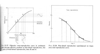
In The Theory of the Photographic Process 3rd edition, Chapter 22 The Theory of Tone Reproduction, top of page 466, "A tone-reproduction diagram of the type developed by L.A. Jones is a convenient means of showing the relation between the objective tone reproduction curve and the characteristic curves for the photographic materials and equipment used to make the photograph. The paper reference for this is L.A. Jones, J. Franklin Inst. 190,39 (1920).

Now for that reproduction curve with fine detail superimposed.

Fine detail reproduction curve.jpg

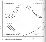
And a fun diagram showing the effects of changes of paper grades.

Grade Changes.jpg

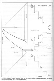
And an insane diagram showing the effects of masking.

Unsharp Mask.jpg
 
Joined
Jan 7, 2005
Messages
2,616
Location
Los Angeles
Format
4x5 Format
Applied Photographic Theory by Paul Kowaliski, Chapter 1 Tone Reproduction,

"The graphical method invented by Jones, already mentioned in several instances, allows a determination of objective and subjective tone reproduction with full consideration of all the empirical relationships between the various parameters described in the preceding chapters (see also p. 3). These relationships depend so much on the influence of different factors that they cannot be expressed analytically, and apparently minor variations in curve shape correspond in the visual evaluation of the final result to quite important differences. Thanks to Jones' simple graphical method it is possible to obtain complete information on the reproduction of tones by a given system. The basic idea underlying this method is to employ the axis of ordinates of a first graph—in which for instance the luminance scale of the original subject has been transformed by the first parameter of the system, the flare light in the camera—as the axis of abscissas of a second graph which gives the transformation due to a second parameter, for instance the sensitometric characteristic of the negative, etc. Taking into account all operations intervening during the process of photographic reproduction, it is possible to construct the tone reproduction curve with precision, so that not only any given system can be evaluated, but also all parameters, and especially the exposure and processing conditions can be chosen for optimum results."

In The Encyclopedia of Photography, under the entry "Jones Diagram" it says "See Quadrant Diagram."

The Manual of Photography: Photographic and Digital Imaging, Chapter 15 Sensitometry, page 237, "It has been found valuable to employ graphical methods to study the problems of tone reproduction, one very useful method being the so-called quadrant diagram originated by L.A. Jones. This enables practical problems in tone reproduction to be studied, and solved scientifically."

Controls in Black and White Photography, 2nd Edition, Chapter 8, The Relationship Between Original Scene and Final Print,page 241, "The first method depicting these transitions is that introduced by Jones in 1920."

Exposure Manual
, 4th Edition, J.F Dunn & G.L. Wakefield, Chapter 1, page 20,

"For the benefit of those interested in pursuing this mater further, however, it should be mentioned that the "windmill" diagrams illustrates an extremely valuable aid to the study of tone reproduction problems generally, and this method has been used by a number of workers for some years in order to obtain a much fuller story of tone reproduction than can be included here - for example to determine the influence of such important additional factors as the subjective viewing of the original scene and the final print under various lighting conditions, the effect of flare in the camera, the influence of illuminant size, film graininess and flare in the enlarger. All this was very adequately summarized by Loyd Jones in the Sixteenth Hurter & Driffield Memorial Lecture to the Royal Photographic Society in 1949, entitled Recent Developments in the Theory and Practice of Tone Reproduction, and readers who wish to study this interesting branch of the subject can hardly do better than refer to this accordingly."

From a paper by Jones in The Photographic Journal based on his Hurter & Driffield Memorial lecture. "Since that time the contributions of the theory and practice of tone reproduction have been many and varied. Much of this material has been summarized and analyzed by Dr Mees in his book The Theory of the Photographic Process, published in 1942. It is the intention of the present paper to pick up the story at approximately the point where it was left by Dr Mees in that publication... The general over-all theory of photographic tone reproduction has been discussed many times before and it is felt, therefore, that a greater contribution to this problem can be made only by dealing with it in a rather detailed fashion. To do this, the solution of an elaborated tone reproduction diagram, illustrated by a quantitative example, will be carried through."

An example from the paper.
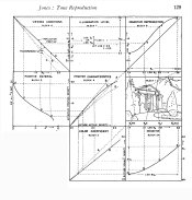
Jones Objective Diagram.jpg
 
Last edited by a moderator:

Photo Engineer

Subscriber
Joined
Apr 19, 2005
Messages
29,018
Location
Rochester, NY
Format
Multi Format
Excellent series of references Stephen. The problem is that they are overly complex for the average person. We used them under a different name, but then we were trying to design a new film or paper. The APUG members are just trying to get a good picture, and that is why Mess and Haist simplified things. That is all I am trying to get across.

Those charts, attributed to Jones, were frequent items in my daily work during product design. In fact, we went into far more detail than any of these ever did. And, there were lots of internal papers on this related to silver tone and dye sets. Silver tone affects the linearity of the curve that translates a film image into a print image and the results are quite interesting but again beyond the scope of this forum.

PE
 
Joined
Jan 7, 2005
Messages
2,616
Location
Los Angeles
Format
4x5 Format
Excellent series of references Stephen. The problem is that they are overly complex for the average person. We used them under a different name, but then we were trying to design a new film or paper. The APUG members are just trying to get a good picture, and that is why Mess and Haist simplified things. That is all I am trying to get across.

Those charts, attributed to Jones, were frequent items in my daily work during product design. In fact, we went into far more detail than any of these ever did. And, there were lots of internal papers on this related to silver tone and dye sets. Silver tone affects the linearity of the curve that translates a film image into a print image and the results are quite interesting but again beyond the scope of this forum.

Generally I use the tone reproduction diagrams for illustration purposes. A picture is worth a thousand words kind of thing. If you read through all those quotes, you should have noticed that many emphasized the problem solving ability of the diagrams. A film curve just shows the response of the film to exposure and development. The tone reproduction diagram puts the curves to work. I don't expect people to plot their own. It's impractical to plot them by hand. That's a big advantage of my program. It does all the tedious work for me. Unfortunately the program isn't ready for prime time, buy I believe BTZS has a program that does a two quad curve if anyone wants to pursue it.

You might feel it's too technical. That's your opinion, but who are you to make this judgement for others? I believe I shouldn't have to tailor the information the lowest common denominator. Some people might be interested in what I have to say. I don't know about you, but I go for extremely long periods of time where nothing catches my interest on these forums. There are a number of experienced photographers here who probably also crave something beyond the endless string of mundane photo 101 type questions. For those less advanced, I like to think I'm potentially exposing them to new concepts. Isn't it better to encourage a challenging discourse.
 

AndreasT

Member
Joined
Sep 15, 2006
Messages
326
Location
Berlin
Format
Multi Format
Isn't this what the Dorst and Jones/"Windmill" diagrams show?

The real problem is people think they can simply apply N-X development to a negative to "fit" the paper, and maintain N local contrast. This is a real problem with how people think about compensating development for example. There's this notion out there you can somehow compress total contrast in the negative without compressing local contrast. Lucky for them they don't get as much compensation as they think they do.

This got me thinking, while I agree with you mostly. Wouldn't you say if there is a need for compensation, there is generaly more harsh light which gives more contrst in the scene. So that when compensation does reduce local contrast it wouldn't be that much since there is more to start with.
 

AndreasT

Member
Joined
Sep 15, 2006
Messages
326
Location
Berlin
Format
Multi Format
This may be very well too technical. I think PE and Stephen both are right and possible wrong. I find this difficult to understand. Won't you all come to Berlin and give me a lecture please.
Graphs are rather abstract, for some more than others. Now I don't have the desire to go reading long fat books about this stuff. It takes a lot of time and money.
When I try to explain just the film curve to some people I know they have a problem understanding that. That is the first simple basic step.
What I do miss from the beginning, at least that is my felling is that the comunication between film makers and photographers is missing.
The why and the how.
Yes the BTZS program does help in this.
This all certainly opens up to concidering more what is involved. Certainly way more than saying use this film/paper it is good. When few can say why.
 
OP
OP
markbarendt

markbarendt

Member
Joined
May 18, 2008
Messages
9,422
Location
Beaverton, OR
Format
Multi Format
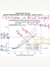
Okay, going to try a different illustration to show the relationship of subject matter to print.

image.jpg

Forget the real numbers, my scribbles are not to scale. They are meant only to convey a concept.

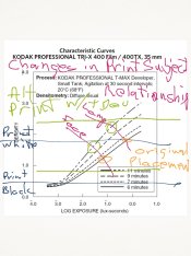
In this case I want to show how various changes in development might change our choices of camera or enlarger exposure.

image.jpg

I know it is cluttered, sorry, but these are hand drawn. In the second example the alternate print range is added and it shows how shadow detail gets lost below the paper's range. If we put 2&2 together we can see that we could reduce camera exposure and get the same print range. With careful observation and a little imagination we get to see how and why a push works and the compromises it makes without 7 pages of text.
 
Last edited by a moderator:
Joined
Jan 7, 2005
Messages
2,616
Location
Los Angeles
Format
4x5 Format
Okay, going to try a different illustration to show the relationship of subject matter to print.

View attachment 67494

Forget the real numbers, my scribbles are not to scale. They are meant only to convey a concept.

In this case I want to show how various changes in development might change our choices of camera or enlarger exposure.

View attachment 67495

I know it is cluttered, sorry, but these are hand drawn. In the second example the alternate print range is added and it shows how shadow detail gets lost below the paper's range. If we put 2&2 together we can see that we could reduce camera exposure and get the same print range. With careful observation and a little imagination we get to see how and why a push works and the compromises it makes without 7 pages of text.

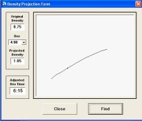
Mark, this makes a lot more sense. The same thing might be able to be accomplished with a simple line graph using density vs time. I have a similar function in my family of curves plotting program. The purpose isn't for display or communication so you will have to bear with me. The density projection function will take a starting density at a specified development time and using a density time curve derived from the family of curves it will determine the development time necessary to achieve a target density. What you could do is take two or three density time curves overlaying Zone System print references.

ScreenHunter_42 Apr. 20 06.15.jpg

Okay, I just realized that while it would be a cleaner graph, it would probably need a program to do. Your way would be easier to create by hand.
 
Joined
Jan 7, 2005
Messages
2,616
Location
Los Angeles
Format
4x5 Format
This may be very well too technical. I think PE and Stephen both are right and possible wrong. I find this difficult to understand. Won't you all come to Berlin and give me a lecture please.
Graphs are rather abstract, for some more than others. Now I don't have the desire to go reading long fat books about this stuff. It takes a lot of time and money.
When I try to explain just the film curve to some people I know they have a problem understanding that. That is the first simple basic step.
What I do miss from the beginning, at least that is my felling is that the comunication between film makers and photographers is missing.
The why and the how.
Yes the BTZS program does help in this.
This all certainly opens up to concidering more what is involved. Certainly way more than saying use this film/paper it is good. When few can say why.

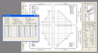
Andreas, as will all things it comes easier with time and experience. The tone reproduction diagram is supposed to give an overview of the process. Attempting to include too much detail would make it difficult to read, but it is also desirable to derived specific information from the graphs. Keeping it both easy to read while still being able to obtain detailed information is one of the advantages of it being a program. I can turn on and off guidelines and labels, and I can also bring up a spreadsheet of all the data points (in the example, Quad 4 data is the gradient between the guidelines). If everyone could interact with the diagram, I'm sure it wouldn't seem so complex.

4 Quad with details.jpg

Without the guideline, there isn't much that can be derived.

4 Quad no guidelines.jpg
 
Last edited by a moderator:
Photrio.com contains affiliate links to products. We may receive a commission for purchases made through these links.
To read our full affiliate disclosure statement please click Here.

PHOTRIO PARTNERS EQUALLY FUNDING OUR COMMUNITY:


Ilford ADOX Freestyle Photographic Stearman Press Weldon Color Lab Blue Moon Camera & Machine
Top Bottom