Print range versus negative.

There there

A
There there

  • 3
  • 0
  • 39
Camel Rock

A
Camel Rock

  • 7
  • 0
  • 152
Wattle Creek Station

A
Wattle Creek Station

  • 9
  • 2
  • 142

Forum statistics

Threads
198,959
Messages
2,783,796
Members
99,758
Latest member
Ryanearlek
Recent bookmarks
2

Photo Engineer

Subscriber
Joined
Apr 19, 2005
Messages
29,018
Location
Rochester, NY
Format
Multi Format
Stephen, you are right. Who am I to say what is easy and what is too complex. All I can do is suggest what might be easier than some other method, and this is based on doing things from the ground up. All I can do is judge based on my learning curve and then try to place myself in the footsteps of someone else posting here.

I appear to have done a poor job if the other posts are any indication. Perhaps us both teaching a class would help. That might be an interesting GEH workshop. "The design of a photographic print system from film to paper"

PE
 
Last edited by a moderator:
Joined
Jan 7, 2005
Messages
2,615
Location
Los Angeles
Format
4x5 Format
All I can do is suggest what might be easier than some other method, and this is based on doing things from the ground up. All I can do is judge based on my learning curve and then try to place myself in someone the footsteps of someone else posting here.

That is probably how you meant to convey it. It's so easy to misinterpret tone and intent here.
 

Photo Engineer

Subscriber
Joined
Apr 19, 2005
Messages
29,018
Location
Rochester, NY
Format
Multi Format
That is exactly right Stephen. I have done this job a number of ways in B&W and color both. I have also fixed the syntax in my post above.

PE
 
OP
OP
markbarendt

markbarendt

Member
Joined
May 18, 2008
Messages
9,422
Location
Beaverton, OR
Format
Multi Format
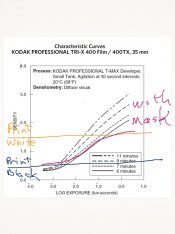
It would seem to me that the intent of a mask is to create an artificially softened toe or shoulder or both.

Maybe like this.

image.jpg
 
Last edited by a moderator:
Joined
Jan 7, 2005
Messages
2,615
Location
Los Angeles
Format
4x5 Format
It would seem to me that the intent of a mask is to create an artificially softened toe or shoulder or both.

Maybe like this.

View attachment 67564

That's one purpose for a mask. The example from Theory of the Photographic Process was to show the effects of a mask on local detail in the print compared to a print from the negative alone. What adds to the apparent complexity is that it illustrates this with two different paper grades.

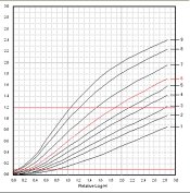
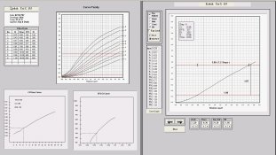
I actually have a function in my family of curves program that's similar to your idea. It defines a specified density range in the curve family. I haven't used it in so long, I forgot it as there. The bottom reference is fixed at 0.10 over Fb+f but it wouldn't take too much effort to make it adjustable. The curves are plotted minus the film base.

Family of Curves Density range.jpg
 
Last edited by a moderator:

MattKing

Moderator
Moderator
Joined
Apr 24, 2005
Messages
53,065
Location
Delta, BC Canada
Format
Medium Format
All of the material in this thread is fascinating, although my understanding of it is far from complete.

As a visual learner, I would ask if it is possible to illustrate the principles reviewed with example photographs?
 

Photo Engineer

Subscriber
Joined
Apr 19, 2005
Messages
29,018
Location
Rochester, NY
Format
Multi Format
MASKING? Geez guys, in simple terms, a mask is a positive image of the thing you are correcting for in a negative. As for masks, Stephen has illustrated unsharp masks to death in Darkroom Techniques with examples. I highly recommend his articles.

PE
 
Joined
Jan 7, 2005
Messages
2,615
Location
Los Angeles
Format
4x5 Format
MASKING? Geez guys, in simple terms, a mask is a positive image of the thing you are correcting for in a negative. As for masks, Stephen has illustrated unsharp masks to death in Darkroom Techniques with examples. I highly recommend his articles.

Ron, in the context of this tread, it's about the graphic representation of the effects of an unsharp mask. I used it as an example of a different aspect of the photographic process that can be depicted in graphic form. Most people are only familiar with film and paper curves.

Matt, I'm not being flip. Since the tone reproduction diagram is a graphic representation of the photographic process, a visual representation would be a photograph. In a way, the diagram from Jones' Hurter and Driffield lecture uses a pictorial example. What you might be wanting is a comparison test. That would be tedious. I believe Phil Davis had a number of articles with comparison tests in PHOTO Techniques.
 
Last edited by a moderator:

Photo Engineer

Subscriber
Joined
Apr 19, 2005
Messages
29,018
Location
Rochester, NY
Format
Multi Format
Ron, in the context of this tread, it's about the graphic representation of the effects of an unsharp mask. I used it as an example of a different aspect of the photographic process that can be depicted in graphic form. Most people are only familiar with film and paper curves.

Stephen, I commented on your other unsharp masking work. This is another subject but related.

PE
 
Joined
Jan 7, 2005
Messages
2,615
Location
Los Angeles
Format
4x5 Format
Stephen, I commented on your other unsharp masking work. This is another subject but related.

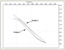
I never wrote anything on masking. I had some photographs with unsharp masks in one of their print sale offers. I used the masks to hold the highlights so I could bring out the midtone contrast by printing on a higher paper grade. The sharpening effect was an added bonus.

How the mask changed the way the photograph looked can be graphed. The reproduction curve shows the difference between printing the same negative on a grade 2 and the negative with a mask printed on grade 3. I reduced the luminance range in Quad 1 to mimic the effects of the mask on the negative density range.

Reproduction curve - Grade 2 and 3.jpg
 
Last edited by a moderator:
Joined
Jan 7, 2005
Messages
2,615
Location
Los Angeles
Format
4x5 Format
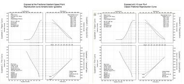
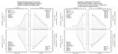
Here is a series of diagrams showing how a four progressive exposures affects the reproduction.

Diagram 1: Exposed at the fractional gradient point. The reproduction curve remains below the reference line
Diagram 2: Exposed at 0.10 over Fb+f. The reproduction curve looks very similar to the classic preferred reproduction curve.

4 Quad - Exposure Series 1.jpg

Diagram 3: Exposed 1 stop over 0.10 over Fb+f. There is increased contrast in the shadows and midtones but at the expense of the higher values which show increased compression.
Diagram 4: Exposed 2 stops over 0.10 over Fb+f. There is some additional increase in shadow contrast. The differences are subtle. Parts of the midtone contrast has been reduced but are still greater than the original scene, and the higher values show a very slight decrease in contrast. It's questionable whether there would be a perceptible difference in the print from diagram 3.

4 Quad - Exposure Series 2.jpg
 
Last edited by a moderator:
OP
OP
markbarendt

markbarendt

Member
Joined
May 18, 2008
Messages
9,422
Location
Beaverton, OR
Format
Multi Format
That's one purpose for a mask. The example from Theory of the Photographic Process was to show the effects of a mask on local detail in the print compared to a print from the negative alone. What adds to the apparent complexity is that it illustrates this with two different paper grades.

I actually have a function in my family of curves program that's similar to your idea. It defines a specified density range in the curve family. I haven't used it in so long, I forgot it as there. The bottom reference is fixed at 0.10 over Fb+f but it wouldn't take too much effort to make it adjustable. The curves are plotted minus the film base.

View attachment 67565

In keeping up with life I rushed and missed the unsharp reference. I was definitely referring to contrast masking.

Your choice to use a fixed bottom reference is really interesting to me conceptually in the context of the thoughts I started the thread with. It seems to me to be an indicator of the "negative centric" thought that the pervades much of technical photographic discussion. Maybe a bit of an arbitrary quest for minimum exposure. This is technically a reasonable, simple, measurable, line of thought and technical discussions benefit from common reference points, but that does not necessarily translate into an artistic advantage.

I see Adams' intellectual conundrum reflected in your choice. On one hand Adams is trying to get people to visualize in the scene what they want on paper (essentially ignoring the negative), on the other hand Adams is trying to get us from A to B within the constraints of the available materials and tools of his day. Fixing the shadow point simplifies the discussion, but it's not the only, nor even the best way to take every photo.

For example Jose Villa http://josevillablog.com/ has an interesting style that looks to be using flare and the upper reaches of the film curve decidedly to his advantage. From interviews I've seen and articles about him his self described shooting style is obviously into what I would classify as the extra exposure range on his favorite Fuji 400h. He shoots it at an EI between 200 and 25, all done specifically for effect, this style places the toe of the film is so far outside the print range that it's shape and exact placement is essentially irrelevant to the end result.
 

Bill Burk

Subscriber
Joined
Feb 9, 2010
Messages
9,316
Format
4x5 Format
Maybe a bit of an arbitrary quest for minimum exposure.

A quote I run into from Todd-Zakia, "The least, if it is enough, is usually the best." applies to the arbitrary quest for minimum exposure. There are times when you need that. Without a tripod, for example, a blurry but well exposed photograph won't be as satisfying as one with shadows in the toe, that is crisp because you were able to use a higher shutter speed.

For photographs where shadows are going to stay dark on the print, there is lots of leeway to stay on the toe, because viewers don't focus on the shadows. There can be less detail.

But if you are going to dodge to bring up the values - my Red Cones tree shadows on the left are a good example - it really helps to have full detail, and be on the straight line section of the curve. Now I made another print and dodged Zone II to between Zone III and IV. You know what happened? The trees look natural as if there was more light. Had I placed shadows on the toe for that shot, I would have had to leave shadows compressed where they stay unseen.

DREW WILEY knows masking, maybe he'll add some guidance here...
 

MattKing

Moderator
Moderator
Joined
Apr 24, 2005
Messages
53,065
Location
Delta, BC Canada
Format
Medium Format
Matt, I'm not being flip. Since the tone reproduction diagram is a graphic representation of the photographic process, a visual representation would be a photograph. In a way, the diagram from Jones' Hurter and Driffield lecture uses a pictorial example. What you might be wanting is a comparison test. That would be tedious. I believe Phil Davis had a number of articles with comparison tests in PHOTO Techniques.

Stephen:

It's true, I would like photographs.

And it may be that comparison tests would supply the photographs.

But what I'm struggling with is that the tone reproduction diagrams are obviously graphical representations of the response of the materials (and the viewer) to different conditions. I expect that most of the contributors to this thread can:

1) look at those diagrams and visualize what the corresponding prints look like; and
2) look at prints, and visualize what the corresponding tone reproduction diagrams look like.

I can do neither.

I expect what I am asking for is something like the illustrations used in this website article on assessing negatives: http://www.ephotozine.com/article/assessing-negatives-4682

It would be onerous in the extreme to ask for carefully prepared reference prints that match exactly the tone reproduction diagrams themselves. But something that is illustrative would be helpful - e.g. a tone reproduction diagram that might correspond with a high key portrait vs a tone reproduction diagram that might correspond with a photograph where the shadows predominate.
 
Joined
Jan 7, 2005
Messages
2,615
Location
Los Angeles
Format
4x5 Format
Your choice to use a fixed bottom reference is really interesting to me conceptually in the context of the thoughts I started the thread with. It seems to me to be an indicator of the "negative centric" thought that the pervades much of technical photographic discussion. Maybe a bit of an arbitrary quest for minimum exposure. This is technically a reasonable, simple, measurable, line of thought and technical discussions benefit from common reference points, but that does not necessarily translate into an artistic advantage.

I see Adams' intellectual conundrum reflected in your choice. On one hand Adams is trying to get people to visualize in the scene what they want on paper (essentially ignoring the negative), on the other hand Adams is trying to get us from A to B within the constraints of the available materials and tools of his day. Fixing the shadow point simplifies the discussion, but it's not the only, nor even the best way to take every photo.

Mark, like I said, I did this a long time ago. It's only a small part of that program. All the adjustments/variables were done on the individual curves. The program still has it's uses, but the tone reproduction diagram program has mostly replaced it.

Family of Curves Screen shot.jpg
 

Photo Engineer

Subscriber
Joined
Apr 19, 2005
Messages
29,018
Location
Rochester, NY
Format
Multi Format
Advanced print studies

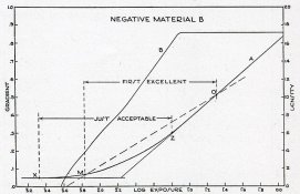
By doing a very advanced print study of negatives exposed over, normal and under that recommended, it is possible to pick the points on the film curve which encompasses the densities that make up the first acceptable print (using any means with a B&W photographic paper). This is discussed in both Mees and Haist and here is the resultant graph of one such study.

The first acceptable print has densities ranging from "M" to "O" in the negative. Print quality improves until the minimum density reaches "Z" as long as the maximum density remains on the straight line portion of the film "A". If the film shoulders, then the quality again degrades and falls out of the acceptable range.

this shows that from "M" to "O", or a film range of about 0.1 to 1.0, you can reproduce a print range of about 0.2 to 2.2.

I hope that this is of use to someone out there.

PE
 

Attachments

  • First Excellent print.jpg
    First Excellent print.jpg
    107.5 KB · Views: 104
Joined
Jan 7, 2005
Messages
2,615
Location
Los Angeles
Format
4x5 Format
Stephen:

It's true, I would like photographs.

And it may be that comparison tests would supply the photographs.

But what I'm struggling with is that the tone reproduction diagrams are obviously graphical representations of the response of the materials (and the viewer) to different conditions. I expect that most of the contributors to this thread can:

1) look at those diagrams and visualize what the corresponding prints look like; and
2) look at prints, and visualize what the corresponding tone reproduction diagrams look like.

I can do neither.

I expect what I am asking for is something like the illustrations used in this website article on assessing negatives: http://www.ephotozine.com/article/assessing-negatives-4682

It would be onerous in the extreme to ask for carefully prepared reference prints that match exactly the tone reproduction diagrams themselves. But something that is illustrative would be helpful - e.g. a tone reproduction diagram that might correspond with a high key portrait vs a tone reproduction diagram that might correspond with a photograph where the shadows predominate.

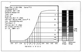
There's an example of a high key subject in this thread (sans photograph). Having to use photographic examples was one of the mired of reasons why I dropped the idea of writing a book on the subject. BTZS uses gray scales in its matching program that essentially is a Dorst graph.

BTZS matching.jpg
 
Last edited by a moderator:
Joined
Jan 7, 2005
Messages
2,615
Location
Los Angeles
Format
4x5 Format
Ron, that graph is from Jones' paper The Evaluation of Negative Film Speeds in Terms of Print Quality, Journal of the Franklin Institute, April 1939, page 502 and 503. The test is best known as the first excellent print test. Psychophysical testing is the definite way to determine print quality. A simplified version of this would be the so called ring-around test which is a popular class assignment at photographic schools. Michael started a thread recently on the fractional gradient method where the first excellent print test was part of the discussion.
 

Bill Burk

Subscriber
Joined
Feb 9, 2010
Messages
9,316
Format
4x5 Format
It would be onerous in the extreme to ask for carefully prepared reference prints that match exactly the tone reproduction diagrams themselves.

Worth the effort though. Images would be a valuable addition to the diagrams. Not too hard to work backwards from example prints. I can provide some when the diagrams "fit my way of working" - other contributors may be able to do the same.
 
OP
OP
markbarendt

markbarendt

Member
Joined
May 18, 2008
Messages
9,422
Location
Beaverton, OR
Format
Multi Format
Bill, I am by no means suggesting that minimizing exposure is a bad technique.

What I'm suggesting it that it is simply one of several ways to think about getting from scene to print.
 

Bill Burk

Subscriber
Joined
Feb 9, 2010
Messages
9,316
Format
4x5 Format
It's fine to go for the least. It's also fine to do other placements. I admire the great imagination it takes to go for high placements.

Just yesterday I re-discovered the joy of having fully-detailed shadows. I dodged them to Zone IV and they look good in Zone IV. (Same microcontrast as other Zone IV parts of the picture).
 

Photo Engineer

Subscriber
Joined
Apr 19, 2005
Messages
29,018
Location
Rochester, NY
Format
Multi Format
Ron, that graph is from Jones' paper The Evaluation of Negative Film Speeds in Terms of Print Quality, Journal of the Franklin Institute, April 1939, page 502 and 503. The test is best known as the first excellent print test. Psychophysical testing is the definite way to determine print quality. A simplified version of this would be the so called ring-around test which is a popular class assignment at photographic schools. Michael started a thread recently on the fractional gradient method where the first excellent print test was part of the discussion.

Stephen, this type of panel test was used for years by Kodak for evaluating prints. My graph was derived from Mees, Revised Edition, page 878, written specifically by J. L. Tupper, in a chapter contributed by L. A. Jones. These works were all contributions from members of the KRL staff. IDK what Jones did at the time you cite, but he was part of the "Mees Team" at the time Mees wrote his book.

Some excellent treatment of this subject, with examples, is shown in Practical Sensitometry by Wakefield. Example curves and prints are shown from a number of different combinations. Ctein has some very nice examples using modern materials in his book "Post Exposure". I suggest that the contributors to this thread put some of these books on their reading list.

PE
 
Joined
Jan 7, 2005
Messages
2,615
Location
Los Angeles
Format
4x5 Format
Stephen, this type of panel test was used for years by Kodak for evaluating prints. My graph was derived from Mees, Revised Edition, page 878, written specifically by J. L. Tupper, in a chapter contributed by L. A. Jones. These works were all contributions from members of the KRL staff. IDK what Jones did at the time you cite, but he was part of the "Mees Team" at the time Mees wrote his book.

Some excellent treatment of this subject, with examples, is shown in Practical Sensitometry by Wakefield. Example curves and prints are shown from a number of different combinations. Ctein has some very nice examples using modern materials in his book "Post Exposure". I suggest that the contributors to this thread put some of these books on their reading list.

Sounds like you are referring to the 2nd edition of Theory of the Photographic Process. If I remember correctly, the first edition was little more than a compilation of recently published papers. I don't remember the 2nd edition. The 3rd edition has it on page 441 by Tupper, in a section where he is summarizing Jones' first excellent print test. Looking at the curve you uploaded more closely, "Negative Material B" is found on page 502 of the paper in the Journal of the Franklin Institute at the bottom half of the page. The same "Negative Material B" was used again on page 94 of Jones and Nelson's 1940 paper "A Study of Various Sensitometric Criteria of Negative Film Speeds." Personally, I like to go to the source material. It avoids some other authors interpretation of the materials.

I'm sure you used derivative curves all the time at Kodak. I'm just pointing out the origins of this particular one and it was from Jones' work. I have to get a life.
 
Last edited by a moderator:

Photo Engineer

Subscriber
Joined
Apr 19, 2005
Messages
29,018
Location
Rochester, NY
Format
Multi Format
In H&D's original work, you will find an idealized negative curve which has turned out to be the seminal curve for all idealized curves published. Why? Because it is essentially right and is the foundation of all derivative work. Thus, that set of curves can be found (or derived) from very simple work with neg pos materials.

Mine comes from Mees, Revised Edition. Those articles, contributed by many people at KRL, were published in 2 forms. Or should I say 3 for more accuracy. One, the publications you cite were published internally in a second form with some "classified" content. In the third version, they were massaged and republished in one of the varying editions of Mees work. However, long after these, that work continued to be published internally. As time went on, this work delved more into color.

On that topic, I reiterate the fact that W. T. Hanson published the 4 part chart you have used, but he related it to the silver criterion (and the unit neutral) of dyes which often distorted each of the 3 color curves considerably. Thus, to get good curve shape we had to either tweak the spectral sensitization, tweak the image dye, or bend the curve shape of one or more layer in order to get a neutral print in a neg-pos color system.

Hanson has given some of that in his book (Evans, Hanson and Brewer) and it is presented in several other works. I have a copy of his original report.

PE
 
Photrio.com contains affiliate links to products. We may receive a commission for purchases made through these links.
To read our full affiliate disclosure statement please click Here.

PHOTRIO PARTNERS EQUALLY FUNDING OUR COMMUNITY:


Ilford ADOX Freestyle Photographic Stearman Press Weldon Color Lab Blue Moon Camera & Machine
Top Bottom