Did H&D title all their graphs as "Negative Material B" and have labels "first excellent prints" and "just acceptable prints"? No. All I'm doing is pointing out the reference material. My god, give it a break.
-
Welcome to Photrio!Registration is fast and free. Join today to unlock search, see fewer ads, and access all forum features.Click here to sign up
You are using an out of date browser. It may not display this or other websites correctly.
You should upgrade or use an alternative browser.
You should upgrade or use an alternative browser.
Print range versus negative.
-
A
- Thread starter markbarendt
- Start date
Recent Classifieds
-
For Sale 8ply Rising Museum Mat Mounting Board 8 Sheets
- Started by oficinouno
-
For Sale Elmar 3,5cm / 3.5 with hood, VOOLA and SBLOO finder
- Started by Laurent
-
For Sale Leica M-A Black Chrome Body MINT- Late Model
- Started by samuelphoto
-
Found Cambo SC lens board - Copal 1 (possible trade?)
- Started by Kino
-
For Sale FS: Konica Hexanon AR 85mm f/1.8 - Clean Glass/User Barrel - $170 Shipped
- Started by UsedFilmCameras
Forum statistics
Looking at the curve you uploaded more closely, "Negative Material B" is found on page 502 of the paper in the Journal of the Franklin Institute at the bottom half of the page. The same "Negative Material B" was used again on page 94 of Jones and Nelson's 1940 paper "A Study of Various Sensitometric Criteria of Negative Film Speeds." Personally, I like to go to the source material. It avoids some other authors interpretation of the materials.
I was referring to the fact that the curve "Negative Material B" was an archetype used by everyone and basically started with H&D. It is a long straight line with a slope of about 0.6 - 0.7. Thats all.
PE
All of the material in this thread is fascinating, although my understanding of it is far from complete.
As a visual learner, I would ask if it is possible to illustrate the principles reviewed with example photographs?
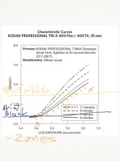
Not photos but see if this helps.
Remember these are not to scale.
Without a shoulder the separation on the negative is greater but it falls outside the print range, that detail is lost unless you burn them back in.
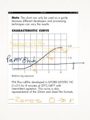
With shouldering and placement high on the curve the negative should straight print with better highlight detail.
Thanks Mark.
Time to print out some graphs and text
Time to print out some graphs and text
Not photos but see if this helps.
Remember these are not to scale.
Without a shoulder the separation on the negative is greater but it falls outside the print range, that detail is lost unless you burn them back in.
View attachment 67743
With shouldering and placement high on the curve the negative should straight print with better highlight detail.
View attachment 67744
The whole idea of processing is to produce a target negative density range for various subject luminance ranges. If the NDR and print LER match, there is a good likelihood of a quality print. If the highlight exposure falls on the shouldering portion of the curve, the highlight detail will be compressed further than what normally occurs from enlarger flare and the need for high mid-tone contrast.
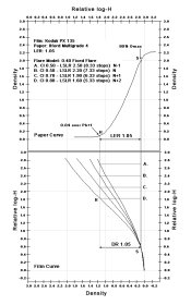
Mark, you've mentioned the negative shoulder a couple of times in this thread. I'm thinking you have some concept in mind.
Matt, you know what too dark, too light, flat, and contrasty look like. Just apply it to the reproduction curve. Imagine a normal looking picture for the preferred reproduction curve. For any other shape of the curve apply one or more of the four possible choices.
Last edited by a moderator:
I actually do have an idea or two that I'm toying with.
For one, when living with prints for a bit and viewing them from across the room in normal life over a week or two I'm finding that I like them brighter. My darker prints while very enjoyable at close range and bright lighting are tougher to enjoy from across the room. I find that same truth, for me, when out in restaurants and other places when viewing the work of others.
In my printing the mid-tones are creeping up brighter and pushing some of the highlight detail off the scale on the print. To put this in real terms of subject matter. The whites of a subjects eyes are competing with the bright side of the nose and forehead for room on the paper curve.
I've been playing with trying retain a bit more detail at the very top, even if its compressed a bit, while retaining good mid-tone snap. I'm trying to find the sweet spot here and see if for example FP4+'s curve fits my needs better than say TMax's or delta's.
The intent is to make printing easier with less burn and dodge.
In essence the question I'm asking is "can I use the inherent compression a shoulder imparts to my advantage here?"
Last edited by a moderator:
- removed account8
- Deleted
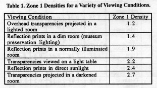
Mark, it sounds like this is part preference, part subjective tone reproduction. You might find this interesting. The table, from Jack Holm, shows Zone I densities for a variety of viewing conditions. The "Reflection prints in a dim room" value seems counter to my understanding, but these values might be based on viewing a single tone and not in relation to the full range of tones (gray scale).
Instead of trying to control the highlights with the shoulder of the film curve, what about print flashing? I flash whenever I'm printing a high key image. Flashing will compress the highlights as well as control them. Sounds exactly like the results you want.

Instead of trying to control the highlights with the shoulder of the film curve, what about print flashing? I flash whenever I'm printing a high key image. Flashing will compress the highlights as well as control them. Sounds exactly like the results you want.
Stephen preflashing could work, but I'm not concerned about old negatives here, I'm looking for ways to shoot and process new negative to eliminate steps in printing. I want to get straight prints as much as possible.
Sounds like a self imposed limitation. The print is part of the photographic process and should be considered as part any option. Not only would print flashing be the easiest approach to obtain the desired effect, but it allows for greater exposure latitude with the negative. It's a win-win.
- removed account8
- Deleted
I tried this in the past but for different reasons. The results where very grainy like Michael says. The sharpness suffered. I got kind of soft edges.
Try it. The good old efke films would show a quick result.
Try it. The good old efke films would show a quick result.
Jed Freudenthal
Member
This might be a dumb question, but can I ask why?
One thing that could help with using less exposure is a highly compensating developer, which will bring compression (ie shouldering) further down the curve. Alternatively perhaps a shorter scale film.
But in the end I still think you're better off simply fixing this in printing. Flashing, or some low contrast burning etc.
The compensating developer is the approach of Hans Windisch. Many photographers, e.g. Ansel Adams used this approach. And, with a modern lens with good detail properties, like certain LF and MF lenses, the compensating effect is even more pronounced. It is my experience that the most important printing property is the microcontrast. And that implies,that there is a large freedom in the interpretation of the print. ( The microcontrast is controlling the overall contrast; or printing on a harder grade will give a softer look).
Jed
Rafal Lukawiecki
Subscriber
Perhaps us both teaching a class would help. That might be an interesting GEH workshop. "The design of a photographic print system from film to paper"
I've enjoyed this thread very much, and if both of you got together to run that workshop, or just meet up with other photo geeks, I'd love to join.
So would I! Travel is hard for me though. But I do have lots of teaching material for something like this.
PE
PE
Sounds like a self imposed limitation. The print is part of the photographic process and should be considered as part any option. Not only would print flashing be the easiest approach to obtain the desired effect, but it allows for greater exposure latitude with the negative. It's a win-win.
Absolutely a self imposed constraint. And yes it surely can be a win-win. And yes I'll be playing with flashing more going forward. And yes I do consider printing as part of the process, just not always an artistic part of the process. One thing that truly makes my day is when I walk into the darkroom with a freshly dry negative, put it in the carrier, and without changing any settings print an 11x14 that is really close to right on the first try. Doesn't happen all the time, but I'm getting closer.
That brings me to a point where I can blend in Michael's thoughts.
This might be a dumb question, but can I ask why?
...
For one thing, less flexibility (should you decide at some point on a different interpretation of the image) since you're reducing the amount of "information" in the negative.
I would suggest that both Hurrell and Karsh, for example, had probably designed and refined their systems to include very specific exposure, developing, and enlarging procedures in order to allow easy, fast, simple, high quality, consistent completion of their client orders by their respective assistants and helpers.
In a tightly controlled system the value of latitude is diminished, even non-existent.
I would be truly surprised if Hurrell or Karsh designed into their production lines the use of pre-flashing their paper. Similarly I would be surprised if they reinterpreted a significant number of their shots.
So far in my photographic pursuits I've found little inspiration in reinterpreting a negative, I'd much rather shoot a fresh frame with different lighting or whatever.
Henri Cartier-Bresson though had a very different approach to shooting and probably benefitted greatly from the latitude/flexibility inherent in negatives. His printer may very well have added flashing and various other tricks of the trade to deal with the variances in scene lighting and subject matter.
As to the comments on grain and slow shutter speed, Michael those are real issues and I don't know if what I'm proposing can work well, or which film/developer combo might support this but as I refine my systems it seems a worthwhile path to play with and my interests aren't strictly related to B&W. Color negatives don't have the same grain issues.
I want to be clear here too, I'm a big fan of shooting normally and metering normally for a lot of my work and normally recommend normal shooting to others.
- Joined
- Feb 9, 2010
- Messages
- 9,582
- Format
- 4x5 Format
Mark Barendt,
I tried with my teenager's pens to draw diagrams like yours to illustrate... and I ended up with something that looked like your very first diagram. So it's a good diagram.
But I don't know if you've focused on this. Every time a toe or shoulder gets involved you lose contrast. There's two curves at work here, film and paper. And flare affects both of their toes. The film curve stretches out so far that no paper can use it all. You only use a small section of the film curve. The paper curve is a distinct S curve, you use all of it, both toe and shoulder.
How much contrast do you want to lose in the highlights? In the highlights you lose contrast from the toe of the paper and flare of the enlarger. If you went with your unusual plan to expose on the shoulder of the film, then you would lose contrast a third time, from the shoulder of the film.
Does that give you flat, muddy highlights. Or delicate high-key tones? I have to guess it's not the dreaded "chalk". So maybe you are onto something. AndreasT knows what it looks like. It's unusual, but it may be exactly what you want.
How much contrast do you want to lose in the shadows? In the shadows, if you expose to "first excellent print" you lose contrast from the toe of the film, flare of the camera and shoulder of the paper. You lose contrast three times in the shadows unless you overexpose enough to put shadows on the straight line of the film. A stop of overexposure may be right.
I like prints I have made where I have shadows on the straight line of the film. At first glance the black under a rock looks pitch black but when you look closely you will see what's under the rock. My preference is to have less compression in the shadows, because it is one place where I can reduce compression.
Bill, according to the reproduction curve, an increase in the contrast for one part of the curve means a decrease in another.
Bill, according to the reproduction curve, an increase in the contrast for one part of the curve means a decrease in another.
Bill, Stephen has nailed the crux of the issue I'm facing.
Regardless of how we parse this once we pick a point on the paper to place say our main subject from the scene, then we are faced with a variety of challenges to get the rest of the subject matter we want on the paper.
Knowing it is a compromise, my question is basically asking "can placing subject matter in relation to the film's shoulder make my printing easier?"
Maybe a film that has, or can be manipulated into, a pronounced S curve with a relatively short straight line might fit my sensibility better than say a TMax that has 13 stops of straight line.
I don't know for sure but I'm beginning to suspect that this is one of the reasons that in practice I tend to prefer FP4+ over Delta 100 is the shape of the curve.
- Joined
- Feb 9, 2010
- Messages
- 9,582
- Format
- 4x5 Format
Bill, Stephen has nailed the crux of the issue I'm facing.
Regardless of how we parse this once we pick a point on the paper to place say our main subject from the scene, then we are faced with a variety of challenges to get the rest of the subject matter we want on the paper.
Knowing it is a compromise, my question is basically asking "can placing subject matter in relation to the film's shoulder make my printing easier?"
Maybe a film that has, or can be manipulated into, a pronounced S curve with a relatively short straight line might fit my sensibility better than say a TMax that has 13 stops of straight line.
I don't know for sure but I'm beginning to suspect that this is one of the reasons that in practice I tend to prefer FP4+ over Delta 100 is the shape of the curve.
I'm pretty sure the paper curve was manipulated into a pronounced S curve to fit the reproduction theory as best as possible, using the toe of the film. And I'm a bit concerned that placing the shadows high on the curve might be defeating part of the plan.
But placing the shadows high gives me negatives that I like to print, so I am likely to continue with my "self-imposed limitation"... that I "ruin" the shadows by placing them on the straight line.
- Joined
- Feb 9, 2010
- Messages
- 9,582
- Format
- 4x5 Format
Bill, according to the reproduction curve, an increase in the contrast for one part of the curve means a decrease in another.
I'm not following this. If I lift the flare curve (more flare), I decrease contrast in the film curve in the shadows. Tracing that part of the curve to the paper, this decreases the density difference between points on the print too. That is not an increase in contrast the way I imagine it.
- Joined
- Feb 9, 2010
- Messages
- 9,582
- Format
- 4x5 Format
From a paper by Jones in The Photographic Journal based on his Hurter & Driffield Memorial lecture. "Since that time the contributions of the theory and practice of tone reproduction have been many and varied. Much of this material has been summarized and analyzed by Dr Mees in his book The Theory of the Photographic Process, published in 1942. It is the intention of the present paper to pick up the story at approximately the point where it was left by Dr Mees in that publication... The general over-all theory of photographic tone reproduction has been discussed many times before and it is felt, therefore, that a greater contribution to this problem can be made only by dealing with it in a rather detailed fashion. To do this, the solution of an elaborated tone reproduction diagram, illustrated by a quantitative example, will be carried through."
An example from the paper.
View attachment 67484
Returning to this diagram... Is that the ideal film curve to achieve the preferred reproduction?
I realize that pegging to the highlights will typically create lots of shadow detail. This choice is simply a matter of picking my priorities. Getting the mid-tones right, especially faces, trumps everything else for me. I'm willing, for the most part, to allow the rest of the scene just to fall where it may. I do though want the rest of the scene to support the main subject and mood expected.
With my priorities defined I can better define and even design the scene to solve some of my problems. This isn't necessarily about studio work either. I can adjust my lighting ratios and scene contrast by the direction and the time of day I choose to shoot.
I used Jose Villa as an example earlier, he uses late afternoon light to backlight his subjects a lot. Part of what this does is to give him very even lighting on his subjects, on the people and the faces he is shooting. He has effectively reduced the contrast across his main subject matter which is then effectively lit as if they would be in an open shade situation.
As far as Jose is concerned, for the subjects that matter, this is a normal contrast shot. For a landscape shooter pointing the camera the same direction as Jose, into a backlit scene poses a very different challenge.
What I'm getting at here is that portrait and product photographers don't necessarily have to adjust film contrast to get what they want. By turning the camera so that it begins to shoot cross lit and or by continuing on to front lit a portrait photographer can control the contrast and lighting across their subject.
Turning the camera may actually prove to be a better systemic fix for my highlight contrast issues than pre flashing the paper. Simply different tools for solving the same problem. I don't always get to pick the perfect angle though so understanding how I can use the curve to my advantage is worth learning.
- Joined
- Feb 9, 2010
- Messages
- 9,582
- Format
- 4x5 Format
I realize that pegging to the highlights will typically create lots of shadow detail. This choice is simply a matter of picking my priorities. Getting the mid-tones right, especially faces, trumps everything else for me.
I appreciate that, and in portraiture I do the same, spot faces and place on VI. -or- Incident read and done.
I am interested to hear more opinions and see more charts and photographs of using the film shoulder. Also agree there might be some value in using traditional primitive emulsions to explore this idea.
...there might be some value in using traditional primitive emulsions to explore this idea.
Dang, you call in' FP4+ primitive?

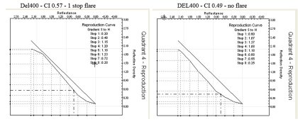
Stephen, Can your model project back from the "Preferred Reproduction" curve in the fourth quadrant... to an ideal film and flare curve in the first quadrant, then back out the flare to an ideal film?
Bill, I don't know if this is what you are looking for. Del400 - one at CI 0.57, one stop flare, 1.06 NDR and 1.06 LER. The other CI 0.49, no flare, 1.05 NDR, 1.06 LER.
| Photrio.com contains affiliate links to products. We may receive a commission for purchases made through these links. To read our full affiliate disclosure statement please click Here. |
PHOTRIO PARTNERS EQUALLY FUNDING OUR COMMUNITY:  |

