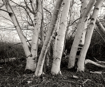
@Alan Edward Klein I agree completely regarding Matt's photograph. In addition to great compositing, mood, etc., it has a "feeling" of "sharpness" but without excessive graininess or any special processing tricks that I can see. At least that is how it looks to me. It may also be the white birch against the dark backdrop of the other trees, emphasized by longer development time? It reminds me of the quote below (speaking of words, words, words) because it represents a certain look or character that I find familiar and pleasing, as does this one:
"Rodinal is a high-acutance developer and I found that, in combination with Delta 400 - which is reasonably fine-grain film for its speed - it produced a negative with uniform sharp grain structure. This developer, for example, when used with 35mm HP5+, will give a much sharper grain than a conventional developer, such as Ilford ID11. But note, it is not fine grain. The negative will be a visible sharp-textured grain, which can be very pleasing." (Adrian Ensor, Advanced Processing and Printing, RotoVision, 2001).
I think there is something to that "sharp" look. Barry Thornton wrote about it as well. A lot of people find it pleasing. I do, too, but not all the time. Also, now that I am trying to print again, I find that the whole notion of sharpness has a very different character/meaning with regard to silver gelatin prints than it does with scans. Scanning tends to change that character somewhat. Some scanners will emphasize grain, others will soften it, not to mention focusing, anti-aliasing filters, unsharp masking, and other digital variables involved. I am not bashing scanning. I am just realizing how different the process is in how it affects the final image. Sharpness is not something that is immediately evident from conventional sensitometric testing, except when it comes to contrast. But it is an important aspect of our perception of print quality.
I wonder how you guys evaluate sharpness in your own work?


