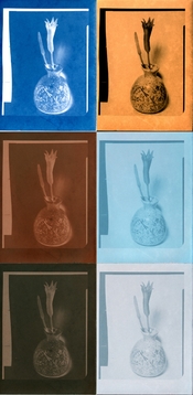
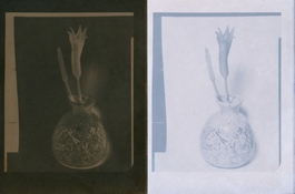
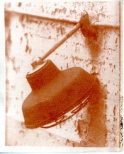
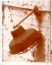
I got interested in cyanotype a couple of years ago as an alternative, fairly safe, simple, and affordable way to do something a bit more arty with my photos rather than just have them sit on my PC.
I know a bit about chemistry, and knowing that silver is what is used for traditional photography, wondered if there were any other transition metals that are photosensitive, and that led me to the alternative photography website. Turns out there are a few, but either they're expensive, toxic or both, but cuprotype caught my attention because it's cheap and fairly non-toxic.
The yellow and pink results interested me, as I can't get those so easily with cyanotype - well yellow to an extent, but the other toned results are not so different to what I could achieve with cyanotype.
What really interested me was the possibility of combining processes to get duotone or more in a single image.
Looking at the yellow and pinkish red, of cuprotype untoned or toned with KFeCN and knowing that I can tone cyanotype to get a reasonable black, I wondered if I could make CMYK images.
I've enjoyed experimenting with toned cyanotypes and that extends the range of possibilities, but they're still monochrome. I've hand coloured a few using watercolour pencils or paints, but though lightfast, since they're watercolour, they're not waterproof.
This isn't ink, it's photosensitive chemistry, and I think I read here or on alternative photography that order matters, as cyanotype chemistry applied over cuprotype can convert cuprotype to cyanotype.
Here's an effort made from 3 separations:
Black: Cyanotype toned with instant coffee for about 5 minutes. Gives more of a blue/black than true black, but I found it stains the paper less than other toners.
Blue: Traditional cyanotype
Yellow: Untoned Cuprotype using CuSO4, FAC, Sodium Thiosulfate recipe.
I deliberately brushed the layers on a bit irregularly, as I want more of a painterly look than a 'perfect' reproduction. I have an inkjet for that!
Actually everything is done on a budget. I use an old laser printer someone donated to me, and a sheet of glass out of an old fridge to hold the negative in place during exposure - hence the scratch marks on the image, and some blotches from where the printer drum is getting tired.
I exposed in the sun. Being in the southern hemisphere with clear skies and close to the ozone hole, there's plenty of UV around most of the time.
View attachment 382330
Second image is CMY (I didn't bother doing a black separation)
I did cyanotype first, then cuprotype and toned it with KFeCN, then finally cuprotype without toning.
I realised subsequently after reading here, I should have washed longer to remove residual unexposed cuprotype chemicals, and I'm not sure whether the CMYK separations in Photoshop are ideal for this and whether there's a better way to produce negatives, but at least I've demonstrated that the principle works.
Also, I suspect the cuprotype emulsion ends up toning the cyanotype, so I'm not sure if there's a way to retain a blue sky.
I was careful to select images where there was clear separation of colours in different parts of the image so they'd be more likely to work.
Image below is a cherry tree in blossom on a grassy hillside, so it actually was pinkish. The top image had dry grass and the structure actually is golden yellow.
Certainly not photorealistic colours, but I still like the aesthetic, and will keep experimenting.
I'd be interested to know if anyone else has tried this kind of process and what sort of success they've had.
View attachment 382333


 Your idea of toning in ferricyanide + ferrocyanide + tartaric acid could potentially help if the plain ferricyanide developer isn't converting all copper(i) thiocyanate to copper(i) ferrocyanide. John Mercer used ammonium chloride with ferricyanide in his experiments to convert copper(i) thiocyanate to copper(i) ferrocyanide. That could be another avenue if I were to redo this experiment again.