A New Cuprotype?

Boys on the block

A
Boys on the block

  • 1
  • 1
  • 48
Sonia..jpg

A
Sonia..jpg

  • 2
  • 1
  • 189
A young woman

A
A young woman

  • 4
  • 4
  • 169
sketch

A
sketch

  • 4
  • 0
  • 173
Foucaultery

D
Foucaultery

  • 1
  • 1
  • 132

Forum statistics

Threads
188,092
Messages
2,622,298
Members
96,920
Latest member
Luc_b
Recent bookmarks
0
OP
OP

nmp

Member
Joined
Jan 20, 2005
Messages
1,828
Location
Maryland USA
Format
35mm
In step #3 in your post #5, what happens if you use citric acid bath in place of tap water?

Good question - I didn't try all CA washing, but substituted a portion of the wash with 0.3% CA. Nothing happens color-wise, it acts as a normal clearing agent giving whiter whites (particularly post-ferri toning later) with some loss in Dmax when compared to all tap water process of the same overall duration.

Here's another twist to the story, as if one was needed - if I have pre-treated with CA as a part of the initial wash, then there is little or no "toning" with citric acid afterwards. Same thing if I used sodium citrate or EDTA. May be this is a clue.

The acid toning occurs with other acid too - oxalic, acetic, and sulfonic. The last one moves the color to greenish hue.

:Niranjan.
 
Joined
Jul 28, 2016
Messages
2,485
Location
India
Format
Multi Format
In Jim Patterson's Cuprotype process, after UV exposure, the print is developed in 1% Ammonium Thiocyanate + 0.5 % Citric Acid solution and this is followed by a long wash in Citric Acid solution. If one were to take Citric Acid from these steps, I wonder if that process would also give results similar to yours.
 
OP
OP

nmp

Member
Joined
Jan 20, 2005
Messages
1,828
Location
Maryland USA
Format
35mm
In Jim Patterson's Cuprotype process, after UV exposure, the print is developed in 1% Ammonium Thiocyanate + 0.5 % Citric Acid solution and this is followed by a long wash in Citric Acid solution. If one were to take Citric Acid from these steps, I wonder if that process would also give results similar to yours.

You mean "take out," right? No idea. I don't have ammonium thio nor inclination to try out that process at this time and open yet another Pandora's box...🙂

Something's happening to something(2) after K ferri toning that makes it reactive to citric acid. That something(2) or its precursor seems to be washed out by citric acid or other chelators in the 1st wash step.

Regardless of the origin, the outcome is very encouraging from the perspective of image making - looks very close to a salt print. I think the DR is close as well based on the fact that it prints well a negative tailored for POP. I will do usual reproducibility, robustness and optimization studies but so far it looks legit and not a fluke. (May be it disappears in a couple of days....you never know.)

By the way, I stumbled into this literally by mistake. I was trying to see what happens with ammonia as queried by Peter Friedrichsen and grabbed a citric acid bottle instead. To my surprise, instead of bleaching which is what I expected with ammonia (copper ferrocyanide being soluble in it,) it darkened immediately. Luckily it dawned upon me that I had used the wrong bottle.


:Niranjan.
 
Joined
Jul 28, 2016
Messages
2,485
Location
India
Format
Multi Format
You mean "take out," right? No idea. I don't have ammonium thio nor inclination to try out that process at this time and open yet another Pandora's box...🙂

No worries. :smile: I was only curious to know if what you observed is something unique to Thiosulphate based process or due to divergence in the developing step.

Something's happening to something(2) after K ferri toning that makes it reactive to citric acid. That something(2) or its precursor seems to be washed out by citric acid or other chelators in the 1st wash step.

Interesting. The whitening of borders could possibly mean something is being subtracted than being added. I don't know. :smile:
 
OP
OP

nmp

Member
Joined
Jan 20, 2005
Messages
1,828
Location
Maryland USA
Format
35mm
No worries. :smile: I was only curious to know if what you observed is something unique to Thiosulphate based process or due to divergence in the developing step.

No I never tried Jim P.'s process. I messed around with CuSO4 a while ago, before I knew that process, exploring some ideas I had for a copper based image - but no follow through as usual. So this was completely new for me.

As far as divergence goes, I did want to use citric acid as a way to get better whites but the amount of Dmax loss stopped me from doing so and opted for longer tap water wash instead in this starter process. I still wanted to use something - so thought may be sodium citrate (suggested by Jim P.) or EDTA would be better chelators without density loss. But at first glance, it does not seem to be so. I guess ultimately, there is always give and take in any alternative process - it's what is more important governs which way to go. Here the Dmax is on the low side for a full-fledged process (or so I thought at the time) so I tried to give it a preference. If the Dmax can be improved by some other independent way, tweaking the recipe or the methodology - citric acid or others can come back. But after seeing what can be done in terms of toning with citric acid later, may be tap water washing is the way to go for now. Particularly if it also cleans up the whites.

Interesting. The whitening of borders could possibly mean something is being subtracted than being added. I don't know. :smile:

Well, a toner can be acting in a non-linear fashion - there is a bleaching action (subtraction) superimposed with toning action (addition.) In the highlights, the former is more dominant and in the shadows, the latter. For example, in case of low concentration Kala Namak toning with salt print, there was a bump in Dmax (as signified by 40 min exposure line) AND lightening in the lower densities (as signified by 5 minutes exposure line) :


Same thing happened with KRST toning of POP...helped me tremendously with less than adequate UV opacity in the inkjet negative that I was able to do at the time.

Kind of ideal for a toner - as long as you can compensate for the tonal changes with a proper correction in the negative.

:Niranjan.
 
Last edited:
Joined
Jul 28, 2016
Messages
2,485
Location
India
Format
Multi Format
To visually compare the change in tone during the various stages, I took screenshots sections of the border in the three prints, and put them together:

1660550182961.png


Similarly, the DMax regions:

1660550309739.png


Sharing in case anyone who's following Niranjan's experiments is interested.
 
OP
OP

nmp

Member
Joined
Jan 20, 2005
Messages
1,828
Location
Maryland USA
Format
35mm
An update:

Tried a couple of modifications with a new paper. I wanted to see if I can move over to a cheaper paper alternative to the COT 320 I had been using since I only have one pack of 8x10 left now and it seems to have become exceeding difficult get new supply lately. So I better conserve this lot for good things like salt prints that are fussy with paper. I have a bunch of Canson XL that is one of the cheapest out there - so I can experiment different things without fear of running out. So it became an obvious choice.

So here are the particulars:

Paper - Canson XL watercolor paper, 300 gsm, cold press

Sensitizer - the same as before except that I am now premixing the FAC and CuSO4 and using it as Solution A. Sodium thio is added to Solution A just before coating. The paper also required a couple of drops of 5% T-20 to make it spread better.

Ferricyanide Toning - instead of doing a dip-treatment in 2% KFi, I tried out rod-coating a 20% solution on dried paper. This works very well. Brushing should work too. An advantage is the paper does not get saturated with ferricyanide that requires thorough washing. Also, it is easier to manage the toner - just a few drops each time, leave for 5 minutes and then wash off.

Acid Treatment - Used sulfonic acid (0.5% w/v) instead of citric acid. Sulfonic acid does give higher Dmax - and a much more neutral tone than what you get out of citric acid. It is also faster. There is one quirk though - it seems to develop a greeninsh/blue fog if left longer than a certain point. Most of this does get washed off subsequently. It seems to be related to residual ferricyanide but I have yet to pin-point the exact circumstances. Needs more study.

Anyway, here is the result of all this put together - I used the rough side of the paper which gives a lot of texture to the image as well as a dull appearance and lower Dmax compared to the smooth COT 320. But it has its own charm. I think this will be a good candidate for waxing:


2022-09-27-0001.jpg


:Niranjan.
 
Last edited:
OP
OP

nmp

Member
Joined
Jan 20, 2005
Messages
1,828
Location
Maryland USA
Format
35mm
Nice result Niranjan! Good work.

The brush trick for toning is interesting. Thanks for sharing.

Thanks Raghu. I am glad you like it. I am trying to make the process demo-friendly - as I am going to do a show-and-tell to a local alternative process group in coming weeks. Hence the attempt to streamline the process. I think I will stick to citric acid though for now before I figure out sure-fire way not to get the green stain.

:Niranjan.
 
OP
OP

nmp

Member
Joined
Jan 20, 2005
Messages
1,828
Location
Maryland USA
Format
35mm
You need to give the process a name. :smile:

There are so many versions now. Jim Patterson had the original cuprotype that used ammonium thiocyanate. Then this one that uses sodium thiosulfate aka "hypo." Just recently, Jim has developed one containing sodium bromide (one-pot sensitizer like this one.) So I am thinking call them in order: cyano-cuprotype, hypo-cuprotype and bromo-cuprotype.

What do you think?

:Niranjan.
 
Joined
Jul 28, 2016
Messages
2,485
Location
India
Format
Multi Format
There are so many versions now. Jim Patterson had the original cuprotype that used ammonium thiocyanate. Then this one that uses sodium thiosulfate aka "hypo." Just recently, Jim has developed one containing sodium bromide (one-pot sensitizer like this one.)

Looks like a lot of activity has happened around cuprotype variants on the altphotolist in the recent past! Nice!

The names serve the purpose but alt processes needs a Jay DeFehr to come up with more interesting names. :smile:
 
OP
OP

nmp

Member
Joined
Jan 20, 2005
Messages
1,828
Location
Maryland USA
Format
35mm
Looks like a lot of activity has happened around cuprotype variants on the altphotolist in the recent past! Nice!

The names serve the purpose but alt processes needs a Jay DeFehr to come up with more interesting names. :smile:

I am not big on fancy Greek or Latin names - making them more than they are. I think cuprotypes they are, so an appropriate prefix will make them distinguish from each other. Or speaking of variants, we can call it like coronavirus - delta, omicron etc...🙂

:Niranjan.
 
Last edited:

Jan de Jong

Member
Joined
Jul 20, 2022
Messages
30
Location
Germany
Format
Analog
cyano-cuprotype, hypo-cuprotype and bromo-cuprotype.
Sound all good. Nice to see so much progress. The Brom-cuprotype has even some potential for in-camera use I think. Although i have not been able to get some good result after washing and drying.

Thanks!
 
OP
OP

nmp

Member
Joined
Jan 20, 2005
Messages
1,828
Location
Maryland USA
Format
35mm
Sound all good. Nice to see so much progress. The Brom-cuprotype has even some potential for in-camera use I think. Although i have not been able to get some good result after washing and drying.

Thanks!

Hi, Jan:

Good to hear back from you.

If you have some issues with bromo-cupro, please feel free to share them with the altphotolist - I don't think Jim Patterson is on Photrio.

:Niranjan.
 

Jan de Jong

Member
Joined
Jul 20, 2022
Messages
30
Location
Germany
Format
Analog
Hi Nirajan,

Sure will check-in on altphotolist. For now have not much new too add though. My recent tries were a disappointment, but I found the paper to be the cause. Even if it is the same brand, it seem to be of different property.
Applying the Fixo or Bromo solution, it started mottling with blue spots immediately. It also did not absorb and coat as evenly.
Trying the some sheets from the previous block (same brand and type) does not show this.

This shows how much the paper plays a role in all of this. And this is probably why the more expensive paper can give you that consistency.

Jan.
 

NedL

Subscriber
Joined
Aug 23, 2012
Messages
3,271
Location
Sonoma County, California
Format
Multi Format
This is great stuff Niranjan!

We still don't really know what is going on w/ citric or sulfonic acid after "toning" with Pot-Ferri, right?
Since the highlights are changing, there is something in those highlights left to be changed ( the bane of toned cyanotypes... the highlights are never just paper. )
 
OP
OP

nmp

Member
Joined
Jan 20, 2005
Messages
1,828
Location
Maryland USA
Format
35mm
This is great stuff Niranjan!

We still don't really know what is going on w/ citric or sulfonic acid after "toning" with Pot-Ferri, right?
Since the highlights are changing, there is something in those highlights left to be changed ( the bane of toned cyanotypes... the highlights are never just paper. )

Thanks Ned. Kind of one thing leading to another.

One prevailing conjecture about the action of the acid is that it is decomposing residual thiosulfate into sulfurous compounds (a la hypo-alum toner) which in turn are forming copper (I or II) sulfides with darker colors. This does not happen with other cuprotypes not using thiosulfate. Of course, without analysis it stays a guess at this point, albeit of a decent likelihood.

Regarding the highlights - interesting observations are these:

1) At the first washing, the unexposed areas visually look very clean. Scanned measurements are not much different from the bare paper.

2) On ferricyanide toning, those white areas take a light pinkish tone - signifying some formation of copper (II) ferrocyanide. The extent of this stain is lessened if the print is washed longer after exposure. So unless you are in a hurry, give it a good wash. Not like salt print, but better than cyanotypes.

3) The pink stain occurs to nearly the same extent whether or not the print has been through exposure cycle or how long after coating it is processed (I tried from 10 minutes to 1 hour at around 50 C to mimic my hot UV exposure box.) My sense is that a certain amount of copper (II) is reduced to copper (I) by thiosulfate at the outset when the sensitizer is mixed, coated and dried. (As Jim Patterson has pointed out elsewhere, the fact that this does not happen to a great degree in the first place is due ro presence of citrate ions which bind and protect Cu (II) from spontaneous reduction by thiosulfate.) The resulting compound has lower solubility so it is not able to thoroughly get washed out. Also, the color of this compound at that concentration is very similar to the base color of the paper, so it is difficult to detect it visually before ferrycyanide toning.

4) The extent of pink stain seems to be paper dependent. Canson XL watercolor paper so far seems to be better than COT 320 in this regard. I don't know if this is related to the pH or some other mechanical differences in the papers.

5) The pink stain gets bleached significantly and the tone moving more towards off-white on acid treatment, so we are back at close to the paper white. Don't ask me why....🙂

All in all I would say, this is not a big problem. It has a fairly good usable tonal range and you wouldn't know unless you print a white border torture using the negative ink like I do to notice it much in the picture. I think cyanotype staining is way too complicated in terms of its origins by comparison.

Sorry for the long answer. Hope you get a chance to try it some time....


:Niranjan
 

Idagal

Member
Joined
Oct 18, 2022
Messages
1
Location
Pennsylvania
Format
Digital
Background:

I thought it would be a good idea to open a new thread continuing the work started in an another thread started by @Jan de Jong on possibility of a VDB-like process using residual silver content in a depleted fixer:


There it was demonstrated that a photogram can be made with a photosensitizer consisting of used film fixer, CuSO4 and ferric ammonium citrate (FAC). Questions regarding the role of CuSO4, which is obviously not a part of a typical VDB recipe, in the image formation led to the possibility that the active ingredient in the observed photo activity may also be the thiosulfate ions and not necessarily only the silver ones. Based on that, I speculated what would happen if a photosensitizer was made simply with pure sodium thiosulfate in lieu of the spent fixer. The image obtained in that case would be more akin to a cuprotype dating back to 1850’s and 1860’s (works of Burnett and Obernetter) with the most recent update by Jim Patterson:


Upon quick examination, I found that an image did form with such a photosensitizer on exposure to UV. This was followed up with some preliminary work by me presented on that thread to look at the viability of this process. Since the scope of this work is no longer use of spent fixer and the outcome no longer a variant of VDB-like process as originally premised, I felt a separate thread will be more appropriate - where a discussion with digital negatives can also be possible.

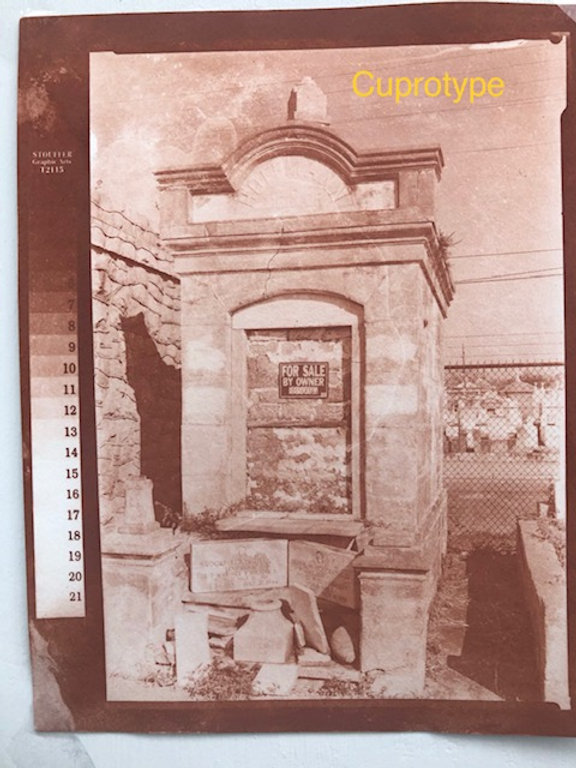
Continuing that work, based on a starter set of sensitizer formulation and process conditions, I was able to print an actual image of what I am terming as the New Cuprotype, to differentiate it from Patterson's version. The two are similar in that they both use FAC and CuSO4 in the photosensitizer. In the Patterson process, first a Cu(i) image is formed from Cu(ii) reduced by Fe(ii), itself the result of UV photoreduction of Fe(iii), which is then converted to a grey Cu(i) thiocyanate image by developing in ammonium thiocyanate. Finally, a copper(ii) ferrocynide, also known as Hatchett’s brown, image is formed by treatment with potassium ferricyanide.

In the current process the “developer” in a sense is the sodium thiosulfate, incorporated in the photosensitizer - so no separate intermediate image is required. A strong print-out of yellowish-brown image is obtained upon exposure. The exact nature of the pigment responsible for the image at this stage is not being proposed yet, but it’s safe to say it is some form of complex between Cu(i) and sodium thiosulfate. The development is simply washing out of the un-reacted chemicals in the paper in a similar fashion as cyanotype. Unlike cyanotype though, there does not seem to be any intensification of the image from what is already printed out during exposure. Copper ferrocyanide image is then obtained by treatment with potassium ferricyanide as usual.

In short, we may have stumbled upon a new cuprotype variant - thanks to @Jan de Jong' s creative experimenting.

The print in the next post.


:Niranjan.

Sorry this is random because I’m new so I can’t post, do you have any idea if one could use cyanotype over oil ground?
 
OP
OP

nmp

Member
Joined
Jan 20, 2005
Messages
1,828
Location
Maryland USA
Format
35mm
Sorry this is random because I’m new so I can’t post, do you have any idea if one could use cyanotype over oil ground?

I don't know too much about the oil- painting world but I am guessing it is some kind of primer one uses to seal the canvas before doing an oil-painting. Considering cyanotype chemistry is water-based, it would not be compatible to the oil-liking surface underneath which would tend to repel water. It would be like brushing on a watercolor on an oil-painting.

:Niranjan.
 
OP
OP

nmp

Member
Joined
Jan 20, 2005
Messages
1,828
Location
Maryland USA
Format
35mm
An Update:

I have been working on a couple of modifications from the last iteration of the process that I thought I will summarize here for the sake of completion.

The first one is addition of copper sulfate in the plain ferricyanide toner that was used before, details of which were posted on an another thread. The ferricyanide toner becomes a copper toner now, which results in a boost in the copper ferrocyanide density in the print.

The other change I made was increasing the amount of sodium thiosulfate in the recipe. In the original recipe, the ratio of the three main components in the sensitizer was FAC/CuSO4.5H2O/Na2S2O3.5H2O = 1/0.6/0.36 by weight which now goes to 1/0.6/0.6.

I found that adding more thiosulfate results in cleaner unexposed areas (less reddish staining after ferricyanide toning) coupled with significant boost in the overall contrast. Higher thiosulfate seems to also help in the acid-toning step, moving the print tone more toward neutral (relatively speaking) from a more intensely reddish one obtained by the original recipe in conjunction with copper toning. Overall a definite improvement.

Here is the resulting print with this new set of conditions compared with the old print from Post # 33 (everything else being the same.)

2022-09-27-0001.jpg

On its own:

2023-01-12-0001.jpg

I would say the range of tones obtained now with this version of cuprotype would be good for any process out there.

:Niranjan.
 
Last edited:

fgorga

Member
Joined
Aug 31, 2015
Messages
543
Location
New Hampshire
Format
Multi Format
Niranjan,

Thanks for the update.

I am planning another interval of cuprotype printing later this week mainly to see if I can optimize things for printing on cloth.

I'll incorporate both of your recent changes into my practice and report back here when I can.

Regards,
 
OP
OP

nmp

Member
Joined
Jan 20, 2005
Messages
1,828
Location
Maryland USA
Format
35mm
Niranjan,

Thanks for the update.

I am planning another interval of cuprotype printing later this week mainly to see if I can optimize things for printing on cloth.

I'll incorporate both of your recent changes into my practice and report back here when I can.

Regards,

Sounds good, Frank. I liked your experiment on cloth the first time.

:Niranjan.
 
Photrio.com contains affiliate links to products. We may receive a commission for purchases made through these links.
To read our full affiliate disclosure statement please click Here.

PHOTRIO PARTNERS EQUALLY FUNDING OUR COMMUNITY:


Ilford ADOX Freestyle Photographic Stearman Press Weldon Color Lab Blue Moon Camera & Machine
Top Bottom