@Raghu Kuvempunagar thank you for linking the video here! I should have done the same.
-
Welcome to Photrio!Registration is fast and free. Join today to unlock search, see fewer ads, and access all forum features.Click here to sign up
You are using an out of date browser. It may not display this or other websites correctly.
You should upgrade or use an alternative browser.
You should upgrade or use an alternative browser.
A blended ferrocyanide print process
-
A
- Thread starter Raghu Kuvempunagar
- Start date


Recent Classifieds
-
Free 3 enlarging lenses
- Started by jvo
-
For Sale Pentax 67 body with metered prism and grip
- Started by Guivd
-
For Sale Lens boards:Toyo, Canham, cambo, grafle
- Started by darinwc
-
For Sale Toyo 110mm lens boards (45 CF 45AR, 45ARII A11, AX
- Started by binglebugbob
-
Want to Buy Hasselblad A12 type III or IV back (Black or Silver)
- Started by jshcrlsn
Forum statistics
@Raghu Kuvempunagar is there a way to control contrast with the Ferroblend process? What happens if instead of using a 1+1 mixture of A and B solutions, one uses a 1+2, or 1+0.5?
OP
OP
Hi Andrew,
Contrast control, colour blending and cleaner highlights are intricately linked to the underlying mechanism that produces Prussian White under UV light. I'll have more to say on this sometime soon in a longer post. In the meanwhile, I am happy to share a formulation that produces clean highlights, more subtle colour blending and also importantly, works with Classic Cyanotype sensitiser.
Sensitiser:
(To coat 1 x A4 size sheet)
Water: 2 ml
FAC: 0.25 g
Potassium Ferricyanide: 0.1 g
Ammonium Dichromate 4%: 2 drops
In terms of Part A and Part B described in OP, this corresponds to 1+0.5:
Part A: 1 ml
Part B: 0.5 ml
Water to make: 2 ml
Please note that this sensitiser is the same as the very familiar Classic Cyanotype sensitiser with a few drops of Ammonium Dichromate added. Despite this change, please use negatives of the same/similar density range as before and I'll explain why in my detailed post. If your Part A has Ammonium Chloride in it, result will be warmer.
Developer:
(To develop 1 x A4 size sheet)
Water: 5 ml
Copper Sulphate: 0.1 g
Trisodium Citrate: 0.4 g
Potassium Ferricyanide: 0.1 g
Please note that the developer has Ferricyanide in it. Again, I'll have more to say on the role of Ferricyanide in my detailed post. Order of mixing is critical and Ferricyanide must be added only after a dark green/blue solution is formed.
Will post some examples later.
@Raghu Kuvempunagar very interesting. Looking forward to seeing your examples. So, this method increases contrast?
OP
OP
Many years since I was on any forum, but I have to say, this is a wonderful process.
My first ferroblend print on Canson Montval. neg is 5x7 delta100 in D23.
Welcome back and thanks for sharing your work. I like the split tone effect here.
-

- eliadesqu
- Deleted
OP
OP
@Raghu Kuvempunagar very interesting. Looking forward to seeing your examples. So, this method increases contrast?
@Andrew O'Neill: I posted a recent print here.
With Dichromate added [edit: to the senistiser], it should be possible to print negatives with density range 1.5-1.8. Please give it a try but don't add Ammonium Chloride.
Last edited:
@Andrew O'Neill: I posted a recent print here.
With Dichromate added, it should be possible to print negatives with density range 1.5-1.8. Please give it a try but don't add Ammonium Chloride.
With the dichromate added to the sensitiser? Thanks! I'll give it a go.
Last edited:
OP
OP
With the dichromate added to the sensitiser? Thanks!
Yes, to the sensitiser.
No idea if adding Dichromate to the developer works similarly. I haven't tested.
Usual substitutes for Dichromate like Peroxide/Persulphate/Chlorate might work as an additive to the sensitiser, but I haven't had a chance to try.
@Raghu Kuvempunagar
When you say:
"Please note that this sensitiser is the same as the very familiar Classic Cyanotype sensitiser with a few drops of Ammonium Dichromate added. Despite this change, please use negatives of the same/similar density range as before..."
Do you mean to use negatives for the traditional Cyanotype? Thanks!
OP
OP
A negative with density range ~1.8 will work best, but ~1.5 might also work. This is, of course, with the addition of Dichromate to the sensitiser.
OP
OP
A recent FerroBlend print.

A recent FerroBlend print.
Nice! The tone in the lighter areas makes this a great idea.
Cor
Member
Ok, by popular demand..;-)
first some background;

Erice

first some background;
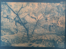
- Images made in Sicily this October
- RAW images taken with Samsung EX1 with dark red filter attached to register mostly infrared light at 3200 ASA
- Processed in Photoshop
- Negatives made by Koraks (thanks again !), size A4
- FerroBlend coated on smooth side Simili Japon, size 24*30 cm
- "Developed" with CopperSulphate + 14% KBr
Erice
Cor
Member
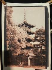
And this one too:
Modica

Enjoy !
Cor
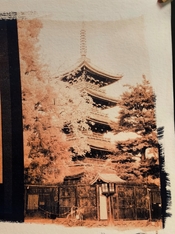
Modica
Enjoy !
Cor
Cor
Member
The images really work very nicely with this process; lovely!
They are also nice as Kallitype, frankly I did not expect it, it is much more subtle compared to the spectacle a FerroBlend print gives.
OP
OP
hi every one. this summer I read the article from @koraks and immediately tried it. my results were pretty similar to his tones, thinking "uh ok" and moved on. but two days ago I found this tread and raghu's tones are from another planet. so I tried again, and again and again. The crunchy black wasn't there. Today, on the last try I got something closer to him.
paper used was Fabriano unica, same sensitiser traditional solution A and 20% solution b plus ammonium chloride.
no PFC in the developer for the first one and some in the second one. What's interesting, while playing around I added some ammonium chloride in developer to compensate the excess of ofc and it worked!
@Raghu Kuvempunagar does it sound right?
why should I need more than normal?
I feel both a bit underexposed since there is a lot of copper and only a few of iron.
I'll might play a bit more aiming the blackest tone and then linearize it.
Raghu, what you did is amazing!
Attachments
Welcome to Photrio; beautiful prints @Ksnbdooanndin !
| Photrio.com contains affiliate links to products. We may receive a commission for purchases made through these links. To read our full affiliate disclosure statement please click Here. |
PHOTRIO PARTNERS EQUALLY FUNDING OUR COMMUNITY:  |