What you point out is more of a high-key vs. low-key difference.
There's a couple of things at work here and I think it's worthwhile separating them out as they easily get mingled and mixed up when they're hiding under somewhat problematic shortcuts like "high/low contrast."
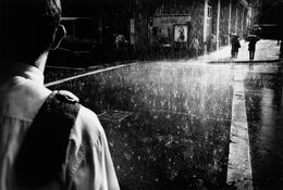
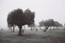
The first is the continuous tone nature of an image. An image can have a continuous range of tones, hitting every value between pure black and pure white. The low-key image you posted answers to this. The high-key image
probably also does this. I'll get back to this later.
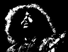
@Bob Merlin's example above is a nice one that shows the other extreme, with only two values - black and white.
The 'probably' in relation to the continuous-tone nature of the tree image relates to the black point, which is the only thing that keeps this image from covering the entire spread of possible values. It's a continuous tone image for sure, but the black point in the version we're seeing here is at a dark grey value. The reason I have some doubts about this is whether we don't know for sure whether this is the original image as intended by the maker. The shifted black point
could be an artifact (accident) of a digital process. However, it may also very well be intentional. The same principle also applies to the white point, but on the tree images this isn't shifted down quite as far as the black point is shifted up.
Another characteristic is the distribution of value across the histogram. This is where the low/high-key difference really lies. If you compare the tree pic to the one of the rainy street, then what stands out is the large sections of (nearly) pure black in the latter, and the dominant (nearly) pure white sky in the latter.
Then the issue with contrast is I think a slightly tricky one, as it depends a bit on how you define it. We could define contrast as the difference in values in close proximity. A large difference = high contrast. The fuzzy bit here is what constitutes 'proximity'. If you speak of the image in its entirety, then it can still be 'high contrast' without necessarily involving abrupt or hard edges, whereas it's also possible someone calls an image 'high contrast' only if such harsh transitions are present. The rainy street image answers to both conceptions of 'high contrast'. For the tree-in-mist image it's a little more diffuse, as it depends also on the presentation and the extent to which the shifted black point (see above) is intentional.
I really don't know whether preferences today are so different from what they were in e.g. the 1950s or 1960s in this sense. There's such a lot of gritty work from the 'film noir' era (hence the name!) that the rainy street image visually refers to, and that's rather 'vintage' for sure. At a technical level, I think we all have to agree that images like the tree image could perfectly well be produced with TriX and a modern lens - and indeed, this exact type of image (there's plenty of them around) is routinely made with modern equipment that's optimized for producing high contrast in an objective sense (i.e. minimize 'bleeding' of light into adjacent dark areas). Evidently, people can and will choose in printing or post processing how they want to present the final image (or achieve the same through selection of in-camera profiles). Also here, whether there's a tendency towards image #1 and away from #2 - I don't know. Image #2 does seem to fit nicely in the pictorialist tradition dating back to the late 19th century. The rise of other styles to contrast with it (heh) happened so long ago that we really can't speak of a modern development.
What is desirable in an images is of course up to you to decide. There's no accounting for taste. Personally, I'd say, why choose across the board between either style? For some compositions, a graphic approach (with high contrast and harsh transitions) works well. For others, it's contradictory to the visual core of the image. Ultimately, I personally don't think the image is ultimately made by the presence of the tonal range - it's primarily made by things like composition, light, subject matter. Control of the tonal range can help or hinder the extent to which that essence is brought out. As a result, in my mind, it doesn't make a lot of sense to judge an image purely on the tonal distributions it exhibits. It's an important factor, but not the primary criterion, and it follows other, more fundamental choices.