The Price of 8x10 Color Film Out of Control

Hydrangeas from the garden

A
Hydrangeas from the garden

  • 2
  • 1
  • 34
Field #6

D
Field #6

  • 4
  • 1
  • 57
Hosta

A
Hosta

  • 12
  • 8
  • 118
Water Orchids

A
Water Orchids

  • 5
  • 1
  • 69

Recent Classifieds

Forum statistics

Threads
197,910
Messages
2,766,743
Members
99,500
Latest member
Neilmark
Recent bookmarks
1

DREW WILEY

Member
Joined
Jul 14, 2011
Messages
13,799
Format
8x10 Format
Glad that my math skills only rely on counting fingers. That's what allows me to inventory how many boxes of 8x10 Ektar I still have in the freezer - enough that I won't have to tangle with another thread like this one for a number of years.
 

138S

Member
Joined
Dec 4, 2019
Messages
1,776
Location
Pyrenees
Format
Large Format
Glad that my math skills only rely on counting fingers. That's what allows me to inventory how many boxes of 8x10 Ektar I still have in the freezer - enough that I won't have to tangle with another thread like this one for a number of years.

Drew, anyway we got some fun :smile: :smile: (never give a bone! :smile:)

What I had to say it has been said, so I leave this thread for the moment, I feel nobody can bring real evidence that sheet's large overprice has an ex-factory cost explanation, so not worth insisting in defending what's clear enough: Sheet overpricing it's (legitime) manufacturer's policy.

You know, my feel is that they damage color LF survability, but this is only a personal opinion.

Bye
 

Lachlan Young

Member
Joined
Dec 2, 2005
Messages
4,850
Location
Glasgow
Format
Multi Format
You won't be able to point any specific formulae alteration in a modern emulsion to coat on LF base having an overcost. You won't find anything in no book or reliable source because this does not exist.

Go back and read what David quoted from Simon Galley about the problems of re-building Delta 400's coating package to work on polyester base - specifically "because they would have had to reformulate it to coat evenly and retain its grain properties". And that's a much less complex layer build-up than a 16-layer package incorporating multiple coupler dispersions. The costs of doing this & the costs of the thick polyester sheet film base which is only used for sheet film products all add up. And as format size of the final cut sheet goes up, the potential reject rate for minor coating inconsistencies rises too. It has taken Adox 7 coatings so far to work out the kinks in getting Polywarmtone to work well on the Marly coating machine - and it's only 2 layers plus supercoat on a base that readily accepts aqueous coatings.


Furthermore, you still haven't answered my question about colour balance differences - and if you have worked with various generations of Portra you'll have noticed that the current 160 has slightly higher colour contrast than NC, and 400 is a bit higher still, but not as much as VC. You can add saturation in post production much more convincingly than taking it away, however if your argument held water, why are all the current Portras slightly different colour balances and colour contrasts? Might it not be because there was plenty of research done into what the most demanded behaviour at certain emulsion speeds was & the emulsions designed from that? For social/ travel/ documentary photography you might want speed and some warmth, for more studio/ reproduction aimed work you want accuracy and a bit less saturation. Maybe there was also a desire to correct what some saw as excessive colour contrast in the VC emulsions while finding the most profitably saleable compromises between the NC and VC colour contrasts. If Kodak had done what you claim, both Portras would be low colour contrast, neutral tone.
 
Last edited:
Joined
Nov 21, 2005
Messages
7,527
Location
San Clemente, California
Format
Multi Format
...I don't have anyone on an "ignore" list...
No time like the present for you (and the other head-flat-spot-accumulating posters in this thread) to place the troll on one. Doing so would increase your and readers' serenity immensely, keep the archive clean and discourage further pollution of PHOTRIO. :smile:
 

138S

Member
Joined
Dec 4, 2019
Messages
1,776
Location
Pyrenees
Format
Large Format
Your argument is "It can't possibly be as complex as what industry professionals with real world experience claim it is"?
Seriously?

Sorry, I've nothing to add to my Post #270,

I'd would be happy to discuss any specific emulsion modification for LF you are able to show, since (say) 30 years ago: any manufacturer, any book, any technical document... Have you a single one?

If not then better we discuss in a private conversation, to not over-post. I send you a PM for it.
 

Lachlan Young

Member
Joined
Dec 2, 2005
Messages
4,850
Location
Glasgow
Format
Multi Format
My post #266

You still have not answered the question about differing colour balances and colour contrasts in current Portra 160 & 400 and the consequences this has for your assertions. Nowhere in the documentation is it explained that the films have in any way been optimised vis-a-vis earlier Portra films for post production alteration. In fact, the earlier Portra films have much more extensive documentation about scanning and digital post-production. The only conclusion I can draw is that you have at best only used a small quantity of one Portra (likely 160) & never had any hands on experience of any other variants/ generations.
 

138S

Member
Joined
Dec 4, 2019
Messages
1,776
Location
Pyrenees
Format
Large Format
You still have not answered the question about differing colour balances and colour contrasts in current Portra 160 & 400

Sorry, I was not aware you asked that.

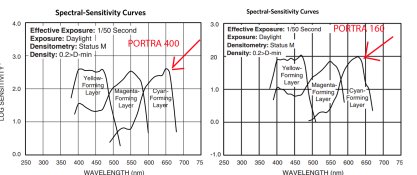
Portra 160 vs 400 cannot be totally emulated because spectral response is different, a 3D LUT (or other) may work in certain conditions but if you change illumination or subject's reflective spectral nature then you may have a mismatch.

Look, Portra 400 has a different spectral sensitivity in the red channel than Portra 160:

160-400.jpg


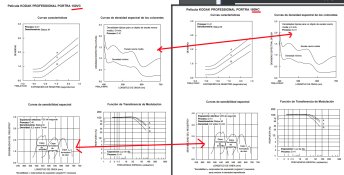
_________________________________

Instead Portra 160 NC and VC had the exactly the same spectral sensitivity, wich allows a perfect match with a 3D LUT

portra_ncvc.jpg

Some colorimetric concepts require math that's not basic.

After first Developer both NC and VC will deliver the same metallic silver densitities in each of the three color layers, at this stage color information is encodeed in a (math ) 3 dimensions real space, 3 optic densities and no spectrum, let's call XYZ those three densities encoding color in that intermediate stage.

1st developer seen as a transfer function is a Surjection in what for each (exposed) spectrum reaching film you have a point in a XYZ. Spectrums are in a Space of Functions, the Surjection assigns an XYZ point in the 3D real space for each exposed Spectrum. It is a Surjection because several spectrums may deliver the same XYZ, but you can't recover the original Spectrum from the XYZ values, let me reiterate that XYZ are metallic silver densities for each of the 3 channels at this stage.

If you consider that Second developement plus scanning is a "blackbox" transfer function, here you have a Bijection, for each point in the XYZ silver density 3D space you have an RGB point in the sRGB space, no information is lost because transfer fuctions are Monotonic in the cross-channel sections, so you would be able to recover the XYZ point from the RGB value.

In the Portra NC vs VC you start from a common XYZ point and you end in two RGB values, one for NC and another one for VC, each of the transfer functions are Bijections, so also there is a Bijection maping RGB in the NC space with RGB in the VC, this means that a 3D LUT will perfectly map NC vs VC, not matering illumination kind or subject's spectral reflectivity, because this only changed the XYZ value that is the same for NC than for VC.

Instead this is not possible in the Portra 400 vs 160, because we depart from different XYZ spaces from different spectral responses.


Those theoric concepts are ususally not much needed in pictorial practice, but we the technicians that work with technical LUTs we need to have those concepts very clear.
 
Last edited:

DREW WILEY

Member
Joined
Jul 14, 2011
Messages
13,799
Format
8x10 Format
I'm sure it's not quite that simple. You can get quite a bit of mileage out of color mapping; but it won't tell you everything. I worked with 4-axis pigment mapping, more for practical feedback rather than the actual spectrophotometer design or engineering phase, as they kept changing. In the final analysis, a well trained human eye is the best instrument, but there is an art as well as science to even that.
 

Lachlan Young

Member
Joined
Dec 2, 2005
Messages
4,850
Location
Glasgow
Format
Multi Format
Sorry, I was not aware you asked that.

Portra 160 vs 400 cannot be totally emulated because spectral response is different, a 3D LUT (or other) may work in certain conditions but if you change illumination or subject's reflective spectral nature then you may have a mismatch.

Look, Portra 400 has a different spectral sensitivity in the red channel than Portra 160:

View attachment 242056


_________________________________

Instead Portra 160 NC and VC had the exactly the same spectral sensitivity, wich allows a perfect match with a 3D LUT

View attachment 242057

Some colorimetric concepts require math that's not basic.

After first Developer both NC and VC will deliver the same metallic silver densitities in each of the three color layers, at this stage color information is encodeed in a (math ) 3 dimensions real space, 3 optic densities and no spectrum, let's call XYZ those three densities encoding color in that intermediate stage.

1st developer seen as a transfer function is a Surjection in what for each (exposed) spectrum reaching film you have a point in a XYZ. Spectrums are in a Space of Functions, the Surjection assigns an XYZ point in the 3D real space for each exposed Spectrum. It is a Surjection because several spectrums may deliver the same XYZ, but you can't recover the original Spectrum from the XYZ values, let me reiterate that XYZ are metallic silver densities for each of the 3 channels at this stage.

If you consider that Second developement plus scanning is a "blackbox" transfer function, here you have a Bijection, for each point in the XYZ silver density 3D space you have an RGB point in the sRGB space, no information is lost because transfer fuctions are Monotonic in the cross-channel sections, so you would be able to recover the XYZ point from the RGB value.

In the Portra NC vs VC you start from a common XYZ point and you end in two RGB values, one for NC and another one for VC, each of the transfer functions are Bijections, so also there is a Bijection maping RGB in the NC space with RGB in the VC, this means that a 3D LUT will perfectly map NC vs VC, not matering illumination kind or subject's spectral reflectivity, because this only changed the XYZ value that is the same for NC than for VC.

Instead this is not possible in the Portra 400 vs 160, because we depart from different XYZ spaces from different spectral responses.


Those theoric concepts are ususally not much needed in pictorial practice, but we the technicians that work with technical LUTs we need to have those concepts very clear.

There's a rather fundamental problem here: spectral sensitivity provides no indication of colour contrast behaviour. You could change out the couplers between emulsion sets and get wildly distorted colour, but the spectral sensitisation wouldn't change. What those charts show is that the peak spectral response from the emulsions is correct for normal colour photography - not how the dye couplers will actually respond. As you should be aware, the couplers are dispersed long before spectral sensitisation is carried out - they are discreet processes, but obviously the dye sensitisation choice has to match the coupler colour for the film to work correctly. The discrepancy may be because both films use a similar/ identical red sensitising dye, but if it uses (for example) J-Aggregation enabling a green sensitising dye to instead sensitise to red owing to iodide content, differing iodide levels in each set of red sensitive emulsions may be the rather more straightforward cause.

What I'm talking about is the effects of choice and contrast of the couplers themselves & their impact on the 'look' of the film. In fact Kodak have apparently had quite sophisticated computer modelling of colour contrast since the 1980's & there's a whole succession of patents covering varying approaches to digital post-production long pre-dating when 1st generation Portra would have entered product development (possibly even before the Pro- series that pre-dated Portra). By the time Portra came along, digital post-production was well established & yet no fewer than three colour contrast variants were initially launched. As Drew effectively suggests above, a digital model will only sort-of take you in the right direction, before the complexities of the manufacturing process may introduce all sorts of odd subtleties that are challenging to digitally replicate.

All of which comes back to this: as you are assuming that Kodak assumed that people would boost saturation etc in post production by the time Portra 160 and Portra 400 came on the market, why do they still have quite different coupler colour balances and colour contrasts - one more saturated (but less than VC) and warmer, the other less saturated (but more than NC)? As for why they're both less punchyin colour contrast than the old VC, the answer is quite simple: Ektar does everything better in that regard.
 
Last edited:

DREW WILEY

Member
Joined
Jul 14, 2011
Messages
13,799
Format
8x10 Format
VC had somewhat better blue repro than Ektar does; but in every other category, Ektar seems to excel. I'm comfortable reading dye curves and graphs etc, but there's no doubt an art to making such films that's a lot harder to quantify, and I'm particularly interested in certain complex dye interactions almost impossible to pin down except by a trained eye. It takes awhile to learn the "signature" of any new film, and frankly, I get frustrated at times with these forums when people are telegraphing their own scanning or printing idiosyncrasies rather than objectively appraising the film itself.
 

138S

Member
Joined
Dec 4, 2019
Messages
1,776
Location
Pyrenees
Format
Large Format
There's a rather fundamental problem here: spectral sensitivity provides no indication of colour contrast behaviour.

"Coupler colour balances and colour contrasts" are important for optic printing... and in hybrid for easy conversion/edition to have a canned look. For an advanced edition what is important is Spectral Response as the effects of "Coupler colour balances" can be edited quite easy, but you can't edit what spectral response did in the taking.

Let me say a simplified analogy: In a BW scan you can edit the curve to modify toe/shoulder, contrast, etc, but you may not be able to globally emulate the effect of a red filter on the lens that modifies effective Spectral Response.


Lachlan, I don't say if one film provides a particular contrast behaviour or not...

What I say is that there is a technical Fact: in hybrid processing VC and NC reponses can be mapped to match, so with the right calibrations and the right software we can exactly match VC result from a NC negative and the counter.

There is another technical Fact: Instead with Portra 400 vs 160 there is no software tool that can do that perfectly, a universal 3D LUT doing that it does not exist.

These are Facts.


as you are assuming that Kodak assumed that people would boost saturation etc in post production by the time Portra 160 and Portra 400 came on the market,

Lachlan, I don't know why Kodak designed the Portra 400 red channel sensitivity different than Portra 160.

Also I don't know if the 650nm peak in Portra 400 is a designed feature or instead it resulted from the 400 speed sensitization, what is clear is that spectral responses are different in the red.


I'm sure it's not quite that simple.

It depends on who does it... a colorist scientist working at Fuji, Noritsu, Kodak or Epson... or a colorist technician working at Hollywood does that before breakfast.
 
Last edited:

DREW WILEY

Member
Joined
Jul 14, 2011
Messages
13,799
Format
8x10 Format
I think you're underestimating quite a few things, one being the fact that there are many hues simply impossible to correctly reproduce by any kind of photographic medium. In terms of Hollywood, in major gigs, they'd match movie sets, lighting, makeup, and costume colors to specific customized Technicolor dye sets. You can't do that with the entire world! Current inkjet printing has a lot of disappointing gamut limitations and idiosyncrasies simply due to the mechanical limitations of what can or cannot pass those tiny nozzles. Simply mapping them into the same color space doesn't cure that. But if you want to talk about color space, in the biotech industry, my wife once worked with a six million dollar spectrophotometer that plotted DNA configurations via color using plotting software so secret that the device was kept behind a timed bank vault door with four-foot thick reinforced concrete on every side.
 

138S

Member
Joined
Dec 4, 2019
Messages
1,776
Location
Pyrenees
Format
Large Format
I think you're underestimating quite a few things, one being the fact that there are many hues simply impossible to correctly reproduce by any kind of photographic medium.

Drew, not underestimating that. If you check Post #284 you'll find demonstration is based in XYZ values representing layer densities after 1st development to just not understimate what you say.

An scanner (having DR enough) is able to map all hues that color film has, another thing is what the paper or the monitor is able to show in its color space, and the conversions we make.
 

DREW WILEY

Member
Joined
Jul 14, 2011
Messages
13,799
Format
8x10 Format
You've just repeating yourself and not really listening. There are a LOT of things regarding color you're NEVER going to be able to quantify. At one time I taught professional color matchers how to learn how to do things that no machine can. Yes, spectrophotometers, densitometers, and so forth can make such procedures far more efficient; but none of them can take you the whole distance. Nor is all your hypothesizing a substitute for what are no doubt inside secrets about how specific films are made, essentially consisting of an industrial art as well as science.
 

jrhilton

Member
Joined
Nov 5, 2007
Messages
82
Format
Medium Format
But if you want to talk about color space, in the biotech industry, my wife once worked with a six million dollar spectrophotometer that plotted DNA configurations via color using plotting software so secret that the device was kept behind a timed bank vault door with four-foot thick reinforced concrete on every side.

Forget the rest of the thread, this is what we want to know more about! :D
 

DREW WILEY

Member
Joined
Jul 14, 2011
Messages
13,799
Format
8x10 Format
At an avg cost of $40,000 per cc for designer serums, some of which could potentially becomes worth billions if scaled up to market pharmaceuticals, this required special precautions. Nobody in the entire company was allowed to know but a small portion of the system, with the exception of the two founders. This particular service did prototyping under contract for the big high-roller pharmaceutical manufacturers who undertook the volume expenses. Just to get R&D thru FDA and to the market cost around half a billion per item back then, and closer to an average billion per drug now. So a particular very well known manufacturer thought they could save a bit of money by recruiting an industrial spy from inside. When he was caught, he couldn't just be fired or there would be a wrongful termination suit requiring disclosure of the intellectual property involved, and in such cases, many things necessarily remain trade secrets rather than patents, lest any clue about them be in the public domain. But the big manufacturer didn't want the embarrassment of a lawsuit against them either. So what the employer did instead of firing the culprit was to "promote" him to Manager of the rat cages, with his office right in the stinky middle of them! Poetic justice. He's probably delivering pizzas today. Once someone is caught trying to sell trade secrets, they instantly become a pariah that will never find a position in that profession again. The company itself was finally bought out by a different big high-roller pharmaceutical manufacturer, who mismanaged it, and it had to be drastically scaled down. My wife moved on to a different career. I have no idea what happened to the fancy spectrophotometer. That whole industrial park has now been purchased for sake of a second campus of Lawrence Berkeley Lab.
 

DREW WILEY

Member
Joined
Jul 14, 2011
Messages
13,799
Format
8x10 Format
Why talk about it? There's not much we can do until the pendulum stabilizes after the panic wave is over, which might take months. Of course there are going to be corporate as well as individual failures. I complained to the manufacturers I dealt with about the smoke and mirrors economy for over two decades. Now look what all that get rich quick slash n' burn outsourcing is doing to them. The whole system has been fragile all along. But I'm sure not gonna cry if WalMart or Home Depot get hurt; they caused a lot of it. Likewise, there were plenty of experts warning against pathogens getting out due to the illegal wildlife trade, whether for food or folk medicine. Didn't we have close enough calls with Marburg and Ebola? The chickens are simply coming home to roost. I'm not even going to speculate about photographic products. About the best I can personally do (and already did) is make sure enough darkroom supplies are on hand for the next few months, just in case there is a lengthy disruption. I already had plenty of film in the freezer.
 

Lachlan Young

Member
Joined
Dec 2, 2005
Messages
4,850
Location
Glasgow
Format
Multi Format
"Coupler colour balances and colour contrasts" are important for optic printing... and in hybrid for easy conversion/edition to have a canned look. For an advanced edition what is important is Spectral Response as the effects of "Coupler colour balances" can be edited quite easy, but you can't edit what spectral response did in the taking.

Let me say a simplified analogy: In a BW scan you can edit the curve to modify toe/shoulder, contrast, etc, but you may not be able to globally emulate the effect of a red filter on the lens that modifies effective Spectral Response.

In colour, spectral response matters in a rather different way to BW. It matters in terms of the latitude of the material relative to the colour of the lighting conditions - ie, more cyan sensitivity will help under warmer light sources for example. The couplers formed do so relative to the exposure of the layer in question, so, while light source colour matters in terms of absolute coupler formed (ie under-, correct, over-exposure), the quantity of coupler, colour balance of the couplers, any restrainers added also contribute dramatically to it. As you have done so throughout this thread you are severely underestimating how complex this is, either via a lack of experience or a lack of sufficient qualitative comparators. A blind reliance on LUT's suggests a very real lack of experience in their limitations.

Anyway, this graphic assembled from the Portra 160 sell sheet, should make it pretty clear why the VC films went - Ektar equalled or outperformed them in pretty much every relevant metric apart from speed - and even then, quite a few people overexposed the VC films for more saturation.

film_comparisons.jpg

It should also make clear that the re-engineering choices seem not driven by hypothetical digital postproduction concerns but rather to offer a broader range of colour choices than previously offered. My own experience suggests that Portra 160 is maybe a hair more saturated than 160NC (and only a hair), but otherwise those charts match what I've found in actual use. It also clearly illustrates that a tiny drop in sharpness may allow a significant drop in granularity in the Portra 160 emulsions (Ektar's structure and lower latitude help it here). It also demonstrates the relationship between granularity, saturation, sharpness and effective visual contrast - all of which are regulated by the specific use of DIR and DIAR couplers etc.
 

DREW WILEY

Member
Joined
Jul 14, 2011
Messages
13,799
Format
8x10 Format
Not everyone who can read a recipe book becomes a great chef; nor does the ability to read printed notes make one a skilled musician. Intangibles of nuanced taste and hearing subtle tones are even more important. I've even met some remarkable photographic engineers and chemists who were lousy picture-takers.
 

138S

Member
Joined
Dec 4, 2019
Messages
1,776
Location
Pyrenees
Format
Large Format
In colour, spectral response matters in a rather different way to BW.

Of course, color is more complex because you have 3 channels inteacting instead a single one, the example was to show that you cannot recover what was lost in the capture from spectral response, but color interpretation after spectral response is easily edited.


As you have done so throughout this thread you are severely underestimating how complex this is, A blind reliance on LUT's suggests a very real lack of experience in their limitations.

If you check post #284 there is no "blind reliance on LUT's", I state that in one situation it's possible and in the other it is impossible, no blind reliance.


It should also make clear that the re-engineering choices seem not driven by hypothetical digital postproduction concerns but rather to offer a broader range of colour choices than previously offered.

It may seem one thing or another, but since many years ago 99.99% of CN film is digitally processed, in the digi minilabs or scanned at home, only a few make artisan optic RA-4.

In that concern you should understand what digital processing does well: contrast, saturation, selective saturation shifts, selective color shifts, "image iltelligence" etc, etc are a kid's game in the hybrid.

...so as CN film is 99.99% digitally processed what remains very important is what digital processing cannot do: it can't recover Spectral Information to modify the spectral interpretation because that was lost in the taking.

Anyway we even can make good film emulations even from digital shots, of course not the same than true film, but this shows the power of the color digital edition.


Not everyone who can read a recipe book becomes a great chef; nor does the ability to read printed notes make one a skilled musician. Intangibles of nuanced taste and hearing subtle tones are even more important. I've even met some remarkable photographic engineers and chemists who were lousy picture-takers.

Of course...
 
Last edited:

DREW WILEY

Member
Joined
Jul 14, 2011
Messages
13,799
Format
8x10 Format
I don't know about your statistics. For example, most people don't send out their CN snapshots to either conventional RA4 minilab services or digital printing alternatives anymore; those are farer and fewer between because people have predominantly switched over to digital cameras and picture-taking phones, and don't order up prints anymore at all. Then those who want to print at home are mostly taking their shots digitally anyway. Obvious. That means that a greater proportion of those remaining few who still shoot CN film might have a more serious reason for doing so, with some potentially gravitating back to darkroom printing. But I appreciate how you've tightened your explanation about recovering spectral information. In my thinking, once dyes begin crossing over is when it get harder and harder to untangle things using simple axis models. And in most CN films, that zone of crossover is substantial, and not just .01%; more like 10%. There have also been four-sensiitized-layer CN films, plus the effect of the orange mask in all of them, which is not simply an overall filter. There are lots of complex color interactions in play.
 

Adrian Bacon

Member
Joined
Oct 18, 2016
Messages
2,086
Location
Petaluma, CA.
Format
Multi Format
There are lots of complex color interactions in play.

+1

138S, Take it from somebody who has in fact written software specifically for scanning color negative film and has spent an inordinate amount of time studying it in a quest for ever better scans, lots of recent posts on this thread are painting with a big fat brush and glossing over a whole pile of technical complexities that are significantly more complex than they appear to be at first blush.

in short, if it were really that straightforward, then why does it seem to be so difficult to get consistent/good color negative scans? Have you actually seen color negative scans from most labs lately? Have you actually sent the same negatives around to each one and asked for scans? Despite the fact that most of them use the same or similar hardware, what they return back is completely inconsistent between the various labs. True, a fair amount of that is them imparting their look because they’re catering to a certain type of photographer, but still, you should be able to get a fairly consistent and colormetrically accurate scan from one lab to the next, and you can’t, despite the fact that most their equipment is the same. That says a lot.
 
Photrio.com contains affiliate links to products. We may receive a commission for purchases made through these links.
To read our full affiliate disclosure statement please click Here.

PHOTRIO PARTNERS EQUALLY FUNDING OUR COMMUNITY:


Ilford ADOX Freestyle Photographic Stearman Press Weldon Color Lab Blue Moon Camera & Machine
Top Bottom