Reversal RA-4 experiment thread.

R..jpg

A
R..jpg

  • 0
  • 0
  • 5
WPPD25 Self Portrait

A
WPPD25 Self Portrait

  • 7
  • 1
  • 76
Wife

A
Wife

  • 5
  • 1
  • 106
Dragon IV 10.jpg

A
Dragon IV 10.jpg

  • 4
  • 0
  • 94
DRAGON IV 08.jpg

A
DRAGON IV 08.jpg

  • 1
  • 0
  • 63

Recent Classifieds

Forum statistics

Threads
197,889
Messages
2,766,438
Members
99,495
Latest member
Brenva1A
Recent bookmarks
0

grainyvision

Subscriber
Joined
Feb 19, 2018
Messages
695
Location
Denver, Colorado
Format
Multi Format
I read the recipe for RFD-1 with some interest; and looking at the post where you were talking about the whites going gray, wouldn't a touch of thiosulphate (fixer) help with this, like it does in clearing whites for B&W reversal FD?

Thiocyanate works in the same way as thiosulfate as far as I can tell, though apparently gives somewhat different results. I imagine thiosulfate could probably be substituted even. I might try increasing the amount of thiocyanate on my next test run actually as it is known for also developing/fogging shadows (dmin in negative) thus reducing contrast, and also make it easier to get clear highlights. I found a color film process from Kodak (RVNP) which uses thiocyanate in the first developer. I also found a patent which describes basically a C-41 based E-6 positive process (x-pro/C-41 reversal) which is pretty funny. Apparently though it uses both thiosulfate and thiocyanate in order to balance the speeds between the blue layer and the other layers (red in particular). According to it, thiosulfate acts more strongly on the outermost blue sensitive layer (yellow in positive) more strongly than the innermost red sensitive layer (cyan in positive), while thiocyanate is the opposite. Actually a super interesting piece of information to have discovered https://patents.google.com/patent/CN1077985C/en (translated from Chinese, so it's even harder to read than most patents)

The formula in the patent seems to say that you need a ratio of 2:9 thiocyanate:thiosulfate for color accuracy in slide film. However, RA-4 is built for an entirely different color balance so I imagine the best result would require a different ratio. The fact that unclear highlights are yellowish seems to indicate at least some thiosulfate would be useful. My understanding of how RA-4 is designed to work is that the blue sensitive layer is significantly faster than the red sensitive layer, since it's designed to account for the orange C-41 mask. This is also why so much yellow filtration is necessary So as a modification to RFD-1 it'd probably be ideal to add a very small amount of thiosulfate, say, 0.2g or 0.5g. Just enough to clear highlights without increasing the speed of the blue layer too much, and more thiocyanate could probably be added to further reduce filtration and potentially reduce contrast and color crossing

I have a small fascination with the prospect of using RA-4 reversal for color positive in-camera usage as well. If tuning these ratios could produce decent color balance with no filtration it'd be especially interesting.
 

grainyvision

Subscriber
Joined
Feb 19, 2018
Messages
695
Location
Denver, Colorado
Format
Multi Format
Alright this is a long one... Hopefully it helps someone in the future. I think I've pretty much hit my limit on further experiments trying to get this to be lower contrast or with better color accuracy. This is an 18 print series where I tweak a variable with each print.

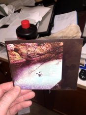
Filtration remained the same (~80Y, 40M though that isn't too important). RFD-1 was used as the base developer, though I made it as a 1+3 concentrate this time and diluted before development. I won't include the images directly in the post because photrio is a real pain with its 1mb limit and it'd be a real scroller of a post otherwise. Sorry it's such a boring picture, but I wanted something fairly contrasty and a variety of colors. Scanning was done with an Epson v600 and Vuescan with all color correction turned off, but some curve setting done so that the scans mostly matched the print (a small amount of shadow detail is missing and colors are slightly more saturated in the scan compared to the print). Working solution developer volume through all tests was 600ml, aside from when water was added. Developer was NOT remixed between each print unless indicated, so exhaustion can play a part in some of this, though I expect very little. Changes are cumulative.. For instance, in steps 2 and 3, 3 had additional thiocyanate as well as thiosulfate. Developer remixed resets the additions.

Process, all in trays and room temp:

1. Expose
2. First develop (time varies)
3. Citric acid stop bath, ~20s
4. Room lights on, rinse
5. RA-4 develop (Kodak RA-4 RT developer replenisher) for 2m
6. Citric acid stop bath, ~20s
7. RA-4 bleach-fix (Kodak RA-4 bleach-fix non-prime) for 1.5m
8. Rinse

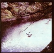
1. f/8 16s, 3m dev, Mitsubishi RA-4 paper. This functions as the base print to compare all the tweaks to. http://earlz.net/films/ra4tests/scan0001.jpg
2. Add 5ml of 10g:100ml thiocyanite solution. This makes the print noticeably more yellow and also seems to increase the speed of the paper. Some highlight details become "etched" with fine lines eaten away http://earlz.net/films/ra4tests/scan0002.jpg
3. Add 5ml thiosulfate (hypo) crystaline 10g:100ml solution. This completely ruined the print, leaving only the yellow layer to be developed it seems. Apparently I had accidentally created a monobath. http://earlz.net/films/ra4tests/scan0003.jpg
4. Remix developer, add 4ml thiocyanate solution and 0.5ml thiosulfate. Another ruined print, but ruined to a much lesser extent. This seemed to be missing a lot of blue color and so tilted very strongly to red, including the undeveloped blacks. http://earlz.net/films/ra4tests/scan0004.jpg
5. Remix developer, add only 0.1ml (3 drops) of thiosulfate, also remixed 1st dev stop bath to ensure no hypo present. This had a subtle effect and seemed to tilt highlights toward yellow, seemingly correcting some color crossing of the process. Doesn't show up well on the scan, but the blacks are very slightly warm with a very subtle red tint, though still perfectly usable, maybe improved. http://earlz.net/films/ra4tests/scan0005.jpg
6. Reduce development time to 2m. This clearly reduces the perceived speed of the print. Unlike with previous tests though, the reduced development does not leave any yellow staining in highlights. Contrast seems to be slightly reduced compared to base print, but with some green cast in shadows. http://earlz.net/films/ra4tests/scan0006.jpg
7. 2m development time and add 10ml thiocyanate. This boosts the "perceived" speed beyond the base print speed and introduces more etched highlight detail. Contrast also seems to have increased. Appears to not actually develop any additional shadow detail, only makes highlights and midtone detail brighter and/or clipping to white. Also seems to make overall tint more yellow and to give more vibrant greens than base print. http://earlz.net/films/ra4tests/scan0007.jpg
8. 3m development time. This definitely gives a very high contrast print with highlights very easily clipping to white. This brings in some shadow detail not present in base print, though it is very little. Definitely quite tilted toward yellow compared to base print. http://earlz.net/films/ra4tests/scan0008.jpg
9. Add 2g of bromide. This looks very similar to test #7. Slightly less shadow detail and very slightly more highlight detail. Slightly less blue overall, significantly less blue crossing in very faint highlights. Some highlight edges have a yellow-green cast http://earlz.net/films/ra4tests/scan0009.jpg
10. Decrease to 2m development time. Significantly worse shadow detail than base print. Slightly more highlight detail than base print. Blueish green casts in highlights. Overall lower perceived speed than base print. http://earlz.net/films/ra4tests/scan0010.jpg
11. Add 1 drop (~0.03ml) of thiosulfate solution and 10 drops of 1% (1g:100ml) iodide solution. Significantly more blue "flare" around highlight edges against shadows. Slightly less shadow detail, no additional highlight detail. More overall blue with more blue introduced to highlights than shadows http://earlz.net/films/ra4tests/scan0011.jpg
12. Switch to Fuji CA paper. Significantly faster than Mitsubishi paper, with significantly more shadow detail as well as clipped highlights. Significantly less color saturation. Not really visible in this print, but there was a lot of mottle in the silver negative, probably would show up in more gentle images with solid colors, more testing needed. A lot of highlights and midtones blown, but also a ton of shadow detail revealed. Overall colors, despite being less saturated, are also less crossed and more natural looking. More neutral-cool whites, whereas the mitsubishi paper tends to have slightly warm whites. Slightly worse blacks with a bit more red tint than mitsubishi in this process at this point http://earlz.net/films/ra4tests/scan0012.jpg
13. Fuji CA paper, reduce exposure to 12s. Of course better than the previous test and closer to a correct exposure comparable to the #1 test base print. More yellow in highlights than base print, Slightly more shadow detail revealed and highlight detail missing. Exact exposure needed was probably 10s or 11s. http://earlz.net/films/ra4tests/scan0013.jpg
14. Back to Mitsubishi paper and 16s exposure (still at 2m dev time); add 10ml thiocyanite solution and 300ml of water. Compared to #11, this significantly increases highlight detail with clouds becoming faintly visible. Blue edges at highlights are more obvious and darker. Significantly reduced shadow detail. Midtones slightly darker. http://earlz.net/films/ra4tests/scan0014.jpg
15. Add another 300ml of water. Print becomes significantly darker with nearly no shadow detail and significant cloud detail. The few whites that are present remain a true white. Significantly more blue cast all over, but especially obvious in highlights. http://earlz.net/films/ra4tests/scan0015.jpg
16. Change exposure to 22s. Seems to restore exposure level to around test #14. Significantly more blue all over.Fairly good highlight detail with some faint visible clouds. A moderate amount more shadow detail compared to test#14. Seemingly a true reduction in contrast. Whites are difficult to judge. http://earlz.net/films/ra4tests/scan0016.jpg
17. Change exposure to 33s. Seems to restore exposure level to base print levels. Significantly more blue than test print, increased blue color crossing in highlights especially. Seems to be less saturated, kind of resembling the Fuji paper. Highlight detail is mostly the same as base print, but visibly more shadow detail with a more gentle gradation between shadows and black. Appears to be a true decrease in contrast, but still a contrasty print. http://earlz.net/films/ra4tests/scan0017.jpg

Anyway, I'm still digesting what these results tell me, but here's my preliminary conclusions:

* A bit of thiosulfate is useful to ensure whites stay white and reduce highlight blue crossing, but it requires an extremely precise and small amount.
* Thiocyanate should be used with more care than I'm using it. It is useful for adjusting color balance to reduce overall blue, especially in shadows.. but too much will easily eat away highlight edges, and it also will directly increase contrast, especially in highlights. It has a tendency to make highlights "runaway" to white and will increase overall amount of development.
* iodide can be used to control color crossing and add more blue to highlights and some iodide in the developer is essential for white whites (without iodide, any developing agent will cause the yellow layer to be fogged in color, resulting in yellow whites). Too much iodide will ruin the emulsion of the paper and cause red and murky blacks
* Bromide for the most part can be used to set the pace of development speed, but can not be used to control contrast in this process, at least not with RFD-1 as a base. It also can be used to reduce the amount of blue in highlights
* Dilution holds some promise for reducing contrast, though also with reduced saturation and more yellow filtration needed.
* Development time max is 3m. At 3m it seems to produce all of the shadow detail that the paper is capable of doing, with any developer. RA-4 paper will not go "to completion" like B/W. highlights and midtones will continue to clip, so it's important to be precise with this timing.
* Less development can potentially reduce contrast, as well as speed of the paper, but also carries the risk of increased color crossing, especially in the shadows.
* Fuji CA paper might hold some promise in this too, as long as you have a busy subject where mottle won't be obvious
* I should've stopped and remixed at several points in the testing process.
 

Lightfire

Member
Joined
Mar 17, 2019
Messages
65
Location
Moscow
Format
Medium Format
I've been experimenting with both Kodak and Fuji papers. Fuji CA seems to be nearly mottle free and it's possible to print low-contrast slides on it without any problems at all. Kodak Premier Digital dissapointed me with red blacks and "blocked whites" in the beginning, but in the end I decided to experiment with the first developer. I have 5 litres of Kodak X-OMAT EX II developer (which is for x-ray films originally), so I decided to try it. As the result, I got the formula:

8 ml of the Kodak X-OMAT EX II developer
600 ml of water
15 drops of "Antifog" (Silberra's site says it's made of potassium iodide and benzotriazole, but... I don't have a correct formula for that. I guess it won't affect the result too much, to be honest)
3 drops of completely used fixer (It has to be useless for fixing b&w materials anymore)
2,5 g. of sodium chloride

Working temperature: 25C. The time of development: 2 minutes. You don't need to use the developer for only one print as you have to do it with other formulas, it can be used for 10-15 prints 20x30. You will understand that you need to replace it when you see that you can't get whites on your image. After that you pour off the developer and mix a new one. If you want, you can add about 100 ml of used developer instead of 100 ml of water in the fresh mixed developer. It makes it a bit less agressive, but actually I don't have any problems with my blacks after adding sodium chloride. You also can try to increase the amount of used fixer, it may make your whites a bit whiter, but in the same time they will become very high in contrast. 3 drops are enough to make whites brighter without losing details tho.

Also, pre-flashing helps to get much better shadow details, but it affects the saturation and the color balance. I need to experiment with that more, although I've already used it for one of the landscape photos.

So, these are the results (Kodak Premier Digital paper):

4.jpg 5.jpg 1.jpg 2.jpg 3.jpg
 

grainyvision

Subscriber
Joined
Feb 19, 2018
Messages
695
Location
Denver, Colorado
Format
Multi Format
That's interesting and really not bad results. X-Ray developer would be very high contrast when used as intended right? Fuji CA seems to have very bad mottle no matter what I do, but yet I find other people giving references that it is mottle-free. Very confusing! I wonder if they ship a different version to the US than elsewhere or something even. I've tried weak, strong, and heavily restrained with a mix of different restrainers and no matter what the mottle shows up in the B/W negative and carries on into B/W processing for solid color areas.
 

Lightfire

Member
Joined
Mar 17, 2019
Messages
65
Location
Moscow
Format
Medium Format
Actually... That developer gives a softer image than most of typical paper developers. Especially in such a small amount (only 8 ml). Even if you use it for a film, you will get a pretty much soft image, not a contrast one. But... If you use 50 ml of developer for 300 ml of water, it will become a very high contrast one. D-72, if I remember correctly, wasn't suitable for this paper. I haven't ever tried original dektol tho.

I don't think that restrainers affect the mottle... Actually, I decided to add it to get good blacks, because it was more difficult without adding it. But... Adding restrainers also tends to give worse whites.

And about the contrast problems of slides: pulled slides work better, because their bright areas aren't as bright as a normal processed slide's ones. I'm experimenting with contrast masks currently and I can say that it really works. I was able to get a full range of tones (of course, without 100% white whites, but you just can't get rid of it). It also may help you to get sharper lines on your image, if the mask is unsharp. I'll share the result when I finish.

About Fuji CA: I use a roll of glossy paper. The first developer is Kodak X-OMAT as well, but if I remember correctly, I had to change it after every photo I print.. because it won't show you decent whites if you use the same developer for more than one print. But maybe it's possible to make it work if you experiment with some addition components for the first developer. I've attached a print which was made on Fuji CA paper using a Fuji Velvia 50 slide film (all photos had a strong orange cast, because of halogen lighting). I also got really good results with old ORWO slides. Probably because their contrast was lower than the contrast of modern slides.

egS7nTS4fn8[1].jpg

Update***

I've made a print, using a silver negative mask. My slide was very contrasty (with completely white and black areas), so I couldn't get any kind of useble image by printing it without any mask at all.

4242.jpg

As you can see, all shadow details are there, but...They are too low in contrast yet. I had an overexposed print made with the mask, which had excelent shadow details and colors. So, it means that experiments with masking can improve results of RA-4 reversal printing.

I made the shadows brighter in Photoshop to show that all details are there.
Edited scan.jpg

And that's how that print would look without any masking at all. I couldn't find any of my previous attempts, unfortunately, so it's a photoshop imitation.

No mask.jpg
 
Last edited:

Lightfire

Member
Joined
Mar 17, 2019
Messages
65
Location
Moscow
Format
Medium Format
Alright, I've made a denser mask for a slide which has normal contrast (without empty whites and so on)... And it worked! I actually can say that the colors look good enough, although they don't match the slide's ones perfectly. Also, I've realized that in this case the color developer you use really matters.

I mean, I used exhausted color developer for my previous prints, because it worked good enough.

But in this case it gave me too low contrast with dark whites (the blacks are good enough tho). The color palette has a vintage look. I guess if you use a less dense mask, you will be able to get good whites and low-saturated colors.
x1.jpg
After that I decided to develop a print using a fresh color developer. It gave me nearly perfect whites, higher color saturation, but reddish-brown blacks. It looks acceptable tho, because dark whites are much more annoying than brown blacks.
x2.jpg
And in the end I decided to mix 100 ml of fresh developer with 100 ml of exhausted developer. It gave me perfect blacks, but whites became darker. The color saturation is the highest among all the results I got today. Whites could be better, tho...
x3.jpg
So... What can I say? It works. It really works. I was really suprised that color developer started to affect the result as well, because it didn't change things that much recently (it actually affected only blacks). With a suitable mask you can get a slide which can be printed without any problems at all. In my case I used expired x-ray film (blue sensitive) for that. I bet that you can experiment with different b&w films to get good results, just don't forget to make sharp masks if you don't want to see that "sharpening" effect on your prints.
 

1kgcoffee

Member
Joined
Jan 19, 2017
Messages
500
Location
Calgary
Format
Medium Format
Would blank colour negative film used as a mask help to counter the blue sensitivity of the paper?
 

Lightfire

Member
Joined
Mar 17, 2019
Messages
65
Location
Moscow
Format
Medium Format
Blank color film will work as a filter, but I don't see any need to do that. I use about 100Y, 50M and 10C, so it's fine for me already. But if you need to make some color darker, you can simply use different b&w films with different color filters. Blue sensitive film makes blues darker, orthochromatic film makes both blues and yellows (greens) darker, red filter will make reds darker.
 

Lightfire

Member
Joined
Mar 17, 2019
Messages
65
Location
Moscow
Format
Medium Format
So, this time I switched to Fuji CA paper. Actually, I was surprized, because getting good blacks and whites is much easier with this paper. But it tends to exhaust the first developer pretty much fastly. I decided to try developing that paper in Kodak X-OMAT, which was diluted for developing expired x-ray film (and it was used for developing 3 small sheets). It gave me great results as well as it was possible to use it for ~8 sheets of 13x18 paper without any changes (I used 300 ml of developer, but I didn't make any notes about it's dilution). After it was exhausted, I decided to find the right dilution and so on. 50 ml of Kodak X-OMAT + 950 ml of water seemed like a good point, but the results were a bit weird, as well as there was a pronounced mottle. So, I bleached a developed sheet of x-ray film in bromide bleach and developed it in the working solution. After that, I bleached it again, but in chloride bleach + developed it. And in the end I bleached the same sheet for the third time, but in bromide bleach + developed it as well. I also decided to add about 1,6 ml of "Antifog". In the end I got the same result as with the exhausted developer I used before. By the way, the mottle dissapeared after adding restrainers. The image quality is very good.

1)
So, it's a straight print from a slide which has full range of tones:
11111.jpg
The contrast is too high, but both blacks and whites are wonderful.

2)
2222222.jpg
So, using a contrast mask it's possible to get ALL details that you have on your slide. You also can affect contrast of colors separately and so on. I made a very contrast mask, so the shadows are even brighter than they have to be. Have you ever thought that it's even possible in this printing process? Just don't forget to use the finest grain film you can get, because in other case it will affect the quality of your image.
Also, I decided to print a photo, which was taken on Kodak 100SW slide film (expired in 1999, I shot it as 100 iso). The slide's contrast is extremely soft, but that's the point! The result I got showed that it was too low in contrast to be printed in the process without any masking (in that case I'd need a positive mask).
33333.jpg
The film is very sharp although it's old. Some mottle can be seen in solid color areas, but... comparing to Kodak Premier Digital, it's easier to say that there isn't any mottle at all.
 

grainyvision

Subscriber
Joined
Feb 19, 2018
Messages
695
Location
Denver, Colorado
Format
Multi Format
I found a place that sells Fuji CA in glossy finish rather than luster, so hoping that might be the key to at least partially solving the mottle issue, and wanted some glossy color anyway. The contrast mask is probably the only ideal way to actually make contrast reasonable, though it definitely makes RA-4 reversal even more of a pain than it already is. I'm taking break from color stuff for the moment (way too much B/W to do and film to develop), but keeping up with this for the next time I have some extra time
 

Rodrigo Silva

Member
Joined
Dec 24, 2019
Messages
9
Location
Sao Paulo - Brazil
Format
Analog
Wow this thread is over 10 years old but I also would like to share some of my experiments with reversal RA-4.

My main interest is using the paper in camera for sorta like a polaroid vibe.
I'm pretty new to this process and I would like to share my "best" results so far from my tests and leave here for future reference to anyone interested.

Camera Toyo-View 45G + Voigtlander Heliar 210mm f4.5
Paper Fujifilm CAII Lustre
img20200115_21084030.jpg
Filter 3x 85
Natural light

img20200117_21084587-2.jpg

Filters 85B + 85 + 85C + 20M (from Cibachrome)
Light source flash

BW dev Dektol 1:2 (1:30)
Stop (20 seg)
Wash (1 min)
RA-4 (1:30)
Blix (1 min)

I still see some room for improvement in the white balance and the exposure itself (I need more flash power).
Also messing with the first developer formula for some contrast control following the many advices shared in here.

I also would like to thank Ethan Moses and Joe Van Cleave for publishing videos showing the process because that was what got me interested. but also the original creator and the contribution on this thread hrst, Photo Engineer, bvy, bujor_b from PN and many others.
 

grainyvision

Subscriber
Joined
Feb 19, 2018
Messages
695
Location
Denver, Colorado
Format
Multi Format
Finally decided to revisit RA-4 reversal, armed with a bit of extra B/W developer formulation experience from my ModernLith stuff. I studied some homebrew RA-4 formulas and used that to guide the developer formulation. The specific key points I found from RA-4 developer:

* Contains triethanolamine
* Uses microscopic amounts or no bromide, uses chloride as the primary restrainer
* Uses a rather small amount of sulfite
* As with most color developers, is not super additive

Going through the developing agents possible for this, I decided that Glycin actually seemed to make the most sense. Hydroquinone isn't stable with small amounts of sulfite, metol isn't a very strong developer with low sulfite levels due to its oxidation products, phenidone is terrible without another agent. Ascorbic acid might also work, but definitely not without another developing agent in the mix. I wanted to stick to just one agent to keep things simple. The formula I landed on that gave almost kinda usable results was this:

* 10ml TEA (triethanolamine)
* 1g glycin
* 2g sulfite
* 4g sodium chloride
* 0.5ml of 0.01% iodide
* 7.5g sodium carbonate
* 500ml water

Printed from Fuji Provia 100 on Fuji Crystal Archive using 50Y, 80M
The results:

* Significantly reduced contrast compared to previous experiments with Dektol etc
* Significantly reduced mottle problem in the B/W negative, no noticeable mottle in final result
* Weak blacks with either a magenta or red cast
* Whites with cyan staining in large solid white sections
* No significant color crossing

Findings from experiments:

* Sulfite addition increases contrast, but does not eliminate cyan staining
* Iodide addition causes a red cast and too much will significantly increase red cast in blacks
* Additional time in first developer or increase in temperature causes decrease in blackness level and no significant different in contrast (ie, there is some fog)
* Chloride addition decreases overall speed in a seemingly linear way across all colors, slightly increases black level, significantly increases cyan staining in whites
* Even very small (0.5ml of 10% solution) additions of bromide adds a significant amount of orange staining to whites and changes color balance slightly
* Additional carbonate very slightly increases black level and red cast in blacks
* Adding lye does not eliminate dull whites
* Additional glycin and TEA (I use a % solution so hard to separate) increases contrast significantly but does not increase black nor white level
* Thiocyanate addition causes a significant color balance shift toward red, and shifts blacks further toward red and decreases overall black level
* hydroquinone addition (kinda a hell mary, not tested well) slightly increases white level

Overall this is quite exciting, but something needs to be done to increase developer penetration to eliminate the cyan cast, but also some way to eliminate the fogging problem. The contrast given with this is extremely good for printing from slide film with only moderately increased contrast, and the color balance is the best I've seen thus far, with no obvious color crossing. I don't care as much about weak blacks as long as I can get them neutral and brighten up the whites.
 

Attachments

  • IMG_3703.jpg
    IMG_3703.jpg
    446.4 KB · Views: 285

koraks

Moderator
Moderator
Joined
Nov 29, 2018
Messages
21,424
Location
Europe
Format
Multi Format
* Weak blacks with either a magenta or red cast
* Whites with cyan staining in large solid white sections
* No significant color crossing
Uhm, that's more or less the definition of color crossing right there...red shadows with cyan highlights.

What's the problem with a developer with 2 active agents?

Also, those blacks look pretty severely mottled and the color rendition is certainly not better than I got with some very quick & dirty experiments with a regular paper developer. Interesting experiments, but still a long way from success, I'd say.
 

grainyvision

Subscriber
Joined
Feb 19, 2018
Messages
695
Location
Denver, Colorado
Format
Multi Format
Uhm, that's more or less the definition of color crossing right there...red shadows with cyan highlights.

What's the problem with a developer with 2 active agents?

Also, those blacks look pretty severely mottled and the color rendition is certainly not better than I got with some very quick & dirty experiments with a regular paper developer. Interesting experiments, but still a long way from success, I'd say.

The It's not "red shadows" and "cyan highlights" though, it's rather that there is a dmin cast and a dmax cast. The image itself looks rather natural if you ignore the dmin and dmax. Realized after posting that the picture I took is pretty terrible to get a sense of the colors etc though

Two developing agents is just more of a juggling act, especially for trying to get lower contrast results that have minimal fogging despite not being able to use anything more than microscopic amounts of bromide and potentially needing to keep it very low sulfite. I think the best solution will be building a pH buffer system to target the RA-4 color developer pH, about 10.1, and going to either glycin+phenidone or metol+phenidone

They are also "mottled" I suppose, but the reason for it there is uneven development and it's not consistent (ie, you can see where my thumb was when getting the paper). The mottle I'm talking about is the type that everyone has seen in solid color areas in this process.

A scan of a similar print is attached (the one above actually also has some yellow staining in highlights as well). It's only a 4x4" print so it won't be too crazy sharp either way scanned on a flatbed scanner, but it's enough to show the red cast to blacks and the cyan stains on the highlights. Honestly this subject is pretty poor for evaluating if mottle is truly gone in this developer though
 

Attachments

  • 2020-04-29-0001.jpg
    2020-04-29-0001.jpg
    1.4 MB · Views: 182

Lightfire

Member
Joined
Mar 17, 2019
Messages
65
Location
Moscow
Format
Medium Format
The It's not "red shadows" and "cyan highlights" though, it's rather that there is a dmin cast and a dmax cast. The image itself looks rather natural if you ignore the dmin and dmax. Realized after posting that the picture I took is pretty terrible to get a sense of the colors etc though

Two developing agents is just more of a juggling act, especially for trying to get lower contrast results that have minimal fogging despite not being able to use anything more than microscopic amounts of bromide and potentially needing to keep it very low sulfite. I think the best solution will be building a pH buffer system to target the RA-4 color developer pH, about 10.1, and going to either glycin+phenidone or metol+phenidone

They are also "mottled" I suppose, but the reason for it there is uneven development and it's not consistent (ie, you can see where my thumb was when getting the paper). The mottle I'm talking about is the type that everyone has seen in solid color areas in this process.

A scan of a similar print is attached (the one above actually also has some yellow staining in highlights as well). It's only a 4x4" print so it won't be too crazy sharp either way scanned on a flatbed scanner, but it's enough to show the red cast to blacks and the cyan stains on the highlights. Honestly this subject is pretty poor for evaluating if mottle is truly gone in this developer though

I have to say, your result look nearly the same to the results I got with a developer formula used for soviet slide films (first b&w developer). Try to dilute your developer a bit or try to add a bit of BTZ (even a small amount "ressurects" black, but it makes whites a bit darker as well).
The contrast problem, unfortunately, always exists, if your slidefilm is fresh. If it's expired, it's d-max is very weak. As the result, you get a lower contrast, which is just fine for such kind of printing. I guess, it's possible to try "fogging" slide film somehow to decrease it's contrast. Maybe with some kind of pre-flash. Another option is using a contrast mask. It also helps a lot in terms of color crossing. I mean, it still exists, but not as much as it does when your slidefilm is high-contrast.

I'd say, it's impossible to control contrast with a developer. As well as it's impossible to solve that problems with color crossing. The only thing to control contrast is using a contrast mask. It works the best, giving you an opportunity to get all details possible. But ofc you should avoid x-ray film for such things. You better try some extremely fine-grain panchromatic film. I'm sure you will be happy with your result.
It also helps to get more consistent results as well.
You can also try to color your mask with markers/dyes if you want to adjust colors in some areas a bit.
 
Last edited:

Verpeilto_0

Member
Joined
Feb 11, 2020
Messages
20
Location
Germany
Format
Multi Format
Hey you all.

This thread really has some legendary status. I don't know how often I visited this thread to look for advice. I started to mess with the ra4 reversal process in the summer of last year. My main goal is to shoot it as a direct positive in Camera similar to Rodrigo Silva.
First things first. I use Fuji Chrystal archieve paper dg and cut that down to fit in a 4x5 filmholder. I Use a mixture of Rosco Color correction kit and some yellow effect gel for filtration. I rate the paper at iso 2 and i measure between shadows and midtones. so more like iso 1 when exposed for mid tones. I use adox bw developer in which i added some "Glaubersalz" sodium sulfate decahydrate, I added around 3cm x 0,5cm x0,5cm i didn't weight it, sorry, to reduce contrast( doesn't have a huge effect searching for a better way) and then untouched ra4 process at room temperature. BW 2min, wash 1min, dev 2min, blix 2min. I think that was it. So as most of you know Ra4 Paper, when exposed in camera has some significant color shift when used in Camera, because of the lack of sensitivity in the paper(where the safelight would be). Which produces some funny looks, when you try to photography something green. But there are exceptions, which irritate me. The shift seems to happen only when underexposed by a bit.
ra4168.jpg ra4169.jpg ra4171.jpg ra4170.jpg

ra4107.jpg ra4106.jpg ra4108.jpg ra4109.jpg
If somebody here knows more about the technical aspect of this shift please let me know. I would love to understand, why the color shift changes with exposure.
Furthermore, if somebody knows how to control contrast in a reliable way i would love to hear more about that. I tried sodium sulfate in both my bw dev and the ra4 dev. i tried preflashing, but there were massive differences somehow. I Also tried just using a graduale nd Filter, but that somehow ended in an apocalyptic sky somehow.
ra4136.jpg ra4139.jpg ra4146.jpg
Im not sure why, the only thing i can imagine is that my filter is actually pretty cheap and color cast a bit of pink. When you combine the little amount of pink with the extreme saturation of this process it maybe leads to this.
I tried one without the filter and that came out pretty great.
ra4132.jpg

I'm sorry if this post is messy and isn't really on the technical level of the other post of this thread, but I wanted to share a bit and maybe spark some interest in the process again. I personally really enjoy the process and the limitations, it's okay for landscapes and things where you need high contrast, but I would love to have a way to reduce contrast and open up the mid tones a bit.

Thank you very much for reading and all the information in this thread. I know this is kinda self-promotion, but I would love to see you work and a bit about the process and the pictures you produce with this process, so if you have pictures and tips, i would love to see them and if you have an Instagram account or something similar please send me a direct message, or just write me on Instagram @schafer.leon. I would love to see more ra4 reversal pictures.
 

Lightfire

Member
Joined
Mar 17, 2019
Messages
65
Location
Moscow
Format
Medium Format
Hey you all.

This thread really has some legendary status. I don't know how often I visited this thread to look for advice. I started to mess with the ra4 reversal process in the summer of last year. My main goal is to shoot it as a direct positive in Camera similar to Rodrigo Silva.
First things first. I use Fuji Chrystal archieve paper dg and cut that down to fit in a 4x5 filmholder. I Use a mixture of Rosco Color correction kit and some yellow effect gel for filtration. I rate the paper at iso 2 and i measure between shadows and midtones. so more like iso 1 when exposed for mid tones. I use adox bw developer in which i added some "Glaubersalz" sodium sulfate decahydrate, I added around 3cm x 0,5cm x0,5cm i didn't weight it, sorry, to reduce contrast( doesn't have a huge effect searching for a better way) and then untouched ra4 process at room temperature. BW 2min, wash 1min, dev 2min, blix 2min. I think that was it. So as most of you know Ra4 Paper, when exposed in camera has some significant color shift when used in Camera, because of the lack of sensitivity in the paper(where the safelight would be). Which produces some funny looks, when you try to photography something green. But there are exceptions, which irritate me. The shift seems to happen only when underexposed by a bit.
View attachment 245648 View attachment 245649 View attachment 245651 View attachment 245650

View attachment 245653 View attachment 245652 View attachment 245654 View attachment 245656
If somebody here knows more about the technical aspect of this shift please let me know. I would love to understand, why the color shift changes with exposure.


Furthermore, if somebody knows how to control contrast in a reliable way i would love to hear more about that. I tried sodium sulfate in both my bw dev and the ra4 dev. i tried preflashing, but there were massive differences somehow. I Also tried just using a graduale nd Filter, but that somehow ended in an apocalyptic sky somehow.
View attachment 245657 View attachment 245658 View attachment 245659
Im not sure why, the only thing i can imagine is that my filter is actually pretty cheap and color cast a bit of pink. When you combine the little amount of pink with the extreme saturation of this process it maybe leads to this.
I tried one without the filter and that came out pretty great.
View attachment 245660

I'm sorry if this post is messy and isn't really on the technical level of the other post of this thread, but I wanted to share a bit and maybe spark some interest in the process again. I personally really enjoy the process and the limitations, it's okay for landscapes and things where you need high contrast, but I would love to have a way to reduce contrast and open up the mid tones a bit.

Thank you very much for reading and all the information in this thread. I know this is kinda self-promotion, but I would love to see you work and a bit about the process and the pictures you produce with this process, so if you have pictures and tips, i would love to see them and if you have an Instagram account or something similar please send me a direct message, or just write me on Instagram @schafer.leon. I would love to see more ra4 reversal pictures.

The paper's layers have different sensitivity. The blue one is the fastest one. That's why it happens. Besides that, RA-4 reversal is fully experimental, ra-4 papers weren't created for being reversed, so it's impossible to get a perfect result. But of course, it doesn't mean it's a bad thing. Maybe it's better to use the effects of that process for artistic purposes? I actually liked that apocalyptic sky.
About contrast...
Again, it wasn't made for reversal process, so you can't get bright whites, which isn't a problem mostly. But the thing is, if you change something in your developer, color shifts will occur too easily. As well as contrast problems. You may try to use Kodak X-Omat developer. When it's exhausted a bit, it gives a lower contrast. But if you exhaust it too much, a strong yellow cast will occur.
Also you can try old low-contrast lenses and different filters. In that case your pictures will look closer to pictorialism, but... It's fine if it works.
I just have to say that it's easier to deal with a fresh developer, which always gives a high contrast. In that case you can just start with low-contrast scenes.
I hope I could help you somehow.
 

grainyvision

Subscriber
Joined
Feb 19, 2018
Messages
695
Location
Denver, Colorado
Format
Multi Format
Honestly I'd say you're mostly struggling with the high contrast of the paper, and likely have a wrong filter stack. You need some magenta in there as well (C-41 film base is orange, not yellow). It's also tungsten balanced. I'd start with something equivalent to 140Y 70M under daylight. Note color balance can vary significantly with developer choice as well. Also, "sulfate" is not the chemical you want. In fact it has almost no uses in photography. Sulfite is what you want, but it only reduces contrast in the RA-4 color developer and does it primarily by decreasing black level. Only use a tiny bit, it's very sensitive.

The green cast when under exposed is likely due to color crossing, ie, bad first developer formulation. I've personally tried many different formulas and first developers and have never been able to get a good amount of green saturation. Green specifically is cyan + yellow, Yellow is the top layer and cyan is the bottom layer with magenta sandwiched inbetween. Getting good green requires getting a properly balanced yellow and cyan development. Since these are in opposite ends of the emulsion, this is extremely difficult. Even the late PE couldn't completely crack it. I'm not convinced it is actually possible to make RA-4 reversal a perfect in-camera process. However, many people have used the process with controlled conditions to create very nice results. I'd say you're better off keeping RA-4 reversal in the studio where you can exactly control contrast, lighting, and color balance

Also you mentioned lack fo sensitivity for a safelight. Keep in mind RA-4 paper must be processed in complete darkness, there is not a good safelight for it other than IR goggles.
 

Verpeilto_0

Member
Joined
Feb 11, 2020
Messages
20
Location
Germany
Format
Multi Format
Hey Guys, i continued the experiments and found out the the white balance or Filtration seems to make more of an impact than i originally thought. My filter always seem to work with a very specific time of day and will mess up really fast when not matched with the right light sources. The pictures of the "apocalyptic sky" brought me to the idea to check my nd filters and it has a slight tint, that got exaggerated by the paper. A bit of a color temperature difference seems to leads to a very very strong cast. Well that is nothing surprising when you think about it, but it inspired me to buy a grey card and i will do some test with some cinema gels. I will use a digital camera to figure out the exact temperature and tint and will try to match it as best as i can with my gels, hoping that this will correct these huge colorshifts. I will post my results here when i am done.
 

Qebs

Member
Joined
Mar 27, 2018
Messages
105
Location
Canada
Format
Digital
Hey everyone,

Has anyone continued to work on this experimental process?

Rodrigo Silva sent me this video a while ago on Matt Marrash trying the process:


I contacted Matt and he said he hasn't figured out the color shifting.
IR and UV filters did not help (which was assumed to possible be the culprit to color shifting).

Does anyone think if this will ever be solved?
This process really inspires me deeply and I would love to see if there might be a solution.
Perhaps, could one make their own RA4 paper specifically for direct positives?
There is a group of photographers and chemists in Discord hoping to work together
to find a way to make their own black&white and color emulsions.

Thanks for reading this.
Be well
 

koraks

Moderator
Moderator
Joined
Nov 29, 2018
Messages
21,424
Location
Europe
Format
Multi Format
Perhaps, could one make their own RA4 paper specifically for direct positives?
Simply put: no. Of course, anything can be done, but this is going to be a multi-million dollar enterprise. No bunch of hobbyists on a website are going to pull that off, ever.

RA4 just isn't "meant" to be used as a direct positive. Whatever result you get won't be true to life, but with some scenes you may get something that resembles reality. Or just embrace the weirdness, lomo style.
 

mshchem

Subscriber
Joined
Nov 26, 2007
Messages
14,376
Location
Iowa City, Iowa USA
Format
Medium Format
I must say this is a daunting task. One thing that comes to mind is the blue colored component that comes off during prewet of RA4 paper.

To make things more complicated.......could on wash and dry the paper before attempting daylight exposure???

Also since it's blue, how bout paper, normal, right from the box, using tungsten lights??
 

mshchem

Subscriber
Joined
Nov 26, 2007
Messages
14,376
Location
Iowa City, Iowa USA
Format
Medium Format
I need a process camera, I have a friend who has one, covered in dust. I think the blue pink anti halation dye on the paper may be part of the problem?? It would be fun to rinse the paper, squeegee it off, slap it onto a vacuum back of a horizontal process camera, and start shooting color charts with flash.
I could sit my processor and dryer next to the camera, crank out a print dry every 4 minutes.
I need to check the level of decay of my friends Robertson 16x20 camera. (It's a baby process camera, only 10 feet long).
 

koraks

Moderator
Moderator
Joined
Nov 29, 2018
Messages
21,424
Location
Europe
Format
Multi Format
I think the blue pink anti halation dye on the paper may be part of the problem??
I don't think so. It's mostly an antihalation dye as I understand. I doubt removing it would magically bring color rendition and contrast in line with natural light (and consequently miles off a projected c41 neg).
 

Donald Qualls

Subscriber
Joined
Jan 19, 2005
Messages
12,154
Location
North Carolina
Format
Multi Format
Seems to me Joe Van Cleave and Ethan (don't recall his last name, the Brancopan guy) got some decent results shooting in golden hour with a couple Ilford VC filters. After all, you need to add enough orange to emulate the mask in the C-41 negative (which you'll never fully do, because it's got an imagewise component -- it's weaker where one of the dye image layers is stronger).
 
Photrio.com contains affiliate links to products. We may receive a commission for purchases made through these links.
To read our full affiliate disclosure statement please click Here.

PHOTRIO PARTNERS EQUALLY FUNDING OUR COMMUNITY:


Ilford ADOX Freestyle Photographic Stearman Press Weldon Color Lab Blue Moon Camera & Machine
Top Bottom