Philippe-Georges
Subscriber
Linhof Technorama 617 II + Super-Angulon 90mm on Tri-X @ 1600ASA in X-Tol 1+1, wet scanned on Epson 750

 Sentinels by atomstitcher, on Flickr
 Envelopment by atomstitcher, on Flickr
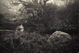
Fiery Gizzard Creek. Nikon fm2n, most likely the series e 28/2.8, fp4+ from some years back.

Fiery Gizzard Creek. Nikon fm2n, most likely the series e 28/2.8, fp4+ from some years back.
Thank you kindly! I have extensively photographed this area over the past 16+ years and will share more from the area.I love this!
This is about a quarter mile down the trail head from the parking lot. I have photographed there so much that I began really slowing my walk down to a crawl looking for new compositions. This is a fun little spot on the creek with a lot of potential.Cool, used to know a landowner there and went caving on his property as well as Catacomb and Bible Springs on the roadside. Where on the creek is this?

 Beech & Stones, alt. by atomstitcher, on Flickr
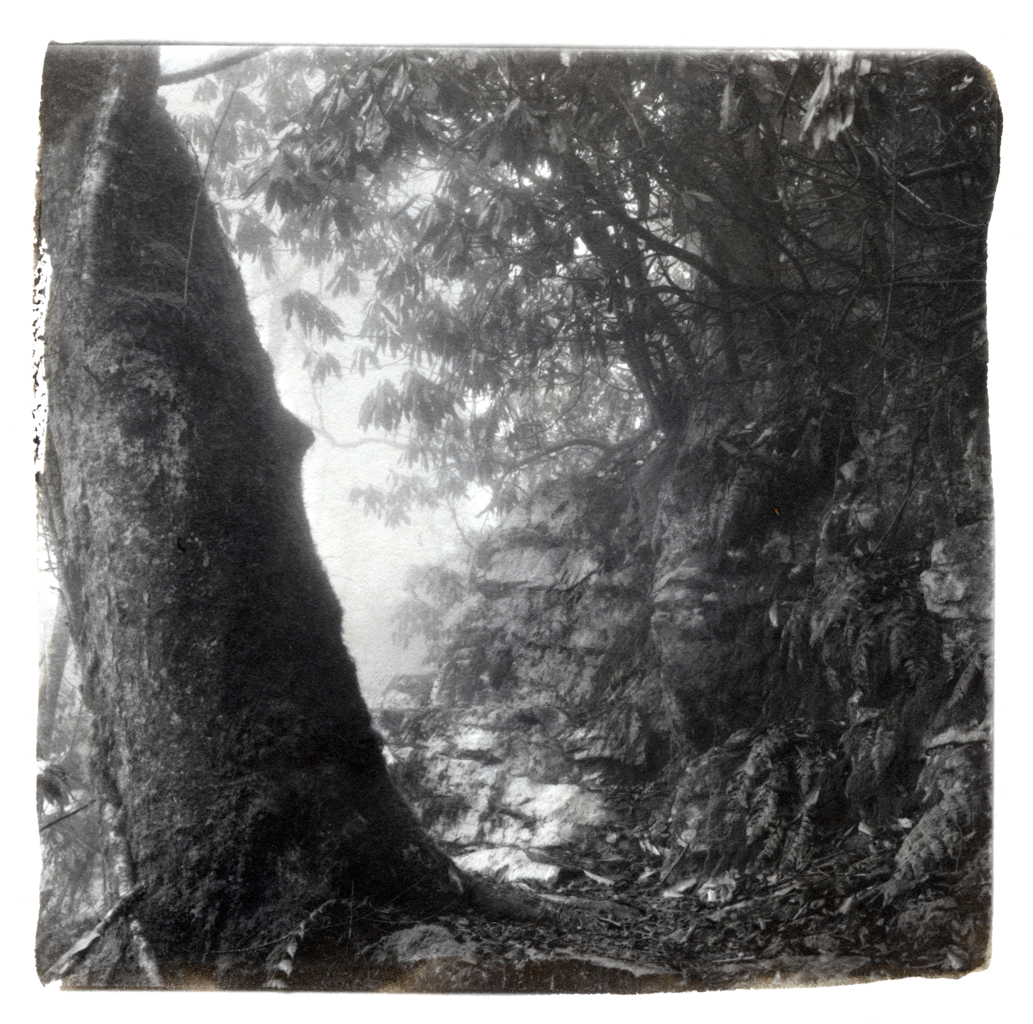
Linhof Technikardan S45, Rodenstock Grandagon-N 4.5/90, center ND filter, Kodak Portra 400.
Something on the fishy side.View attachment 328451
Nice composition, but my eyes want to peek into the dark foreground, and are frustrated by the absence of details there.Young birches in the Gentbrugse Scheldemeersen (the marches along the river Escaut) Ghent (Gentbrugge), Flanders, Belgium.
Could it be something to do with color profiles? Like, you upload an image with a specific, slightly uncommon profile, that is mis-interpreted by the forum software? How about trying to upload in sRGB, just to be on the safe/dumb side? Just a hypothesis, of course, probably wrong.A question:
Why do my pictures I post here have a red-pinkish tone?
I really like this one. The colors. How it feels like a Celtic scared space. The mill stone is a perfect touch.
Nice composition, but my eyes want to peek into the dark foreground, and are frustrated by the absence of details there.
And the image tone, is that what you were referring to above? Indeed it looks reddish on my monitor as well.
Could it be something to do with color profiles? Like, you upload an image with a specific, slightly uncommon profile, that is mis-interpreted by the forum software? How about trying to upload in sRGB, just to be on the safe/dumb side? Just a hypothesis, of course, probably wrong.
| Photrio.com contains affiliate links to products. We may receive a commission for purchases made through these links. To read our full affiliate disclosure statement please click Here. |
PHOTRIO PARTNERS EQUALLY FUNDING OUR COMMUNITY:  |