0.6 -- standard contrast?

spain

A
spain

  • 1
  • 0
  • 54
Humming Around!

D
Humming Around!

  • 5
  • 1
  • 64
Pride

A
Pride

  • 2
  • 1
  • 139
Paris

A
Paris

  • 5
  • 1
  • 215

Recent Classifieds

Forum statistics

Threads
198,424
Messages
2,774,762
Members
99,612
Latest member
Renato Donelli
Recent bookmarks
0
Joined
Jan 7, 2005
Messages
2,609
Location
Los Angeles
Format
4x5 Format
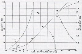
Let's not forget the Tone Reproduction Curve, which compares the original subject with the print. For me this is an important and is frequently overlooked part of the process. It's basically the objective results of the photographic process. Wonder how a certain film and paper combination works together, want to compare one film to another, or the effects of exposure and development adjustments? Most of the questions can be answered with the reproduction curve. It requires a little study to properly read the curve, but it's worth it. I wrote my four quadrant reproduction program partly for the reproduction curve to help evaluate the photographic process.

Adding to what Ron has written, the eye doesn't see tones/luminances linearly. It tends to compress the shadows. That's why the Munsel Scale has its tone at perceptually uniform spacing (also a possible topic on print Zones). Short toed films can only help to compensate for this phenomenon.

It's important to realize that the print has a limited range. Any change in one part of the curve changes another. Increase local contrast in the shadows and the highlights are reduced. Mid-tones are also effected usually by darkening somewhat. This is not a judgement on perceived quality one way or the other, just something to be aware of.

Preferred tone reproduction curve - preferred print.jpg

From The Theory of the Photographic Process, 3rd edition, "The gradient in the middletone region was always greater than 1.00 (usually 1.10-1.20) for the preferred prints of all the scenes studied. Whenever the middle tone gradient was less than 1.10, the prints were unanimously rejected as being "too flat." Whenever the density level of the prints was great enough so that the curves closely approached the 45-degree reference line, the prints were unanimously rejected because they appeared too dark." Preferred placement is around 1/3 stop below.

"This consistent failure of the preferred tone-reproduction curves to approximate the 45 degree reference line was thought to be due either to the limited maximum density (1.80) of the particular photographic papers used, or to the inability of the eye to compensate for the low illuminance on the prints, which was only about one-hundredth of the illuminance on the original sunlit scenes."
 
Last edited by a moderator:

Photo Engineer

Subscriber
Joined
Apr 19, 2005
Messages
29,018
Location
Rochester, NY
Format
Multi Format
An interesting phenomenon is observed in building a paper. One would think that designing a soft toe and/or shoulder would make the situation worse as described by both myself and Stephen, but the opposite takes place. If one builds a softer to (within limits) into a paper, the highlights become more defined not less, as if there was more separation in tones.

Well, this is exactly what happens with a paper such as Azo, which has a soft toe when compared with Kodabromide and which has a soft shoulder when compared with, well, just about everything. Azo has superior reproduction in highlights and shadows. This is also what takes place with some alternative processes which have soft toe and shoulder, or in the extreme, hard toe and shoulder.

In the design of print materials, there are multiple windows for toe, shoulder and mid scale contrasts that the user should be aware of and if they find one that suits, stick with it. It is a gem. Having designed several B&W print materials as well as color, I can point to this as a typical (and somewhat difficult to explain) area of the arcane science of tone reproduction.

PE
 
Joined
Jan 7, 2005
Messages
2,609
Location
Los Angeles
Format
4x5 Format
Michael, just to follow-up on a couple of points with long and short toed curves. According to the section in Theory of Photographic Process that I was thinking of, "...the camera exposures required to obtain maximum quality are different for the two films. The film with the short toe (solid line) provides this quality only if the camera exposure lies within the narrow range that includes the small hump. This range is so narrow that it would be difficult in practice to keep the camera exposures within it. The film with the long toe provides maximum quality over a much greater range of camera exposures. One the other-hand, if the aim is to achieve not the maximum quality, but any quality not less than 90% of the maximum quality, the conclusion regarding the relative camera-exposure latitudes of the two films is reversed. The film with the short toe then has the greater camera-exposure latitude. It should be kept in mind that the quality differences...are smaller than the quality differences that often occur in practice because of random errors in the printing exposure"

Exposure vs Quality - long and short toed curves.jpg

The graph below is something I found interesting about preferred tone reproduction for outdoor scenes and portraiture. "For the portrait subject, a higher gradient is evidently desired in the middletone and highlight regions of the reproduction, where the various skin tones usually lie. This enhancement of contrast provides the 'highlight brilliance' often preferred in portraits. It is obtained at the expense of subdued contrast in the shadow region." Does that remind you of TXP's up-swept curve?

Preferred Reproduction for portraiits.jpg
 
Last edited by a moderator:

Photo Engineer

Subscriber
Joined
Apr 19, 2005
Messages
29,018
Location
Rochester, NY
Format
Multi Format
:D Try doing all of this in color. B&W is simple! In fact, AFAIK, Mees and James never addressed this topic. Haist never planned to either. He was a B&W man to the core.

PE
 

RalphLambrecht

Subscriber
Joined
Sep 19, 2003
Messages
14,631
Location
K,Germany
Format
Medium Format
:D Try doing all of this in color. B&W is simple! In fact, AFAIK, Mees and James never addressed this topic. Haist never planned to either. He was a B&W man to the core.

PE

Yes, thinking about this for color would put a knot in my brain.B&W is complex enough.:cool:
 

RalphLambrecht

Subscriber
Joined
Sep 19, 2003
Messages
14,631
Location
K,Germany
Format
Medium Format
I have heard that "standard contrast" for negative film is 0.6, on the straight-line portion of the h&d curve. I have a couple of questions about this.

1. is this true?
2. Why 0.6 not 1?
3. Do manufacturers development data uniformly target this standard contrast value?
4. If I have papers from grade 0 to grade 5 at my disposal, how much tolerance does that give me with regards to the contrast of my negatives?

I am trying to determine if there is a development recipe that I can use with all the different films I use.

This is a perfect example of a cntrst curve for a high-quality photograph;the midtones have a high contrast to add to the illusion of sharpness and, of course, this contrast increase needs to 'come' from someehere;that's why shadows and highlights are contrast -compromised,which just adds to the brilliance of his approach;this works well in analog and digital printing.:smile:
 

Photo Engineer

Subscriber
Joined
Apr 19, 2005
Messages
29,018
Location
Rochester, NY
Format
Multi Format
Michael, do you have a reference? I have none of the paper and cannot do DR work at the present time. Sounds like they are doing what I mentioned above.

Ralph, yes, color ties us in knots. We have to work with 6 curves (not 3). We work with analytical density (the quantity of dye present) and integral density (the dye as seen by the human eye - similar to B&W). And, we have to do this in the presence of color masking and interimage effects.

PE
 

DREW WILEY

Member
Joined
Jul 14, 2011
Messages
13,870
Format
8x10 Format
Tri-X and TMY are about as similar in shadow reproduction as a poodle and a rottweiler are in behavior. When it comes to printing, one shoe size does not fit all. Gosh, about five minutes with an actual test strip will tell me more than all of this when it comes to understanding a particular film/paper/developer personality! And what is "best" is an entirely subjective evaluation, dependent upon both the intent of the photographer and the characteristics of the specific scene. But it does take some experience to judge how to "surf" the toe of a film for your own expectations, with your preferred papers, cause understanding the toe is often the distinction between the men and the boys when it come to effective printmaking. Mere hypothetical film speed can't tell you that. Color films are a whole different ballgame, cause you have to also have understand how the separate curves relate.
 

Photo Engineer

Subscriber
Joined
Apr 19, 2005
Messages
29,018
Location
Rochester, NY
Format
Multi Format
Thanks Michael. Looks like they have done more to the shoulder than to the toe, but it does look like they have moved in the direction that I described earlier. These should give more highlight and shadow detail at any contrast grade.

PE
 

DREW WILEY

Member
Joined
Jul 14, 2011
Messages
13,870
Format
8x10 Format
The new Classic paper is really a completely different animal and not just a tweak on the older MGIV. Yes, you will get conspicuously better
highlight detail; but there are a number of other important differences too, like much greater flexibilty with toners. So there's quite a bit just
the curves don't tell you.
 

Photo Engineer

Subscriber
Joined
Apr 19, 2005
Messages
29,018
Location
Rochester, NY
Format
Multi Format
Yes Drew and that was the point of my earlier posts. Sometimes you have to do "field work" with these materials.

PE
 

Photo Engineer

Subscriber
Joined
Apr 19, 2005
Messages
29,018
Location
Rochester, NY
Format
Multi Format
If the toe is softer, there is more gradual delta density per unit exposure rather than a sharp transition as would be the case with a sharp paper toe. Thus, one sees detail more easily in the soft toe material.

PE
 

Photo Engineer

Subscriber
Joined
Apr 19, 2005
Messages
29,018
Location
Rochester, NY
Format
Multi Format
With high contrast, the image goes from gray to white in a shorter delta log E on the film. So, counter to intuition, a lower gradient can give better detail.

PE
 
Joined
Sep 10, 2002
Messages
3,583
Location
Eugene, Oregon
Format
4x5 Format
With high contrast, the image goes from gray to white in a shorter delta log E on the film. So, counter to intuition, a lower gradient can give better detail.

PE

Exactly.

I think the confusion is that with less contrast you get more information. Sure, there is less separation, but there is more information. This is especially useful in the highlights, where the eye separates values better than in the shadows.

Best,

Doremus
 
Joined
Jan 7, 2005
Messages
2,609
Location
Los Angeles
Format
4x5 Format
Ilford shows the curves for MG Classic on page 2 here:

http://www.ilfordphoto.com/Webfiles/2013116121925810.pdf

I've also attached some comparative curves I came up with for the new paper (MG Classic) and the paper it replaces (MGIV). In particular the shape of the shoulder is markedly different.

The MG Classic reminds me of Oriental New Seagull G. I loved that paper. You had shadows that appeared black from a distance but would open up to wonderful detail as you moved in. The example is a side-by-side comparison of Oriental Seagull and Ilford Multigrade. Both have the same LER.

Paper Curve Max LER Range Comparison.jpg
 

Bill Burk

Subscriber
Joined
Feb 9, 2010
Messages
9,221
Format
4x5 Format
If the toe is softer, there is more gradual delta density per unit exposure rather than a sharp transition as would be the case with a sharp paper toe. Thus, one sees detail more easily in the soft toe material.

PE

Except for the hard grades of paper, seems reasonable to think of the "toe" as similar for the different grades of paper - almost as if the highlights get their own grade of paper, and it's always soft.

If that's the case, then how the highlights look would be the main appearance difference between prints as you match hard, medium and soft negatives to their appropriate soft, medium and hard papers.

Supposing you shoot high-key scenes and can control how you develop, you have these choices in how you render the highlights in your print:
Hard negative on Soft paper
Medium negative on Soft paper
Soft negative on Soft paper

Which is the best match?
 
Joined
Jan 7, 2005
Messages
2,609
Location
Los Angeles
Format
4x5 Format
I deleted my earlier, more lengthy post, but I don't agree. Ron and I are talking about different things. Obviously if the soft toe leads to a longer exposure range you can squeeze more in. But that doesn't make the tone reproduction characteristics of that part of the curve "better". It just means the paper has a slightly longer exposure range.

I don't think the long shoulder is necessarily a good thing either.

Michael, it depends on what your needs are and where the shoulder begins. With the Oriental Seagull example, the paper didn't begin to shoulder off until after 90% D-Max, which can be considered Zone 1. In this case, you're getting a paper that just doesn't block up the deeper shadows too quickly. This can also be beneficial if, like Brett Weston, you like to print the image down a bit. I remember something about portrait papers not have a straight-line section at all. A case of different requirements for different situations?
 

Bill Burk

Subscriber
Joined
Feb 9, 2010
Messages
9,221
Format
4x5 Format
Michael R 1974,

Are you saying you don't agree with PE's assertion that less contrast in the highlights (more compression) gives better highlight detail. I don't know about that, but low-contrast lenses can give higher resolution images so it might be a valid point.

I know that we take advantage of compression (lesser contrast) in the highlights, it is part of the magic that makes black and white photographs so attractive.

Stark highlights are not attractive (in all cases), softness is pleasant. But there is probably a best look.

If you agree with my point that all paper (Grades 1-3) present themselves as low contrast paper (Grade 1) to the highlights, then it may be possible to agree on how much contrast generally looks best in the highlights.

I think maybe the best might be a negative tailored to print on Grade 1 printed on Grade 1 which matches the midtones while it flattens the highlights the least.

When you print a negative tailored to Grade 3 on Grade 3, you are already beginning to compress the highlights more.

So what truly is the best treatment? I'm not saying it's the whole answer but I think it's somewhere between Grade 1 and 2, and that might be part of why 0.6 is considered normal.
 

Photo Engineer

Subscriber
Joined
Apr 19, 2005
Messages
29,018
Location
Rochester, NY
Format
Multi Format
A good series of papers in various contrasts do show differences in both toe and shoulder. Look at the new Ilford paper. It is a good example. I would also add, that we built portrait papers to have a long straight mid scale with a soft toe and shoulder to get the soft gradation we wanted in flesh tones and shadows.

PE
 

Photo Engineer

Subscriber
Joined
Apr 19, 2005
Messages
29,018
Location
Rochester, NY
Format
Multi Format
Well, you can change the characteristic curve of a print by using split grade printing, and to some extent by dodging. I've used both.

PE
 

bernard_L

Member
Joined
Feb 17, 2008
Messages
2,005
Format
Multi Format
Well, you can change the characteristic curve of a print by using split grade printing, and to some extent by dodging. I've used both.
It is so far my understanding that split grade printing is a different (more convenient, intuitive, efficient...) way to achieve the same end result as printing through filtered light. Are you saying that, e.g. 6s exposure under blue light followed by 4s exposure under green light achieves a result different from 10s with filter transmitting 60% blue and 40% green? Or, more generally, a result that could not be achieved by any type of multigrade filter? Of course, split grade combined with dodging can achieve unique results; but your statement appears to consider split grade (and dodging) on its own merit.
 

Bill Burk

Subscriber
Joined
Feb 9, 2010
Messages
9,221
Format
4x5 Format
Split grade printing does give the same effect as using a specific filter. But it goes well beyond simply "getting the same grade as" an intermediate filter.

The main exposure for each extreme filter is decided to get the same grade as an intermediate filter. And any dodge and burn done "proportionally" would be same as normal dodge and burn.

But the fun starts when you creatively alter the proportion of times as you dodge and burn, you get different contrasts in those areas.

For those familiar with split grade dodge and burn to get locally different contrasts... Isn't it very common to "burn highlights" with the highest grade filter? If so I think that supports the idea that the paper toe is fighting what a print needs, and more contrast in the highlights... is better.
 

Bill Burk

Subscriber
Joined
Feb 9, 2010
Messages
9,221
Format
4x5 Format
OK then if burning highlights is better at lower grade, then soft paper toe is desirable and PE was right all along.

Except that you sometimes like higher contrast for highlights.
 

Photo Engineer

Subscriber
Joined
Apr 19, 2005
Messages
29,018
Location
Rochester, NY
Format
Multi Format
One of the most important figures in Mees was overlooked in this "study".

His graph of usable latitude A' to B' in the figure, is right where it should be. On the straight line portion.

Just thought you might appreciate it.

PE
 

Attachments

  • Mees usable latitude.jpg
    Mees usable latitude.jpg
    114.7 KB · Views: 84
Photrio.com contains affiliate links to products. We may receive a commission for purchases made through these links.
To read our full affiliate disclosure statement please click Here.

PHOTRIO PARTNERS EQUALLY FUNDING OUR COMMUNITY:


Ilford ADOX Freestyle Photographic Stearman Press Weldon Color Lab Blue Moon Camera & Machine
Top Bottom