Aren't the "zone" differnces just the result of paper choice? CI is the same, it's the paper LER that's changed.
You can of course adjust the paper LER to fit the negative density ranges, but that's assuming that the both the negative density ranges in the examples are realistic.
All the conditions on the subject and film/processing side are identical. Shouldn't the values in both examples then be the same?
Doesn't this only leave the possibility that one of the interpretations of the exposure scenarios are in error? Remember what I said earlier, "the key is in the interpretation of the data, and a large part of that is having a good grasp of certain principles and asking the right questions." What principle is missing? I also hinted to focus on what the x-axis represents. Bill has it.
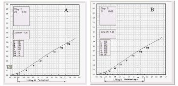
I'm guessing the left hand is the perfectly spaced theoretical or planned Zones superimposed on actual film curve, while the right hand is the result where the predictions landed. There is compression in the shadows, which could lead to disappointment if you were counting on them being where you wanted.
That is exactly the difference between the two, although I wouldn't use the term "perfectly spaced" as it implies an ideal. The film curve is produced by contacting a step tablet made up of equally space densities. This produces a graphic depiction of how the film will respond to specific exposure values. The problem comes when interpreting how the values from a scene will interact with the curve. Any optical system will change the relationship between the tones of the original scene and the exposure values of its optical camera image through the mechanism of flare. Flare compresses the apparent scene luminance range. For a one stop flare factor, an original scene with a luminance range of seven stops will become an illuminance range of six stops at the film plane. As flare affects the shadows more than the upper tones, the distribution of the exposure values in the reduced exposure is irregular compressing the lower values and having little affect on the higher values.
So, which one of the examples do you think is the best representative of the actual exposure process?
How would not factoring in the influence of flare affect the interpretation of the contrast of the negative using the method of determining the negative density range? What about the two different aim values for the negative density range? They can't possibly be both be right for the same paper grade? Can they?
Does this example tend to strengthen or diminish the validity of the negative density range method of contrast determination?
Let's consider a typical Zone III printing test. The idea is to expose the paper where Fb+b is paper black, then see where Zone III falls. In the test, the exposure range between the Zone I exposure and the Zone III exposure is two stops. According to Curve A example, Zone III under a zero flare condition will have a density of 0.43. There is virtually no flare when shooting single toned subjects. In the field under flare conditions, Zone III falls only one stop to the right of the Zone I exposure and according to Curve B will have a density of 0.29. What is the purpose of a test that doesn't reflect use?
Here's a funny little saving grace. Since the Zone System doesn't factor in flare with it's speed testing, it tends to produce film speeds 1/2 to one stop below the ISO speed rating. This will shift all the exposures to the right on the curve effectively bringing the Zone III density up to or above the density used in the test. There will almost always be accent black and the change in the lower shadow placement from the lower EI setting will not be noticed.
And why do you suppose example A represents the most prevalent approach to curve interpretation in the photographic community when the results are less than representative?
I believe a large part of the problem is caused by the tendency to isolate the film curve away from the camera image/flare curve and the paper curve. Most of the time, we aren't see the whole picture. Add the camera image quadrant and now it's possible to see how the original image changes inside the camera and how the exposure values shift as they move from the subject through the camera to the film. Add the paper curve, and it's now possible to compare how the original tonal values are represented in the final product.
I'm going to work on some examples to illustrate some of this and will hopefully have something to show tomorrow.