Why is Zone System EI often about half rated ISO/ASA?

Sparrow.jpg

A
Sparrow.jpg

  • 2
  • 0
  • 74
Orlovka river valley

A
Orlovka river valley

  • 6
  • 0
  • 132
Norfolk coast - 2

A
Norfolk coast - 2

  • 5
  • 1
  • 150
In the Vondelpark

A
In the Vondelpark

  • 4
  • 3
  • 237
Cascade

A
Cascade

  • sly
  • May 22, 2025
  • 9
  • 6
  • 206

Recent Classifieds

Forum statistics

Threads
197,848
Messages
2,765,666
Members
99,488
Latest member
colpe
Recent bookmarks
0
Joined
Jan 7, 2005
Messages
2,603
Location
Los Angeles
Format
4x5 Format
I interpret the same Zone VIII density. But I used the Contrast Index meter overlay to read CI from my hand-drawn chart where I transcribed the numbers. I see Ansel Adams didn't subtract Base plus Fog from the graphs, and when I came up with the lower CI, I had set the Contrast Index meter overlay on baseline zero. When I lift the CI meter to about 0.05 density (which is where I believe his Normal curve would zero out), I get close to 0.57 CI like you do.

I agree, Delta-X criterion justifies holding the same speed rating (so I will not include this specific 1/6 stop adjustment in my own personal EI), but most Zone System EI are taken from the 0.1 density mark, and that would definitely move for people reading Zone System tests.

The reason for working out factors of 1/6 stop is not to achieve a false sense of precision... I would round to the nearest 1/3 stop. For now, for me, that is 2/3 stop.

I just wanted to remind you that because of Deltx-X, the CI comparison wasn't apples to apples. The consistency of speeds using under Delta-X brings into question the need for testing.
 

RobC

Member
Joined
Nov 5, 2007
Messages
3,880
Location
UK
Format
Multi Format
Now can someone tell me how you are going to print your 10 stop range of subject, as Adams does on page 50 of "The negative" and on page 54, onto grade 2 or grade 3 paper when a density of 1.3 above fb+fog (Adams zone VIII) will print as pure white on Grade 2 paper.

Are we to assume that the whole concept of getting zones 0 thru 10 onto paper without burning in is a myth put about by Adams himself?

Or maybe you're just not interested in looking at the "Whole system" which includes printing which I thought was the whole point of the zone system.
 
OP
OP
Bill Burk

Bill Burk

Subscriber
Joined
Feb 9, 2010
Messages
9,159
Format
4x5 Format
I just wanted to remind you that because of Delta-X, the CI comparison wasn't apples to apples. The consistency of speeds using under Delta-X brings into question the need for testing.

Thanks, yes I keep that in mind, it's one of the reasons why I won't use that estimated 1/6 stop adjustment in my own EI calculations.

But to compare to other people's Zone System test results, it helps to know the approximate CI for Zone System Normal - because the interpretation of those results always takes 0.10 density as the speed point. And that is displaced from the ASA/ISO speed point given the same film and same developer.
 
OP
OP
Bill Burk

Bill Burk

Subscriber
Joined
Feb 9, 2010
Messages
9,159
Format
4x5 Format
Now can someone tell me how you are going to print your 10 stop range of subject, as Adams does on page 50 of "The negative" and on page 54, onto grade 2 or grade 3 paper when a density of 1.3 above fb+fog (Adams zone VIII) will print as pure white on Grade 2 paper.

Are we to assume that the whole concept of getting zones 0 thru 10 onto paper without burning in is a myth put about by Adams himself?

Or maybe you're just not interested in looking at the "Whole system" which includes printing which I thought was the whole point of the zone system.

I print a negative that has 1.18 density range on Grade 2, my density range measurement includes only the important parts of the picture.

My shot may have had a 10 stops subject luminance range, because if I measure the blackest black highlight to the clearest deep shadow on this negative, it covers a 1.61 density range.

Although the Film Base + Fog of my negative is 0.09, the darkest shadow I am interested in is at 0.27 so I can print down. Then my important highlight density, which is at 1.45, shows on the print as a very slight tone.
 
Joined
Jan 7, 2005
Messages
2,603
Location
Los Angeles
Format
4x5 Format
Thanks, yes I keep that in mind, it's one of the reasons why I won't use that estimated 1/6 stop adjustment in my own EI calculations.

But to compare to other people's Zone System test results, it helps to know the approximate CI for Zone System Normal - because the interpretation of those results always takes 0.10 density as the speed point. And that is displaced from the ASA/ISO speed point given the same film and same developer.

You can always use NDR / 2.10
 

RobC

Member
Joined
Nov 5, 2007
Messages
3,880
Location
UK
Format
Multi Format
How convenient.

AND

printing down (over printing) takes out a lot of micro contrast detail throughout the image becasue you are essentially fogging the micro highlights in the print unless you are selectively printing down only some of the highlights. There is a print time you should not normally go past. But that is your creative decision.
 
Last edited by a moderator:

David Allen

Member
Joined
Nov 6, 2008
Messages
991
Location
Berlin
Format
Med. Format RF
Just spotted this very long thread so thought that I would put my two pence worth in.

Firstly, I should qualify my comments by saying that I test for EI with my students using practical means (meaning not with a densitometer).

My experience is that, with post 1980s cameras and lenses there is a very real tendency for the tests to deliver an EI of 1/2 box speed. However, this has much to do with more accurate shutter speeds, better control of internal reflection and CRUCIALLY multi-coating of lenses that dramatically reduce flare.

When I taught on my Dad's courses, it was not uncommon for two OM1 users to deliver widely varying EIs. Recently, a student who is using a 1950s Rolleiflex had an EI of 650 for Tri-X. Nothing surprising here as the lens has a simple coating and flare pays a significant role.

printing down (over printing) takes out a lot of micro contrast detail throughout the image becasue you are essentially fogging the micro highlights in the print

This is also one of those 'urban / photographic?' myths that hang around from generation to generation. If you print a Zone III area that was exposed at Zone IV as Zone III on the print, you will have a wider range of tones and detail than the same area that is exposed at Zone III. This is simply a result of the fact that we are dealing here with Zones and not fixed mono-tonality areas of an image. This is where the ridiculous claims of Bruce Barnbaum with his "Placing Shadows on Zone IV" idea comes from. Firstly, his Zone III test methodology is plain wrong. However, what he got right is that a Zone III (or Zone IV) area exposed for Zone IV (or Zone V) will give more textural complexity when printed to Zone III (or Zone IV). It is a simple given that printing an area full of detail and a a wide range of intermediate tones will always look more dynamic than those placed 'correctly'. However, the questions are 'is this required for the image' and 'can I afford such a loss in useable EI'.

Bests,

David.
www.dsallen.de
 

RobC

Member
Joined
Nov 5, 2007
Messages
3,880
Location
UK
Format
Multi Format
Michael,

I was asking how those that develop to standard CI manage to print a 10 stop range. The one answer given so far is that the deep shadows are thrown away and the highlights need to be printed down. That seems to make a mockery of capturing the shadows in the first places and then needing to print down the highlights.

Adams shows otherwise on the pages I cited. Why did he do that? I suggested in a previous topic that people actually try and reproduce what he shows in the image on page 50 of the negative as surely that is the target of the zone system. Of course some people focus on his numbers and they won't be able to do that. Others, like me focus on being able to reproduce that and expose for the highlights in the knowledge that where my SBR is < 10 stops my shadows will be well up the curve but can be pushed back down by increasing print contrast. The beauty of this is that for the vast majority of images I can adjust shadows to taste without fear of blocking them when printing.

Using the standard CI will give you just that but increasing contrast from there is extremely difficult without blocking shadows and blowing highlights which may already require printing down becasue they are above 1.3 density above fb+fog. Depends how much contrast your printing style requires I guess.

The method I use is based on using roll film and being able to capture varying SBRs with them nearly all being easily printable. If you're using sheet film then you can apply N+ or N- per sheet to get to where you want to be.
 
Joined
Jan 7, 2005
Messages
2,603
Location
Los Angeles
Format
4x5 Format
Or maybe you're just not interested in looking at the "Whole system" which includes printing which I thought was the whole point of the zone system.

Quite the opposite for me. Very little has meaning in isolation. One of my favorite topics is tone reproduction theory. I've even written a program that has a four quadrant reproduction diagram, which was recently used to disprove one of your claims. The program not only incorporates the original subject, camera image, negative curve, and print curve, but a reproduction curve which is comparing the print to the original subject. One of my major complaints about the Zone System is that Adam's doesn't adequately link the film to the paper. He gives a negative density range of the negative test but never shows how it relates to the print.

Now can someone tell me how you are going to print your 10 stop range of subject, as Adams does on page 50 of "The negative" and on page 54, onto grade 2 or grade 3 paper when a density of 1.3 above fb+fog (Adams zone VIII) will print as pure white on Grade 2 paper.

Are we to assume that the whole concept of getting zones 0 thru 10 onto paper without burning in is a myth put about by Adams himself?

I'm not going to be able to adequately address this unless you define it better. I've tried to answer what I thought was your point three different ways on three difference occasions. We need to start from common ground.
 

RobC

Member
Joined
Nov 5, 2007
Messages
3,880
Location
UK
Format
Multi Format
Nope, I'm now very bored of the zone system explained in mathematical terms. I don't think we'll ever have any common ground. Going to the depths you goto simply isn't necessary. It's of academic interest to a few but not me. Like gaussian optics, I studied it until I understood it, realised it was of no practical use to me in my everyday photography, promptly forgot it and got on with my photography. Sensitometry is exactly the same, boring for me now, I've learnt what I need of it and moved on.
 
Joined
Jan 7, 2005
Messages
2,603
Location
Los Angeles
Format
4x5 Format
Nope, I'm now very bored of the zone system explained in mathematical terms. I don't think we'll ever have any common ground. Going to the depths you goto simply isn't necessary. It's of academic interest to a few but not me. Like gaussian optics, I studied it until I understood it, realised it was of no practical use to me in my everyday photography, promptly forgot it and got on with my photography. Sensitometry is exactly the same, boring for me now, I've learnt what I need of it and moved on.

There are two ways to interpret your 10 stops. It's either about the ten print Zones which means a normal range that includes with accent blacks and specular highlights. Or it's about considering the average range to be 7 1/3 stops which is measured at the deepest shadow in which detail is visible and diffuse white (Zone I to VIII)? Adams uses full black to white for his Zone 0 to Zone X, and then dynamic range for Zone I to Zone VIII. In those terms, is your ten stops about the full black to pure white or is it about falling within the dynamic range? I'm not asking for you to use math, just to help people understand what you mean.

If you are talking about the latter, then here is how it basically works.

Film Paper Dev Method.jpg

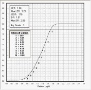
I've always suspected that Adams got his 10 print Zones from the Munsell scale. Munsell uses steps 1 to 10 spaced at perceptually equal distance apart. Here's an example of the Munsell scale on a paper curve with an LER that equals a grade 2 paper.

Paper Curve - Munsell.jpg

There's a very nice section in The Theory of the Photographic Process, Chapter 22 - The Theory of Tone Reproduction, on subjective tone reproduction and perception.

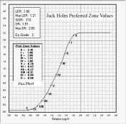
Jack Holm in his paper Speed Relations and Tone Reproduction has what he calls preferred Zone values. Here they are on the same paper curve as above.

Paper Curve - Preferred Zones.jpg

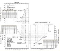
And here is the Zone System example using three quadrants.

3 Quad - Exposure example - Zone - Flare.jpg
 
Last edited by a moderator:

RobC

Member
Joined
Nov 5, 2007
Messages
3,880
Location
UK
Format
Multi Format
18% grey card is munsel middle grey (number 5) which is a perceptual colour model. But he didn't think in terms of stops and I couldn't find anything which stated what the difference between each of his greyscale steps were.

But as we know, 18% is only 2 1/2 stops less than 100% so it can only be the middle of a 5 stop range at most.
 
OP
OP
Bill Burk

Bill Burk

Subscriber
Joined
Feb 9, 2010
Messages
9,159
Format
4x5 Format
This is the picture I was talking about. I consider the original scene Normal, and would say that there might have been 10 stops of subject luminance range from the darkest point (blue jeans waist in the shadow under the animals) to the brightest point (bright white pillow in full sun).

The densities are 0.09 for that deepest pocket of shade around his waist. 0.27 for the textured shade of the tree on his right pants leg. 1.45 for the chest of the husky stuffed animal and 1.70 for the brightest part of the pillow.

Main print exposure is 32 seconds, highlights burned 1/3 stop (+8 seconds) using a sheet of black construction paper that has a hole torn in it roughly the shape of the pillows and animals. The sky is dodged one stop with another torn sheet of construction paper. So there are three exposure times in this print: 40 seconds highlight, 32 seconds main, 17 seconds sky.

But enough of numbers. What really makes this negative and print special (except of course the captured moment of my son just reaching the cusp between innocent youth and maturity), is that the print was rather difficult to hold on Grade 2 paper. Yes I still use graded paper, because Ilford still makes my life-long favorite, Galerie in Grade 2 and 3.

Now if I can print a negative on Grade 2 or 3 I am happy because I get to use my favorite paper. So this negative marks the boundary - I don't want to have to print any negative with a greater density range than this negative has.

Can you do that without sensitometry? Absolutely. Find a negative like this in your collection (make a print that's hard to do at Grade 2). Tape the negative (in a protective sleeve) to a piece of glass, window or lightbox in your darkroom. Just visually compare any new neg to this negative and there you will have a clear idea whether the new negative is too contrasty for your taste.

upperlimit.jpg
 
OP
OP
Bill Burk

Bill Burk

Subscriber
Joined
Feb 9, 2010
Messages
9,159
Format
4x5 Format
I also have a lower limit. This negative has so little density and contrast, that it was difficult to print on Grade 3.

So I keep this in mind as a negative I don't want to have anything thinner.

Two visual references, one with too little contrast and one with too much contrast.

No densitometry or sensitometry required. But if you want to do sensitometry and densitometry, this is a good way to find your personal upper and lower limits.

lowerlimit.jpg
 
OP
OP
Bill Burk

Bill Burk

Subscriber
Joined
Feb 9, 2010
Messages
9,159
Format
4x5 Format
18% grey card is munsel middle grey (number 5) which is a perceptual colour model. But he didn't think in terms of stops and I couldn't find anything which stated what the difference between each of his greyscale steps were.

But as we know, 18% is only 2 1/2 stops less than 100% so it can only be the middle of a 5 stop range at most.

5 stops is all you can get from a flat scene in full light.

But as soon as you put half of that flat scene in a 2 stop shadow... you have 7 stops subject luminance range.

The Zone System gray patches are not any perceptual or percentage spacing.

They are spaced according to the print that you get from the negatives that you got when you did your Zone System tests. That is, they relate the meter to the print... So you can pre-visualize what you will get on the print as you check different meter readings.
 

RobC

Member
Joined
Nov 5, 2007
Messages
3,880
Location
UK
Format
Multi Format
The first image is a tough one. To me it looks too contrasty. But most of that is becasue the pillow and stuffed toys are so large and dominant in the center of the image. Tone those down and then the contrast of the rest of the image doesn't look so contrasty for me. Maybe slightly too contrasty but not a lot.

So the visual aesthetic is determined not by overall contrast but rather by the tonal relationships between elements of the image. You can't put that into numbers. You have to deal with/optimise that in printing to give the right emphasis where required and tone down to reduce emphasis where required. And that all deviates from what the actual subject values were. i.e. an expressive print will usually deviate significantly from direct tonal reproduction from subject to print.
 
Last edited by a moderator:

RobC

Member
Joined
Nov 5, 2007
Messages
3,880
Location
UK
Format
Multi Format
And just for stephen becasue I know he's itching to know, my typical CI is + or - a tad from 0.5. That's not a target I aim for becasue it will vary with the shape of the "Characteristic Curve" from film to film. It just happens to be one I calculated from an old chart I made which had a fairly straight curve all the way from zone II to zone VIII.
 
Last edited by a moderator:

Sirius Glass

Subscriber
Joined
Jan 18, 2007
Messages
50,216
Location
Southern California
Format
Multi Format
My experience is that, with post 1980s cameras and lenses there is a very real tendency for the tests to deliver an EI of 1/2 box speed. However, this has much to do with more accurate shutter speeds, better control of internal reflection and CRUCIALLY multi-coating of lenses that dramatically reduce flare.

As I posted earlier. It depends on equipment accuracy and metering technique than the film and the developer. If one does Zone System test, the test will have to be repeated after every CLA or just skip the testing.
 
Joined
Jan 7, 2005
Messages
2,603
Location
Los Angeles
Format
4x5 Format
18% grey card is munsel middle grey (number 5) which is a perceptual colour model. But he didn't think in terms of stops and I couldn't find anything which stated what the difference between each of his greyscale steps were.

The Munsell steps are spaced perceptually uniform distance apart and are psychophysically based. As I've written before, I find Adams to be rather muddled on the relationship between the print Zones and scene Zones especially on how they relate with density. I think he got the idea of 10 print Zones from Munsell (or at least influenced by it) but Adams doesn't adequately explain the 10 print Zones and the normal 7 1/3 stop scene, and I think this has confused a lot of people.

I've shown how the two points on the paper curve used to measure LER do not fall on the paper Dmax or Dmin, but have space above and below each point on the curve. The two points represent approximately Zones I and VIII. Accent black and specular highlights fill out the rest of the curve. In this way, you can have 10 print Zones from a 7 1/3 stop scene luminance range and a negative developed N.

Matching will only get you close because of the subjective nature of the photograph. A lot has to do with how people perceive the contents of a photograph should look like based on how they interpret the scene and the lighting conditions in the photograph. And tastes can change. Take the preferred skin tone in today's photographs for instance and compare it to the 1920s through the 1950s. The preference over the last 40 years is definitely toward lighter skin tones. I wonder how digital's HDR will change the perception of the way a scene should look?
 
Last edited by a moderator:
OP
OP
Bill Burk

Bill Burk

Subscriber
Joined
Feb 9, 2010
Messages
9,159
Format
4x5 Format
They are spaced perceptually uniform distance apart and are psychophysically based. As I've written before, I find Adams to be rather muddled on the relationship between the print Zones and scene Zones especially on how they relate with density.

No, not percents, not perceptual...

You'll appreciate and understand it this way... The different Print Zones are the output of the tone reproduction diagram.

The different patches are just what you get for the print given a one-stop change of exposure to the film between patches, as calibrated for Normal.

There are a surprising number of patches that "might as well be black". And between middle gray to white there are precious few stops.

The strange sequence is "the limitation of the medium" organized so you can see what you are going to be up against when you go to print the scene you are looking at.
 

RobC

Member
Joined
Nov 5, 2007
Messages
3,880
Location
UK
Format
Multi Format
There are a surprising number of patches that "might as well be black".

My old copy of the Negative does show the zone 0,1 and 2 as almost a single tone. But when it was new all those years ago, they were clearly separated. The book tones have faded. If you have it nailed in a properly produced test of printing the patches with a fairly straight film curve then they will be separated. But you may have an upswept curve and shied away from reducing EI becasue no one wants to use 160 with a 400 speed film. Result is all your deep shadows are blocked for want of another 1/3 to 1/2 stop of exposure.

I found I usually get a speed of 160. I don't know why. It could be my meter, it could be my lens, it could be my shutter(but I don't think so) or it could be my methodogy highlights what is really required to get good shadow separation. I don't really care why becasue it gives good results.

Of course if you go with standard dev and CI the shadow separation will be better as it will be in highlights. Only problem is you will struggle to get it all on paper. I rekon you're trying to fit a square peg in a round hole but that's really a subjective opnion becasue if you are happy with the contrast in your prints then no one can argue with that. Well they might becasue its a web forum but if it pleases you then its good. And it depends on the actual subject contrast range. Ah the old standard range. Again, its not so clever for landscapes with bright skies and deep shadows. Something has to give and probably requires some manipulation or long waits until the light is right.

When I look at B+W prints posted on forums I often think "that is so flat I don't believe they've posted it" or "That is so hard I don't believe they've posted it". I don't normally mention it for several reasons, firstly it may just be a bad or uncorrected scan, secondly that may be their idea of what is correct for the subject and I really can't argue with that and thirdly becasue my monitor is calibrated to fairly low contrast and most modern monitors are calibrated to much higher contrast so what I see in the way of contrast is rarely the same as what the poster sees.
And the contrasts in a print are really what make a really good print of a good subject.

And on that note I thought that people should consider that tone reproduction of luminance directly in B+W ignores colour contrast in the subject which may be significant but with same or close luminance. In B+W that likely looks very dull and lacking in contrast so there should never be an assumption that direct tone reproduction is desireable unless the print is really about direct tone reproduction (probably used only for illustrating the point). At least not if you want make an expressive print. This is what taking filters are for after all, to change the tonal relationships.
 
Last edited by a moderator:

Photo Engineer

Subscriber
Joined
Apr 19, 2005
Messages
29,018
Location
Rochester, NY
Format
Multi Format
Adams knew that overexposure of negatives increased the average number of acceptable prints!

Mees published it in his book with a graph showing this. So did Haist. It is in his book. And, before he became ill, he was tracing Adams route through the Grand Tetons reproducing many of the Adams shots on modern film, both B&W and color.

Adams could not afford to miss a shot.

So, he biased the zone system to call for about 1/2 to 1/3 stop overexposure in order to increase the number of usable negatives when he was out in the middle of nowhere and could not go back easily to re-create a scene. This was to help you all out, not create trillions of disturbed electrons discussing why and wherefore! :wink:

Simple as that!

PE
 

Sirius Glass

Subscriber
Joined
Jan 18, 2007
Messages
50,216
Location
Southern California
Format
Multi Format
Adams knew that overexposure of negatives increased the average number of acceptable prints!

Mees published it in his book with a graph showing this. So did Haist. It is in his book. And, before he became ill, he was tracing Adams route through the Grand Tetons reproducing many of the Adams shots on modern film, both B&W and color.

Adams could not afford to miss a shot.

So, he biased the zone system to call for about 1/2 to 1/3 stop overexposure in order to increase the number of usable negatives when he was out in the middle of nowhere and could not go back easily to re-create a scene. This was to help you all out, not create trillions of disturbed electrons discussing why and wherefore! :wink:

Simple as that!

PE

Now that is the first clear reason for down rating the ISO without getting into endless testing.
 

DREW WILEY

Member
Joined
Jul 14, 2011
Messages
13,787
Format
8x10 Format
Even "back in the day" there was a world of difference between popular films like Super-XX. which could in fact cleanly resolve shadows clear
down into Zone 1 or even 0, and something like Plus-X, which would struggle below Zone 3, but separate highlight beautifully. Trying to find
a one-shoe-fits-all exposure model for all such variables in fairly ridiculous. Teaching the basics is one thing; fine-tuning it for real-world
circumstances, another. How Minor White managed to make a religion out the Zone System is something I'll never figure out.
 
Photrio.com contains affiliate links to products. We may receive a commission for purchases made through these links.
To read our full affiliate disclosure statement please click Here.

PHOTRIO PARTNERS EQUALLY FUNDING OUR COMMUNITY:


Ilford ADOX Freestyle Photographic Stearman Press Weldon Color Lab Blue Moon Camera & Machine
Top Bottom