Trying Zerochrome-SbQ (PVA-SbQ)

Brentwood Kebab!

A
Brentwood Kebab!

  • 0
  • 0
  • 26
Summer Lady

A
Summer Lady

  • 0
  • 0
  • 31
DINO Acting Up !

A
DINO Acting Up !

  • 0
  • 0
  • 23
What Have They Seen?

A
What Have They Seen?

  • 0
  • 0
  • 32
Lady With Attitude !

A
Lady With Attitude !

  • 0
  • 0
  • 34

Recent Classifieds

Forum statistics

Threads
198,758
Messages
2,780,506
Members
99,700
Latest member
Harryyang
Recent bookmarks
0
OP
OP

AndrewBurns

Member
Joined
Jul 12, 2019
Messages
221
Location
Auckland, New Zealand
Format
Multi Format
Nope these were exposed with my LCD screen contact printing setup, so true continuous tone and pretty well collimated light. You should probably ignore the aluminium plate I posted before because as I mentioned I used totally the wrong exposure times by accident (I used the inverse exposure times I was using when exposing my 6 test strips, rather than exposing each layer for the correct time during the stacking process).

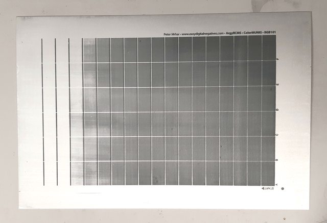
That said, I did another test print with the 'correct' exposure times and the test pattern still came out far too dark, but this is probably because I really need to spend more time fine-tuning my exposure times for each layer so they get the correct amount of overlap rather than just trying to go straight to a final print.

Here's my second attempt at this print on aluminium. This time I put down a layer of liquitex matte acrylic varnish diluted 1+1 with water before coating with emulsion and that made a huge difference to how well the PVA adhered.


Previously I had to lay down very wet sloppy coats and if I tried to brush more than once the previous layers would start to tear off the aluminium, but using the varnish to improve adhesion gave me tons of time to even out the coats. I didn't do as good a job making even coats for the lighter layers which resulted in some pretty visible non-uniformity. You can also see some registration error here too, but I think that's easily solved.

What I am happy about here is how clean I managed to get the print to develop. Kees has mentioned a technique called 'spray development' on the Zerochrome page which amounts to just spraying water onto the print with a spray bottle during development. I've noticed that I keep having situations where the PVA melts but then stays on the surface even during violent agitaton, and I've had to use a soft brush to get it off, which always seems to leave some stain and risks damaging the image. This time I tried the spray development idea and it worked brilliantly. The spray bottle I was using seemed just perfect at jetting enough water onto the surface with enough force to push off the unexposed PVA without doing any damage to the exposed areas, I'll definitely try this method again.

I'm quite hopeful that with properly hardened gelatin sized paper and the spray developing technique I should be able to get good prints with minimal stain, even more-so with aluminium sheets which naturally resist staining. Now I need to go back and be a lot more methodical in working out the relative exposure times of my different layers so that they combine to make a tonal range much closer to linear than what I'm currently getting...
 
OP
OP

AndrewBurns

Member
Joined
Jul 12, 2019
Messages
221
Location
Auckland, New Zealand
Format
Multi Format
I just bumped my head myself on how well "pretty well" really is in practice...

Interesting that in your carbon with a halftone screen you see an influence from exposure time. Conceptually, the cone of light coming through the screen doesn't get larger with time, and so there's no reason for the printed dot to get larger in this respect. I assume the gain from exposure time comes from a halation/irradiation type effect where light diffuses out sideways once it enters the light sensitive layer. I've seen this in my PVA-SbQ prints too, when following the layer stacking system the lighter layers are massively over-exposed and fine details like text and thin lines can end up several times thicker than they should be. I think in my case the effect is even more pronounced because the layers that get the most exposure also have the least pigment load, which means there's less opaque material preventing the light from spreading out sideways. If that's true then again I'd imagine that effect could be reduced by using a thinner tissue with higher pigment load (which you do anyway for other reasons).
 

koraks

Moderator
Moderator
Joined
Nov 29, 2018
Messages
22,730
Location
Europe
Format
Multi Format
I assume the gain from exposure time comes from a halation/irradiation type effect where light diffuses out sideways once it enters the light sensitive layer.

That's my thinking, too. Now, what I haven't tested is whether you get the same kind of effect if you have a shorter exposure time but a stronger light source. I assume it'll work out the same. So I think time isn't really the factor, it's basically the degree of (over)exposure.

fine details like text and thin lines can end up several times thicker than they should be
Yeah, and in that case, you can even visually tell that the structures are bigger than they should be. In my case, visual inspection of the halftone dots showed no anomalies, but the average density gain was still pretty massive. Which goes to show how much dot gain can be 'hiding in plain sight', so to speak.
 
OP
OP

AndrewBurns

Member
Joined
Jul 12, 2019
Messages
221
Location
Auckland, New Zealand
Format
Multi Format
Made another test print on aluminium sheet in an attempt to dial in my exposure. The per-layer exposure values for this test were less than half what I made my previous test print with and the exposure still isn't right, so yeah the last test I did was definitely very over-exposed on every layer.

Here's a plain photo of the 6 different layers, each with 21-step scale exposed at the correct time for that layer. They look very light in this photo, but they get significantly darker when stacked on top of each other.


Here's a version I edited to make the scales stand out more to make them easier to read. I've added red boxes around the dynamic range of each layer.


Ideally, the dynamic range of each layer would slightly overlap with the layers before and after it, such that when they're all stacked on top of each other there's a smooth transition through the whole range. Clearly that isn't yet the case here, but it's not terrible which is nice to see.

Lots of interesting stuff going on here.
  • The 1.2 second exposure for the darkest layer looks about right, the darkest and second darkest patches are slightly different and it shows a surprising amount of tonal range (8 steps out of 21)
  • The next layer, at 2 seconds, shows no overlap with the first layer meaning it needed less exposure. The dynamic range has also dropped down to 4 steps.
  • Layers 2,3 and 4 show a fairly linear shift in the tonal range but that flattens out massively for layer 5
  • Layers 5 and 6 are the same, there must be some non-linearity here (I think the density of the LCD screen is non-linear towards the darker tones)
  • You can clearly see the thickness of the lines and text increasing with exposure, this is the halation/irradiation effect we were talking about before. It might even be worse when printing on metal sheet which could be expected to reflect a fair bit of light back up into the emulsion.
In this case each layer was 0.58 times the previous one as per Calvin's PMF formula but clearly my PVA-SbQ doesn't really work the same way. I think I'm going to keep my darkest layer at 1.2 seconds as that looks right, but move my lightest layer to the same exposure time as my second layer in this test (10 seconds). This works out to each layer being 0.65 times the previous one. This will have the effect of pushing the 'red boxes' of all of the layers except the first one up the scale, which should make them all slightly overlap each other.
 
OP
OP

AndrewBurns

Member
Joined
Jul 12, 2019
Messages
221
Location
Auckland, New Zealand
Format
Multi Format
Best result so far, but still some work to do.

6 layers of PVA-SbQ tinted with lampblack on gelatin sized and hardened Hahnemuhle platinum rag (still wet straight out of the bath):


I think I need to reduce my exposure of the lighter layers and maybe add another dark layer because the scale is currently too dark overall but the dmax isn't as dark as I would want it either.

I also had to liberally use 'spray development' to clear the paper as much as I did and there's still a bit of staining that didn't want to shift. A clear coat does seem to help with the staining so I might try that next, I'm also curious about putting down a white pigmented base coat, which would hopefully serve the same role but also prevent what I think the clear coat does in terms of reducing dynamic range.
 
OP
OP

AndrewBurns

Member
Joined
Jul 12, 2019
Messages
221
Location
Auckland, New Zealand
Format
Multi Format
Out of interest, here's the measured vs. target density for the above test print. Definitely over-exposed for most of the tonal range which I'll fix, but also I think if I had to calibrate and use it as-is I'd get decent results (it's better than the cyanotype curve I've been using for ages).


Also the measured L* value for the densest patch is about 43, so nowhere near as dark as I'd like. Weirdly this same stack of layers gave me an L* of about 30 for the darkest layer during earlier testing but I think that my brushing technique is different now and it's resulting in thinner (and lighter) layers.

I've noticed that when brushing on the darker layers after the earlier ones have been exposed there's a very clear latent image on the page which I believe is because the hardened layer swells slightly resulting in a raised surface (you can see a slight relief before developing). This raised and hardened surface means that as you brush on later coats the layer of emulsion over the top of previously exposed areas is thinner than it would otherwise be because the brush drags more emulsion off the surface of the raised areas vs. the lower unexposed areas. So I guess the takeaway here is that spectro measurements of the emulsion brushed onto paper won't necessarily match what you get when making a real image and brush technique makes a big difference.
 
Photrio.com contains affiliate links to products. We may receive a commission for purchases made through these links.
To read our full affiliate disclosure statement please click Here.

PHOTRIO PARTNERS EQUALLY FUNDING OUR COMMUNITY:


Ilford ADOX Freestyle Photographic Stearman Press Weldon Color Lab Blue Moon Camera & Machine
Top Bottom