The Price of 8x10 Color Film Out of Control

Mansion

A
Mansion

  • 0
  • 0
  • 16
Lake

A
Lake

  • 2
  • 0
  • 16
One cloud, four windmills

D
One cloud, four windmills

  • 1
  • 0
  • 14
Priorities #2

D
Priorities #2

  • 0
  • 0
  • 14
Priorities

D
Priorities

  • 0
  • 0
  • 13

Forum statistics

Threads
199,015
Messages
2,784,655
Members
99,772
Latest member
samiams
Recent bookmarks
0

Adrian Bacon

Subscriber
Joined
Oct 18, 2016
Messages
2,086
Location
Petaluma, CA.
Format
Multi Format
With my medium format I bracket my shots +1 and -1. It's cheap insurance. I'm not going to do that with 4x5. My Schneider 150mm lens is 1/3 stop fast to 1/60. So I'm going to have to adjust especially with chromes. I think I bit off more than I can chew having film loaded in 35mm, 6x7 and now 4x5 cameras.

with color negative (or just negative film in general), it’s not necessarily a bad thing to err on the side of over exposure, as long as you don’t really over do it. The biggest issue I see with most negative film that gets sent to me for processing is that it’s typically under exposed. Many shooters are so used to shooting digital and biasing exposure to not clip the highlights that they do the same thing when shooting film without even realizing it and then wonder why it’s doesn’t look that good. Meter for the shadows and don’t be afraid to give it more exposure. It’s not going to blow out the highlights and whites unless you really overdo it.

when I’m shooting a portrait session in my studio with strobes, if it’s shot digitally, I meter the key light.and set camera exposure based off that, if I’m shooting the exact same thing on film, I meter the fill light and set exposure based on that. Modern digital typically has at least several stops of under exposure before noise becomes a concern (and still quite a bit of exposure below that, depending on how much chroma noise you’re willing to tolerate/clean up), so you can afford to meter so nothing is clipping (except light sources). Negative film has so much over exposure latitude that you can typically afford to meter so that your important shadows have a pretty healthy amount of exposure and let the highlights fall where they will. Unless you used an emulsion that is particularly low on DR, it’s typically not a problem.

personally I’d rather have a denser negative than one that has big sections going to film base plus fog, but that’s just me.
 

138S

Member
Joined
Dec 4, 2019
Messages
1,776
Location
Pyrenees
Format
Large Format
138s - I prefer to modulate color via hue relationships, neutrals played against purer hues.

Drew, this is Velvia, totally neutral grays and pure hues.

What Velvia has extraordinary it's a dedicated spectral response for landscape, in the same way Portra has one unsurpased for skin tones which it's even remarked in the film box.

Additionally In Velvia 50 yellows are shifted to warmer hues, but in hybrid this can be also be easily worked from Velvia 100 with a 3D LUT editor.

Some people knows how to make Velvia shine and some not...
 
Last edited:

138S

Member
Joined
Dec 4, 2019
Messages
1,776
Location
Pyrenees
Format
Large Format
With my medium format I bracket my shots +1 and -1. It's cheap insurance.

Instead with 4x5 you tend to shot two times the same scene with exactly same settings, to have a backup, or at least it's what many masters (Sexton, BW) tend to do. So metering accurately it's crucial.

I would recommend you check the scene with spot meter, to have confidence use a 35mm roll, spot meter key spots in reference scenes and bracket, from that you will know how blue sky, clouds, vegetation, water, rocks, snow... is depicted at different ver-under exposure levels, from -3 to +3.

With that job done then when you spot meter an scene, say a blue sky it's at +2 you will know exactly how it will be. With the view camera simply you have to spot meter accurately, other recipes may work sometimes, spot metering individual areas allows you to predict exactly what you'll get. With CN you overxpose +1 if a doubt, with velvia you know... you have to nail it.

Also spot metering will tell you what exact Graded ND you may require for challenging scenes. Anyway there is no problem is a t the beginning you make some LF brackquetings...
 

Lachlan Young

Member
Joined
Dec 2, 2005
Messages
4,945
Location
Glasgow
Format
Multi Format
See Velvia 50 blowing miles away (for landscape) DSLRs, IQ3, Ektar 160Pro, Portra and the rest on earth, it's not the Iowa, it's Velvia 50 blowing

I think you'll find that if you move away from the limited reading you have done and gain functional experience, you'll discover that colour neg has very considerable benefits in terms of sharpness, colour rendering/ correction and latitude. Saturation can be manipulated at various process/ print stages too. Velvia 50 was quite clearly intended to take on Kodachrome 25 - to match it in terms of sharpness and granularity but with higher saturation (the saturated colours you think you remember), more speed and easier/ faster processing - all of which were seen as limitations of KM25. For example, compared to both Kodachrome and Velvia, the Portra films have a more even overall sharpness performance, a far lower granularity and broader latitude & thus can potentially transmit more information. Since the early 1950's, the scientific literature has consistently criticised high contrast resolution as a poor metric for the understanding of film imaging performance.

I concede today with hybrid workflow some may prefer (frozen) Sensia and later working the saturation digitally, it's the case of Treasured Lands' author.

It was Astia. A major difference. And for the most part that sort of work is Photography-as-Illustration, not Photography-as-Art. It's pretty clear (as usual) that you're guessing wildly about the what and why of saturation control & how it can be approached. You'd be astonished at what can be achieved by purely analogue means. But that would mean killing your sacred cows and actually doing some useful learning.

Your statement "Velvia is seen as the stuff a particular kind of clichéd landscape" is absolutely arbitrary. I personally processed and process quite a lot of stuff of some artists that has been exhibitited or are to be exhibited internationally in the following months, and I can tell you that your statements are totally arbitrary and nosense.

As I've stated several times: Velvia can be used well & creatively, however it is perceived as a cliche of unoriginal landscape photography, laden with ND grad filters. The examples you linked do nothing to dispell the idea that your knowledge of vast parts of the last half century of fine art photography - let alone contemporary analogue photographic art practices - is severely lacking.

difficult thing is to expose well Velvia in challenging situations

Not if you can halfway competently use a meter & accept that you have a limited number of stops of latitude to work with. The means to solve this (fill lighting, filters) have to be traded off against potential impact on the tonal feel of the imagery. The IRE scale on the Pentax spot meters have some advantages in terms of quickly reading the useable contrast range and placing an exposure.

When someone puts jam and jelly atop sugar cubes, and routinely serves up bowlfuls of that, pretty soon nobody can taste anything.

That's about the sum of it - but we live in a world where people think Thomas Kinkade and Peter Lik produce(d) good art...
 

DREW WILEY

Member
Joined
Jul 14, 2011
Messages
13,991
Format
8x10 Format
The first time I accidentally walked into a Kinkade gallery I burst out laughing (not deliberately - couldn't help it). And when Iater I accidentally walked in to Lik gallery I literally felt sick to my stomach, and walked straight back out. Seems like he dosed kindergartners with LSD and then handed them cans of fluorescent spray paint. Kitchy, kitchy, kitchy.
 

138S

Member
Joined
Dec 4, 2019
Messages
1,776
Location
Pyrenees
Format
Large Format
It was Astia. A major difference.
Yes

https://www.largeformatphotography....th-LF-camera&p=1489650&viewfull=1#post1489650

-----------
For the rest, your understanding about what is Velvia or Portra is pretty flawed.

Portra is a portrait film, specially designed to shine in portraiture, velvia is sharper, designed to shine in landscape.

Both films can be used for other things.

Your diatribe aganist Velvia is a nosense, I guess you don't undestand what Velvia does.
 

DREW WILEY

Member
Joined
Jul 14, 2011
Messages
13,991
Format
8x10 Format
Just try making duplicate chromes on Velvia and you'll discover just how far off its is from hue neutrality. CDUII was basically tungsten-balanced Astia. Later I used Astia 100F itself for contact dupes. Even third generation dupes were spot on, hue-wise. That's a real litmus test. Of course, masking was also involved. I've even made a number of Portra internegs from those old master dupes. Velvia originals are the hardest to work with, not just from a contrast standpoint, but due to dye idiosyncrasies. It's can be a wonderful film for certain circumstances, but I certainly wouldn't term it a versatile film. What does ring true in my mind is the old adage that most outdoor photographers confuse color with noise.
 

Lachlan Young

Member
Joined
Dec 2, 2005
Messages
4,945
Location
Glasgow
Format
Multi Format
For the rest, your understanding about what is Velvia or Portra is pretty flawed.

Portra is a portrait film, specially designed to shine in portraiture, velvia is sharper, designed to shine in landscape.

Well, perhaps you'd like to tell us which film it is whose data sheet explicitly states it is suitable for "nature, travel and outdoor photography" amongst other roles?
 

DREW WILEY

Member
Joined
Jul 14, 2011
Messages
13,991
Format
8x10 Format
Colors in nature are quite complex. There is no silver bullet film, so it depends on your priority. Old style Ektachrome 64 film would pick up certain subtle sage hues that no current color film will, but did a poor job with saturated "spring"greens due to red contamination of that particular dye. Velvia can differentiate very subtle differences between emerald greens and more neutral greens better than any other film, but has trouble with muted greens. Old pre-E6 Agfachrome could reproduce certain fluorescent lichen and algae colors that no current film can, but had a terrible time with greens in general. Ektar can recored the true turquoise of tropical waters but struggles with saturated blue or violet due to a bit of cyan crossover if you aren't careful. But inkjet struggles with all kinds of hues, so everything is limited by your output method anyway, and just how skilled you are at your chosen medium. I learned how to make the most our of Cibachrome even though it was a highly idiosyncratic printing medium. Now I've shifted to RA4 papers which are much easier to control but have their own learning curve in terms of the inherent biases of color neg films themselves. Dye transfer printing allows the most accurate control, but certainly isn't the sharpest kind of image, and is highly labor and cost intensive. What amazes me is how any competent watercolorist can mix subtle hues in mere minutes or even seconds that are impossible for any kind of photographic medium to reproduce accurately. The secret is to eloquently work within those limitations and not pretend otherwise. Anyone who says they can "do anything in Photoshop" probably can't do anything well. Restraint is an asset.
 

Lachlan Young

Member
Joined
Dec 2, 2005
Messages
4,945
Location
Glasgow
Format
Multi Format
Ektar can recored the true turquoise of tropical waters but struggles with saturated blue or violet due to a bit of cyan crossover if you aren't careful.

I've found this to be almost entirely an exposure issue - if Ektar is overexposed, you get hit by the cyan crossover - it really seems to prefer careful keying to the highlights.

But inkjet struggles with all kinds of hues
The latest generation print heads on the big professional Canon printers can do startlingly better than some older generation machines, especially on tricky tone values and certain saturated colours - particularly on matte/ rag papers, but as ever, it's a case of working intelligently to the medium - and allowing each medium to bring its own particular aesthetic to the table is important. 'Both/ And' is better than 'Either/ Or'.
 

138S

Member
Joined
Dec 4, 2019
Messages
1,776
Location
Pyrenees
Format
Large Format
Well, perhaps you'd like to tell us which film it is whose data sheet explicitly states it is suitable for "nature, travel and outdoor photography" amongst other roles?

Ok, if we need to go to the basics... let's go.

Portra is suitable for "nature, travel and outdoor photography" if you like its rendering for that, but it's a portraiture specialized film, Portra is for "portrait", and even this is remarked on the Box:

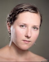
portra.jpg


Its Spectral sensitivity is dedicated to obtain this:

Ania.jpg


In the current Kodak pro segmentation:

Portra: optimized fo portraiture, general usage able, including some landscapes if wanting a creammy depiction.

Ektar: Optimized for general usage, portraiture and landscape able.

Just check the spectral response curves of Ektar and Portra and try to understand what they do.


__________

Regarding Velvia... Fuji slides also had 3 segments:

Sensia (defunct): Portraits

Provia: General usage

Velvia (50, 100, 100F): Landscape

Also check spectral response curves, you may understand how they are optimized for a certain usage.
 

DREW WILEY

Member
Joined
Jul 14, 2011
Messages
13,991
Format
8x10 Format
You're mixing up apples and oranges. Fuji offered three categories or levels of contrast/saturation CHROME film: Astia products, which had the most neutrality and lowest contrast, the Provia line, mid contrast and saturation, and Velvia films with the highest level of contrast and saturation. No sense discussing amateur versions here, but nearly all CN films have traditionally been artificially warmed or muddied for sake of skintones with a degree of curve crossover. The current Kodak Ektar is an exception. How one uses any of these films is up to them. If someone wanted a particular color neg look in landscape work, that's what they did. If they wanted saturated chrome portraiture, they did that. Yes, there was targeted marketing, but lots of people broke those rules and always will.
 

DREW WILEY

Member
Joined
Jul 14, 2011
Messages
13,991
Format
8x10 Format
Lachlan - Ektar needs color temp balancing to avoid cyan crossover in the shadows too. I always have a pinkish skylight filter on hand for a bit of hue correction, an 81A or KR1.5 for overcast skies, and a stronger KR3 or 81C for deep blue shade under open skies. Otherwise you get cyan issues across the board contaminating hues and almost impossible to post-correct, and not just where it's obvious like in an open sky. But yes, I strictly adhere to box speed with Ektar.
 
Last edited:

138S

Member
Joined
Dec 4, 2019
Messages
1,776
Location
Pyrenees
Format
Large Format
Astia products, which had the most neutrality and lowest contrast, the Provia line, mid contrast and saturation,

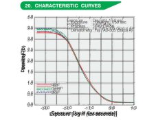
Drew, Astia an Provia had exactly the same contrast, see curves of both superimposed, exactly the same contrast :

SP32-20200308-174240.jpg


Saturation and contrast are only half of the history in a portraiture film, and both can be easily corrected. Most critical thing is Spectral Response.

Astia, IIRC comes from AST: pro film designed for Accurate Skin Tone(AST).

Spectral response for portraiture has to separate well skin tones, rather confusing them, like also Portra does.


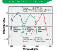
See where the important Astia vs Provia difference is, spectral sensitivity

astia.jpg


The dyes were also a bit different to balance the color output and neutrality:


dyes.jpg

But for Hybrid the key difference is spectral sensitivity, because the effect of the dyes are easily corrected, nuances of spectral sensitivity may not be possible to correct, those colors that are confused in that step won't be saparated later.
 
Last edited:

Lachlan Young

Member
Joined
Dec 2, 2005
Messages
4,945
Location
Glasgow
Format
Multi Format
Lachlan - Ektar needs color temp balancing to avoid cyan crossover in the shadows too. I always have a pinkish skylight filter on hand for a bit of hue correction, an 81A or KR1.5 for overcast skies, and a stronger KR3 or 81C for deep blue shade under open skies. Otherwise you get cyan issues across the board contaminating hues and almost impossible to post-correct, and not just where it's obvious like in an open sky. But yes, I strictly adhere to box speed with Ektar.

Oh, it'll quite happily do that too - and yes, a few 81 series filters are about right for correcting it. It's also reassuring that I am able to reproduce (and correct) the exact same flaws in Ektar in Photoshop as you are seeing in the darkroom, which suggests that my inversion model is doing a pretty accurate job in that aspect at least.

Regarding what you said about CN film 'muddying' values, that's rather inaccurate - CN is always potentially much more accurate than positive films, but some films (the VC Portras among others) could be a bit muddy (to my eyes) under certain lighting/ exposure conditions. The current Portras seem to balance the rendering of NC with a little more saturation depth (not un-naturally so) and in the case of Portra 400, a little more warmth and saturation - though not dramatic in quantity.
 

DREW WILEY

Member
Joined
Jul 14, 2011
Messages
13,991
Format
8x10 Format
Portras are cleaner than older Vericolor films, but still have a very hard time cleanly differentiating closely related warm hues like yellows and oranges, and tends to lump them toward skintones. Likewise, greens still tend to be a bit "poison" or cyan inflected. Most people would just see the notable improvement over olden generation products, but the class of issues is analogous. 160VC was pretty close to the current Portra 400 except for speed. I can't take the time to explain here how I critically analyze these things or the special equipment involved. Everything bottlenecks at the printing step anyway, so it's the sum workflow that has to be factored. But some issues are far easier to correct right at the time of the shot, including cyan contamination with Ektar.
 

DREW WILEY

Member
Joined
Jul 14, 2011
Messages
13,991
Format
8x10 Format
138s - I don't have time to argue with you today. It's just obvious you don't have a lot of real-world experience with certain films under discussion. Hopefully you'll find a few rolls of frozen Astia somewhere, and be lucky enough that they're still good, to get a preview of the Astia signature before you thaw your expensive box of CDU III sheets. The latter is of course tungsten-balanced, but otherwise quite similar.
 

138S

Member
Joined
Dec 4, 2019
Messages
1,776
Location
Pyrenees
Format
Large Format
138s - I don't have time to argue with you today. It's just obvious you don't have a lot of real-world experience with certain films under discussion. Hopefully you'll find a few rolls of frozen Astia somewhere, and be lucky enough that they're still good, to get a preview of the Astia signature before you thaw your expensive box of CDU III sheets. The latter is of course tungsten-balanced, but otherwise quite similar.

Graphs in Fuji datasheets don't lie, Astia and Provia, exactly same contrast.

CDU ii is way lower contrast, curve has exactly 45°, D vs H units, to deliver one to one transference just nailing exposure. See datasheet
 

Lachlan Young

Member
Joined
Dec 2, 2005
Messages
4,945
Location
Glasgow
Format
Multi Format
Drew, Astia an Provia had exactly the same contrast, see curves of both superimposed, exactly the same contrast :

Right page, wrong graphs.

What you need is the RMSG & to a lesser extent the MTF.

If you think about it at its most basic level, what is happening is that essentially, much as pushing C-41 film will increase grain and saturation, the same effect happens in E-6 with the silver and couplers - it is a vastly complex field, but this is simplifying it to make it easier to understand. More development = more grain, & more saturation. What the photo engineers seem to have done was to build the emulsions such that one product would deliver more saturation (and grain) and one less - but both would have closely matching characteristic curves. The consequence of lower granularity is that more information can potentially be held - and indeed, below the point that their curves meet at about 45% response at 45 cyc/mm, Astia maintains higher sharpness too (better for 35mm). Provia is sharper on large edges - better for LF (and those edge effects can contribute to noise/ grain as as well). If we then look at Velvia 50, the consequences of the choices made regarding saturation, desired MTF response and granularity, it is much clearer that 50 was likely the speed limit in 1989 for how fast it could go & still maintain as low an RMSG. A case in point is E100G and E100VS where the RMSG is 8 and 11 respectively, most likely because of the consequences of increased saturation. Velvia 100 and 100F show us further changes in approach where it became possible to maintain Provia's sharpness in large objects, while keeping Astia's better response at higher frequencies. And all of this without incurring a granularity penalty for raising the speed to 100. It's thus possible to see that the definition of a film as 'portrait' or 'landscape' is largely comprised of attempts to explain in simplistic terms what the saturation level differences in films (that are otherwise quite close matches in contrast etc) might look like. Same with the descriptions used for the 3 different sorts of RA4 paper that used to be made. Just because something is recommended for portraits doesn't mean you shouldn't use it for other purposes - there is extensive correspondence between Ansel Adams and Paul Strand to the effect that Kodak Portrait Pan (not a million miles off TXP in tone curve) is 'perfect for our purposes'.
 
Last edited:

138S

Member
Joined
Dec 4, 2019
Messages
1,776
Location
Pyrenees
Format
Large Format
Right page, wrong graphs.
What you need is the RMSG & to a lesser extent the MTF.

Lachlan, this was about sensitometric contrast, not about optic performance.

Graph shows that Astia and Provia deilver exactly same densities for the same exposures, so same contrast. Velvias are slightly more contrasty.

Astia vs Provia, superimposed:

SP32-20200308-174240.jpg

Sorry for the off topic, as this thread is about film price...
 

TheFlyingCamera

Membership Council
Advertiser
Joined
May 24, 2005
Messages
11,546
Location
Washington DC
Format
Multi Format
with color negative (or just negative film in general), it’s not necessarily a bad thing to err on the side of over exposure, as long as you don’t really over do it. The biggest issue I see with most negative film that gets sent to me for processing is that it’s typically under exposed. Many shooters are so used to shooting digital and biasing exposure to not clip the highlights that they do the same thing when shooting film without even realizing it and then wonder why it’s doesn’t look that good. Meter for the shadows and don’t be afraid to give it more exposure. It’s not going to blow out the highlights and whites unless you really overdo it.

when I’m shooting a portrait session in my studio with strobes, if it’s shot digitally, I meter the key light.and set camera exposure based off that, if I’m shooting the exact same thing on film, I meter the fill light and set exposure based on that. Modern digital typically has at least several stops of under exposure before noise becomes a concern (and still quite a bit of exposure below that, depending on how much chroma noise you’re willing to tolerate/clean up), so you can afford to meter so nothing is clipping (except light sources). Negative film has so much over exposure latitude that you can typically afford to meter so that your important shadows have a pretty healthy amount of exposure and let the highlights fall where they will. Unless you used an emulsion that is particularly low on DR, it’s typically not a problem.

personally I’d rather have a denser negative than one that has big sections going to film base plus fog, but that’s just me.

When shooting color negative, it's still better to be precise and accurate with your exposure. Yes, it is tolerant of overexposure as a general principle, but if you go more than say two stops over, you'll be risking color crossovers that are somewhere between difficult and impossible to correct. The new Kodak Ektar, for example, is a film that is best when shot exactly at box speed and processed promptly with fresh chemistry at the correct processing temperature. Films like Kodak Gold (amateur films that are designed to produce good results under sub-optimal conditions) will produce acceptable results even when overexposed by three or four stops, but even when exposed optimally, they will not be as good as "pro" films when "pro" films are exposed properly.
 

Lachlan Young

Member
Joined
Dec 2, 2005
Messages
4,945
Location
Glasgow
Format
Multi Format
Lachlan, this was about sensitometric contrast, not about optic performance.

Graph shows that Astia and Provia deilver exactly same densities for the same exposures, so same contrast. Velvias are slightly more contrasty.

Astia vs Provia, superimposed:

View attachment 241744

Sorry for the off topic, as this thread is about film price...

No, it was about your errant claims about saturation & your vague guessing/ assumptions about impersonating very complex chemical effects in a colour LUT. If you look at the characteristic curves of E100G and E100VS, you wouldn't know that one is significantly more saturated than the other. There is a similar relationship between Provia and Astia.

Which all comes back to your envious vendetta about 8x10 colour films. Use the materials if you can afford them, but stop whining about the price that's necessary to keep them in production!
 

Adrian Bacon

Subscriber
Joined
Oct 18, 2016
Messages
2,086
Location
Petaluma, CA.
Format
Multi Format
When shooting color negative, it's still better to be precise and accurate with your exposure. Yes, it is tolerant of overexposure as a general principle, but if you go more than say two stops over, you'll be risking color crossovers that are somewhere between difficult and impossible to correct. The new Kodak Ektar, for example, is a film that is best when shot exactly at box speed and processed promptly with fresh chemistry at the correct processing temperature. Films like Kodak Gold (amateur films that are designed to produce good results under sub-optimal conditions) will produce acceptable results even when overexposed by three or four stops, but even when exposed optimally, they will not be as good as "pro" films when "pro" films are exposed properly.

absolutely. Correct exposure is always preferable, but, everything else being equal, I’d rather have more exposure over less exposure. Whether you can correct color crossover is totally a subject of much discussion and contention. In analog land, it can be difficult to deal with, in hybrid land, it can also be difficult to deal with, but depending on how out of whack it is, relatively straightforward to push into place with tone curve tools.

all that being said, I do not recommend just blasting it 3-4 stops over exposed.
 
Last edited:

138S

Member
Joined
Dec 4, 2019
Messages
1,776
Location
Pyrenees
Format
Large Format
There is a similar relationship between Provia and Astia.

That relationship is perfectly explained in the graph comparison posted in https://www.photrio.com/forum/threa...ilm-out-of-control.173528/page-9#post-2259296 , they define exactly what each film does, in particular the shape in the green channel of the spectral sensitivity graph.


Which all comes back to your envious vendetta about 8x10 colour films. Use the materials if you can afford them, but stop whining about the price that's necessary to keep them in production!

Why I have to stop? I can say my opinion as you say yours, let's each say politely what he thinks.

In my opinion present Sheet overprice will is what it will provocate discontinuation, lower sales end in higher fixed costs per unit, this ends in additional price increases and lower sells until it has no sense producing. In the UE 8x10" LF color photography has been nearly exterminated yet.

Today in the EU 20 sheets 8x10 Portra 400 have a 600€ price, which is 720 dollars. Kaput... nearly not a single box sold. I say the 20 sheets price to comapre with Velvia price...

ilford has historically sold sheet film at same per surface price than rolls, many of the remaining LF BW photography continues thanks to them, with that policy they will be sourcing LF film in the long term. My guess is that if well priced!promoted LF color photography would reach a level of sales that would end in higher profits in the long term, problem is that Fuji and Kodak policy optimizes profits for the short term.

We have seen erratic behaviours from them: Frist they waste money in the Ektachrome discontinuation, later they spend money in launching it again, with years of sells lost, instead promoting well the product. Same with Fuji, they discontinued Neopan, now they want to launch it again, also having lost years of sells. If thay had priced the product correctly then they would have saved a lot of money.

In the sheet pricing they are also wrong, ilford and foma are way smarter.
 
Last edited:
Photrio.com contains affiliate links to products. We may receive a commission for purchases made through these links.
To read our full affiliate disclosure statement please click Here.

PHOTRIO PARTNERS EQUALLY FUNDING OUR COMMUNITY:


Ilford ADOX Freestyle Photographic Stearman Press Weldon Color Lab Blue Moon Camera & Machine
Top Bottom