Quality of color for lighting - CRI, R9, TLCI, etc.

Dog Opposites

A
Dog Opposites

  • 2
  • 3
  • 111
Acrobatics in the Vondelpark

A
Acrobatics in the Vondelpark

  • 6
  • 5
  • 192
Finn Slough Fishing Net

A
Finn Slough Fishing Net

  • 1
  • 0
  • 108
Dried roses

A
Dried roses

  • 13
  • 7
  • 196
Hot Rod

A
Hot Rod

  • 5
  • 0
  • 118

Recent Classifieds

Forum statistics

Threads
197,470
Messages
2,759,551
Members
99,513
Latest member
yutaka96
Recent bookmarks
0

alanrockwood

Member
Joined
Oct 11, 2006
Messages
2,184
Format
Multi Format
We have probably all heard of color rendering index (CRI), and that the closer the CRI of a light source is to 100 the better the light source is for good visual rendering of color. However, I just learned that there are some other measures of color quality. Here's where I got the first inkling that there is more to it than CRI, although I intuitively knew that there must be something beyond just CRI. https://www.waveformlighting.com/fi...-important-for-skin-tones-a-spectral-analysis.

I haven't quite figured it all out yet, but I gather that R9 has something to do with getting accurate reds, and that this is a weakness of many light sources. Apparently this is particularly important for getting good skin tones.

As I started surfing the internet some more I learned that there is something called Television Lighting Consistency Index (TLCI), which is kind of like CRI except optimized for video cameras with digital sensors. Apparently, a high CRI light source does not necessarily give good color rendering for modern video cameras, but a high TLCI does give good color rendering for modern video cameras. (I assume, perhaps naively, that a high TLCI light source would also be good for digital still cameras, but that's actually a topic for a different time and place.)

Anyway, I did not raise this to discuss digital imaging. I only use that as a point of reference to discuss the idea that different sensors (the eye being one of them) require different specifications when it comes to quality of different light sources. This brings me to the relevant question regarding optimal light sources for film cameras. Is there something like CRI and TLCI that is intended for film cameras? The reason I ask is that I don't think we could necessarily assume that a high CRI light source would give optimal color reproduction on film because the spectral response of film (in both exposure and viewing) is not the same as the human eye. the same goes for high TLCI light sources. They probably aren't optimized for film either. Does anybody know anything more about this topic, so you can teach us about it?
 

Mr Bill

Member
Joined
Aug 22, 2006
Messages
1,436
Format
Multi Format
Does anybody know anything more about this topic, so you can teach us about it?

I've been something of a color specialist for a lot of years, but the topic can get so deep that it's not easily explained.

In a nutshell, humans essentially have three color-sensing functions, which we loosely call reddish, greenish, and bluish. So everything we see, color-wise, is a result of pushing or pulling those three responses. The human color vision thing was studied by a couple of people, independently, named Wright and Guild. In the late 1920s, as I recall, they set up color-matching experiments where an "observer" had control of three colored lights - they could change the strengths independently. The observer was shown a full range of spectral colors, and for each color they attempted to make a visual match by adjusting the three colored lights. As an aside, this is not always strictly possible, so the spectral light sample could also be contaminated by one of the three colored lamps until they matched - this was seen as equivalent to a "negative light" on the other side. So ultimately the results were seen as set of human color-matching functions for the specific three lights used. It gave the ability to somehow specify an "equivalent" to whatever real world color was seen by a human (at least for those with more or less "normal" color vision). Next, for whatever reason, the more or less governing body in this realm, the CIE, decided that it would be better to have a different set of "primaries," the colored lights being used. So they invented a set of "imaginary" colored lights - lights that would be impossible to actually make, and mathematically these imaginary lights could be converted into another set of color-matching functions that never required negative numbers. So today these color matching functions are the basis of human color-matching studies.

Now, this may seem mostly useless to photographers, but it's the basis for being able to predict how humans will see colors. So if you said, here's an apple, with its own unique spectral characteristics, and here's the spectral makeup of the light illuminating it, and here are the human color-matching functions, you could multiply all three together to determine how it would more or less appear to a human. So this sort of thing is a bridge, of sorts, between real world things seen by humans and the "equivalent" made up of colored lights (such as a CRT monitor) or a set of colored dyes under a specific light source (such as a color photo print). I should probably mention one major part I skipped over - the issue of color temperature. Human vision adapts to this by automatically adjusting the three color-sensing functions in the general manner of an amplifier, with the result being that white things will continue to look white.

As a general rule the most common lighting for most of us comes from the sun so that's what everything ultimately is judged against. You get a color print in your hands, sooner or later you're probably gonna see it by window light, or whatever, and if it doesn't keep looking at least somewhat ok, you're probably not gonna be satisfied.

I know this doesn't really answer what you were asking about, but I hope you can see that making a color photograph is fundamentally using a camera/film/sensor, etc., with the intention of making a tricolor image that hopefully will appear to the human eye the same as the original. Something worth pointing out is that human skin tones vary across the whole light spectrum, and our eyes, under daylight (which has a full spectrum), can see a rich range of skin tones. Now if you consider a camera, taking color photos under a "deficient" light source, missing certain spectral components (an eco-friendly fluorescent light, such as a CFL) is a good example of this), you can probably predict that the camera system will not be able to do an ideal job, as it will be somewhat blind to things that the human eye can see. On the other hand many colored objects likely CAN be reproduced well. For example, some of the color samples used for CRI ratings. Fwiw I think that CRI was once a very good way to rate lamps. But I think that manufacturers learned how to game the system, especially with eco-friendly lamps. If they concentrate the spectral output of their phosphorus right in the ranges of the CRI test colors they can get a fairly high CRI rating, as well as a high eco-friendly rating, yet a miserable result for photographing skin tones. Not to mention for viewing prints.

I hope this is a good start. Fwiw you might be interested in reading the original paper on the Macbeth ColorCheckers; I think a copy is still somewhere on an RIT site - search for a color rendition chart, or similar, by McCamy. A second reference, from the late 90s, is one of the best primers on color tech that I know of. It's by Fred Bunting, about a hundred pages, titled something like a Color Shop Primer (Color Shop was software supplied with an early X-rite handheld spectro unit). I can probably find it online if necessary. Best of luck.

Or if this whole thing is too deep, just stick with either daylight or electronic flash for portrait work. And avoid CFLs like the plague, for both photography AND print viewing.
 

MattKing

Moderator
Moderator
Joined
Apr 24, 2005
Messages
51,936
Location
Delta, BC Canada
Format
Medium Format
You will notice that Mr. Bill carefully avoided referencing LED based light sources. Most likely that is because they are both harder to evaluate appropriately, and so new as to be constantly and quickly evolving.
By their nature, their spectrum is discontinuous, and discontinuity is the challenge.
A continuous spectrum source - such as an incandescent/halogen or electronic flash - provides light that avoids the problems with discontinuity.
 

Mr Bill

Member
Joined
Aug 22, 2006
Messages
1,436
Format
Multi Format
You will notice that Mr. Bill carefully avoided referencing LED based light sources. Most likely that is because they are both harder to evaluate appropriately, and so new as to be constantly and quickly evolving

Nah, they'd just make a long post longer, to no real benefit. They're not really changing that much. The big breakthrough was when Cree Research found a way to make the blue LEDs. Then, for so-called white LEDs someone found a way to lay certain phosphors down in there to supply most of the non-bluish light. If one looks at spectral graphs of their output, comparing "white" LEDs of different color temps, they'll see that there are basically two "curves," the bluish one and then everything else, which are balanced differently. And between the two is a large dip in the graph. So if your most important subject material has important spectral content in that dip, well, not too great. But maybe not horribly bad either. I think that when/if someone finds a way to fill in that spectral dip they'll be great light sources. For now, they don't stand up to electronic flash for high-quality portraiture. Yet a lot of people seem to be pretty happy with them - I sorta attribute this to not comparing the two side by side under "proper" viewing lights. Or they're simply not that finicky about color. With respect to CRI of LEDs, they typically get pretty good numbers. The problem is that, for the specific CRI test colors, most are very good, but a couple apretty lousy. If you're the photographer shooting subject "material" with the problem colors, then they're not gonna be that great. Fwiw, these white LEDs DO have a continuous spectrum - it's just not the "right" spectrum.

As a note, incandescent lamps DO have a good, complete spectral output. And a near perfect CRI rating.. But... it's the wrong shape for daylight balanced film - very weak in the bluish output, by about 2 f-stops as I recall. But... there are corrective filters available that take care of the curve shape (but they cannot overcome the bluish deficiency). Anyway, biggest problem with incandescent is that they are not very energy efficient - most of the power is "thrown away" as infrared light (as heat). As a note, electronic flash also throws away a lot of IR light - we just don't care that much cuz it only happens during the camera exposure.

Now that I'm started, I'm gonna run off on a quick tangent - spectral makeup of the print viewing lamps. Some people know that i spent a lot of time with a large chain studio outfit, which is where the majority of my know-how came from. They were, shall I say frugal, which at the time seemed like a bad thing but I eventually came to the realization that this is what allowed me to gain a great deal of experience. Need expertise in a certain area? No, we're not gonna pay for an already qualified person - you guys figure out how to do it with what you have. So working too cheap and hard was something of the tuition for my photo education.

Anyway here's the story. We had recently started doing some sort of digital printing in the main lab, probably some sort of larger format ink jet prints, I guess (I didn't work in a "production" department, so not really my problem). So one of the loud talking excitable semi-execs comes looking for me. "Bill, we've got a major problem! The digital prints have bad color by the window light. What's going on?!! What are we gonna do?" So, show me. It was true. The digital prints, color corrected on profiled monitors, looked fine in a color booth but horrible by outdoor light. ("Horrible" is relative, probably perfectly acceptable to 80% of the public, but definitely outside of our production standards. All of this work has got to be reprinted.) So the first thing I do is go to one of the main color booths and open up the overhead light fixtures; I'm expecting that the Maintenance department has put in the wrong lamps. Nope, they're correct. The QC monitoring record in the booth is up to date - correct color temperature and light output. Yet it's very obvious that digital prints, while they look fine in the booth take a strong color shift when viewed near a window. Curiously, the conventional RA4 prints, silver halide, do NOT have this problem. But he's right - this is a major problem cuz we do a lot of printing volume, something like 300,000 8x10s (inches) every day. That's like a dozen master rolls of paper every day. The digital stuff is only a tiny proportion of this, but still, all of the shipping has to be held back until the orders, including the digital prints, are complete. And it's not clear how the color standards for the digital prints should be done.

Next thing I did was to grab a spectrophotometer and measure the lighting in the color booth. AND, I also have old records from when the color booth specs were originally made (not by me, but I have a copy of the setup data). Surprise, the CRI (calculated by software from the spectral data) is much lower than the original spec, although the tubes are the correct part #. Apparently the product had been changed somewhere over the years, but no one noticed. So the temporary quality screening of digital prints should be done by window light. Until a new lighting booth configuration can be worked out.

So now, what was my point? Well basically that the CRI (color rendering index) of the lighting booth was very important with regard to the digital prints - it actually changed the apparent color balance by quite a bit. Whereas the RA4 prints did NOT change color balance. As a note, sometime later i spent a few hours with one of the guys from the Kodak Research Labs, a color guy (this was not unusual when they want us to trial a new printer; an expert comes along with it to make sure that things work seamlessly). I mentioned what had happened - that the digital print was much more sensitive to CRI of the light source. He said, sure. The digital prints typically have the ability for more saturated colors, which is a result of dye sets with narrower spectral response. Along with that comes increased sensitivity to "oddities" in the light source. Whereas the conventional RA4 color papers have broader dye peaks, making them somewhat immune to flaky light sources. This is something that is not well-known in the business - I don't recall ever seeing it mentioned on the internet. So I think that says something about the quality of internet info. As a note I did a little experimentation on the side as a viewing light evaluation system, which many of the people here could also do. Basically you print a color ringaround of a certain image. This is a set of one "best" print, plus a series of color offsets. Then you essentially decide which looks best under a given light source. If the results are close, fine. But if one particular light gives a significantly different preference, well, be distrustful of that lamp. Or perhaps be distrustful of the print materials.

Sorry about the wordy response; this is partly why I didn't get into LEDs.

Ps, I think you can download Fred's writing from this link... https://silo.tips/download/the-colo...oduction-to-the-history-of-color-color-theory
 
Last edited:

DREW WILEY

Member
Joined
Jul 14, 2011
Messages
13,679
Format
8x10 Format
I did professional color consulting as a significant sideline for a number of years, while at the same time playing guinea pig for improvements in industrial spectrophotometers, along with architectural photography, architectural technical consultation, specialty supplies, on and on, quite a range of interconnected themes. Also taught professional color matchers. There is a lot to it, and that's why people like me charged a lot for our services. Some of those architects and contractors became collectors of my personal prints, which were mostly color back then.

Color is about psychology and physiology as well as physics. Certain aspects can be quantified, but plenty of nuances can't. Every decent house painter knows the same rules of mixing complementaries just like Van Gogh did, but that doesn't make them Van Gogh. About all I can say about the original link and its claims is that they're tooting their own horn commercially. It's worth reading, but a relatively small piece to a potentially huge jigsaw puzzle. And it amazes me how many millions of dollars of R&D money have been spent fine-tuning films, print paper dyes, and inkjet colorants, etc, attempting to iron out hue reproduction wrinkles with only modest success, whereas any decent watercolorist a hundred years ago could have mixed those same hues more accurately in two minutes. Still, we try. Me too. I'm obsessed with it. Fortunately, things like color film and RA4 papers really have advanced quite a bit in recent times. Inkjet still seems relatively adolescent, just like LED's.

But ideally, one has to print for sake of the intended display conditions themselves. Of course that is rarely entirely predictable, so I keep on hand not only very high quality 98 CRI 5500 K "standard viewing" lights, but also a range of other options which can be independently switched on and off, as well as having a variety of natural sunlight condition right outside the door. Here our coastal fog equates to especially nice natural softbox lighting. Then you examine the entrails of an owl, consult the Oracle at Dephi, and finally figure out the exact direction you want to go. Science plus a little intuitive superstition, it seems. But we get there.
 
OP
OP

alanrockwood

Member
Joined
Oct 11, 2006
Messages
2,184
Format
Multi Format
I very much like and appreciate the discussion so far, but none of it has quite addressed my question, which is whether there is a parameter similar to CRI or TLCI which specifically targets the quality of lighting as it pertains to color fidelity on film. Because the frequency response of the eye and the frequency response of film and the frequency response of digital video cameras, and (possibly) the frequency response of digital still cameras all all different there is every reason to suppose that some light sources may be good at giving good visual color fidelity (the purpose of CRI), or good color fidelity in digital video cameras (the purpose of TLCI) and yet give less-good color fidelity when an image is captured on film.

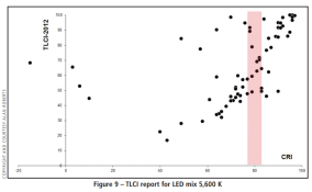
I can illustrate this by analogy using a figure from this link: https://www.mikewoodconsulting.com/articles/Protocol Fall 2013 - TLCI.pdf. This figure plots the results from several light sources that were measured according to CRI and TLCI. As you can see, some light sources give terrific CRI scores but poor TLCI scores, and some give great TLCI scores but poor CRI scores. This mean that one light source will produce good result for a human viewing the scene, but poor results when the same light is used for video recording, and vice versa.

CRI vs. TLCI.PNG

Now, if I were to hazard a guess it would be that the frequency response for film is probably more similar to a digital video camera than it is to the frequency response of the human eye, and if this is true then the TLCI score is probably going to be more relevant to shooting film than the CRI score, but even then I would bet that some high TLCI light sources are probably going to be suboptimal light sources for shooting film.
 

DREW WILEY

Member
Joined
Jul 14, 2011
Messages
13,679
Format
8x10 Format
I don't want to sound rude, but you need to start with some basic color theory before you get into all the intermediate theory of CIE anyalytic geometry color mapping and so forth, which lies behind all the models and modes of automation of it you're mentioning. And the most basic concept you need to understand and apply relative to your question, and how it applies to different media reacting differently to different light sources, concerns metamerism. That's a crucial term in color matching because absolutely no color film, pigment set, or ink variety ever invented is perfect in that respect. And one needs to experientially learn specifically where the Achilles heel lies in each instance, because even monitoring instruments themselves are partially prone to the same thing. Once that is understood, at least conceptually, then it's a little easier to understand why it's compounded, or "lost in translation", when comparing one model of interpretation to another.

Second, you're getting hung up on generic assumptions. You can't realistically talk about the human eye versus color film response, for example. You'd have to address this on a SPECIFIC film basis every time. It's inherently complicated, and looking for easy answers won't solve anything. Take it from someone who once fiddled with continuous-spectrum spectrophotometers the size of a grand piano. None of the convenience devices people use today do that. There's a lot of interpolation involved between evenly spaced readings, lacunae which might be misrepresented. But that's the only way that it's convenient to breaks these things down into basic color mapping programs, including those behind inkjet colorant dispersals.

Then the light sources themselves might not be blackbody, and will have their own spectral lacunae and foibles. The dyes in color films are a complex science unto themselves. Therefore any easy answer is either not a real answer, or is just a starting point for the next set of questions. That's just the way it is. I won't even get started on the physiology of color vision; but it's not a constant either.
 
Last edited:
OP
OP

alanrockwood

Member
Joined
Oct 11, 2006
Messages
2,184
Format
Multi Format
I don't want to sound rude, but you need to start with some basic color theory before you get into all the intermediate theory of CIE anyalytic geometry color mapping and so forth, which lies behind all the models and modes of automation of it you're mentioning. And the most basic concept you need to understand and apply relative to your question, and how it applies to different media reacting differently to different light sources, concerns metamerism. That's a crucial term in color matching because absolutely no color film, pigment set, or ink variety ever invented is perfect in that respect. And one needs to experientially learn specifically where the Achilles heel lies in each instance, because even monitoring instruments themselves are partially prone to the same thing. Once that is understood, at least conceptually, then it's a little easier to understand why it's compounded, or "lost in translation", when comparing one model of interpretation to another.

Second, you're getting hung up on generic assumptions. You can't realistically talk about the human eye versus color film response, for example. You'd have to address this on a SPECIFIC film basis every time. It's inherently complicated, and looking for easy answers won't solve anything. Take it from someone who once fiddled with continuous-spectrum spectrophotometers the size of a grand piano. None of the convenience devices people use today do that. There's a lot of interpolation involved between evenly spaced readings, lacunae which might be misrepresented. But that's the only way that it's convenient to breaks these things down into basic color mapping programs, including those behind inkjet colorant dispersals.

Then the light sources themselves might not be blackbody, and will have their own spectral lacunae and foibles. The dyes in color films are a complex science unto themselves. Therefore any easy answer is either not a real answer, or is just a starting point for the next set of questions. That's just the way it is. I won't even get started on the physiology of color vision; but it's not a constant either.

Nice deflection. You are assuming I know essentially nothing about color theory. I am not an expert , but I have done some study of the topic. I want to know more.

As far as spectrometry is concerned, although not specific to color theory, I have taken spectroscopy coursework as part of my PhD program in chemistry, and I have taken UV/vis spectra on multiple spectrometers, though none of the ones I used were as big as a grand piano, more the size of a spinet piano for the largest one I used. I also took a course in photochemistry as part of my PhD coursework, though it was photochemistry in general and not specific to photographic chemistry.

As far as blackbody lighting is concerned, there is no light source that is more continuous than a blackbody emitter, so most of this discussion is moot for them because blackbody emitters have a CRI of 100.000...

You are correct that different films would have different spectral responses. The same goes for video cameras, but nevertheless the TLCI was devised to help people deal with different light sources when used with video cameras. There is no reason the same could not be done for film, at least for a generic color film. Even a generic result would be better than nothing, probably better than CRI or TLCI, and probably good enough for practical purposes.
 
Last edited:

M Carter

Member
Joined
Jan 23, 2013
Messages
2,147
Location
Dallas, TX
Format
Medium Format
A note on the state of LEDs - my day gig is mostly corporate video, and I've gone full LED with v-lock batteries. Color's beautiful, I rarely even bother to white balance for multiple fixtures from different makers, just setup and go.

I haven't shot color film with them; some of my fixtures are perfectly fine power wise for 400 ISO video at 1/60th. but I still use packs & heads for film. But man, we've come a heck of a long way in 5 years. I have a 100w rollup-mat fixture with a softbox/fabric grid - I have my key interview light up in a minute with that thing. It's absolutely game changing to be able to boom a gridded softbox wherever I want it, too, the thing weighs about a pound. And no extension cords and hunting for wall outlets (Asian V-mounts have come a long way, too). For under a grand you can get an LED fresnel that's close to a 575 HMI output; it's getting unreal.
 

DREW WILEY

Member
Joined
Jul 14, 2011
Messages
13,679
Format
8x10 Format
I use mid-pro-quality rim LED lighting for my copystand. The color is plenty good for documentation or web purposes, but I wouldn't use it for anything critical.
 

DREW WILEY

Member
Joined
Jul 14, 2011
Messages
13,679
Format
8x10 Format
alan - Nice to know your background too. But I don't know if you're interested in this from a research career level or personal photography applications. At best, instruments and associated programs merely speed up color analysis, sometimes dramatically. But there is no better instrument for handling the "visible spectrum" than the human eye. But it takes a lot of training and experience to distinguish what we do all subconsciously see, given normal healthy vision, and what we consciously recognize in terms of subtle hue distinctions. Any skilled artist learns to perceive what his own colorants specifically do. Or, take one of the most demanding applications, matching auto paints on expensive sports cars or some nitpicky gangbanger's low-rider. Those guys get really good with their colorants; and it's all done by eye. Whenever my own color matchers reached an impasse, they'd bring the sample to my office for an eye assessment; and I'd walk it to sunlight, preferably foggy, which was common.

I specialized in re-dos of architectural exteriors when other color consultants botched it by not taking into account enough variables. My background in color outdoor photography really helped because I understood how light and color temperature, and environmental reflections, are constantly changing from dawn to sunset, and how to handle that fact to its best advantage, plus how respective pigments fade in relation to each other, with its own kind of gradual continuum until scheduled repainting. Fun stuff.

Analogously, I just retrieved an installation of my own large color prints from a stunning big legal office renovation which recently sold to a new firm with their own ideas. The lighting was somewhat too high in UV to be ideal, and was on about 20 hrs per day: so I was eager to see how they held up. Just right. The owner said he liked their look better now than when they were new. I responded that I had deliberately overprinted them a bit so they would look just right a little faded, understanding in advance that it would be about 15 yrs until they wanted to retire and sell the building. Milled my own hardwood frames for them. Deluxe presentation. The ceiling above consisted of 500 sheets of real maple plywood bent and curved to resemble waves of the sea; indoor- outdoor koi ponds; I even consulted on the original paint color scheme, which had photographic display in mind right from the start. Gosh a lot of work. But fun indeed when we still had the necessary level of energy.
 
Last edited:
Photrio.com contains affiliate links to products. We may receive a commission for purchases made through these links.
To read our full affiliate disclosure statement please click Here.

PHOTRIO PARTNERS EQUALLY FUNDING OUR COMMUNITY:


Ilford ADOX Freestyle Photographic Stearman Press Weldon Color Lab Blue Moon Camera & Machine
Top Bottom