darkosaric
Member
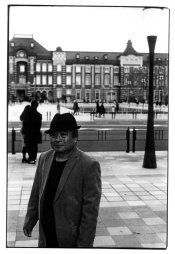
It is hard to put this in words, but sometimes I get some prints that are somehow "mushy", they look kind of "dirty"... it looks like print does not snap, there is no pop out. I am not sure why, is it the light, wrong contrast grade while printing...
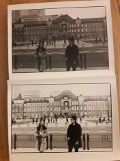
It is something like example below - upper print has all details, but does not pop out, lower has pop effect, but with too high contrast, so the details are lost - and therefore not satisfactory. Should I use higher contrast while printing, but with dodging and burning get all the details in the highlights, so that I have increased local contrast - but overall uniform contrast with no blow up highlights, and no loss in the shadows?
It happens to me sometimes, not often - and on the same negative some frames are perfect with for example grade 3, and some are suffering with this. I doubt it is the negative developing, could be bad lightning in the scene? Some frames are good only with dual (split) grade printing and with excessive burning and dodging?
Thanks,
 .
.