Let's All Print (or Maybe Scan) One Negative 2025

Barn and Silo

H
Barn and Silo

  • 2
  • 0
  • 17
Awaiting light

D
Awaiting light

  • 1
  • 0
  • 19
Dusk in the Rockies

A
Dusk in the Rockies

  • 3
  • 0
  • 87
Under A Raven Sky, 2025

A
Under A Raven Sky, 2025

  • 6
  • 1
  • 90
Pond and trees

H
Pond and trees

  • 5
  • 0
  • 59

Recent Classifieds

Forum statistics

Threads
200,346
Messages
2,806,434
Members
100,219
Latest member
Karl0joh
Recent bookmarks
0

snusmumriken

Subscriber
Joined
Jul 22, 2021
Messages
2,614
Location
Salisbury, UK
Format
35mm
That's much larger than I did. All my prints are 5x7 except the one 11x14 I did as a test. Even making an 11x14 is a chore for me.

I only meant to point out that the negative was good enough for that much enlargement and probably more. Nice and sharp, and no spotting required. For this thread, size is otherwise irrelevant.
 
Joined
Apr 1, 2017
Messages
30
Location
Southern Illinois
Format
35mm
I started with the scanned negative named PNX2509_SDIV_3200dpi, and here's what I did to it:

I didn't crop it.
Darkened the image because it looked over/under exposed.
Straightened it by pulling down the lower right corner a bit. That made the horizon line perfectly level, (at least for the image I started with.)
Removed various scratches and dust specks from the scanning process of the original negative.
Fixed some dark patches either introduced during the developing process or shadows from the rising sun.
Removed a distracting highline wire from the top left area.
Cloned over other distracting elements such as some patches in the grass, etc.
Gave it some minor sharpening.
And I especialoly enjoyed the Mercury Cougar XR-7 positioned in front.

I didn't crop the image because of the way I work when I'm shooting. What I frame in the viewfinder is what I want in my final image to be, and I assume other people work that way as well. That's why I left the image uncropped because that's the way it was originally framed by Don_ih. I wanted to respect his vision.

Looking at everybody else's submissions gave me lots of great ideas. I never would have thought to do things like that.

PNX2509_SDIV_3200dpi 1if.jpg
 

cowanw

Member
Joined
Aug 29, 2006
Messages
2,265
Location
Hamilton, On
Format
Large Format
Scan from a darkroom print, on Ilford MGRC Satin, 18x24cm. Developper is Adox MCC, dilution 1:4.

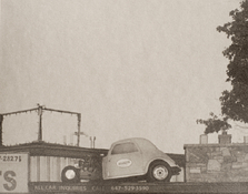
The sign above the building: USED AUTO PARTS was the inspiration.

The print is multiple exposures on the same sheet of paper, the negative first under-exposed so that a ghost image of the slightly cropped negative formed the base for the rest.

That sheet was put in the paper safe while I got on with the next part of the printing process.

The head of the enlarger was raised and refocused before returning the sheet of pre-exposed paper.

It was swivelled 180°, so upside down relative to the first exposure.

The easel was then shifted around under the enlarger head, with areas dodged while exposing areas that interested me.

I wanted to fill the spaces that were empty, and move those vehicles around in space.

Four separate areas were exposed this way, et voilà le résultat.

This is a very simplified description of two separate days in the darkroom and of all the trial and error that went on!

Four prints were done this way, each one different, and unique.

None can be duplicated, at least in a darkroom.
It's not simple to describe what my mental process was, that took me from a straight work print of the negative to the final print.
It was a matter of facing the complexity of a rather dense negative, an image with strong graphic elements in the central horizontal area, and empty space in the sky and textured space on the grassy foreground. The more I looked at all the details in the store front, the cars, etc, the more fascinating those became. A form of mosaic seemed most appealing to me, but not as a collage compiled from the work prints and test strips. Rather, a mosaic formed under the enlarger lens. Which is what I ended up with, and am quite happy with it.

This was my soundtrack to the project, and it suits the image, I think.


Thanks for responding to my post and to others who have described their thought processes. Very impressive printmakingYour print reminded me of photographers in the 1920's and 30's who would make prints fo patterns to try to sell to fabric designers. This would be a fabulous bed sheet set or curtain design or a beer can design
really! Submit art here
When the negative arrived I first made a 8x10 work print to assess where to go. I confess I was nonplussed and did not quite know what to make of it. I mainly do portraiture, where the subject is usually plainly obvious and other elements of the composition are designed to enhance the subject. What was the subject here? How did the composition aid and direct attention to the subject? I was handicapped by being one of the 0.125% of North American males that have no interest in automobiles.

But I was impressed with the sharpness of the negative and thought the development and exposure made an easy to print negative. So I sat on it for a while and tried various crops with L-shaped cards. I thought perhaps a solarisation type treatment might be interesting. I was unable to make that happen but I did in actuality end up flashing the print which darkened the sky and help in the separation of tones Vis a Vis the rooftop car. The rooftop car presented itself to me as a subject and I decided to try some older Ilford Art paper for its texture, tone, and feel. The out of date paper had fogged and also separated the high values. I went from a 20 sec exposure for the work print to a 4 minute exposure for this. The end result demonstrates the nature of photography as an isolation of elements; removing and removing until the subject reveals itself. This is my end result which I mailed to Don because I thought he should be able to experience the physical nature of the print (he has done such excellent work)! Click on it to see.
 

Attachments

  • photrio-b.jpg
    photrio-b.jpg
    319.1 KB · Views: 43

gbroadbridge

Subscriber
Joined
Nov 18, 2004
Messages
696
Location
Sydney, Australia
Format
Medium Format
Well I scanned the neg (nice photo for this event), and decided to go nuts and do something completely different.
I made some slight adjustments to contrast etc, just to fit the next part of the job.

Then I took another photo of a car interior (Kodak Ultramax 400 135) and did some layering in Affinity Photo.


"Anachronism"

20251020_19_AltProcess.jpg
 

rduraoc

Member
Joined
Dec 19, 2004
Messages
245
Location
Brussels
Format
Medium Format
I went with a 18x24cm darkroom print, using old (and slightly fogged) Tura VC paper. The print was then bleached and selenium toned, and this combination has been giving me these very warm tones that I'm enjoying (and that I tried to replicate when I scanned the print)

The print was cropped from the original negative because I felt there was too much going on there - it wasn't easy to decide how to recenter the image. I struggled with the sky, which was burned in in this final version, but I still wasn't able to get it where I imagined it.

At some point I became really obsessed with the zone with extra density that goes down from the engine of the hot rod on the roof, but ended up ignoring it.

printanegative_rduraoc.png


This was a lot of fun, and seeing the results here is a great experience. Thank you all for this, and particularly to @Don_ih !
 

MattKing

Moderator
Moderator
Joined
Apr 24, 2005
Messages
54,053
Location
Delta, BC Canada
Format
Medium Format
Well I scanned the neg (nice photo for this event), and decided to go nuts and do something completely different.
I made some slight adjustments to contrast etc, just to fit the next part of the job.

Then I took another photo of a car interior (Kodak Ultramax 400 135) and did some layering in Affinity Photo.


"Anachronism"

View attachment 409840

Gee, a right hand drive Tesla in the heart of Ontario - anachronism indeed :smile:
 

MattKing

Moderator
Moderator
Joined
Apr 24, 2005
Messages
54,053
Location
Delta, BC Canada
Format
Medium Format
@Don_ih ,
I thought the inspiration was the last half century of playoff success of the Toronto Maple Leafs. :whistling:
(For those not familiar, the rivalry between BC and Ontario can be rather intense wrt these things).
And by the way, growing up, my favorite hockey player was Dave Keon).
 

mmerig

Member
Joined
Oct 9, 2012
Messages
222
Location
Teton Valley
Format
Medium Format
Don_IH MFM.jpg
Here what I emailed Don, along with an attached image:

"Here is my print of your negative. This is the third try, all were very close. For this one I burned in the sky a little. I pretended that someone took this picture to show the business (like it was theirs), and just wanted a normal-looking picture of it.

I used Bromophen 1:2 on Ilford MGRC Deluxe glossy paper, with a #0 Ilford filter under the lens. My enlarger is an Omega DII, with the standard lamp housing, which has a frosted tungsten lamp. So it's more like a diffusion enlarger than a true condenser enlarger. The lens is an EL Nikkor 50 mm f2.8. The developer was a bit weak, but I don't think enough to matter."
 

nikos79

Member
Joined
Mar 9, 2025
Messages
732
Location
Lausanne
Format
35mm
Btw really enjoyed this project you should make a new one!
 

gary mulder

Member
Joined
Nov 29, 2006
Messages
311
Format
4x5 Format
Some recording of my process. The top two are inkjet prints. The other 5 are bromoil prints. The one on the bottom is the one that made it.

IMG_0436.jpg
 
Joined
Jul 28, 2016
Messages
2,930
Location
India
Format
Multi Format
I made two FerroBlend prints yesterday.

[If you don't know what FerroBlend is, you're encouraged to look at this thread.]

Both prints were made on Brustro 25% Cotton Hotpress 300 gsm A4 paper. The paper was acidified using Citric Acid, washed and dried before exposing.

First print was made using Classic Cyanotype sensitiser with Potassium Ferricyanide added to Copper developer as described here.

Second print was made using FerroBlend sensitiser and Copper developer as described here.

In both cases, no Ammonium Chloride was used either in the sensitiser or in the developer but 2 drops of Dichromate was added to the sensitiser.

Both prints were toned with Copper toner as described here to move the dark blues towards black.

I used the larger scan that @koraks provided for making the digital negative. Tweaked the contrast, applied graduated filter and used adjustment brush in Lightroom.

The negative was printed at a local printing shop by a lage format Canon Laser printer and is far from perfect. There are some artifacts in the negative that the printer introduced and I regard them as the printer's contribution to the work. :smile:


1761462491774.png


1761462564104.png


Last but not the least, my gratitude to @Don_ih for this opportunity and to @koraks for scanning and sharing the negative.
 
OP
OP
Don_ih

Don_ih

Member
Joined
Jan 24, 2021
Messages
8,181
Location
Ontario
Format
35mm RF
I made two FerroBlend prints yesterday.

They look great! I also like the crop you chose. I think I prefer the bottom print - for contrast and tone. I read a bit about Ferroblend and may need to try it some day. I did cyanotypes long ago. I should give it a try.
 
Photrio.com contains affiliate links to products. We may receive a commission for purchases made through these links.
To read our full affiliate disclosure statement please click Here.

PHOTRIO PARTNERS EQUALLY FUNDING OUR COMMUNITY:


Ilford ADOX Freestyle Photographic Stearman Press Weldon Color Lab Blue Moon Camera & Machine
Top Bottom