-
Welcome to Photrio!Registration is fast and free. Join today to unlock search, see fewer ads, and access all forum features.Click here to sign up
You are using an out of date browser. It may not display this or other websites correctly.
You should upgrade or use an alternative browser.
You should upgrade or use an alternative browser.
Let's All Print (or Maybe Scan) One Negative 2025
-
A
- Thread starter Don_ih
- Start date


Recent Classifieds
-
For Sale Fuji GW670 III
- Started by campy51
-
For Sale Hasselblad X Pan w/ 45mm/f4 Lens
- Started by eftones
-
For Sale 6 antique French pneumatic shutters _ Guerry
- Started by Manual Camera
-
For Sale Voigtländer Nokton Classic 35mm/1.4 with Leica M-mount
- Started by Klaus Mähring
-
For Sale Voigtländer Bessa R2 Special Edition Olive Green
- Started by Klaus Mähring
Forum statistics
cowanw
Member
The technical details are great and the three we see show some wonderful interpretations. I wonder if posters could add a bit of their mental process, what took them from negative to end product, why they enhanced some part or cropped some other?
gary mulder
Member
- Joined
- Nov 29, 2006
- Messages
- 343
- Format
- 4x5 Format
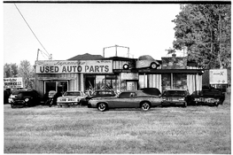
I have made some bromoil prints. This one I thought was the nicest. Fiberbase paper. 6 X 10”

The technical details are great and the three we see show some wonderful interpretations. I wonder if posters could add a bit of their mental process, what took them from negative to end product, why they enhanced some part or cropped some other?
My idea was to bring as much clarity as possible to the main theme which was the store and the cars. Tried also to selectively enhance the contrast there. The sky was the most tricky part to keep untouched that is why selective masking worked well. My mental process was pure and straight depiction, show everything as clear as possible try to faithfully describe the store, and let the viewer come with any associations.
Awesome! What did you mean by "change the sky with clouds" ?
I changed the sky with Photoshop. I have a library of sky photos. Some come with Photoshop and I add to it with my own. If I see an interesting cloud formation I photograph it and add to the library. Photoshop has a “replace sky “ feature that works pretty well and can be tweaked if needed.
Anon Ymous
Member
Well, since others have posted more than one photo, I'll do so too.  Here's my process and results:
At first I did some basic level and curves adjustments, nothing fancy, things that could have been done in the darkroom. Then some spotting to remove scratches and dust and it was almost done. I then had some thoughts about isolating things in the frame, or altering the aspect ratio, or leaving it as is. In the end I found the cinemascope aspect ratio complemented the scene nicely IMHO, it almost looks as a still from a movie. Then I went one step further and isolated the two cars in the square frame:


Here's my process and results:At first I did some basic level and curves adjustments, nothing fancy, things that could have been done in the darkroom. Then some spotting to remove scratches and dust and it was almost done. I then had some thoughts about isolating things in the frame, or altering the aspect ratio, or leaving it as is. In the end I found the cinemascope aspect ratio complemented the scene nicely IMHO, it almost looks as a still from a movie. Then I went one step further and isolated the two cars in the square frame:
I'm very impressed with what people have done.
I ended up with six prints (well, I ended up with more, but six are more noteworthy. When I made my first test print on 11x14 (mainly to see if the negative was any good for this activity), I saw that the sky was very blank and wouldn't burn in that well. So I decided to try to change that.
However, here is a "straight" print from the negative:

(ignore the dust on my scans - I am. Some dust is in the print, some is on the scanner glass. I didn't bother to fix it.)
I say that's "straight" but there was a lot of burning and then I bleached part of it mildly.
I ended up with six prints (well, I ended up with more, but six are more noteworthy. When I made my first test print on 11x14 (mainly to see if the negative was any good for this activity), I saw that the sky was very blank and wouldn't burn in that well. So I decided to try to change that.
However, here is a "straight" print from the negative:
(ignore the dust on my scans - I am. Some dust is in the print, some is on the scanner glass. I didn't bother to fix it.)
I say that's "straight" but there was a lot of burning and then I bleached part of it mildly.
My subsequent prints were made using other negatives. I made a lot of different positives of the negative - contact printing and also using a Bowens Illumitrans. It was difficult to get the positive the way I wanted it - namely, with the right amount of density. I then taped a selected positive in a camera and loaded a small strip of film in so that when I took photos, what I was photographing would pass through a positive of our negative - remaking the image. All this was me trying to get clouds in the sky.

That's probably the most successful attempt.
That's probably the most successful attempt.
I'll just dump my other prints here. They all are a result of different attempts - some using quite degraded film.

That's a solarized print from a copy negative.

High contrast film in camera behind a positive.

Clouds through a tree with the positive unfortunately upside-down in the camera.

And that was a positive contact printed onto moldy Geavart (sp?) ortho graphic arts film in the camera.
All my prints were on Ilford 5x7 rc paper except that last one which was on grade 5 Kodabromide (since I can't get Ilford paper to that high a contrast).
That's a solarized print from a copy negative.
High contrast film in camera behind a positive.
Clouds through a tree with the positive unfortunately upside-down in the camera.
And that was a positive contact printed onto moldy Geavart (sp?) ortho graphic arts film in the camera.
All my prints were on Ilford 5x7 rc paper except that last one which was on grade 5 Kodabromide (since I can't get Ilford paper to that high a contrast).
It's fascinating to see what people have made of this and I really like what I'm seeing!
Here's mine; I also did multiple versions, and ended up selecting four I wanted to share. They have a lot in common in that they stay close to the literal image as it's on the negative, and I also ended up using virtually the same crop on all versions.
I started by scanning the negative, also because the scans were to be made available to everyone to play with. But for my own version, I also started playing with the image a bit in GIMP to see how I'd like to approach it. I decided that I wanted to keep that one car smack in the middle and emphasize it. From there, I tried to balance out the composition while keeping as much as possible from the image. I then selectively adjusted contrast across the image by making a stack of half a dozen or so layers with curve adjustments for specific elements - the car, the grass in the foreground, the sky, etc. These layers were assembled into a single image using selective masking. Finally I added a border and split toning, and some post-resize sharpening. This resulted in the version I based the 'real' prints on.

For the actual prints, I decided fairly quickly that I'd want to use this as 'target practice' for lith printing; the derelict cars invite some form of grittiness and lith seemed an appropriate way to get there (besides, it's been ages since I got to play with lith, so this was a good excuse). However, the negative was kind of dense for the long exposure times I'd need with lith. I did some attempts and just didn't like the result or the long exposure times. So I went the full monty and made a duplicate negative via an interpositive, using x-ray film.

I used this negative for the actual prints. The negative is ca. 10x7cm (image area).
I started with some straight prints on Adox MCC110. I didn't really like these to be honest; not enough zap, or zing, or what-have-you, despite doing some burning & dodging to create a similar emphasis as in the digital version. I ended up working on one of these prints afterwards; I did some bleaching to brighten the sky and used a combination of sepia and selenium toning. It's OK, but not what I was going for.

Enter the lith experiment. I mixed up some simple lith chemistry from raw ingredients and worked with two papers. Below is a print I made on some old Orwo BS1 single weight paper which turns out to lith quite well, albeit not very colorful. Same overall pattern of burning & dodging as in the previous exposure. The print was a little on the flat side, so I ended up toning it in gold almost to completion, followed by light sepia toning to warm it back up a little.

I figured I wanted to make things more colorful and bold. I exaggerated the burning & dodging on this one, and used Fomatone MG to get more color from the start. I also used a dual developer approach I gleaned from Moersch' 'polychrome' technique. I started with a regular lith developer and then when the shadows were where I wanted them, I went over to a very dilute and heavily restrained metol-only developer to add color. This was further enhanced afterwards by toning in sepia and gold.

Ultimately, I personally prefer either the digital/hybrid version for its 'cleanness', but the first lith print (the more monochrome one on the Orwo paper) is the closest to what I had in mind at the start. It has the gritty feel to it I was after.
Here's mine; I also did multiple versions, and ended up selecting four I wanted to share. They have a lot in common in that they stay close to the literal image as it's on the negative, and I also ended up using virtually the same crop on all versions.
I started by scanning the negative, also because the scans were to be made available to everyone to play with. But for my own version, I also started playing with the image a bit in GIMP to see how I'd like to approach it. I decided that I wanted to keep that one car smack in the middle and emphasize it. From there, I tried to balance out the composition while keeping as much as possible from the image. I then selectively adjusted contrast across the image by making a stack of half a dozen or so layers with curve adjustments for specific elements - the car, the grass in the foreground, the sky, etc. These layers were assembled into a single image using selective masking. Finally I added a border and split toning, and some post-resize sharpening. This resulted in the version I based the 'real' prints on.
For the actual prints, I decided fairly quickly that I'd want to use this as 'target practice' for lith printing; the derelict cars invite some form of grittiness and lith seemed an appropriate way to get there (besides, it's been ages since I got to play with lith, so this was a good excuse). However, the negative was kind of dense for the long exposure times I'd need with lith. I did some attempts and just didn't like the result or the long exposure times. So I went the full monty and made a duplicate negative via an interpositive, using x-ray film.
I used this negative for the actual prints. The negative is ca. 10x7cm (image area).
I started with some straight prints on Adox MCC110. I didn't really like these to be honest; not enough zap, or zing, or what-have-you, despite doing some burning & dodging to create a similar emphasis as in the digital version. I ended up working on one of these prints afterwards; I did some bleaching to brighten the sky and used a combination of sepia and selenium toning. It's OK, but not what I was going for.
Enter the lith experiment. I mixed up some simple lith chemistry from raw ingredients and worked with two papers. Below is a print I made on some old Orwo BS1 single weight paper which turns out to lith quite well, albeit not very colorful. Same overall pattern of burning & dodging as in the previous exposure. The print was a little on the flat side, so I ended up toning it in gold almost to completion, followed by light sepia toning to warm it back up a little.
I figured I wanted to make things more colorful and bold. I exaggerated the burning & dodging on this one, and used Fomatone MG to get more color from the start. I also used a dual developer approach I gleaned from Moersch' 'polychrome' technique. I started with a regular lith developer and then when the shadows were where I wanted them, I went over to a very dilute and heavily restrained metol-only developer to add color. This was further enhanced afterwards by toning in sepia and gold.
Ultimately, I personally prefer either the digital/hybrid version for its 'cleanness', but the first lith print (the more monochrome one on the Orwo paper) is the closest to what I had in mind at the start. It has the gritty feel to it I was after.
I am stunned by the skill of all the people here
So am I.

I'm seeing things in these photos that I neither saw when taking the photo nor when making my own prints. It's a very interesting experiment.
Interesting, indeed!
This may give people a bit of a sense of what it can be like to print for others.
mcfitz
Member
- Joined
- Nov 9, 2006
- Messages
- 202
- Format
- Multi Format
The technical details are great and the three we see show some wonderful interpretations. I wonder if posters could add a bit of their mental process, what took them from negative to end product, why they enhanced some part or cropped some other?
It's not simple to describe what my mental process was, that took me from a straight work print of the negative to the final print.
It was a matter of facing the complexity of a rather dense negative, an image with strong graphic elements in the central horizontal area, and empty space in the sky and textured space on the grassy foreground. The more I looked at all the details in the store front, the cars, etc, the more fascinating those became. A form of mosaic seemed most appealing to me, but not as a collage compiled from the work prints and test strips. Rather, a mosaic formed under the enlarger lens. Which is what I ended up with, and am quite happy with it.
This was my soundtrack to the project, and it suits the image, I think.
djdister
Subscriber
Working from the scanned file, inverted, panoramic crop, local thresholding applied (using GIMP).

And here's a Photoshop variation - trying to add some movement into a very static shot. Created a duplicate layer of the image, overlaid it out of register with the background layer, and used some layer blending magic for a balance between the two images.

And here's a Photoshop variation - trying to add some movement into a very static shot. Created a duplicate layer of the image, overlaid it out of register with the background layer, and used some layer blending magic for a balance between the two images.
Last edited:
snusmumriken
Subscriber
I have neither imagination nor skill in the special effects department of the darkroom. All I did was to crop the image to a panoramic format so as to exclude the uninteresting foreground and sky, and then to make the best print I could from what was left. Here it is in the fixer.

make the best print I could
Looks to me that you made an excellent print. The activity was to do what you wanted with no special requirements. And think how daring it is to crop! At least according to some.
Anon Ymous
Member
It seems the panoramic crop was way too obvious for many of us.
I have neither imagination nor skill in the special effects department of the darkroom. All I did was to crop the image to a panoramic format so as to exclude the uninteresting foreground and sky, and then to make the best print I could from what was left. Here it is in the fixer.
View attachment 409677
I think that photographing the print in the fixer tray is a particularly nice grace note
snusmumriken
Subscriber
And think how daring it is to crop! At least according to some.
Well, you’d already thrown your artistic integrity to the jackals!
 And there’s nothing lost quality-wise, because I used almost the full width of the negative. That’s a 16” print, btw.
That’s a 16” print, btw.
That's much larger than I did. All my prints are 5x7 except the one 11x14 I did as a test. Even making an 11x14 is a chore for me.
| Photrio.com contains affiliate links to products. We may receive a commission for purchases made through these links. To read our full affiliate disclosure statement please click Here. |
PHOTRIO PARTNERS EQUALLY FUNDING OUR COMMUNITY:  |