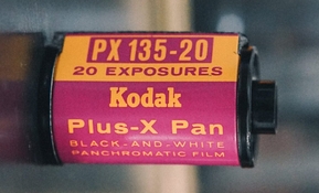
Unfortunately, my intro to LF photography was right at the time The Great Yellow Father, (in its Infinite Wisdom) decided to discontinue Super-XX, Ektapan, Ektalure, DK-50, et al., so I didn't get to explore the capabilities therein...except as a starving college student looking for bargains in the expired film & developer bins.
My calibrations were for a Plus-X and Acufine combination.
Tmax 100 & 400 were in their infancy, and all my early negs from them looked awful thin, like 2 stops under-exposed...
"That's the way they're supposed to look!"...says Kodak.
"Umm... No". says me.
My eyes were, and still are, calibrated for old-school thick-emulsion films.


