Kodak Aerocolor (2460) compared to Ektar 100 in 120

img421.jpg

H
img421.jpg

  • Tel
  • Apr 26, 2025
  • 1
  • 0
  • 18
Caution Post

A
Caution Post

  • 2
  • 0
  • 38
Hidden

A
Hidden

  • 1
  • 0
  • 38
Is Jabba In?

A
Is Jabba In?

  • 3
  • 0
  • 45
Dog Opposites

A
Dog Opposites

  • 2
  • 3
  • 151

Recent Classifieds

Forum statistics

Threads
197,480
Messages
2,759,724
Members
99,514
Latest member
cukon
Recent bookmarks
0

blee1996

Subscriber
Joined
Jul 25, 2008
Messages
1,088
Location
SF Bay Area, California
Format
Multi Format
Recently I tried one roll of Aerocolor 100 (re-spooled 2460 by Reflx Labs) alongside Ektar 100. I'm a total amateur and there is no systematic controls. This is just one data point from a novice user, instead of a scientific bench test.
  • Location: a local ranch
  • Exposure: it was glorious NorCal weather at 10-11AM, and I simply used sunny 16 rules.
  • Camera and lens:
    • The Aerocolor 100 was shot in a Hasselblad 500C with Planar 80/2.8 T* lens
    • The Ektar 100 was shot in a Hasselblad SWC/M with Biogon 38/4.5 lens.
  • Processing: I developed both film in a single tank using brand new and fresh Bellini C41 1L chemistry.
  • Scanning: both through Epson V700 flatbed scanner using Epson Scan software in professional mode.
    • Aerocolor 100: using custom histogram parameters to get the best white balance (best feasible to me)
    • Ektar 100: using auto exposure and auto color in Epson Scan
  • Digital processing: Lightroom Classic
Here is the album for all the photos:

My initial observations:
  • Color: Ektar 100 is more true to life than Aerocolor 100. Aerocolor has a more yellow tint that is difficult to eradicate.
  • Saturation and contrast: Ektar 100 is a bit more saturated and more contrasty
  • Grain: comparable in general. Ektar 100 has sharper looking grains at 100%.
  • Scan difficulty: at least for Epson Scan, it is super difficult to scan Aerocolor 100.
  • Quick take: I still like Ektar 100 more, and the price difference is small enough.
Next steps:
  • Try to scan Aerocolor in slide mode instead of negative in Epson Scan, and invert in Lightroom
  • Try VueScan on the Aerocolor
  • Try Gold 200 in 120 and compare to Aerocolor 100. If I need a different look from Ektar 100, maybe Gold 200 can achieve that at much lower cost and little fuss.
 

koraks

Moderator
Moderator
Joined
Nov 29, 2018
Messages
20,672
Location
Europe
Format
Multi Format
The Ektar 100 renders more accurate red, while the Aerocolor 100 is a bit yellow.

With all due respect and also great gratitude for posting a comparison, but a qualification along the lines of "the film renders" if we're looking at scans that were (necessarily!) processed in very different ways is quite difficult to substantiate.

Try to scan Aerocolor in slide mode instead of negative in Epson Scan, and invert in Lightroom

Yes, that would be my first suggestion as well; I think it'll make things a little easier. I generally invert in GIMP by inverting the R, G and B channels separately while keeping an eye on the histogram. That usually gets me fairly close, even on difficult frames.

Btw, to me, your Ektar shots seem balanced pronouncedly towards cyan and blue. It's a matter of personal taste, of course, but it also illustrates that this is not something the film does - it's a choice we make, deliberately or subconsciously (or by accident), within the limitations of what our workflow allows. I know that if I were to print those Ektar shots on DPII, the red would really pop, unlike in the scans above.
 

lamerko

Member
Joined
Oct 27, 2022
Messages
718
Location
Bulgaria
Format
Multi Format
On my computer, the pictures from the Ektar 100 look a little weird. The ones from the 2460 are visibly better without knowing the actual colors of the objects...
 

AnselMortensen

Subscriber
Joined
Jun 9, 2020
Messages
2,259
Location
SFBayArea
Format
Traditional
Going by Zheng's photos above, I agree that the Ektar images have a cyan/blue bias, and prefer the warmer version of the Aerocolor.
Of course, scanning negative film has a lot of leeway for color correction.
An interesting comparison...
Thank you, Zheng!
 

Helge

Member
Joined
Jun 27, 2018
Messages
3,938
Location
Denmark
Format
Medium Format
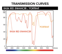
I've wanted to shoot Aerocolor with a didymium filter for some time now. It would seem the nudge in the didymium filter could potentially lessen or cure the yellow streak of the Aerocolor.

IMG_2170.jpeg
Skærmbillede 2023-11-22 kl. 01.09.23.png
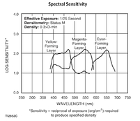
Looking at the spectral graph of the Aerocolor, has anyone tried shooting this through a dark red filter? You could do a double exposure with a deep blue and get something not miles off from Aerochrome? Or maybe just a deep purple filter, if such a thing exists (Congo Blue with optical qualities).
 
Last edited:

ags2mikon

Member
Joined
Dec 19, 2009
Messages
569
Location
New Mexico
Format
Multi Format
Thank you Zheng. Nice work. I was just looking at that film last night. I think the CatLabs X FILM 100 is the same, even though CatLabs says otherwise. I think with a little fiddling with the colors both would look very close.
 

koraks

Moderator
Moderator
Joined
Nov 29, 2018
Messages
20,672
Location
Europe
Format
Multi Format
the yellow streak of the Aerocolor.

The chart you included is a dye density chart. It doesn't say anything about the film's spectral sensitivity and ability to render hues. You'd have to look at the spectral sensitivity chart instead. I assume it's also included in the datasheet.
 

dokko

Member
Joined
Oct 4, 2023
Messages
318
Location
Berlin
Format
Medium Format
great to see a comparison of these films!

one point to note though:
Kodak Ektar is rather difficult to scan and the Epson Software is pretty bad at scanning color negative film, so what we see is not so much how Ektar renders colors but rather how well (or rather poorly) the Epson software manages to render the colors of Ektar.
 

Helge

Member
Joined
Jun 27, 2018
Messages
3,938
Location
Denmark
Format
Medium Format
The chart you included is a dye density chart. It doesn't say anything about the film's spectral sensitivity and ability to render hues. You'd have to look at the spectral sensitivity chart instead. I assume it's also included in the datasheet.

You’re absolutely right. That was a faux pas. Corrected.
Still looks interesting with the correct curves.
 

koraks

Moderator
Moderator
Joined
Nov 29, 2018
Messages
20,672
Location
Europe
Format
Multi Format
Yes, certainly. There is something interesting going on around 600nm with this film. It's decidedly less sensitive there than e.g. Portra. This also underlines my earlier caution about scanning; while the conclusion of @blee1996 is that reds render very yellow, the datasheet suggests the exact opposite. However, since color correction takes place in digital post processing, a lack of yellow sensitivity can end up being overcompensated.

The portrait correction filter whose transmission curves you posted @Helge will further emphasize (not correct!) this effect. One might say that this film already has the filter built into it. Which is of course rather informal and haphazard to put it this way, but it sort of looks like it.
 

albireo

Member
Joined
Nov 15, 2017
Messages
1,240
Location
Europe
Format
Multi Format
Recently I tried one roll of Aerocolor 100 (re-spooled 2460 by Reflx Labs) alongside Ektar 100. I'm a total amateur and there is no systematic controls.

@blee1996 - thanks for taking the time to carry out this comparison. A few thoughts from a fellow negative scanner (I don't print my negatives so, like you, I'm extremely interested in how they render in a hybrid workflow).

The fact that you're a self-defined 'total amateur' is not a problem at all.

The problem you are facing is with the 'no systematic' controls bit. No systematic controls = no validity to your findings. Your test is not a test, because its results are confounded by the covariates you willingly surrendered to either randomness or algorithmic decision-making: if the outcome you're observing cannot be safely associated with the exposure you're interested in measuring, what is the point of the test? If the point of your test was to define predictable variables to help you in selecting one film over the other in the future, it is unclear, at least to me, how the observations you obtained will help you in your journey.

For starters, I would completely review your scanning methodology.

You should extract, for each of the negatives in the comparison, a raw (positive), linear 16bit per channel signal file. This way you could completely factor out any unknown -to you- scanner software intervention and get as close as you can to the raw quantised/digitised signal produced by the scanner hardware.

Following that, you should apply a standardised inversion algorithm to all images in the test. Importantly, this needs to be used with the exact same parameters. There are tutorials online on how to extract a raw scanner linear positive using Vuescan or Silverfast, so that would be a good start. I'm not sure if Epson scan allows you to produce raw files.

By repeating your test as follows, you'll at least get closer to establishing a few reproducible insights on the relative merits of the material you're testing within your workflow.

-same subject
-same light conditions
-same camera, same lens (do you have multiple film backs for one of your Hasselblads?)
-same chemistry (well done there)
-same scanner, same scanning workflow (room for improvement here)
-same calibrated monitor to assess the differences

(I'm sure there's something I'm missing here but you get the gist)

Notice the use of the word 'relative' above. That's probably all it matters in your workflow for now.

So keep on this path and discover the workflow, and the film, that gives you the results you find most pleasant, stick to that workflow and then move on to taking pictures.
 
Last edited:

Helge

Member
Joined
Jun 27, 2018
Messages
3,938
Location
Denmark
Format
Medium Format
Yes, certainly. There is something interesting going on around 600nm with this film. It's decidedly less sensitive there than e.g. Portra. This also underlines my earlier caution about scanning; while the conclusion of @blee1996 is that reds render very yellow, the datasheet suggests the exact opposite. However, since color correction takes place in digital post processing, a lack of yellow sensitivity can end up being overcompensated.

The portrait correction filter whose transmission curves you posted @Helge will further emphasize (not correct!) this effect. One might say that this film already has the filter built into it. Which is of course rather informal and haphazard to put it this way, but it sort of looks like it.

That would be up to an experiment (that I’ll do soonish, just need some sunshine and time). The Hoya curve I posted was mainly for the strong didymium filter. The portrait one is the weak sauce version for well, portraits.

Didymium corrects exactly for yellow casts. Hence the light purple colour. Question is how well the curves line up IRL.
Also the type of filter pulls out the blue in the sky so together with a polarizer it can work more or less like IR does for B&W skies.
 
Last edited:

koraks

Moderator
Moderator
Joined
Nov 29, 2018
Messages
20,672
Location
Europe
Format
Multi Format
Didymium corrects exactly for yellow casts.

Note that the filter you suggested cuts yellow. The Aerocolor sensitivity curve also cuts yellow. As I pointed out, the yellow rendition of the scans shown above seems like a digital/post processing artefact as it does not conform with the film's sensitivity. You'd need the opposite of your suggested filter to correct for this aspect of the film's response.

Following that, you should apply a standardised inversion algorithm to all images in the test.

The problem here, however, is that we're working with an unmasked film. As a result, whatever you do, you'll scan/process these negatives differently from regular C41 negatives. As a result, a ceterus paribus approach is fundamentally impossible.
 

albireo

Member
Joined
Nov 15, 2017
Messages
1,240
Location
Europe
Format
Multi Format
The problem here, however, is that we're working with an unmasked film. As a result, whatever you do, you'll scan/process these negatives differently from regular C41 negatives. As a result, a ceterus paribus approach is fundamentally impossible.

Thank you Koraks - I have never used that particular film and was not aware it's unmasked. I was more commenting on the general approach here, and OP suggested they want to try Gold 200 next, and so I hope my post might be still somewhat relevant.
 
Last edited:

koraks

Moderator
Moderator
Joined
Nov 29, 2018
Messages
20,672
Location
Europe
Format
Multi Format
@albireo yes, in general your suggestions are very useful indeed. In fact, for direct comparisons, I'd suggest scanning both samples with a flatbed scanner in one pass so that a straight comparison is possible. Of course, this still leaves problems with mask color even with normally masked films, so even this isn't exactly watertight. The case of Aerocolor with its lack of a mask is a challenging one altogether, bearing in mind also that the orange mask on C41 film is partly density-dependent on two out of the three dye colors. It'll surely give different results from a regular C41 film.

Btw, for amusement purposes, this is one way I could color adjust one of the scans shown above:
1700649732473.png

To me, the scan seems crossed over. I cannot tell whether this is an artefact of the scanning process, inherent to the film or an artefact of film development.
Looking at the film's curves, it does seem to have an inherent crossover that furthermore changes as development time is extended. The way I read the plot is that at normal development, it'll give a green/magenta crossover with green shadows and magenta highlights (in the positive/inverted image) and with a red/cyan crossover resulting in cyan highlights and red shadows. The green/magenta crossover I recognize in the scan above (see the correction curve I suggest), but the red channel to my eye seems to exhibit the opposite in the scan of what I'd expect the film to do. Furthermore, if I want to fix what I perceive as a problem on the blue/yellow channel, I need a non-linear adjustment to prevent the red wood from going purple and the sky from going green at the same time. Maybe this is due to the oddity in the yellow part of the spectrum.

It's all a whole lot of speculation and second guessing of course based on a scan that I obviously didn't make and that has been color-corrected in some way that I don't know, so take all this with a hefty grain of salt. I'm looking forward to seeing how this film prints in the darkroom; in my experience this is usually a totally different story than whap happens when I scan things.

PS: this is the characteristic curve I based my comments on:
1700649951068.png
 

Helge

Member
Joined
Jun 27, 2018
Messages
3,938
Location
Denmark
Format
Medium Format
Note that the filter you suggested cuts yellow. The Aerocolor sensitivity curve also cuts yellow. As I pointed out, the yellow rendition of the scans shown above seems like a digital/post processing artefact as it does not conform with the film's sensitivity. You'd need the opposite of your suggested filter to correct for this aspect of the film's response.

That might be. The cyan curve is certainly shaped differently than most other CN film and ”skewed” further to red.

But the developed film still has an overall yellow cast in all scans I’ve seen. Whether it’s actual response or how the dyes reacts in development is hard to say.

Aerocolor might actually be a good astrophotography film?
 

dokko

Member
Joined
Oct 4, 2023
Messages
318
Location
Berlin
Format
Medium Format
Following that, you should apply a standardised inversion algorithm to all images in the test. Importantly, this needs to be used with the exact same parameters.

while I agree with the idea that it's necessary to reduce the variables as much as possible (same subject, same light, same lens, same development, etc), the problem with scanning is that there is no standardised inversion algorithm for color negative film.

well, it it was kind of standardised for RA-4 paper, but even there it makes a difference which paper we use, or which light source (those who ever tried to print with an RGB LED enlarger head will know what I mean).

scanners will need to apply a different color conversion for each film type to get similar colours to what an optical enlargement would give.

in other words, if you scan a Kodak Portra 160 and a Kodak Ektar and apply exactly the same color inversion, the differences will larger than if you'd print the two negatives on the same paper in the darkroom.

getting accurate color conversion for each film type is actually one of the most challenging aspect of scanning color negative film (so far I have not seen a single scanning system that has really solved it).
It doesn't help that these days very few photolabs keep their chemicals exactly to specifications, so the results vary even day by day.
 

koraks

Moderator
Moderator
Joined
Nov 29, 2018
Messages
20,672
Location
Europe
Format
Multi Format
those who ever tried to print with an RGB LED enlarger head will know what I mean

Don't get me started...
But yeah, light source and paper do matter. Quite a lot, too. And that's in the knowledge that Fuji's emulsion on their different papers is all the same. The only thing that varies is layer thickness, and that already makes quite a dramatic difference.
 

albireo

Member
Joined
Nov 15, 2017
Messages
1,240
Location
Europe
Format
Multi Format
while I agree with the idea that it's necessary to reduce the variables as much as possible (same subject, same light, same lens, same development, etc), the problem with scanning is that there is no standardised inversion algorithm for color negative film.

I had hoped I had been clear in my post in that I am discussing 'relative' differences.

Here are a few notes on the concept of relative change in statistics


The approach in my post above, and all I'm interested in, is in factoring out confounding variables so that the only differences visible in my controlled environment are imputable to (in this case) film choice alone relative to my closed testing environment.

The last bit is extremely important. 'relative' means that I'm not interested in how those two films differ when optically printed; or, for instance, I'm not interested in how those two films differ when developed via (e.g.) Fuji Hunt chemistry instead of the Tetenal chemistry I use.

'Optical conversion' or 'RA-4 printing' does not figure in the planned workflow at all, and I won't be able to draw any conclusions about differences in RA-4 prints, because RA-4 printing is not in the study design.

Of course, if OP's purpose was (for instance) to establish differences between the two scanned film stocks and some optically printed references, then it would be an entirely different problem.
 
Last edited:
OP
OP
blee1996

blee1996

Subscriber
Joined
Jul 25, 2008
Messages
1,088
Location
SF Bay Area, California
Format
Multi Format
Thanks for all the discussions. This is exactly what I intended, starting as a "crude" first attempt, so photrio members can improve upon it and reach better conclusions for all of us to benefit. I'm grateful for all the fascinating knowledge sharing so far. :smile:
 

dokko

Member
Joined
Oct 4, 2023
Messages
318
Location
Berlin
Format
Medium Format
I don't quite see how much use a comparison between the two film stocks would be if they are scanned with an unfitting color inversion?

of course we could see some relative differences (ie one film is denser than the other) but any more complex characteristics would be impossible to judge if it's due to the film or due to the scanner.

for example, let's say the scan of film A scan would show the blue sky indigo blue and scan of film B more turquoise. It would then be tempting to say that the film A renders blue more indigo compared to film B, but all we can really say for sure is that film A looks more indigo in a scan on a certain scanner, with a certain backlight, a certain sensor, and a certain film calibration.

if scanned on another scanner it could turn out that film A shows the sky more light blue and film B more a desaturated blue. etc.

so what I'm trying to say here is that color is always a combination of the elements of the whole system, and unfortunately different scanners will change the color appearance of different films quite unpredictably.
 

albireo

Member
Joined
Nov 15, 2017
Messages
1,240
Location
Europe
Format
Multi Format
if scanned on another scanner it could turn out that film A shows the sky more light blue and film B more a desaturated blue. etc.

Seems like we're still not on board wrt the meaning of 'relative comparison'. The scanner 'model' is a variable we have factored out (pinned?) at experimental design stage.

We are not suggesting any observed differences drawn from the methodology above can be extended to other scanner models or scanner makes. We are not suggesting any observed differences drawn from the methodology above can be extended to judgements made from eg a RA-4 printed copy of those negatives. Even judging using a different monitor (eg non calibrated) will be risky.

In other words the observed signal is only meaningful in the closed system we have defined, and will only make sense in the same system. Which is an acceptable compromise I suppose if one wants to start making methodological progress within the confines of their OWN materials+worflows.
 
Photrio.com contains affiliate links to products. We may receive a commission for purchases made through these links.
To read our full affiliate disclosure statement please click Here.

PHOTRIO PARTNERS EQUALLY FUNDING OUR COMMUNITY:


Ilford ADOX Freestyle Photographic Stearman Press Weldon Color Lab Blue Moon Camera & Machine
Top Bottom