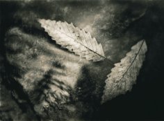
Solarize
Member
This is a great thread.
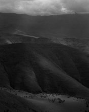
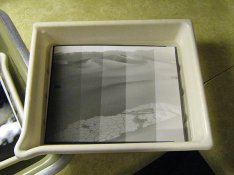
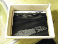
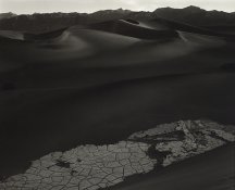
I've posted this in the gallery before, but thought I'd start my contribution here with something which represents a significant visual departure from the negative scan.
This photograph was taken in the Drakensberg, South Africa. It was shot on Ilford FP4 and developed in Rodinal. The negative is of good density and shows detail throughout the scale. While the scan is very flat I was drawn to the light at the bottom of the frame, and particularly interested in pulling out contrast in this area. Because the mountain occupied such a large part of the image, I wanted a paper which would give very rich midtones.
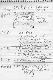
A quick test strip revealed the neg would print very nicely on grade 3 Fortezo in Ilford Warmtone developer. I gave a base exposure of 60 seconds, holding back the sunlit are for 10. 10 seconds was added to to the bottom left, again, to force attention on the sunlit area. A further 5 seconds was added to everyinthing above the trees, 15 seconds to the distant mountains and everything above, and a final further 15 added to the sky and very furthest mountains.
2 minutes in the developer was enough to reveal all the shadow detail I needed, while a waterbath for a further minute helped push a little detail into the lower trees.
This version was arrived at on the second or third attempt, so unusually quickly for me! To intensify the contrast and because I love the look in general, I lightly bleached the print back and toned with Sepia. A quick wash later and I gave it a few seconds in Selenium - just enough for a colour shift and to make the midtones go chocolate-like.
On several reprints I didn't quite dodge the trees enough, so some selective bleaching has been required - but on the whole this is a step I prefer to avoid, and on this version, I don't think it was required.
This was an 8x10 inch print on 9.5x12 inch paper. It originated from a 645 negative, which I routinely crop to 8x10, 8x8 or 5x10 proportions.
Thanks for looking,
Ciaran
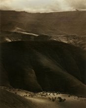
I've posted this in the gallery before, but thought I'd start my contribution here with something which represents a significant visual departure from the negative scan.
This photograph was taken in the Drakensberg, South Africa. It was shot on Ilford FP4 and developed in Rodinal. The negative is of good density and shows detail throughout the scale. While the scan is very flat I was drawn to the light at the bottom of the frame, and particularly interested in pulling out contrast in this area. Because the mountain occupied such a large part of the image, I wanted a paper which would give very rich midtones.
A quick test strip revealed the neg would print very nicely on grade 3 Fortezo in Ilford Warmtone developer. I gave a base exposure of 60 seconds, holding back the sunlit are for 10. 10 seconds was added to to the bottom left, again, to force attention on the sunlit area. A further 5 seconds was added to everyinthing above the trees, 15 seconds to the distant mountains and everything above, and a final further 15 added to the sky and very furthest mountains.
2 minutes in the developer was enough to reveal all the shadow detail I needed, while a waterbath for a further minute helped push a little detail into the lower trees.
This version was arrived at on the second or third attempt, so unusually quickly for me! To intensify the contrast and because I love the look in general, I lightly bleached the print back and toned with Sepia. A quick wash later and I gave it a few seconds in Selenium - just enough for a colour shift and to make the midtones go chocolate-like.
On several reprints I didn't quite dodge the trees enough, so some selective bleaching has been required - but on the whole this is a step I prefer to avoid, and on this version, I don't think it was required.
This was an 8x10 inch print on 9.5x12 inch paper. It originated from a 645 negative, which I routinely crop to 8x10, 8x8 or 5x10 proportions.
Thanks for looking,
Ciaran