Interpretations of a negative

Ilya

A
Ilya

  • 2
  • 1
  • 11
Caboose

A
Caboose

  • 2
  • 0
  • 15
Flowers

A
Flowers

  • 5
  • 1
  • 30
The Padstow Busker

A
The Padstow Busker

  • 1
  • 0
  • 33
End Table

A
End Table

  • 1
  • 1
  • 113

Forum statistics

Threads
197,671
Messages
2,762,752
Members
99,437
Latest member
fabripav
Recent bookmarks
5

Shawn Dougherty

Subscriber
Joined
Jul 22, 2004
Messages
4,129
Location
Pittsburgh
Format
Multi Format
Hi Shawn,
Thanks for the detailed post, very informative. Very nice b/w print too. thanks for sharing.
I have a quick question on your negative development process - could you please share the developer you use. (I currently use Rodinal Stand and tried HC-110 but having over development issues, but the 1:140 dilution could be useful. Will post some sample scans and print interpretations to the thread shortly).
Regards,
Arun.

Thank you! =) If you are referring to my last post, Skunk Run Falls, the developer was Rodinal (Adox Adonal). I've found at very high dilutions, changing the time brings up the shadows more than the highlights and changing the dilution brings down the highlights more than the shadows.

I've gotten away from stand development for a variety of reasons but that is another issue which has been discussed to no end here on APUG. =)
 

aruns

Member
Joined
Oct 20, 2012
Messages
2
Location
Bay Area, CA
Format
4x5 Format
Hi Shawn,
Thank you and yes, I was referring to the Skunk Run Falls post.
You make two very interesting observations here on the relationship between developer dilution, time, and shadow/highlights.
I am very curious about your other experiences and observations with Rodinal, such as this. If you have posted them anywhere, please do share the link.
Also, if you aren't doing stand, may I ask you what approach you use these days.

Thanks,
Arun
 

Shawn Dougherty

Subscriber
Joined
Jul 22, 2004
Messages
4,129
Location
Pittsburgh
Format
Multi Format
Hi Shawn,
Thank you and yes, I was referring to the Skunk Run Falls post.
You make two very interesting observations here on the relationship between developer dilution, time, and shadow/highlights.
I am very curious about your other experiences and observations with Rodinal, such as this. If you have posted them anywhere, please do share the link.
Also, if you aren't doing stand, may I ask you what approach you use these days.

Thanks,
Arun

Arun,
I sent you a PM with some additional information. =)
Shawn
 

Black Dog

Member
Joined
Jul 21, 2003
Messages
4,291
Location
Running up that hill
Format
Multi Format
I'm quite keen on PCAT for semistand development, but YMMV.
 
Joined
Oct 15, 2009
Messages
231
Location
Stockholm, Sweden
Format
Multi Format
Time to contribute to this thread!

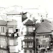
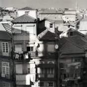
Picture taken in Porto, Portugal during a business trip there early 2015. I really wanted a picture of the stonework on the facades, so I went up early one Saturday morning to shoot it. The contrast was pretty high, I used (for some reason...) #8 filter and development was normal. The contrast in the negative is pretty high.

First proof, trying to have some coverage in the shadows, using the #00 filter.

2015-09-01-0001.jpg

Pre-flash, two cut out masks and several stages of burn-ins with a card resulted in this:

2015-09-01-0003.jpg

The print is on old, expired and fogged Ilford MGIV FB but the print came out anyways. I've toned it in sepia and framed it since scanning it.
 

Pitotshock

Member
Joined
Mar 11, 2021
Messages
123
Location
Renfrew, ON, Canada
Format
Analog
So I had a good read through this stellar thread and thought that I would revive this discussion and add in something from a color world perspective as well.
Here is a shot from my Nikon F6 & 24-70f2.8 on Kodak Gold 200 filmstock, developed in Cinestill Cs41 1quart powder kit.

  • I have shown the raw negative, digitized by DSLR with macro lens, as well as my attempt at adjusting it in Lightroom (I am not an expert at doing this, so that was my attempt, others that do hybrid workflows regularly can probably do much better)
  • First off, I flipped the negative in the carrier to get a mirror image. I just liked the subject going the other way; my preference and each person may have their own opinion and interpretation. There were no letters or writing in the shot that would have given it away, so I reversed it.
  • Next, cropped slightly from the original shot. As with most 135 film shots, the aspect ratio doesn't fit the standard print sizes so there is generally some cropping to do. I did perhaps a hair more than just the aspect ratio.
  • Final print has a gradient burn from about 3/4 a stop on the outside edges to 1/4 stop by the subject, using my right hand as the tool
Some other notes
  • As with most RA4 printing on the enlarger, the work starts with exposure time and color correction, so I would have had a few test prints to adjust color balance as necessary, this one came out at 47M, 42Y and 0C on my Omega C enlarger
  • this paper is Kodak Endura glossy, so getting an image (here just shot with my cell phone) without any glare is a bit of a challenge, especially if the paper doesn't sit flat.
  • the paper is also long expired giving it a slight yellow/green fog, which I think works with this scene
  • paper was developed in Unicolor rotary drums, on a roller base with replenished Kodak Ektacolor chemistry at room temperature (with a stop bath and wash between Developer and Blix)
  • Pushpins through a final print? Ahhh, Heresy! Relax, I do this for my enjoyment...


Raw, unadjusted negative
JSG_8770-3.JPG


digitally processed (as minimal as possible) to get an idea what was on the negative
JSG_8771-4.JPG


Final print as 16x20inch
20211219_175305.jpg
 
Photrio.com contains affiliate links to products. We may receive a commission for purchases made through these links.
To read our full affiliate disclosure statement please click Here.

PHOTRIO PARTNERS EQUALLY FUNDING OUR COMMUNITY:


Ilford ADOX Freestyle Photographic Stearman Press Weldon Color Lab Blue Moon Camera & Machine
Top Bottom