Holy Moly your Ladner Creek Trestle image looks like mine! Great minds thing alike!
I was thinking of you when I posted that. Can't take that photo anymore, they have put up a fence at the end of the bridge.


Holy Moly your Ladner Creek Trestle image looks like mine! Great minds thing alike!
I was thinking of you when I posted that. Can't take that photo anymore, they have put up a fence at the end of the bridge.

the headlights of a texting driver on the morning commute.
Same question - I prefer a staining pyro like PMK to keep the highlights more printable without penalty to the rest of the curve. Superb grain structure and crisp edge acutance. Makes the most out of this film for me. But D76 produces a sag in the middle of the curve with a long upsweep. Perceptol 1:3 is a dream developer for TMX100 at this dilution, but produces annoyingly exaggerated grain in Acros. I have zero experience with XTOL. Incidentally, I routinely rate ACROS at 50 in order to boost deep shadows tonality off the toe and up onto the straight line section of the curve, unless it's a low contrast scene to begin with.
Thank you Henning. I find ACROS highly responsive to printing. But when encountering extreme 11 or 12 stop scene contrast ranges, I use either TMX100 or TMY400 instead.
Hello Heiko,
I am using a Kaiser enlarger which has a double-condensor with a mix / diffusion box. So all my testing and evaluation of characteristic curves is optimised for my workflow to get perfect silver-halide prints with my Kaiser enlarger. That as a short introduction, but it is important to know for you as your workflow would probably be different. Individual tests and adapting to the own, individual workflow are always necessary for optimal results in BW.
I like my Acros II results best with excellent to good shadow detail and good highlight detail.
For now I have two different settings for Acros II in FX-39 II:
1. Optimised for excellent shadow and highlight detail: EI 40/17°, 1+9, 20°C, 7 minutes developing time, first minute permanent agitation, then 1x agitation (Kipp) per minute.
2. Higher speed with good detail: EI 50/18°, 1+9, 20°C, 8 minutes, same agitation rhythm as above.
I will most probably do some further tests with 1+14 and maybe even 1+19 dilution as well. One of the big advantages of FX-39 II is its versatility and flexibility with dilutions. For example FX-39 II works excellently in 1+14 for me with TMY-2. I've got record values in resolution (surpassing lots of ISO 100/21° films) and a for me optimal characteristic curve.
Best regards,
Henning
Henning,...Acros 100 II 120, exposed at E.I 40/17°, developed in ADOX FX-39 II, dilution 1+9, 7 minutes developing time, first minute permanent agitation, then 1x agitation / turn (Kipp) per minute...In the original negative there is even more detail, as these are just quick scans with my very cheap office flatbed scanner (Epson V550)...
Henning,
Those appear rather grainy on my screen, especially from 120 originals at the small image sizes I'm viewing. Do you attribute this to a scanning artifact, or is the same thing visible on your negatives? Thanks in advance.
Sal
Development, distribution and marketing costs are always substantial. 40 years ago I read somewhere that the cost of manufacturing most widgets was usually about 10% of retail pricing. I very much appreciate Henning’s contribution to our knowledge and especially his insights into the film manufacturing business, present and future.
But for the life of me I do not get the focus on price. We are lucky to have more choices! It’s been brought up before- the cost of film (certainly for me) is one of the smallest expenses in this hobby. And if you are a professional using film it just means you’ll have to raise your prices a little to maintain your margins.
When I worked for a company our rule of thumb was that the direct costs to the company to make the product should be about 30% of the selling price.
Those appear rather grainy on my screen, especially from 120 originals at the small image sizes I'm viewing. Do you attribute this to a scanning artifact, or is the same thing visible on your negatives?
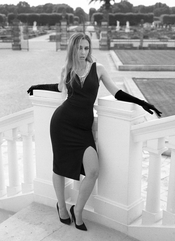
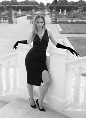
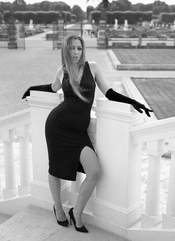
The scene was quite challenging because of the very high contrast of the deep black dress to the the very bright white stairway.
What you're seeing is more likely a compression artefact, or a poor film/developer match, or the result of a slightly overdeveloped and/or overexposed negative, or a combination of some or all of these.
I can absolutely ensure you
Lacking proper testing,
Sorry, a very arrogant claim.
Do you know which and how much tests I have done with this film / developer combination?
No, you don't know. Period.
I know how to properly do such tests. I am running an independent, non-profit photography test lab for many years, and film and developer tests belong to the most demanded tests. I have tested almost all films on the market, and dozens of different developers.
And the results of my negatives and prints are as I have described them in my post above.

Hear, hear! Well said koraks.Moderator note: sometimes, there's no other solution than to "agree to disagree". In this case, @Henning Serger is clear about his observations (with the negatives in his possession). The rest of us can take or leave his claims as we please, but there's only so much we can (and should) do to try to get to the bottom of it.
As it stands, it seems that the constructive part of the exchange has run its course and it's now entering a decidedly less constructive phase - which is a good moment to put a stop to it.
Please continue in another direction from here.
| Photrio.com contains affiliate links to products. We may receive a commission for purchases made through these links. To read our full affiliate disclosure statement please click Here. |
PHOTRIO PARTNERS EQUALLY FUNDING OUR COMMUNITY:  |