• Welcome to Photrio!
    Registration is fast and free. Join today to unlock search, see fewer ads, and access all forum features.
    Click here to sign up

Direct carbon on glass process

The Hot Waters

A
The Hot Waters

  • 2
  • 1
  • 51
The Hot Waters

A
The Hot Waters

  • 1
  • 0
  • 61

Recent Classifieds

Forum statistics

Threads
204,445
Messages
2,868,742
Members
102,278
Latest member
rdglidewell
Recent bookmarks
0
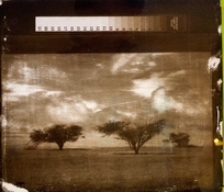
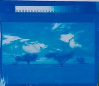
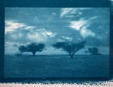
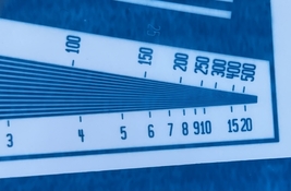
FYI here's two exposure tests, one with cyan pigment and the other magenta. For fun I flipped and stacked the two glass plates so that the gradients overlapped and blended together.

20260128_051543.jpg


The colour plates are pretty vibrant, happy with the results so far. I plan to expose and develop the yellow plate tonight.
 
If you replace acetic acid by tartaric acid, you will have the system Poitevin introduced around 1860.
At a ~ 4 : 1 (ferric chloride : tartaric acid) weight ratio the warm gelatin solution will not coagulate and can be used for coating.
They used to use this as a positive process, by toning the unexposed parts with gallic acid. The exposed parts became more soluble which aids clearing, to amplify this they let the gelatin/ferric/TA mix hydrolyze for a couple days before coating. See e.g. ch. 8 in Die Lichtpausverfahren, die Platinotypie und verschiedene Kopierverfahren ohne Silbersalze (not sure if that link works from outside of Germany).

Perhaps fructose would work - it also forms a light sensitive complex with FeCl3 and its thermolysis products are effective crosslinkers (sadly also effective at staining).
 
Thanks!

The yellow plate was a bit of a mess, still worked but there was a lot of pigment staining, even with very tenacious development. On a positive note the gelatin is really well adhered to the glass because I was spraying and pouring hot water onto the print from a reasonable height and none of it budged.

I think the staining and overall kinda crappy print is a result of the heroic pigment load Calvin recommends for his yellow colour paste carbon glop, about 60% of the dry gelatin weight! Vs. 16% for magenta and 5% for cyan. I think I might try again with a much lower pigment load, the yellow pigment is already quite opaque so I don't think I need that much pigment to get a strong colour out of it.

The magenta also stained a bit and it also has a fairly high pigment load. I was happy with how that plate turned out, but it was also quite a solid colour in the high-density areas so I feel like it could benefit from a lower loading too.
 
They used to use this as a positive process, by toning the unexposed parts with gallic acid. The exposed parts became more soluble which aids clearing, to amplify this they let the gelatin/ferric/TA mix hydrolyze for a couple days before coating. See e.g. ch. 8 in Die Lichtpausverfahren, die Platinotypie und verschiedene Kopierverfahren ohne Silbersalze (not sure if that link works from outside of Germany).

Perhaps fructose would work - it also forms a light sensitive complex with FeCl3 and its thermolysis products are effective crosslinkers (sadly also effective at staining).

Thanks very much for the link. It has been a while I have been reading Eder. It is definitely worth a second look!


Fructose looks like something try - pectin might be another candidate.
 
A few more pics of the colour plates overlapping. I'm going to try again with lower pigment loads on magenta and yellow, but happy with cyan at this point.

20260129_064459.jpg

20260129_064534.jpg

20260129_064657.jpg

20260129_065126.jpg


On the fence about backlight vs. place them on a very reflective white backing. Putting them on a white backing works quite well for one or two plates but once you get to 3 or 4 the slight colour of the cheap float glass adds up and the highlights look a little grey. Backlighting works quite well for 4 plates as collectively they have enough density for a reasonable black but it would be a bit more work to figure out how to integrate the backlight and present it in a nice way (don't want to have cables all over the wall etc.).
 
Here are a couple of PVOH- SbQ ( zerochrome) images on glass - back exposed. The biggest challenge is getting an even coat. Phthalo pigment developed well but my carbon black thickened up the PVOH and clotted, and it had to be brush developed. These were laid on a white sheet of paper for light transmission through the back, and photographed.

Also note the contrast difference. The C-blk has more.
 

Attachments

  • IMG_1282.jpeg
    IMG_1282.jpeg
    1.8 MB · Views: 94
  • IMG_1277.jpeg
    IMG_1277.jpeg
    1.2 MB · Views: 96
Last edited:
Another SbQ emulsion test on glass. Not bad resolution even with the negative sitting 1.5 mm above the emulsion surface (again, back projected through the glass thickness of such). UV Led is a projection config 80 cm above. It is a 25 mm square COB with collimating lens, running at 225 W. Line pairs resolving to 350 lpi., which is pretty good. Exposure 17s. There is bleed. It may be light travelling horizontally through the emulsion as SbQ is not much of a light blocker. I will try with cblk to see if that changes.
 

Attachments

  • PVA-SbQ-phthalo blue + cblk by magic eraser foam 15 s exp UV 170- light through glass.jpg
    PVA-SbQ-phthalo blue + cblk by magic eraser foam 15 s exp UV 170- light through glass.jpg
    1.2 MB · Views: 106
  • IMG_8670.jpeg
    IMG_8670.jpeg
    587.2 KB · Views: 85
Another SbQ emulsion test on glass. Not bad resolution even with the negative sitting 1.5 mm above the emulsion surface (again, back projected through the glass thickness of such). UV Led is a projection config 80 cm above. It is a 25 mm square COB with collimating lens, running at 225 W. Line pairs resolving to 350 lpi., which is pretty good. Exposure 17s. There is bleed. It may be light travelling horizontally through the emulsion as SbQ is not much of a light blocker. I will try with cblk to see if that changes.

Nice results, what's the dilution of the SbQ you're using? And are you brushing it onto the glass or pouring?

I've tried 1+2 dilution and pouring the layers on but my results were quite variable, I got some good results but on larger pieces of glass there were significant variations in density across the sheet. I suspect it's because as the layer dries unevenly it 'pulls' pigment from other areas.
 
My PVA- SbQ is made up. I have two viscosities. For these tests, I used my high viscosity grade undiluted. Its probably a little under that of undiluted gum arabic solution, maybe 100 cP ish after adding a pigment dispersion. The best coating I can get with a brush approach is using a thin cut foam rectangle of magic eraser which is ultrafine melamine foam. I just dip the bottom edge and brush with it. It‘s efficient, does not leave a bead at its edge and works well but not perfect. I don’t have a wirewound rod to try but that might be the best way to lay it.

Because it is so viscous, I can get a dense coat easily, but still, levelling could be better. Such a high viscosity does hinder levelling. I can’t say for sure if my viscosity is ideal, but my first goal was laying a sufficient thickness, which a higher viscosity provides.
 
I had to take a time-out from this process for a while because my UV projector LCD screen died, but now that I've ressurected it as a UV enlarger that takes 4x5 negatives (which I can write digital images onto) I'm back doing carbon on glass again!

Here's my most recent print, super happy with how it looks! I honestly can't see much of a tonal threshold at all, which I think is because hardening and developing directly on the glass plate as the final support mechanically protects really thin layers of gelatine that would be easily destroyed if you tried to transfer to another substrate.

_DSC5240.jpg


There are some micro-bubbles that I think were from the gelatine gelling too quickly as I was pouring and spreading, it's getting cold here so I need to start pre-heating my glass plates to give me more working time.
 
Looks good. You could always build a dam, and pour a thicker layer, allowing the bubbles vertical space to rise up and away from the imaging area.
 
From the pov of bubbles forming, how different is a tissue poured over glass different from that over Yupo or fixed-out XRay?

I imagine it should be virtually no different. All I can think of is the glass will have more thermal mass, so it will suck heat out of the glop faster, but it's also more dimensionally stable so there's no risk of it buckling from the heat.

I was doing this process earlier this year when my garage was much warmer and there's a huge difference in how fast the glop starts to gel. Once during summer I picked up a plate after it had been sitting for a while assuming it would have set and the glop poured off onto the ground! Now I get maybe 30 seconds of time to spread before it starts to set.

I'd imagine that a longer 'working time' would give more time for any small bubbles to rise, and there would be less risk of introducing/trapping bubbles as I spread the glop around if it stays liquid for longer.
 
Back onto colour printing on glass again now, although because I've changed my exposure process I have to re-do a bunch of work I'd done previously, namely working out new exposure times and calibration curves for each colour.

I've done black and cyan so far, and have just poured some magenta plates to test with tomorrow.

Out of interest I've plotted the measured a* and b* values for the densest patches on my calibration prints for black and cyan:

CK_CIELAB.PNG


The points on the graph are also coloured to the same RGB values as the patches measured, so they should be the true colours.

As you can see my black is a bit warm and my cyan is a bit blue, I'm using Pebeo indian ink for black and Calvin's colour pastes for CMY.

I had more of an obvious tonal threshold for cyan than black, I think the tinting strength of the cyan colour paste is quite strong and so it needs less exposure to get to maximum density and thinner (and more fragile) gelatine layers are needed for lighter tones. Here's the transmission density vs. exposure time for black and cyan:

Carbon density vs exposure.PNG

Btw, I'm pretty sure the drop in density with increasing exposure after the curves plateau is just do to my UV enlarger showing some intensity falloff towards the edges rather than anything to do with the process.
 
As you can see my black is a bit warm and my cyan is a bit blue, I'm using Pebeo indian ink for black and Calvin's colour pastes for CMY.
Calvin gives the following benchmark coordinates for saturated primaries:
primary L a b
Light Cyan
74​
-30​
-33​
Cyan
57​
-40​
-52​
Light Magenta
64​
61​
-19​
Magenta
48​
80​
-10​
Yellow
95​
-8​
100​
Looks like your cyan could actually be a tiny bit more blue. Since you're on the mark on the a* axis, this implies you may have some yellow staining in your cyan.

Indian ink is often very warm-toned because it's such a fine pigment as it needs to be (and remain) dispersed in a free-running liquid.

I had more of an obvious tonal threshold for cyan than black, I think the tinting strength of the cyan colour paste is quite strong and so it needs less exposure to get to maximum density and thinner (and more fragile) gelatine layers are needed for lighter tones.
You could of course dial back the cyan pigment concentration a little. I find it helps to plot the Lab coordinates of a step tablet; you generally see the intensity of the hue maxes out at some point. For color work there's no use in going beyond that point.
 
Calvin gives the following benchmark coordinates for saturated primaries:
primary L a b
Light Cyan
74​
-30​
-33​
Cyan
57​
-40​
-52​
Light Magenta
64​
61​
-19​
Magenta
48​
80​
-10​
Yellow
95​
-8​
100​
Looks like your cyan could actually be a tiny bit more blue. Since you're on the mark on the a* axis, this implies you may have some yellow staining in your cyan.

Indian ink is often very warm-toned because it's such a fine pigment as it needs to be (and remain) dispersed in a free-running liquid.


You could of course dial back the cyan pigment concentration a little. I find it helps to plot the Lab coordinates of a step tablet; you generally see the intensity of the hue maxes out at some point. For color work there's no use in going beyond that point.

Hmm actually looking at that table my cyan maximum L* is actually quite a bit darker than Calvin's recommendation (mine is 41 vs. his 57) although he also lists a 'light cyan' so I wonder if he anticipates that the maximum density of his print would stack the densities of the two cyan layers? In which case mine might be ok.

I should probably just buy his calibration e-book sometime, I think large chunks of it will not be that useful to me as I'm using a totally different workflow (no QTR, not halftone printing, no digital negatives etc.) but there's probably some information in there that will save me time.

Also in terms of the yellow cast to the cyan, I didn't clear that print so there would have been some sensitiser stain still, although I am running a very small amount of DAS in my glop.
 
I wonder if he anticipates that the maximum density of his print would stack the densities of the two cyan layers
Yes, absolutely, that's what happens!

I suspected retained DAS would be account for the stain.

I can really recommend his ebook even if your workflow is different. It's very insightful indeed.

PS: as to cyan density/L-value: I'd focus on the ab* coordinates as those represent chromacity, which is the relevant bit. L is kind of a sideshow.
 
Last edited:
I've been noticing some small bubbles in the highest density areas of my direct-carbon prints that I'm quite sure were not present in the gelatin when it was poured, so I did an experiment with the two magenta test prints I just developed. As you would know, DAS generates nitrogen bubbles during exposure and the typical method for getting rid of them is to soak the exposed tissue in cold water and then hang it up to dry for a while, which swells the gelatin and allows the gas to escape before mating. In my case however because I expose through the thickness of the glass, the exposed DAS (and as such, the nitrogen) is deep under a layer of unexposed gelatin, right on the surface of the glass, rather than right at the surface of the gelatin as is the case with normal contact exposure.

The first test plate was soaked in a tub of cold water for a few minutes, before developing in 45 degree Celsius water, and it was a disaster. At the end of the cold water soak the gelatin was horribly blistered with hundreds/thousands of millimeter-scale bubbles across the surface of the print, which didn't go away during development. I figure during the cold soak, water swelling the gelatin allowed millions of tiny micro-bubbles to coalesce into thousands of very obvious macro-bubbles, which had enough force to push the gelatin off the glass and blister up, but which couldn't escape due to how much gelatin was above them.

For the second test I went the opposite way, and plunged the exposed plate into a tub of 47 degree Celsius water and immediately began vigorous agitation for the duration of development. This worked much better, can't see any large bubbles evident in the final print. My theory is that hot water and strong agitation melts away the unexposed gelatin on the back-side of the glass fast enough that by the time water has infiltrated down to the exposed layers where the micro-bubbles exist they now have a path to freedom and don't coalesce into larger bubbles or blister the gelatin.

The magenta plate shows a similar tonal threshold to the cyan one, again probably because the colour pastes have such high tinting strength that areas of very light tint are super thin, delicate and probably also highlight unevenness in the illumination field of my enlarger that weren't obvious for the black layer. I'm hoping this won't be so evident in a final 4-layer print, but we'll see.
 
Also I just got Calvin's e-book on calibration and started skimming it and it's not doing me any favors! Not because it's not fantastic, because it seems to be, but because it's telling me I need to go back and do a lot more work on calibrating this process if I want to get good results!

I mean, I already suspected this, but it's a difficult pill to swallow when you work full-time and you've only got an hour or two at night or on the weekends. Ahh well, it's not like anybody is forcing me to do it or not do it, so there's no point complaining.
 
Out of interest I plotted the change in a* and b* values with increasing L* (or roughly, the shift in colour of each layer with increasing exposure) and it's pretty interesting how the colour remains relatively constant with increasing exposure to a point, where it suddenly wraps around and skews off. I've only taken a single measurement of yellow at this point because the test print was such a flop I'm currently re-doing it. Also none of these were from prints that had their sensitiser stain cleared, so I assume that would make some difference.

Colour change vs density.PNG

I feel like this plot, and my initial skim of Calvin's process, is telling me that I'm probably exposing my colour plates for too long, targeting a maximum density rather than 'enough' density and colour to get the job done. I'm sure my life would be easier if my maximum exposure for each colour was still roughly on the linear sections rather than into the sudden change curve.
 
I made the same plots and also had the same observations about them. I think I've posted some on my blog somewhere; they look pretty much identical to yours.
 
Photrio.com contains affiliate links to products. We may receive a commission for purchases made through these links.
To read our full affiliate disclosure statement please click Here.

PHOTRIO PARTNERS EQUALLY FUNDING OUR COMMUNITY:


Ilford ADOX Freestyle Photographic Stearman Press Weldon Color Lab Blue Moon Camera & Machine
Top Bottom