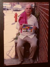
Diluted C41 Tested

River Eucalyptus

H
River Eucalyptus

  • 0
  • 0
  • 33
Musician

A
Musician

  • 2
  • 0
  • 64
Your face (in it)

H
Your face (in it)

  • 0
  • 0
  • 64
A window to art

D
A window to art

  • 4
  • 0
  • 59

Recent Classifieds

Forum statistics

Threads
199,257
Messages
2,788,687
Members
99,844
Latest member
MariusV
Recent bookmarks
2

Mr Bill

Member
Joined
Aug 22, 2006
Messages
1,484
Format
Multi Format
The problem with colour crossover is that without a rigorous route to examine and test the truth of whether it exists or not in a negative ...

Well, it's more complicated because it can't really exist alone in a negative. A negative on its own doesn't make an accurate color reproduction; its an intermediate recording of an image. So one has to define a system. Now in my world, which is largely the world of physical prints, the test for good color reproduction is to photograph something (under a "proper" light source, whatever that may be), then develop the film and make optical prints. I say "optical prints," meaning via an enlarger because that's how these systems were originally designed. There is a delicate balance between how the film "sees" a colored object and how that film forms dyes to represent that object, and then how an enlarger's light source, after passing through the dyes in that film (plus the filters used for color-balancing) affect the printing paper, which has its own set of spectral responses and resulting dyes. Then you look at the print, also under a "proper" sort of light, then decide if it is a decent representation of the color of the original object.

Now if you can succeed at this, then I would say that you have made a decent color reproduction.

I should note that this likely only works "perfectly" under one type of light source; because the original object probably has a different spectral makeup than the print. It is generally possible to "trick" our eyes, under a specific spectral makeup of light, to see the original and the print as nearly identical. (This known as a metameric match.) But... if the light source is changed, then likely the apparent match is gone. (You may have noticed this sort of thing where you pick out some clothes in a department store, but when you get out in the daylight they no longer match.)

Anyway, let's say that you have gotten a fairly decent color reproduction using the combination of film and paper. And this reproduction holds up under a wide range of scene brightness values. So I would say that the "system" was successful. Neither the film nor paper was able to stand alone, but combined, and under the proper conditions, they made a decent color reproduction.

Now let's say that we have screwed up this finely tuned system by making the film behave differently. Say that we now make a print, but we are not able to have, for example, the gray tones stay neutral throughout the brightness range. If you have the specific situation that it "wants" a certain color-correction in the light areas but an opposite (or complementary) color in the dark areas, then this is called a color cross. This is what would happen if you could make the film change its contrast in only one dye layer. And it's not correctable by "normal" means.

Now earlier I suggested that neither the film nor paper can stand alone, that one has to judge their combined effect. But... given that the hypothetical earlier system DID give a decent color reproduction I think that it's fair to say that, since we specifically screwed up this hypothetical film, that the film itself has induced the color crossover. It certainly could be possible to build a special companion paper that exactly counteracts the "bad" aspect of the hypothetical screwed up film, and then there would be no color cross from the "system." But as a general rule the manufacturers have not done fine tuning of papers to match oddball film responses. Papers tend to be generally somewhat interchangeable, at least within the amateur realm and within the professional realm.

Earlier I defined a "system" as the combination of film and paper; it's just my personal baseline, for various reasons. Someone else might define it as scanned film, and if the combination doesn't give good color reproduction then there might be some ambiguity as to which one is the source of the problem. Using the base reference that I prefer, the ability to make a good print on photo paper, can reveal whether or not the negative conforms to a presumed design aim. If it DOES conform (by making a good quality print) then I would judge the negative to be ok, and that therefore the problem must be in the scanning step.
 

MattKing

Moderator
Moderator
Joined
Apr 24, 2005
Messages
53,287
Location
Delta, BC Canada
Format
Medium Format
pentaxuser,
If it is of any consolation, it is as much a curse as a blessing being able to see crossover in some of these images.
I expect it is similar to people who have perfect pitch - apparently they are intensely irritated by much of the "music" around us.
 

Mr Bill

Member
Joined
Aug 22, 2006
Messages
1,484
Format
Multi Format
Not sure I learned a lot about colour crossover except that it depends on a large number of factors and for most users it may never "show its face" which is what counts for most users.

Let me try to bluntly explain how you might test for a color cross in the neutral tones. I'm gonna skip all the finicky little details, so this is mostly a conceptual thing. First find a neutral gray test target that runs from near-white to near-black. Photograph it and develop the film. Then make a print. Now examine the print to see if the "gray" is consistently neutral everywhere, from white to black. If it is, there is no problem. But if you find anywhere on the gray scale that is not neutral, then your film/paper system has a color cross.

I'll elaborate more in a following post. For now I don't want to mislead from this basic idea.
 

Mr Bill

Member
Joined
Aug 22, 2006
Messages
1,484
Format
Multi Format
Regarding how a novice printer might initially discover a color cross is that they are trying to make fine adjustments to a print, and find that they are not able to color balance a print to their satisfaction. If this is the gray scale just mentioned, here's what might have happened: the gray scale is neutral everywhere except in the lighter areas, where, for example, it may have picked up a pinkish tinge. So the printer thinks, ok, I will remove some pink from the print. Now the printer finds that the formerly pink area is ok. But... the formerly "ok" areas now are lacking in pink, that is, they have taken on a sort of bluish or greenish appearance (depending on exactly what the correction was.). If the printer tries to correct the now blue/green parts of the gray scale back to neutral, they find that the pinkish area has returned.

So the printer now realizes that this is a non-correctable problem; it is two aspects of the same color - either adding or subtracting "pinkness," which in the printing world gets translated into some combination of red or magenta. Now if that printer is at all familiar with the characteristic curves of a color film (which are normally published showing a red, green, and blue line for a neutral exposure) then they probably realize that the curves that THEY are dealing with are not parallel, but at least one of the curves is tilted so as to eventually cross another if they were extended.

There IS a book reference in Ctein's book, "Post Exposure... " which is, or at least used to be, available for free download from his website. See page 22.
 

David Lyga

Member
Joined
Nov 25, 2007
Messages
3,445
Location
Philadelphia
Format
35mm
Within this maelstrom, is one's particular ability to discern hue, or color, of any import here?

Traffic lights are boldly represented, maybe for this very reason, because slight differences might otherwise be mitigating factors and might not be able to be perceived as being unique with all drivers' visions.

When koraks saw my prints and said to me that, right out of the envelope, they looked a bit cyan, I knew that I was doomed. This is certainly not korak's fault, but the fault of a perception which is not able to be universal or definitive with all viewers under varying light sources. Indeed, many of us remember (from the 1970s) ads for Fuji film which stressed sensitive Japanese eyes which aided in the manufacture of the perfect color film. Agfa also had ads which stressed the bolder, redder slant to their reversal color films.

This discussion is beyond being one that is merely preoccupied with correcting me. Its value is ongoing and the alternate viewpoints, both in terms that are quantitative and qualitative, produce meritorious output for those both new to this genre and those who have been entrenched, lifelong, within its vast technical and subjective parameters. Maybe Ron Mowrey died before he had a right to do so. - David Lyga
 
Last edited:

MattKing

Moderator
Moderator
Joined
Apr 24, 2005
Messages
53,287
Location
Delta, BC Canada
Format
Medium Format
Within this maelstrom, is one's particular ability to discern hue, or color, of any import here?
Yes.
I have a good friend who boldly jumped into attempting to learn darkroom colour printing with Ilfochrome materials. He became very frustrated, because he failed to take into account his red-green colour blindness!
As for your cyan tinged prints, as koraks noted, it is quite likely that that was at least partly due to your viewing conditions.
And colour palettes traditionally reflected localized preferences - some of which brought rise to complaints of racial prejudice, even when they were most likely merely reflections of localized customer feedback.
 

David Lyga

Member
Joined
Nov 25, 2007
Messages
3,445
Location
Philadelphia
Format
35mm
Yes.
And colour palettes traditionally reflected localized preferences - some of which brought rise to complaints of racial prejudice, even when they were most likely merely reflections of localized customer feedback.
How this brings back recollections of employee ID cards before the digital age. I can remember with clarity all the blacks who (did not even complain, just assumed it was ongoing) said to each other that their ID cards were "ink spots". And, they were!!!! How I wanted to tell the person involved with these photos that he was UNDER exposing the black person, but I would have been met with an arrogant "Who do you think that you are?" because many egos cannot stand correction. Problem was that the 'ideal' photo was derived from a white face being deemed as normal, 'medium gray'. An adjustment should have been made for dark skin, but years and years went by and that had not been corrected.

It goes to say that too often changes are not made because it is assumed that faulty results are inevitable. I also remember people getting photos back from the drugstore and NOT becoming incensed with the color which was not even a facsimile of the correct hue. And, additionally, because marketers promoted their flash units with augmented guide numbers, (or, perhaps, those guide numbers were tailored to reversal film), the prints of scenes from flash exposure were inevitably underexposed. No wonder people jumped to digital when it came out. There WAS a decided improvement. - David Lyga
 

Mr Bill

Member
Joined
Aug 22, 2006
Messages
1,484
Format
Multi Format
A couple more comments on color crosses and characteristic curves: there is a tendency for people to presume that the graphed curves made from densitometer readings will accurately show whether a crossover exists. This is not necessarily so. In other discussions here, using Giorgianni's book on digital color, he shows some examples of densitometer curves vs "printing density" curves for a typical color neg film. Although both are substantially similar, the "printing density" curves are mostly parallel, where the densitometer density curves, for a neutral exposure, are not. Printing density shows how the film response looks to a photo paper, which has broader spectral sensitivities. The densitometer function used for color neg film, status M, looks at narrow spectral slices, so does not exactly mimic the result seen by photo paper.

Another note is that color crosses can occur in many different colors, not only in neutral grays. And they can occur in different parts of the characteristic curves. So one cannot expect to do a simple shooting/printing test and find all possibilities of color crosses. This is why, in the tests I briefly discussed (in a recent link), we did more extensive portrait testing. We used a variety of complexions, from very pale to pretty dark, will a couple of color tone variations. And we ran a wide variety of exposure variations, to represent possible errors in our portrait chain. Anyone who has used a b&w "compensating developer" understands that these are typically very dilute, with the effect that the developer "exhausts" faster in higher density areas. So such a person probably would perhaps realize that the same sort of thing COULD happen to a heavily overexposed color film, and the effect would likely be most pronounced in the bottom color layer of the film (the developer is s becoming exhausted by the top layers). And this could lead to severe color reproduction problems with such film. But to cut through all the hypothetical mumbo jumbo, a simple shooting test answers things right away.
 

David Lyga

Member
Joined
Nov 25, 2007
Messages
3,445
Location
Philadelphia
Format
35mm
Anyone who has used a b&w "compensating developer" understands that these are typically very dilute, with the effect that the developer "exhausts" faster in higher density areas. So such a person probably would perhaps realize that the same sort of thing COULD happen to a heavily overexposed color film, and the effect would likely be most pronounced in the bottom color layer of the film (the developer is s becoming exhausted by the top layers). And this could lead to severe color reproduction problems with such film. But to cut through all the hypothetical mumbo jumbo, a simple shooting test answers things right away.
This DIRECTLY ATTACKS my method and there just might be a lot of sense being made here. However, maybe I mitigate this exhaustion effect somewhat by turning the tank continuously throughout the development. I do not know if that really does reduce any 'compensation effect' but I wanted to state that. Very interesting comparison here. - David Lyga
 

Mr Bill

Member
Joined
Aug 22, 2006
Messages
1,484
Format
Multi Format
This DIRECTLY ATTACKS my method and there just might be a lot of sense being made here. However, maybe I mitigate this exhaustion effect somewhat by turning the tank continuously throughout the development. I do not know if that really does reduce any 'compensation effect' but I wanted to state that. - David Lyga

Yes, I understand; I'm trying to imply this gently. But our purpose in testing was that we would periodically have studios that would forget to stop down their lens, and could accidentally overexpose (for the better part of a week) by 4 or 5 f-stops. So when we evaluated new films we wanted to understand what sort of potential problems we might have (if it was severe enough we would have taken further steps to minimize the errors). But we found that the films we used, generally the Kodak professional portrait/wedding film of the day, could withstand around 4 stops overexposure in studio conditions with no apparent color differences. (One should NOT make the assumption that other films can do this.) Now part of this, I would imagine, was a result of tight process control, meaning that the developer was never deficient with respect to aim values. Had we used "weakened" developers, I would expect that the heavily overexposed film would suffer sooner. But did we test for this? No, because we had no intention of using under-strength developers, nor marginal agitation.

David, I doubt that your agitation helped to mitigate color issues with a heavily diluted developer. I would expect that the upper color layers are gonna cause the diluted developer to be more exhausted by the time it diffuses down to the bottom layer, where I would expect the response curve to start rolling off first, thus becoming unbalanced with respect to the other layers. But... I HAVEN'T DONE THE EXPERIMENT. So these are simply MY GUESSES as to what might happen.
 

MattKing

Moderator
Moderator
Joined
Apr 24, 2005
Messages
53,287
Location
Delta, BC Canada
Format
Medium Format
How this brings back recollections of employee ID cards before the digital age. I can remember with clarity all the blacks who (did not even complain, just assumed it was ongoing) said to each other that their ID cards were "ink spots". And, they were!!!! How I wanted to tell the person involved with these photos that he was UNDER exposing the black person, but I would have been met with an arrogant "Who do you think that you are?" because many egos cannot stand correction. Problem was that the 'ideal' photo was derived from a white face being deemed as normal, 'medium gray'. An adjustment should have been made for dark skin, but years and years went by and that had not been corrected.
I don't know that those ink spot ID cards were a reflection of presumptions, but rather just poor equipment and poor technique.
If it was a problem of presumption, the faces in the cards should have turned out too light!
As I look at my current Drivers Certificate photo, I can assure you that poor ID photos remain with us to this day!
 

David Lyga

Member
Joined
Nov 25, 2007
Messages
3,445
Location
Philadelphia
Format
35mm
Yes, I understand; I'm trying to imply this gently. But our purpose in testing was that we would periodically have studios that would forget to stop down their lens, and could accidentally overexpose (for the better part of a week) by 4 or 5 f-stops. So when we evaluated new films we wanted to understand what sort of potential problems we might have (if it was severe enough we would have taken further steps to minimize the errors). But we found that the films we used, generally the Kodak professional portrait/wedding film of the day, could withstand around 4 stops overexposure in studio conditions with no apparent color differences. (One should NOT make the assumption that other films can do this.) Now part of this, I would imagine, was a result of tight process control, meaning that the developer was never deficient with respect to aim values. Had we used "weakened" developers, I would expect that the heavily overexposed film would suffer sooner. But did we test for this? No, because we had no intention of using under-strength developers, nor marginal agitation.

David, I doubt that your agitation helped to mitigate color issues with a heavily diluted developer. I would expect that the upper color layers are gonna cause the diluted developer to be more exhausted by the time it diffuses down to the bottom layer, where I would expect the response curve to start rolling off first, thus becoming unbalanced with respect to the other layers. But... I HAVEN'T DONE THE EXPERIMENT. So these are simply MY GUESSES as to what might happen.
I think that you are contributing positively to this forum. To be honest, I did not think of this in this way. You bring up something worth discussing and considering. - David Lyga
 
Joined
Jul 28, 2016
Messages
2,788
Location
India
Format
Multi Format
If one were to design a simple reproducible test for detecting colour crossover, would something like this work?

Take a large sheet of paper with a single colour, say, white. Place the paper outdoors such that one half of it is in the sun and other half in the shadows and take an exposure. Repeat this with papers of a few other colours, single colour always. Develop the roll and print each frame with filtering you would use to reproduce the colour corresponding to the frame. Examine the prints carefully.

I guess a colour checkerboard would do the job, but for a non-expert examining one colour at a time is much easier.
 

koraks

Moderator
Moderator
Joined
Nov 29, 2018
Messages
23,521
Location
Europe
Format
Multi Format
Take a large sheet of paper with a single colour, say, white. Place the paper outdoors such that one half of it is in the sun and other half in the shadows and take an exposure.
This will in practice be tricky, as the color temperature of shadow vs. sunlight is so wildly different. A variation could be to photograph the same sheet of paper a few times, but under- and overexpose the frames to simulate a wider brightness range. Which is what I did for my earlier test in this thread.
 

David Lyga

Member
Joined
Nov 25, 2007
Messages
3,445
Location
Philadelphia
Format
35mm
If one were to design a simple reproducible test for detecting colour crossover, would something like this work?

Take a large sheet of paper with a single colour, say, white. Place the paper outdoors such that one half of it is in the sun and other half in the shadows and take an exposure. Repeat this with papers of a few other colours, single colour always. Develop the roll and print each frame with filtering you would use to reproduce the colour corresponding to the frame. Examine the prints carefully.

I guess a colour checkerboard would do the job, but for a non-expert examining one colour at a time is much easier.
When my father used to take color Ektachrome slides back in the 60s, we would always comment that the shots taken in the shade were always too blue, but the slides taken in sunlight were always 'correctly colored'. (With his Kodak Motormatic, he was ignorant in the use of filters.) So, maybe there is something to this. The human eye seems to adjust well to the 'real scene' but not so well to a facsimile of a real scene. - David Lyga
 

RPC

Member
Joined
Sep 7, 2006
Messages
1,630
Format
Multi Format
This will in practice be tricky, as the color temperature of shadow vs. sunlight is so wildly different. A variation could be to photograph the same sheet of paper a few times, but under- and overexpose the frames to simulate a wider brightness range. Which is what I did for my earlier test in this thread.

I sometimes use a similar technique but with a gray card at 1 stop intervals to form a gray scale, as an alternative to photographing a gray scale.

Shades of gray IMO are best to use because grays, all being neutral, make the best reference color, showing color shifts, especially slight ones, betters than colors.

As long as the curves plot reasonably parallel with a gray scale, I get the most overall accurate color reproduction in prints of negatives. I have always used the parallelness of the curves to indicate proper processing, and it has never let me down.
 
Joined
Jul 28, 2016
Messages
2,788
Location
India
Format
Multi Format
Shades of gray IMO are best to use because grays, all being neutral, make the best reference color, showing color shifts, especially slight ones, betters than colors.

Not that I doubt the effectiveness of the method described by you, but pictures of real world might or might not have any grey in them and if the slight color shifts don't show up conspicuously in the color regions of pictures, should one worry too much about them? My motivation for proposing single coloured paper as the subject was to identify the conspicuous colour shifts associated with specific colours.
 

koraks

Moderator
Moderator
Joined
Nov 29, 2018
Messages
23,521
Location
Europe
Format
Multi Format
if the slight color shifts don't show up conspicuously in the color regions of pictures, should one worry too much about them?
That's a very reasonable argument at least for us amateurs. It's indeed also the reason why I don't shoot many grey cards or color patches. Too boring, and if it only highlights issues that don't bother me, then what's the sense in it (for me at least). Too bad that I turn out to be fairly sensitive to color variations (to the great disbelief of my girlfriend). It's not a blessing much of the time.
 

MattKing

Moderator
Moderator
Joined
Apr 24, 2005
Messages
53,287
Location
Delta, BC Canada
Format
Medium Format
If you are going to work with colour negative film regularly, consider including a grey scale in at least one shot on a roll regularly. A Macbeth Color Checker (which includes a grey scale) is even better.
In days of yore, I could safely leave these problems in the hands of the very good local processing labs that were competing for my business.
Ain't progress grand?:sad:
 

RPC

Member
Joined
Sep 7, 2006
Messages
1,630
Format
Multi Format
Not that I doubt the effectiveness of the method described by you, but pictures of real world might or might not have any grey in them and if the slight color shifts don't show up conspicuously in the color regions of pictures, should one worry too much about them? My motivation for proposing single coloured paper as the subject was to identify the conspicuous colour shifts associated with specific colours.

As I said using grays and gray scales to test with I get the most accurate overall color reproduction, and I think most people would want that. But if you are only interested in certain colors over others and a process you are testing reproduces those colors to your satisfaction with such a test, then yes such a test may work for you.

Some of us have tried to show in this thread that this process will not give good overall color reproduction compared to the standard process and why. To those who don't care about that and have other specific goals, well, okay. Run your own tests and accept what you want. It is that simple. It should not be as complicated as it is being made.
 

David Lyga

Member
Joined
Nov 25, 2007
Messages
3,445
Location
Philadelphia
Format
35mm
For what it is worth, I took my picture last week. I tried to get as much color as possible, and I made certain to get shade (me) and sunlight (on my right and behind). It was taken on the same film (Fuji Super G+, expired 1998, ISO 100). I rated it a bit slower (maybe one stop) and developed it in C-41 Kodak Flexicolor 1 + 9 for 9 minutes at 100 F. The print was processed in Kodak RA-4 RT 1 + 9 for 3 minutes at ambient (80 F): Fuji Archive. I took the picture of the RA4 print with my cheap digital camera, so do not expect the highest quality. But you can get the idea.

I would also like to make a comment about RA4 prints, in general: The contrast level for negatives to be printed on RA4 paper must be somewhat truncated in order to obtain detail in both shade and sunlight. I remember that when Cibachrome came out in the 70s, we all marveled at the fantastic and vibrant print colors. But there was a price to pay for this magnificence: Contrast was, at times, unbearably extended. The reason why I am bringing this up is because, sometimes, a sacrifice in the tonal range of detail is mandated when we are after vibrant hues which scream out at us. With B&W, sometimes mid tone separation is more important than capturing the last details of both dark and light extremes. With color, if the negatives are somewhat overdeveloped, the sacrifice wrought by the excess contrast is mitigated by the bounty of having colors that are very saturated; again, the tonal extremes would be compromised, deficient of detail.

In sum, there are two different ways of looking at this imaging aesthetic, whereby one emphasizes hue saturation (or mid tone separation with B&W) AND the other emphasizes 'capturing it all' but comfortably conforming to the paper's rather narrow ability to register the complete tonal range. Sometimes this restriction makes for a somewhat drab print. This decision, more than any other factor, stresses the advantages that sheet film has (individual development) over the need for 'average development' of roll films. - David Lyga
 

Attachments

  • PHOTRIO TESTN0318.jpg
    PHOTRIO TESTN0318.jpg
    1.2 MB · Views: 82
Last edited:

MattKing

Moderator
Moderator
Joined
Apr 24, 2005
Messages
53,287
Location
Delta, BC Canada
Format
Medium Format

David Lyga

Member
Joined
Nov 25, 2007
Messages
3,445
Location
Philadelphia
Format
35mm
I think that Eastman Kodak would have a good model with me, yes, but not Shirley, please. I am male. - David Lyga
 

MattKing

Moderator
Moderator
Joined
Apr 24, 2005
Messages
53,287
Location
Delta, BC Canada
Format
Medium Format
I think that Eastman Kodak would have a good model with me, yes, but not Shirley, please. I am male. - David Lyga
David - some of the Eastman "Shirley" models were male!
 
Photrio.com contains affiliate links to products. We may receive a commission for purchases made through these links.
To read our full affiliate disclosure statement please click Here.

PHOTRIO PARTNERS EQUALLY FUNDING OUR COMMUNITY:


Ilford ADOX Freestyle Photographic Stearman Press Weldon Color Lab Blue Moon Camera & Machine
Top Bottom