Because both the cat and the bus stop were from the same roll of film with the same camera I suspected the Gamma adjustment stage was the problem. These attachments are from more tests using an earlier method with my venerable G5 Mac and PS Creative Suite (CS), the original version. I would be interested to see how it comes out under scrutiny.

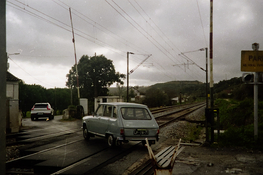
When I look at it closely with the colour picker it does have a tendency to blue/cyan. This is the complimentary to the orange mask so I suspect the gamma correction stage is where the problem lies. I have posted another version done on PS which looks better.
Still puzzled by the apparently strong cast you are seeing because it is very slight here and I have never had major problems with colour trusting in Apple's equipmant. What sytem do you use. I ask because I have articles published online and I would not like to think some of my illustrations are so skewed colur wise.
The picture is very blue. Something is wrong with your colour management.
When I look at it closely with the colour picker it does have a tendency to blue/cyan. This is the complimentary to the orange mask so I suspect the gamma correction stage is where the problem lies. I have posted another version done on PS which looks better.
Still puzzled by the apparently strong cast you are seeing because it is very slight here and I have never had major problems with colour trusting in Apple's equipmant. What sytem do you use. I ask because I have articles published online and I would not like to think some of my illustrations are so skewed colur wise.