How would you explain the emotional response to Bach's second violin partita to someone who was born deaf?
Your case is probably more optimistic in the sense that the physical capability is probably there to an extent, but you'll have to start with allowing your brain to connect to your eyes. So far, you're resisting while kicking and screaming along the way. Don't expect others to overcome your own unwillingness.
So far in this thread you've spent about 7x more words on formulating an increasingly dogmatic (and ridiculous) position on why you believe color in photography is a marginal subject. Yet, you keep asking people to explain it to you. It's evident that you've dug into your position - why would anyone feel compelled to change your views? Apparently you've not woken up to color. That's your loss (and boy, is it a big one for a photographer!) Maybe you never will, the likelihood of which is increased by your stubborn resistance to change your rudimentary views on the matter.
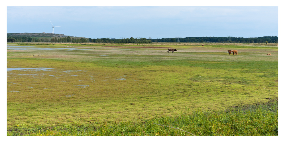
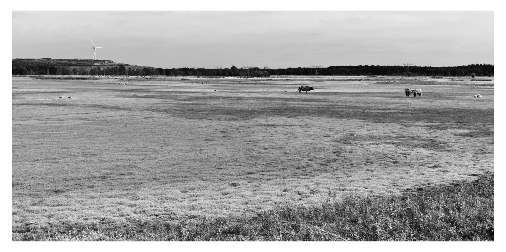
Let me put it this way - if one day you find yourself standing in front of, I don't know, one of Yves Klein's blues, one of Rothko's gradients or something else that's really about color and not much else, and you realize yourself thinking/feeling "Jesus God, holy fu..." - at that point, we can start to talk. Mind you - it doesn't have to be any of these particular names. I really don't care. As far as I'm concerned it's the oppressive pink or blue of one of Koons' ridiculous dogs (or the more muted pink in his doggy-style pics for that matter) that wakes you up. But there's no explaining anything until you find that spot somewhere in the area of your midriff that responds to hue. Words can only serve as communication between two minds who share that sensation - they're not a substitute.
Your words don't read very respectful to me:
Misguided, confused, incoherent, inconsistent - but hella normative. An unfortunate amalgam.