Black and White film with tones more silver than grey.

Pride

A
Pride

  • 2
  • 0
  • 58
Paris

A
Paris

  • 5
  • 0
  • 146
Seeing right through you

Seeing right through you

  • 4
  • 1
  • 183
I'll drink to that

D
I'll drink to that

  • 1
  • 2
  • 129

Recent Classifieds

Forum statistics

Threads
198,402
Messages
2,774,294
Members
99,608
Latest member
Javonimbus
Recent bookmarks
1

JBrunner

Moderator
Moderator
Joined
Dec 14, 2005
Messages
7,429
Location
PNdub
Format
Medium Format
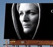
IMO what you are seeing is rich tone. It's the result of a learned style of controlling exposure, color response,and printing, not so much a particular film. There is no magic bullet.

Here's a pic of a billboard I shot on TriX with that intention of style. I have the big one around somewhere, just not right here.

imgres.jpeg
 

Garrett

Member
Joined
Dec 4, 2009
Messages
5
Format
4x5 Format
In printing negatives from all eras in a commercial black and white lab for 2 decades, I know the feeling of silver in a print that you are talking about. I always felt it was lacking in modern films, and frequently present in older negatives. I always ascribed the difference to emulsion thickness, and the thicker the emulsion, the more image-forming silver. I used to love to shoot SuperXX in 4x5—as far as I know, the last manufactured thick emulsion—for the very reason that it gave that silvery look to the mid-tones. When the last of the thick emulsion films were gone, I felt that silvery quality left with them. I keep trying, but I find the silver look to be very elusive with modern thin emulsions.
 
Joined
Aug 14, 2005
Messages
420
Location
NYC
Format
Multi Format
I've only skimmed this thread, and I think most of the good+obvious advice has been covered. To add though, IME, talking film technicalities, I've found that that silvery or metallic look comes from an upswept curve, so to speak, as opposed to more linear one, so it my be a good place to start researching - I believe there was a thread not long ago on the subject.

Otherwise, I'll just reiterate that the rest is the 3 basics of light and exposure and development. Surface does matter too, but only in the sense that you have to adjust those 3 basics to fit it. It's amazing what light can do, and amazing how it's often the last thing for photographers to really take on in depth to find their voice w/. It's the spirit of a photograph. Exposure and development are discipline.

Finally, again to reiterate, the perfect negative can still fall apart if the prints shoddy, so the search for this quality has to be carried all the way through each action to it's maximum.
 

dpurdy

Member
Joined
Jun 24, 2006
Messages
2,673
Location
Portland OR
Format
8x10 Format
I didn't make it through the whole thread but I wonder if you are getting your film developed and printed at a retail type lab... as opposed to doing it yourself. I recently sent some black and white into a lab because I needed a set of little prints for a wedding and was shocked at how ugly and grey the tones looked. I think they were printed digitally on some silver gel RC paper and just looked as you say .. ugly grey and too contrasty with sort of smudgy looking blacks that were too dominating. This was at a local pro lab.
 

DREW WILEY

Member
Joined
Jul 14, 2011
Messages
13,862
Format
8x10 Format
It's a hard look to obtain by digital printing, though I do know a couple of individuals who do it well.
They had years of real darkroom experience first. And when I said which kind of film I prefer for this
look, I could pull it off with long toe films too based on the curve placement and lighting. Very long
toe Plus-X was used this way for decades, but studio lighting helped. Give to a rainy or foggy day,
a contrast range suitable for chromes, and dew on the leaves and ferns, and a "silvery" look becomes easy if the film is properly expanded. Printing is a whole different subject with its own
complexities. But I'd think it would be easier to pull off in a darkroom where you've got complete
control of the outcome.
 

clayne

Member
Joined
Sep 4, 2008
Messages
2,764
Location
San Francisc
Format
Multi Format
Well I'll say this: the reason I threw APX out there is because of it's distinctly different spectral response compared to most typical emulsions. It seems to be obsessed with midtones and overall grey separation.
 
OP
OP

himself

Member
Joined
Apr 8, 2011
Messages
513
Format
Multi Format
Yup, 'fraid so.

Here's a couple of bits of info (best I can do flying past my computer right now :smile:)

http://www.thelightfarm.com/cgi-bin/htmlgen.py?content=04Dec2011
http://www.thelightfarm.com/cgi-bin/htmlgen.py?content=28Apr2011

I hope it could go without saying that I believe the 'look' I think you want can be achieved with modern materials. (Though, I just saw your last post and if you are saying that the old materials weren't an influence on the images you started the thread with, that probably would be incorrect.)

that's really interesting.

if you're referring to the "probably not the case" then that was more of me yielding to the complex idea of it being as much to do with everything else as just a matter of older films having some inbuilt characteristic that would make it the norm for the day (if not to the quality of pro photos)....

now having said that,

In printing negatives from all eras in a commercial black and white lab for 2 decades, I know the feeling of silver in a print that you are talking about. I always felt it was lacking in modern films, and frequently present in older negatives. I always ascribed the difference to emulsion thickness, and the thicker the emulsion, the more image-forming silver. I used to love to shoot SuperXX in 4x5—as far as I know, the last manufactured thick emulsion—for the very reason that it gave that silvery look to the mid-tones. When the last of the thick emulsion films were gone, I felt that silvery quality left with them. I keep trying, but I find the silver look to be very elusive with modern thin emulsions.

is anyone willing to dispute that?

Okay, here is the sand / skin / reclining nude version of my moonflower :wink:

http://s25.photobucket.com/albums/c76/keithwms/?action=view&current=moonflower_macro_bw.jpg

Quite a versatile subject, actually.

that's really beautiful.


thank to everyone else for your answers and my you americans are hard to keep up with, any chance of posting at a more reasonable hour :wink:
I'll just say in response to dpurdy that I find my greys to be flat whether they were developed by myself, or by the pro lab and that the only time I've been able recreate it was with, well, I'll just say cheating.
 
OP
OP

himself

Member
Joined
Apr 8, 2011
Messages
513
Format
Multi Format
Well I'll say this: the reason I threw APX out there is because of it's distinctly different spectral response compared to most typical emulsions. It seems to be obsessed with midtones and overall grey separation.

I've only ever used apx400, perhaps a switch to 100 is worth a try. do you recommend pushing, pulling or just a straight shot?
 

clayne

Member
Joined
Sep 4, 2008
Messages
2,764
Location
San Francisc
Format
Multi Format

markbarendt

Member
Joined
May 18, 2008
Messages
9,422
Location
Beaverton, OR
Format
Multi Format
I've been trying to dissect the look and it seems to me that there are a few common things. Film type doesn't seem to be one of them.

Strong blacks and strong whites in close/intermingled proximity.

Shorter scale subjects.

Kieth's moonflower is a good example. http://s25.photobucket.com/albums/c76/keithwms/?action=view&current=moonflower_macro_bw.jpg

The texture of the subject seems to be very important in intermingling the black and white.

Bringing the lighting across the subject at a significant angle, in this case high and left, allows the texture to pop more than say using a ring light would. The lighting is fairly soft/diffuse but still directional, no knife edge shadows.

In Kieth's example there is no hint, that I see, of over or even extra exposure, nor do I see any need for it. The last thing I'd want here is the background competing with the flower for attention or the highlights starting to compress.

The flower petal is a short scale subject so when printing, the whole photo can be printed with stronger blacks without sacrificing strong whites. Come to think of it, I can't remember seeing any long scale subjects with this effect.
 
Joined
Mar 30, 2011
Messages
2,147
Location
NYC
Format
Multi Format
Wait... has anyone thought to compare this effect with how reflections in bodies of water or liquid are portrayed when photographed? Or even shiny and glossy surfaces like cars and metal? I would assume this is the most commonly photographed subject which offers the easiest way to have the glossy silver look because that subject naturally has that reflectance.

Then if reflectance is the case, can it be assumed to get that silvery sheen, that subject itself has to have similar reflective properties in those lighting situations as well? Skin oils or makeup? Glossy textured flower petals?
 

markbarendt

Member
Joined
May 18, 2008
Messages
9,422
Location
Beaverton, OR
Format
Multi Format
I actually looked at photos of reflections as part of my exploration of the effect.

Kieth's moon flower isn't what I'd call reflective. Bright yes, reflective no.

In everything I could find there was significant contrast locally and texture, reflected or inherent, was there.
 
OP
OP

himself

Member
Joined
Apr 8, 2011
Messages
513
Format
Multi Format
I've been trying to dissect the look and it seems to me that there are a few common things. Film type doesn't seem to be one of them.

Strong blacks and strong whites in close/intermingled proximity.

Shorter scale subjects.

Kieth's moonflower is a good example. http://s25.photobucket.com/albums/c76/keithwms/?action=view&current=moonflower_macro_bw.jpg

The texture of the subject seems to be very important in intermingling the black and white.

Bringing the lighting across the subject at a significant angle, in this case high and left, allows the texture to pop more than say using a ring light would. The lighting is fairly soft/diffuse but still directional, no knife edge shadows.

In Kieth's example there is no hint, that I see, of over or even extra exposure, nor do I see any need for it. The last thing I'd want here is the background competing with the flower for attention or the highlights starting to compress.

The flower petal is a short scale subject so when printing, the whole photo can be printed with stronger blacks without sacrificing strong whites. Come to think of it, I can't remember seeing any long scale subjects with this effect.

so you're on the light side then?
you don't think the tonal range of the film would have anything to do it?
 

markbarendt

Member
Joined
May 18, 2008
Messages
9,422
Location
Beaverton, OR
Format
Multi Format
so you're on the light side then?
you don't think the tonal range of the film would have anything to do it?

Correct on both counts.

If my thoughts are anywhere close to being in the ball park of technically right, all B&W films and developers are fully capable of producing the effect. No exceptions.

It is simply a matter of our choices in how we use the tools at hand.

Technically at the camera, using Kieth's moon flower as an example again, you wouldn't want to place the exposure of the petals high up on the film's shoulder, you would want them on the straight line portion of the curve to get good contrast/tone separation so that you can see detail way out into what might be considered highlights.

There is plenty of room on the straight line portion of any B&W film curve to do this. In fact the brightness change across the leaves is very small so even if we were pushing the film (shortening the film's printable range) there would be plenty of room to get all the info needed.

Then when we get to the printing end of things, and this is admittedly a gross and utter over simplification just to get the idea across (in fact this whole post is), we only print from the top half of the negative's curve.

Kieth's flower petals are made up of lots of midtones on paper, when in real life we know that those petals would appear near white.

The bottom part of the film curve info is simply allowed to fall to black in the print. I don't know what Kieth used as a background but it probably had texture but none shows in the final print. The detail in the background wasn't relevant to the print Kieth wanted.
 

Bob Carnie

Subscriber
Joined
Apr 18, 2004
Messages
7,735
Location
toronto
Format
Med. Format RF
Very Good Description Mark.

putting the area of interest on the steepest part of the curve is a good way of creating wonderful separation and contrast..... Dan Margulis teaches this concept in PS as being the most important aspect, and I agree.

Correct on both counts.

If my thoughts are anywhere close to being in the ball park of technically right, all B&W films and developers are fully capable of producing the effect. No exceptions.

It is simply a matter of our choices in how we use the tools at hand.

Technically at the camera, using Kieth's moon flower as an example again, you wouldn't want to place the exposure of the petals high up on the film's shoulder, you would want them on the straight line portion of the curve to get good contrast/tone separation so that you can see detail way out into what might be considered highlights.

There is plenty of room on the straight line portion of any B&W film curve to do this. In fact the brightness change across the leaves is very small so even if we were pushing the film (shortening the film's printable range) there would be plenty of room to get all the info needed.

Then when we get to the printing end of things, and this is admittedly a gross and utter over simplification just to get the idea across (in fact this whole post is), we only print from the top half of the negative's curve.

Kieth's flower petals are made up of lots of midtones on paper, when in real life we know that those petals would appear near white.

The bottom part of the film curve info is simply allowed to fall to black in the print. I don't know what Kieth used as a background but it probably had texture but none shows in the final print. The detail in the background wasn't relevant to the print Kieth wanted.
 
OP
OP

himself

Member
Joined
Apr 8, 2011
Messages
513
Format
Multi Format
Correct on both counts.

If my thoughts are anywhere close to being in the ball park of technically right, all B&W films and developers are fully capable of producing the effect. No exceptions.

It is simply a matter of our choices in how we use the tools at hand.

Technically at the camera, using Kieth's moon flower as an example again, you wouldn't want to place the exposure of the petals high up on the film's shoulder, you would want them on the straight line portion of the curve to get good contrast/tone separation so that you can see detail way out into what might be considered highlights.

There is plenty of room on the straight line portion of any B&W film curve to do this. In fact the brightness change across the leaves is very small so even if we were pushing the film (shortening the film's printable range) there would be plenty of room to get all the info needed.

Then when we get to the printing end of things, and this is admittedly a gross and utter over simplification just to get the idea across (in fact this whole post is), we only print from the top half of the negative's curve.

Kieth's flower petals are made up of lots of midtones on paper, when in real life we know that those petals would appear near white.

The bottom part of the film curve info is simply allowed to fall to black in the print. I don't know what Kieth used as a background but it probably had texture but none shows in the final print. The detail in the background wasn't relevant to the print Kieth wanted.

that's great, so do you think it's just a matter of taste then, and the reason it doesn't come up so often today is that there is more of a fashion for really strong whites and blacks rather than a smother range? and not that older films, I'm not sure how to word this - but that old films "standard" grey is in a slightly different spot to modern films... because of some chemical/whatever reason.

Obviously ignore this if that's what your saying, but I'm not disputing whether you can do it with modern film, but more that modern films being technically better just sit on a different part of the curve (for standard development and printing) and that's why it needs more effort to find those greys?

does any of that make sense...
 

Nicholas Lindan

Advertiser
Advertiser
Joined
Sep 2, 2006
Messages
4,232
Location
Cleveland, Ohio
Format
Multi Format
modern films ... need more effort to find those greys?

I disagree emphatically. By what logic do you think it was "easier" in the past?

Sounds like some variation of "Things aren't as good as they used to be." Well, they never were.
 
OP
OP

himself

Member
Joined
Apr 8, 2011
Messages
513
Format
Multi Format
I disagree emphatically. By what logic do you think it was "easier" in the past?

Sounds like some variation of "Things aren't as good as they used to be." Well, they never were.

you are free to disagree with as much of a degree of intensity as you please, but I never said easier in the past - just different... or are today's films exactly the same as film from the past? I'm happy to be corrected if they are...
 

keithwms

Member
Joined
Oct 14, 2006
Messages
6,220
Location
Charlottesvi
Format
Multi Format
Thanks for all the consideration and comment on my images :smile:.

As astutely surmised by Mark and others, for the iridescent moonflower shot, the highlights were placed smackdab in the middle of the curve. There were very small, delicate highlights that I wanted to protect. The resulting neg is definitely thin... but printable. And as you can see, it definitely taught some lessons about what to place where when you want this kind of tonality.

The second moonflower shot, the "sandy" one, now that is a nutty experiment. It was shot on fuji tungsten slide film and that slide was used to make an enlarged neg on 5x7 tmax, which was then contact printed.
 

markbarendt

Member
Joined
May 18, 2008
Messages
9,422
Location
Beaverton, OR
Format
Multi Format
that's great, so do you think it's just a matter of taste then, and the reason it doesn't come up so often today is that there is more of a fashion for really strong whites and blacks rather than a smother range? and not that older films, I'm not sure how to word this - but that old films "standard" grey is in a slightly different spot to modern films... because of some chemical/whatever reason.

Obviously ignore this if that's what your saying, but I'm not disputing whether you can do it with modern film, but more that modern films being technically better just sit on a different part of the curve (for standard development and printing) and that's why it needs more effort to find those greys?

does any of that make sense...

Yes, purely personal taste.

Films do differ. Each film has it's own idiosyncrasies but they are all very mailable in practice and there are a dizzying array of variables that can affect the smoothness, grayness, silverness, glow, sharpness, graininess, lightness, darkness...

At the end of the day though, a typical B&W photo is just a white surface with grey blotches on it.

The biggest variable in whether those blotches look like what we want or not, is us.
 
OP
OP

himself

Member
Joined
Apr 8, 2011
Messages
513
Format
Multi Format
[...] The second moonflower shot, the "sandy" one, now that is a nutty experiment. It was shot on fuji tungsten slide film and that slide was used to make an enlarged neg on 5x7 tmax, which was then contact printed.

:blink:

Yes, purely personal taste.

Films do differ. Each film has it's own idiosyncrasies but they are all very mailable in practice and there are a dizzying array of variables that can affect the smoothness, grayness, silverness, glow, sharpness, graininess, lightness, darkness...

At the end of the day though, a typical B&W photo is just a white surface with grey blotches on it.

The biggest variable in whether those blotches look like what we want or not, is us.

ok, very sage
 
Photrio.com contains affiliate links to products. We may receive a commission for purchases made through these links.
To read our full affiliate disclosure statement please click Here.

PHOTRIO PARTNERS EQUALLY FUNDING OUR COMMUNITY:


Ilford ADOX Freestyle Photographic Stearman Press Weldon Color Lab Blue Moon Camera & Machine
Top Bottom