Your techniques with contrast filters for B&W photography?

Cafe Art

A
Cafe Art

  • 7
  • 3
  • 113
Sciuridae

A
Sciuridae

  • 5
  • 2
  • 141
Takatoriyama

D
Takatoriyama

  • 6
  • 3
  • 147
Tree and reflection

H
Tree and reflection

  • 2
  • 0
  • 116

Recent Classifieds

Forum statistics

Threads
197,645
Messages
2,762,369
Members
99,428
Latest member
DIW
Recent bookmarks
0

DREW WILEY

Member
Joined
Jul 14, 2011
Messages
13,743
Format
8x10 Format
Alan, panchromatic film sees color values a little differently than we do, but you can still approximate what a filter will do to a scene simply by looking at scene through that filter with your own eyes.

As far as exposure adjustment goes and filter factors, any time I plan to use either a new filter or new film unfamiliar to me, I expend a roll of 120 film and precisely do plus and minus bracketing tests of a gray card under anticipated outdoor light, then develop that, and then compare the result both by eye and using the densitometer in comparison to a reference frame on the same roll of film shot normally with no filter in place.
If a few frames are left over, I'll experiment shooting actual scenes and that particular filter prior to development. It isn't all that hard. But learning to use filters judiciously in an esthetic sense is another story, as both one's craft and sense of composition evolves.

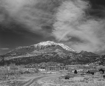
Today I developed the two deep no. 47 blue filter exposures I exposed 3 days ago. The afternoon light was fading and the sky dark and overcast, but I recognized that the forest setting nonetheless held quite a bit of contrast range which I wanted to preserve the sparkle of, all the way from peekaboo sky highlights clear down to deep shadow textures. Any "hard" tricolor filter like a 47 or 47B can act like a sledgehammer and destroy most of the deep texture if you're not careful. I was shooting 8x10 TMax 400, which was a good thing both due to keeping the length of exposure within reason, but also due to its very long scale and ability to hold excellent shadow gradation. From both testing and prior experience I knew to apply a 4 EV filter factor in this case. I simply rotate the dial on my Pentax spot meter to 4 EV less than measured value, then the dial position automatically tells me all the potential combinations of shutter speed and f-stop which equates to that.

I was shooting at f/45, and the dial gave 8 sec; and to accommodate reciprocity, I shot it at 13 second. I developed normal in PMK pyro, and the exposures came out perfect. For Zonie addicts, the essential scene contrast range I needed to bag for the anticipated print was between II and XIII, but due to using TMY film, I actually captured around Zone I to IX, so have a bit of surplus if needed. If a film with less of a straight line were involved, even something like FP4, I would have had to strategize differently; and the exposure time would be frightfully long, with grass and leaves moving around, given such a deep filter under dim light.
 
Last edited:

DREW WILEY

Member
Joined
Jul 14, 2011
Messages
13,743
Format
8x10 Format
I meant to mention that, but didn't have time yesterday. I took two shots, each from a different angle, and both worth printing. I plan to load one of them into an 8x10 enlarger holder later today. The scene was complex with a remarkable pattern of light yellowish in the foreground, yet with shiny objects in front of those rocks I wanted to brighten up. Then there was a ring of bright bare branches in the middle distance which I also wanted to keep bright; then, in the background dark tree foliage which I wanted to dramatically darken, yet without losing deep value texture in the tree trunks etc.

The only filter which can resolve that combination of colors and brightly bring out exactly the details I wanted was a deep blue one, and I'm glad I had it along. I don't even carry one of those in my more compact MF kits. The ochre yellow of the rocks was sufficiently darkened by the deep blue without going too low; the live oak and bay tree foliage was dramatically darkened, and just sparkle preserved, along with retaining the full brightness of those delicate bare buckeye branch patterns in the background becoming evident this time of year. But any kind of yellow, orange, red, or even green filter would have nullified the whole look I wanted. Deep blue was the perfect ticket.
 

Pioneer

Member
Joined
May 29, 2010
Messages
3,869
Location
Elko, Nevada
Format
Multi Format
I quit using filters on my cameras. I always lose them and replacing them is so expensive. :D

I do use them occasionally on my enlarger but for a different reason.

The only one I can ever find is an old orange filter for my little Elmar. I don't know why I haven't lost it yet. Maybe it is magical but I am always finding the little bugger with the spare change in my pocket.

Actually I don't think Tmax needs filters much.
 

Philippe-Georges

Subscriber
Joined
Apr 11, 2005
Messages
2,659
Location
Flanders Fields
Format
Medium Format
Foliage and sky is one reason for a K2 filter.
But for sandstone buildings it is interesting too as the yellow filter wil clear up the stones and reveal more details and structure, particularly when these are in the shadow.
And while printing, the building can be 'placed' into a more or less 'normal' density and the rest, mainly the sky but street cobbles too, wil darken.

SILVESTRI 6-2*.jpg

(In the above image, I admit to have been going to far in shifting the lens...)
SILVESTRI 7-2*.jpg


Silvestri SLC 6x9 camera, Super-Angulon 47mm with center filter plus K2 filter on Hp5+, at F22 (as always) and about t1 sec, in XTOL 1+1 for 14 min at 20°C hand agitated.
 
Last edited:

John Phive

Member
Joined
Sep 19, 2021
Messages
61
Location
North Eastern USA
Format
Digital
I'm not sure I like the Filter in the images above. it doesn't respect or correctly represent the shapes and shadows of the structure. The pinkish tint sort of reminds me of and outdated Pepto-Bismol..
 

Philippe-Georges

Subscriber
Joined
Apr 11, 2005
Messages
2,659
Location
Flanders Fields
Format
Medium Format
I'm not sure I like the Filter in the images above. it doesn't respect or correctly represent the shapes and shadows of the structure. The pinkish tint sort of reminds me of and outdated Pepto-Bismol..

Yes, that pinkish tint bothers me to, and I can’t get rid of it, it isn’t there on my calibrated screen but on the net it’s there…
Neither is it on my iPhone.
 
Last edited:

koraks

Moderator
Moderator
Joined
Nov 29, 2018
Messages
20,985
Location
Europe
Format
Multi Format
Yes, that pinkish tint bothers me to, and I can’t get rid of it, it isn’t there on my calibrated screen but on the net it’s there…
Neither is it on my iPhone.

It's a problem in your color management workflow when publishing for the web. In a WWW context, it's usually safest to just assume everything will be interpreted as sRGB, regardless of what other profile an image may have assigned to it. In this case, it's a translation problem between ProFoto RGB and sRGB that creates the weird magenta cast.
 

Andrew O'Neill

Moderator
Moderator
Joined
Jan 16, 2004
Messages
11,782
Location
Coquitlam,BC Canada
Format
Multi Format
98% of my B&W work is exposed in the camera without colored filters. I do have some filters, however, for special occasions.

Me as well... Although I always use a filter with IR films. 🙂
 

snusmumriken

Subscriber
Joined
Jul 22, 2021
Messages
2,369
Location
Salisbury, UK
Format
35mm
I don't think anyone has yet mentioned that an important property of UV, yellow, orange and red filters in landscape photography is to cut through haze. I know film sees haze that the human eye cannot see; but even so, here in England we have a lot of atmospheric haze and it's often what makes the landscape interesting. So keeping a yellow filter on permanently seems counterproductive to me.
 

DREW WILEY

Member
Joined
Jul 14, 2011
Messages
13,743
Format
8x10 Format
The more toward the red end the filter gets, the more haze it cuts through. But, yes, haze has its own kind of beauty. Skilled photographers back in the days of blue-sensitive only emulsions learned to work with it in a masterful manner, creating a sense of atmosphere and distance generally missing in landscape and architectural photos today. So, if you want to accentuate the effect of haze rather than suppress it, just go the opposite direction filter-wise, toward blue. Even a moderate blue light balancing filter like an 80B will have a noticeable result; or if you want to go the whole way, use deep blue 47 or 47B, if you can tolerate much longer exposures due to their greater density.

An unrelated word of caution : filter numbers do not always correlate brand to brand. And the old literature Wratten K designations no longer apply; numerical designations took over a long time ago, and due to their far greater selection, might mean something more specific than the old K1, K2, etc.
 
Last edited:

Mark J

Member
Joined
Mar 23, 2023
Messages
438
Location
Denbigh, North Wales UK
Format
Multi Format
Yes, this is an important subject. When I first started B&W I used to filter almost everything with an orange or red filter. However, after a few years I realised that many shots look a lot better with some atmospheric haze, mist or dust effects in the shot. The one that convinced me was a portrait shot of a butte in Monument valley, set on a 'pedestal' of stratified rock & sand. I could have filtered with an orange to get some density in the sky, but the dust from the road and tourist cars was giving an impressive scale to the butte, so I opted for no filter at all, and got one of my favourite desert shots.
 

CMoore

Subscriber
Joined
Aug 23, 2015
Messages
6,191
Location
USA CA
Format
35mm
I have little interest in "Landscape Photog"
But once in awhile, in my street photg, i will use an orange filter.

Last winter when i was in Old Sacramento, i shot a picture of the bridge with 2 boats passing underneath and a beautiful sky. Typical big, puffy clouds after a storm.
I shot it with and without a filter. The negs with the orange filter did look better and more dramatic.
 

Jim Peterson

Member
Joined
Mar 23, 2013
Messages
186
Location
NE Washington
Format
Med. Format RF
Example of a red filter. Don't think it is too over the top. I love filters and think an orange would work on this image as well. Mamiya 7ii, 65mm, Acros 100, Mt Nebo Wilderness near Nephi, Utah along busy I-15. I like using an orange filter for the most part for landscapes as a compromise for not enough contrast and too much contrast.
 

Attachments

  • Mt Nebo.jpg
    Mt Nebo.jpg
    1 MB · Views: 105
Last edited:

Sirius Glass

Subscriber
Joined
Jan 18, 2007
Messages
50,168
Location
Southern California
Format
Multi Format
Example of a red filter. Don't think it is too over the top. I love filters and think an orange would work on this image as well. Mamiya 7ii, 65mm, Acros 100, Mt Nebo Wilderness near Nephi, Utah along busy I-15 View attachment 353691

I too found that R25 can be over the top. So I tried the R23 which works better in those situations. Between is problem I have and shooting Rllei IR 400 film I have and use R23, R25, R29 and [R]720 filters.
 
Joined
Aug 29, 2017
Messages
9,284
Location
New Jersey formerly NYC
Format
Multi Format
Foliage and sky is one reason for a K2 filter.
But for sandstone buildings it is interesting too as the yellow filter wil clear up the stones and reveal more details and structure, particularly when these are in the shadow.
And while printing, the building can be 'placed' into a more or less 'normal' density and the rest, mainly the sky but street cobbles too, wil darken.

View attachment 353607
(In the above image, I admit to have been going to far in shifting the lens...)
View attachment 353608

Silvestri SLC 6x9 camera, Super-Angulon 47mm with center filter plus K2 filter on Hp5+, at F22 (as always) and about t1 sec, in XTOL 1+1 for 14 min at 20°C hand agitated.

Is that a scan of the prints or the negatives? The exposure seems too dark. But i like the pictures. Regrading conversion between color profiles, and the pink, since most of my adjustments and final results wind up on the web which is sRGB, I just scan and edit my film and digital shots in sRGB.
 

DREW WILEY

Member
Joined
Jul 14, 2011
Messages
13,743
Format
8x10 Format
There are two different meanings of CONTRAST in play, which need to be distinguished. One is how the internal contrast within a scene between different colored areas or objects can be manipulated relative to one another using an appropriate contrast filter. Bringing white clouds into relief against a blue sky is only one example among many; but why is it nearly the only one we ever hear discussed?

The other kind of contrast is something you can alter by the length of film development. Therefore if you apply the appropriate filter factor, and give sufficient exposure based on a shadow reading, even a deep red filter will allow as much detail down in the shadows as a light yellow filter. It's inherently a myth than any of them are too strong. Yes, there are reasons for choosing stronger or weaker filters. But going around thinking a red one is taboo because it is just too strong is nonsense when typical panchromatic films are in play. In black and white photography, that sort of issue is easily corrected by the length or style of development itself if necessary.

The are often practical reason, however, for choosing a less dense filter. It's harder to focus with a deep filter in place over an SLR lens, and harder to handhold a camera due to the longer exposures needed with deeper filters. So if you walk around with a camera minus a tripod, that is a consideration. But you shouldn't avoid deeper filters just because they aren't socially correct among amateur shooters (who might happen to have a Ansel Adams poster hung on their wall of the face of Half Dome taken with a deep red filter). Or people say you shouldn't use a deep red filter in the mountains at all - heck I've done it thousands of times, and it worked wonderfully for the intended situations. There is a reason a whole range of reds are made, for example : 23A,24, 25, 29.

Then there are cases of certain films with limited red sensitivity - orthopan films like Acros, which don't respond to wavelengths longer than a 25 medium red sees.
 
Joined
Aug 29, 2017
Messages
9,284
Location
New Jersey formerly NYC
Format
Multi Format
These are scanned negatives, which I do after the wet print is made. Doing so, I 'process' the scans to match the prints.
And that the exposures seems to be "to dark" is because I forgot to reder them bleaker for the net, for which this seems to be necessarily. On my Eizo screen they looked how I wantend them to be and matched with the wet print under diffused daylight (Nord).

I admit that, although I am retired now, I am still hooked on a workflow meant for mechanical printing (YMCK), it has become a kind of second nature as I am so used to it, and which I haven't thrown overboard yet...

The trouble with electronic (digital-) reproduction is that almost everybody has it's own system, platform and settings, hardly ISO calibrated, not to mention the environment where te screen stands.
What I see on my computer/screen can't be the same you see, and certainly not what you neighbour sees.

A book, let say printed in an edition of 2000 copies, wil be 2000 times the same (when it is well done) and whoever looks at it wil see the very seem 'thing' (should be).

My goal was/is to match the quality of the books as published by ZODIAQUE (La Pierre Qui Vire) and some by APERTURE (the Paul Strand series), which were magnificent B&W publications.

But I will add a dedicated sRGB export setting for the internet, when I am at it, any suggestions?

My calibrated monitor is set for brightness 140cd and sRGB. The best way to correct this to check a histogram when you're editing the scan file. Adjust the levels (white and black points).

Here's your picture. As you can see, it's way to the left which is why it appears too dark. Notice all the blocked shadow areas on the left of the histogram and little data on the whole right side.

My edited picture adjusted the levels on the right white side. Of course, the original shadow areas that were blocked up are still blocked up because I can't create data that wasn't there in your original picture edits of the scan you made. Try adjusting your scan again. YOu should be able to bring up the overall brightness and also see more details in the shadow areas.
 

Attachments

  • Histogram.jpg
    Histogram.jpg
    343.9 KB · Views: 71
  • Histogram 2.jpg
    Histogram 2.jpg
    255.6 KB · Views: 71

koraks

Moderator
Moderator
Joined
Nov 29, 2018
Messages
20,985
Location
Europe
Format
Multi Format
My edited picture adjusted the levels on the right white side.

Indeed. You've also managed to totally blow out a considerable amount of highlight detail in the process.
Had you used a more sensible curves adjustment, this wouldn't have happened.

Btw, given the fact that Philippe seems to know his way around monitor calibration and ICC profiles, I doubt there's very much need to explain the basics of a histogram to him. I have a feeling he knows this pretty well.
 
Photrio.com contains affiliate links to products. We may receive a commission for purchases made through these links.
To read our full affiliate disclosure statement please click Here.

PHOTRIO PARTNERS EQUALLY FUNDING OUR COMMUNITY:


Ilford ADOX Freestyle Photographic Stearman Press Weldon Color Lab Blue Moon Camera & Machine
Top Bottom