What to ask for with scanning?

spain

A
spain

  • 1
  • 0
  • 54
Humming Around!

D
Humming Around!

  • 5
  • 1
  • 63
Pride

A
Pride

  • 2
  • 1
  • 139
Paris

A
Paris

  • 5
  • 1
  • 215

Recent Classifieds

Forum statistics

Threads
198,424
Messages
2,774,754
Members
99,612
Latest member
Renato Donelli
Recent bookmarks
0

dylan77

Member
Joined
Oct 5, 2019
Messages
105
Location
Australia
Format
35mm
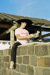
I am looking for any tips on what I should ask for in film scanning, And if anything can help in the editing process.

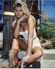
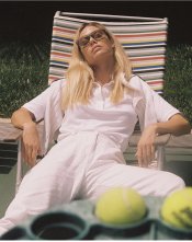
I have attached a few photos here.
1. The first is from the lab scan
2. The second is my edit making the clothes look as they should be. This was done on portra 400, however my editing has also now removed a lot of the film look. My issue seems to continuously be with light or white coloured clothing.
3. Photos 3 and 4 are Shot in very similar conditions, (also film) however the clothes retain the whiteness as they should be.

I’m thinking this Has to do with scanning more so than the film used?
 

Attachments

  • FFA64A52-690A-46FD-ADE6-F23FD729D468.jpeg
    FFA64A52-690A-46FD-ADE6-F23FD729D468.jpeg
    214.5 KB · Views: 137
  • 81F19F9E-D8D3-49C0-8ACE-E44333F4C191.jpeg
    81F19F9E-D8D3-49C0-8ACE-E44333F4C191.jpeg
    156.7 KB · Views: 141
  • 7C852109-FC13-4A0D-ACE6-B136B9C6ACC6.jpeg
    7C852109-FC13-4A0D-ACE6-B136B9C6ACC6.jpeg
    1,003.7 KB · Views: 137
  • 156AB6DC-0C6A-476D-8901-0FC60EAAB71B.jpeg
    156AB6DC-0C6A-476D-8901-0FC60EAAB71B.jpeg
    805.9 KB · Views: 135

LolaColor

Member
Joined
Dec 1, 2018
Messages
43
Location
Ireland
Format
35mm
It's difficult to get consistent looking frames from the same shoot when a lab does your scans. Even if your exposure is consistent, you're at the mercy of two things:

- the scanner software's auto exposure and auto white balance algorithm

- thesubsequent adjustments (if any) made by the person doing the scanning

One solution is the following:
1. Shoot all frames at the same exposure level (ie: box speed or plus one or whatever you're going for)
2. Get your scans done on a Noritsu as it has the ability to be consistent
3. Ask the lab to use the "Photometry Memory" function on the first frame. This locks in the same auto exposure and WB adjustments to all frames
4. Then the lab should copy the desired manual adjustments (contrast, density and colour) to all frames.

This should give you a consistent look.
 
OP
OP
dylan77

dylan77

Member
Joined
Oct 5, 2019
Messages
105
Location
Australia
Format
35mm
It's difficult to get consistent looking frames from the same shoot when a lab does your scans. Even if your exposure is consistent, you're at the mercy of two things:

- the scanner software's auto exposure and auto white balance algorithm

- thesubsequent adjustments (if any) made by the person doing the scanning

One solution is the following:
1. Shoot all frames at the same exposure level (ie: box speed or plus one or whatever you're going for)
2. Get your scans done on a Noritsu as it has the ability to be consistent
3. Ask the lab to use the "Photometry Memory" function on the first frame. This locks in the same auto exposure and WB adjustments to all frames
4. Then the lab should copy the desired manual adjustments (contrast, density and colour) to all frames.

This should give you a consistent look.

That’s very helpful, thanks. I’ll Try that
 
Joined
Jan 31, 2020
Messages
1,280
Location
Germany
Format
Multi Format
Two more things that might help: include a gray card or something like that in the first picture of the roll, makes white balance very easy once you get the lab to stop applying different corrections to each frame. White clothes are hard to white balance forby eye, because they all actually have different colour casts. And not relying on internal light meters unless they can spot meter. Especially for backlit portraits, consistent exposure is much easier with spot or incident metering. Metering your own hand in the same light as the model is a decent workaround.
 

138S

Member
Joined
Dec 4, 2019
Messages
1,776
Location
Pyrenees
Format
Large Format
I’m thinking this Has to do with scanning more so than the film used?

When you have something white in the scene you may use that spot to adjust white balance.

https://expertphotography.com/correct-white-balance-photoshop/

You may also take a shot with a color checker in it, so you may make a calibration procedure that will make each real color in the real checker have the standard RGB value in the image, this is for total color accuracy.

It is a good practice to start edition from the well balanced image that you have after image conditioning. "Image conditioning" is the process you may perform with any image to have a technical optimization (White Balance, sharpening...) before you go to a creative edition or to the aesthetics.


If you make a bet for film photography probably you will soon get a Plustek 8000 series or an Epson V800, which are the most popular choices, those scanners include SIlverfast with Negafix which makes a very good standard color inversion after you tell the software what negative king are you processing.


See here min 21:44


Also remember to scan/edit 16bits per channel images, with more resolution than "necessary" to not degrate image during edition, not always necessary but really a good practice. With today's computers with is easier, in the past one had to restrict image size to not slow down processing too much.


Also take a look to 3D LUT Creator software, this is a powerful tool for color edition, mastering that tool you have total control.
 
OP
OP
dylan77

dylan77

Member
Joined
Oct 5, 2019
Messages
105
Location
Australia
Format
35mm
When you have something white in the scene you may use that spot to adjust white balance.

https://expertphotography.com/correct-white-balance-photoshop/

Does this apply to film? If so I can start asking for tif files instead of JPEGs to possibly fix this. Thanks

You may also take a shot with a color checker in it, so you may make a calibration procedure that will make each real color in the real checker have the standard RGB value in the image, this is for total color accuracy.

It is a good practice to start edition from the well balanced image that you have after image conditioning. "Image conditioning" is the process you may perform with any image to have a technical optimization (White Balance, sharpening...) before you go to a creative edition or to the aesthetics.


If you make a bet for film photography probably you will soon get a Plustek 8000 series or an Epson V800, which are the most popular choices, those scanners include SIlverfast with Negafix which makes a very good standard color inversion after you tell the software what negative king are you processing.


See here min 21:44


Also remember to scan/edit 16bits per channel images, with more resolution than "necessary" to not degrate image during edition, not always necessary but really a good practice. With today's computers with is easier, in the past one had to restrict image size to not slow down processing too much.


Also take a look to 3D LUT Creator software, this is a powerful tool for color edition, mastering that tool you have total control.
 

Latnemrob

Inactive
Joined
Nov 3, 2020
Messages
9
Location
USA
Format
Multi Format
You may also take a shot with a color checker in it, so you may make a calibration procedure that will make each real color in the real checker have the standard RGB value in the image, this is for total color accuracy.

If you try this, you'll quickly realize that there's no "total color accuracy" with C41 inverted images as their CYM/RGB curves aren't smooth and do not align, just look at this:

ss.png

... so depending of which shade of grey you're sampling, you'll see (sometimes massive) WB swings and other color casts in the shadows or highlights. Cyan tends gets out of control. Unfortunately, if one is unhappy with automation (from the lab, or from the scanner software) you only have per-channel curve tweaking which is time consuming and annoying. One trick I've learned recently is to create a +100% saturation layer before making curve corrections, it makes it easier to see color shifts. Do curve tweaking until the color balance is OK, then kill it.

@dylan77 is worried about the "film look". I sometimes worry about this too, and I am beginning to think that what we count as a "film look" is, basically, a combination of color shifts in shadows/mids/highs that certain emulsions are characterized by. When I start editing Portra 400 scans and correcting for color shifts, I eventually end up with 100% true-to-life look which I already get from my digital cameras, making me ask "why bother?" This also leads to another question: the difference between consumer and "pro" emulsions. Portra 400, in particular, is exceptionally well-behaved in terms of gamma consistency between channels, and if edited competently, gives you completely "digital" outcome. Meanwhile, just look at R/G/B curves of a raw Gold or Ultramax scan, and how unbalanced they are, they give you so much "film look" that it's impossible to kill, so maybe we should be shooting consumer films then, if "film look" is what we after? Basically I am re-evaluating my life right now, trying to understand why I even bother with C41.
 
Last edited:

138S

Member
Joined
Dec 4, 2019
Messages
1,776
Location
Pyrenees
Format
Large Format
Does this apply to film? If so I can start asking for tif files instead of JPEGs to possibly fix this. Thanks

I general jpeg is a suitable format to release an image, for example it is ok to post the image in the internet because you want a lightweight file and the slight quality loss from compression may not be much perceived.

For archival and for edition you should always work in TIFF format (or something equivalent), this format allows no data compression and also it allows "no loss" compression. If editing in JPEG each time you save and load again the jpeg file you add some degradation.

Also TIFF allows to save 16 bits per channel images, while jpeg allows only 8bits per channel, this is specially important for contrasty scenes where highlights and shadows would have to be edited for different interpretations. In Photoshop you also shpuld use adjustment layers instead direct curve edition. Direct curve edition operates the pixel values every time you you change the curve, each time degradating a bit information from successive roundings in the operations, this is specially painfull with 8 bit/channel images.

Instead with adjustment layers you never loss the original image, and each time you modify the curve you apply the new curve to the original image, not accumulation sucerssive roundings from successive operations.

When editing, a priority is optimizing the image while not corrupting the image quality, this is about having refined workflow, if not the more you operate modification the more you degradate the quality. In many situations this is not a concern even with bad practices, but when wanting a top quality result combined with a challenging edition you have no other way than preserving the image quality through a sound workflow, which starts with no loss compression and 16/bits channel.


If images are important then ask for TIFF format if you scan around, you may accept the jpg result with the interpretation the operator made, that probably will be good, but if you are to perform a serious edition of the image you need the original TIFF image with no clipping, that image may look dull if it contains all dynamic range that film recorded, but it has the potential to be edited i the way you may want, usually you will have to bend the curve in "S" shape to compress shadows and highlights so the mids would have enough range to be diplayed natural, but you will be able to decide what detail level you allow in shadows/highlights to not take too much range from the mids...
 

Lachlan Young

Member
Joined
Dec 2, 2005
Messages
4,907
Location
Glasgow
Format
Multi Format
If you try this, you'll quickly realize that there's no "total color accuracy" with C41 inverted images as their CYM/RGB curves aren't smooth and do not align

Uh, no. Colour neg can be very very accurate, much more so than transparency. Those casts you are talking about occur as a result of bad inversion approaches that fail to understand how to deal with the colour correction mask - or C-41 process control failures/ compounded by bad exposure decisions. Once you get the mask correction working properly, everything else (assuming you didn't make a grossly wrong exposure) follows pretty easily. The three Portras do have slightly different intended colour balances/ saturations and Ektar leans in the direction of high colour accuracy, higher saturation & lower exposure latitude. Minilab software attempts to compensate (up to a point) for end users who don't bother/ can't understand the manufacturer's data, with the intention of giving hopefully largely pleasing skintones etc.
 

138S

Member
Joined
Dec 4, 2019
Messages
1,776
Location
Pyrenees
Format
Large Format
If you try this, you'll quickly realize that there's no "total color accuracy" with C41 inverted images as their CYM/RGB

Yeah... you will have total color accuracy for the colors in the checkers, other colors with other spectral signature will vary to certain amount.

I agree, regular calibrations cannot overcome interaction from spectral reflectiveness, light source spectral nature and film spectral sensitivity, we can go in depth to that... this is about advanced colorimegtry that is a tough teorical body

A DSLR Nikon image may be very difficult to match with a Canon DSLR image, do what you want with color edition. Canon works slightly "better" for human skin, Nikon is slightly more reputed for the rest... OK

My "total accuracy" was relative to the complexity level we were speaking.

Still the final color dyes are mostly irrelevant when considering the abstract information recorded, in fact the key information is the remaining silver halide levels after first development which record the incoming light spectrum in the form of 3 values, one for each channel. In the color recording (in the film or sensor) we have a remarkable information loss, we depart from an arbitrary spectrum but we only record 3 values. The spectral sensitivity determines which "real colors" in the scene are confused or separated, this is the key event. When we have the crystals exposed in the color layers (on voltage values generated in the pixels) what folows is information management, chemicak management or numeric mangement...

the most important event is always the exposure, this has no way back becasue a lot of information is lost in that moment (spectrum reaching an spot >>> 3 values, analog or digital), the rest is edition...

A technicak advance is hyperspectral imaging wich record the full spectrum for each spot , but this is another war, not used today for pictorial imaging
 

Latnemrob

Inactive
Joined
Nov 3, 2020
Messages
9
Location
USA
Format
Multi Format
Uh, no. Colour neg can be very very accurate, much more so than transparency. Those casts you are talking about occur as a result of bad inversion approaches that fail to understand how to deal with the colour correction mask - or C-41 process control failures/ compounded by bad exposure decisions.

Actually I was referring to raw scans of color targets, i.e. even before any inversions, when you're looking at R/G/B humps spread across your histogram, it's easy to see that they cannot be aligned and the contrast for each channel is not the same. It's even visible in the data sheet:

curves.png


Blue & green start pretty close to each other in the shadows and only begin to behave "normally" closer to the shoulder, and eventually green gets closer to red. I never wet-printed color in my life, but my understanding is that CYM layers of paper are inversely-sensitive to these curves, so yeah - you should be getting color shifts in both shadows and highlights. And this is Portra 400 we're looking at, which is insanely accurate compared to something like Ultramax.

With inversions, I found that different methods of orange mask correction (dividing by it or not) simply changes the method of how you clip the black points, but does not really affect the end result as long as your base is wide enough to capture 100% of all three curves.
 
Last edited:

LolaColor

Member
Joined
Dec 1, 2018
Messages
43
Location
Ireland
Format
35mm
I am beginning to think that what we count as a "film look" is, basically, a combination of color shifts in shadows/mids/highs that certain emulsions are characterized by. When I start editing Portra 400 scans and correcting for color shifts, I eventually end up with 100% true-to-life look which I already get from my digital cameras, making me ask "why bother?"

I have some experience of shooting bracketed exposures of colour charts on different film C41 stocks, scanning them in a very controlled way on a Noritsu and analysing the results. I agree with your assessment that overall colour balance drifts as colour changes so that if you colour balance for 18% grey at box speed you might find, with Portra 400 for example, that shadows are warm and highlights are cool :

Untitled3.jpg

Portra 400 -3 to +3, saturation heavily boosted to show the effect

And if you balance for the shadows the highlights get even cooler, and vice versa. And you can also see that a different "balancing act" is required to balance the midtones of shots that are under or over-exposed.

So yes, it looks like there is a colour curve for each film stock. Using the same methodology, Fuji 400 looks like this:

Untitled4.jpg

Portra 400 -3 to +3, saturation heavily boosted to show the effect

However, it's not the end of the story when it comes to the look of colour film, you might be relieved to hear. Yes, you can throw on a curve that will correct for the colour casts in shadows and highlights. However, the colours that remain are still intrinsically peculiar to that specific stock. In the case of Portra 400, to give one example, blue skies are noticeably more cyan than the slightly purple skies that you would (accurately) get using a digital capture. In the case of Fuji 400, green foliage is cool and minty and skin is quite pink. Let me illustrate that point in a slightly different way. Here is a Colorchecker shot on digital and processed with Lightroom defaults:

compare 01.jpg

Digital

And here is Portra 400 with a curve added to match the above:

compare 02.jpg

Portra 400, box speed, scanned on Noritsu so that middle grey is balanced, then RGB curve added to match the neutral patches with the digital capture

So now the colour casts have been removed. But it should be very clear that there's still a significant difference in the saturation and hue of various colours on the film shot. If you open each image in its ow tab and switch back and forth it really jumps out at you. I conclude that, yes, removing the shadow and highlight colour cast of film does make it a little more clinical but the characteristic colour response of the film remains.

If want your film scans to be even more accurate to reality then the next step would be to create a profile to push the film colour closer to the actual colorimetric values of the Colorchecker patches. But I suspect that most people wouldn't want that. I would argue that the intrinsic colours of film are prettier than those of reality.

When it comes to OP's situation, though, I think it's more of an overall colour balance varying from frame to frame, caused by the vagaries of the auto algorithm in the scanning software. The suggestion to shoot a grey card as the first image of each shoot is a good one, in principle. But from my experience of colour balancing from grey cards I've rarely found that one white balance fits all shots (even with controlled lighting). Sometimes I want things a bit cooler or a bit warmer. (It's good for chart shots though, lol!) But I guess it would give the scanner operator a visual reference to lock in his/her corrections for the entire shoot, and OP could tweak slightly in post.

@dylan77 just so you know (and I'm not sure whether this applies to Frontiers) Noritsu scanners store the raw scans on a hard drive for a certain amount of time. If you ever get a frame that needs tweaking it should be relatively easy for the lab to pull up your roll and re-do it without having to physically scan the roll again.
 
Last edited:
Photrio.com contains affiliate links to products. We may receive a commission for purchases made through these links.
To read our full affiliate disclosure statement please click Here.

PHOTRIO PARTNERS EQUALLY FUNDING OUR COMMUNITY:


Ilford ADOX Freestyle Photographic Stearman Press Weldon Color Lab Blue Moon Camera & Machine
Top Bottom