Split Grade Printing vs. Photoshop Shadows/Hilights Control

Tomato

A
Tomato

  • 2
  • 0
  • 19
Cool

A
Cool

  • 3
  • 0
  • 34
Coquitlam River BC

D
Coquitlam River BC

  • 4
  • 0
  • 39
Mayday celebrations

A
Mayday celebrations

  • 2
  • 2
  • 84
MayDay celebration

A
MayDay celebration

  • 2
  • 0
  • 84

Recent Classifieds

Forum statistics

Threads
197,564
Messages
2,761,116
Members
99,404
Latest member
ManfrediFilm
Recent bookmarks
0

Bob Carnie

Subscriber
Joined
Apr 18, 2004
Messages
7,731
Location
toronto
Format
Med. Format RF
I would add that the hard filter will indeed improve your highlights by darkening an element in that region that is dark therefore creating more local contrast in the highlights.
For example telephone lines in a street scene will darken and create the illusion of detail by just being more obvious.
There are many situations that this additional burn of the highlights with the 5 filter will create a better print.


As it was once explained to me, the soft filter affects the highlights to a large degree, and the shadows to a small degree. The hard filter affects the highlights very little if at all, and the the shadows to a great degree. In my mind a bungee cord is the best metaphor: you can "pin down" the highlights where you want them, then "stretch out" the shadows to get the contrast that you need without moving the highlights back up the scale.
 
OP
OP
Worker 11811

Worker 11811

Member
Joined
Jan 18, 2010
Messages
1,719
Location
Pennsylvania
Format
Multi Format
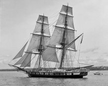
The image I want to split grade is attached.

Bob, you say that split grading adds to the perception of detail in telephone lines. I imagine that the same holds true for things like ship's rigging.

Hopefully, this is just what I need to take this image from a "9" to a "10," so to speak. :smile:
 

Attachments

  • 5877475532_1ba4b4e626.jpg
    5877475532_1ba4b4e626.jpg
    105.3 KB · Views: 130

Monito

Member
Joined
May 16, 2011
Messages
335
Location
Nova Scotia,
Format
Multi Format
Let's say I have scanned a black and white negative into my computer and I am editing it digitally. One of the first things I do is go to the IMAGE > ADJUSTMENTS > SHADOW/HIGHLIGHT control then expand/contract my shadows and my highlights to make the overall contrast of the picture the way I want.

If you really want to get your analogue and digital in sync and in gear so that the synergy between the two of them helps both, then skip shadow/highlight control and go straight to Curve and use masks. The other controls (incl. Levels) are just manipulating a Curve behind the scene. Using Curve directly allows you to think directly in terms of tones in a way that is clearer for connecting it to what is happening with negative tones and paper tones under the enlarger.

By using masks in PS, you better approximate burning and dodging. The burn and dodge tool in PS is a fudge, not very good. It is much better to get your highlight tones Curved the way you like them in one layer and shadows Curved the way you like them in another layer. Then you paint the masks to bring to the fore selected areas from each layer.

This is more directly analogous to burning and dodging under the enlarger with split grade techniques.

I came from printing graded paper silver B&W (and loving it) to PS after a hiatus and immediately saw that Curve is the tool to master with Layers. Now with variable contrast split grading is a very powerful tool which I will endeavour to master now that I've got a darkroom too.
 

Bob Carnie

Subscriber
Joined
Apr 18, 2004
Messages
7,731
Location
toronto
Format
Med. Format RF
Also if you are burning in those cloud areas, the bottom of the clouds will become more defined and any mid tone within.

The image I want to split grade is attached.

Bob, you say that split grading adds to the perception of detail in telephone lines. I imagine that the same holds true for things like ship's rigging.

Hopefully, this is just what I need to take this image from a "9" to a "10," so to speak. :smile:
 
OP
OP
Worker 11811

Worker 11811

Member
Joined
Jan 18, 2010
Messages
1,719
Location
Pennsylvania
Format
Multi Format
I am thinking about burning the clouds and I'm considering whether or not to split grade the print when I make it for good.

I was showing some work prints to a woman who manages a gift shop and gallery. This one was at the back of the book. She flipped through and thought a couple were good but, when she got to the ship she asked me to make a print to sell. I told her I would have a finished print in a week or so.

In the mean time, I am taking a couple of days to look at the work print I have and just think about it. I put the print on the table and look at it when I walk by. I'll have a beer and just sit there, print in hand and consider options and things I like and don't like.

Tomorrow is Sunday and the shop is closed on Monday. I want to work on it between tonight and Tuesday.

I also use Photoshop as a way to experiment and preview different ways to compose, crop and choose other options before I go downstairs and burn up paper. Thus the reason I am asking about parallels between Photoshop and the enlarger. (The negative is on Tri-X 120 format, shot with my Yashica Mat.)

I think I'd like to burn in the clouds but I really want good detail in all the rigging and in the sails. I'd be willing to forgo the sky if the rigging really popped. As Bob Carnie pointed out, this is one of the reasons I'm considering whether to split grade this print.

If luck is with me, maybe I can turn this one into a money shot.
 

holmburgers

Member
Joined
Aug 13, 2009
Messages
4,439
Location
Vienna, Austria
Format
Multi Format
I for one would love to see the finished print when all is said and done.
 

jp498

Member
Joined
Oct 5, 2009
Messages
1,525
Location
Owls Head ME
Format
Multi Format
The image I want to split grade is attached.

Bob, you say that split grading adds to the perception of detail in telephone lines. I imagine that the same holds true for things like ship's rigging.

Hopefully, this is just what I need to take this image from a "9" to a "10," so to speak. :smile:

Try for 11.

Tastes differ, but I think this image would make a killer van dyke print if you can make a big digital negative or if you shot it big to begin with. The dark hull and rigging would really show nicely. A toned cyanotype would be nice too; see what Sandy King has been up to on lfinfo. The historical subject matters usually look good on a historical process too.

The alt process option can come in handy and creative when you have a nice B&W image that doesn't seem ideal for normal gray silver.
 
OP
OP
Worker 11811

Worker 11811

Member
Joined
Jan 18, 2010
Messages
1,719
Location
Pennsylvania
Format
Multi Format
I usually selenium tone but what about sepia? The local camera store doesn't have much in the way of traditional supplies anymore but I do remember they had a couple of sepia tone kits on the rack, still.

I would love to make a cyanotype or something. That would be cool!:cool:

All the galleries around here want exclusives. I've been getting away, sliding under the wire so far because everything I have consigned up to this point has been just post cards and small stuff like 5x7. (Catering to the tourist crowds who don't want to haul big prints home in the trunks of their cars.)

Although I understand the cyanotype and Van Dyke processes, I have never done them. I'd have to study up before I tried to make one for money. Still... the idea is still rattling around inside my head.

I've got a couple rolls of film to develop tonight. After that, it's time to hit the darkroom and get cracking on this print. :smile:
 

jp498

Member
Joined
Oct 5, 2009
Messages
1,525
Location
Owls Head ME
Format
Multi Format
Won't fit your schedule, but you can order the starter kit (chemicals, instructions, paper) for cyanotype and vandyke at bostick & sullivan. It's super easy. Mix the liquids like they say, brush it on the paper and let it dry. Contact print it outdoors. Bring it in and process it.

It's not just the different color results. It's a combination of texture, exclusiveness, and the way it handles tones; for darks they tend to be a little more contrasty. For highlights, you can still get good tones depending on variables like single/double coated, paper choice, amount of exposure.

Sepia toning normal silver prints is worthwhile depending on the subject. It doesn't make a big difference in changing contrast, which is normally a good thing. I've copied lots of old photos (portraits and such from 100 years ago) and the copies looked real nice sepia toned sometimes. It's a safe chemical but very stinky.
 
OP
OP
Worker 11811

Worker 11811

Member
Joined
Jan 18, 2010
Messages
1,719
Location
Pennsylvania
Format
Multi Format
The ship in the picture is the Brig Niagara.
http://en.wikipedia.org/wiki/USS_Niagara_(1813)

It was rebuilt from the original after it was scuttled in Misery Bay after the War of 1812.

A photo of a vintage ship deserves a vintage treatment. Right?

Once I work up a good print, I plan to make a half dozen or so extra copies. I'll get the promised print to the gallery then I'll experiment with the sepia toning or other ideas afterward.
 

Bob Carnie

Subscriber
Joined
Apr 18, 2004
Messages
7,731
Location
toronto
Format
Med. Format RF
As noted a cyanotype would be cool, or IMO a very slight sepia then selenium would make this a killer.

If you are going to sepia, you really need to lay some highlight tone down so that the bleach then tone will be apparent. Without tone in the highlight you may go to paper white and usually that looks like shite.
 

Bob Carnie

Subscriber
Joined
Apr 18, 2004
Messages
7,731
Location
toronto
Format
Med. Format RF
Upon futher thought and actually looking at the photograph, I am hoping you have a frame or two without the power boat.

Otherwise the technique of period toning this image is wasted.

time for PS :munch: if you don't have an image without the power boat , send me the file and I will make you a Lambda Fibre.{ we will have to be dastardly sneaky and clone out the offending tell tale signs.}

I hope the APUG gods do not come down and strike me off this forum.
I just noticed I am coming up to 3k posts, the end is near.
 
OP
OP
Worker 11811

Worker 11811

Member
Joined
Jan 18, 2010
Messages
1,719
Location
Pennsylvania
Format
Multi Format
She was going through the channel from Presque Isle Bay into Lake Erie. There was a fairly narrow window of opportunity. I took two or three shots to try to get one without any other boats but the channel was too busy. This is the one that is least cluttered.

I thought about tinkering, cropping or using some other chicanery to remove the boat but I decided to leave it in because it creates a contrast between "Old & "New" or "Big & Little."

Still thinking about this. Probably will start printing later on today. I'll make some extra prints so I can play with toner, etc.
 
Photrio.com contains affiliate links to products. We may receive a commission for purchases made through these links.
To read our full affiliate disclosure statement please click Here.

PHOTRIO PARTNERS EQUALLY FUNDING OUR COMMUNITY:


Ilford ADOX Freestyle Photographic Stearman Press Weldon Color Lab Blue Moon Camera & Machine
Top Bottom