Jesse,
Matt pretty well answered for me (thanks Matt)

so I can elaborate on something else. Matt stated it well:
When starting out, we tend to think of "contrast" as blacks and whites in a print. This is really just the brightness range. Contrast, better understood, is the degree of (density) difference between tones. Imagine you have a negative with just two grey midtones, pretty close to each other. Now, you can print these at a number of different contrast settings (0-5) and you'll get more separation between the tones in the print as the setting moves toward more contrasty.
Often, we have a negative that screams for lots of separation for a particular part of the image. Let's say we have a scene with a wooden building, white clouds and some very dark, shaded parts. Now I can print this so the blacks in the shaded part of the image are black in the print and so that the clouds are white. That's fitting the overall subject brightness range into the range of the paper by adjusting contrast. That's Mark's "photofinisher" approach. However, I might look at the wood on the building and decide that it would look a lot better with more texture, more separation between those close tones, i.e., more local contrast. The only way to get this is to print at a higher contrast setting (or paper grade... more later about graded papers).
So, I choose a higher contrast setting; one that makes the wood look like I want it to. But now, the whites are blown out and the blacks are blocked up. What to do? Here's where we can get creative! First choice is to just dodge and burn, which amounts to giving the whites more exposure and the blacks less exposure to get them to appear how I want them. At this point, we've given our print three different exposures and we see that it is exposure, not contrast, that determines what is black and what is white in a print.
We could go on to refine this a lot more, by doing even more dodging and burning, giving graduated exposures to parts of the print, etc., etc. But then, we might find that the clouds, even though exposed "correctly" now, are too contrasty. So we decide to do our burning of the clouds at a lower contrast setting. And maybe the shadows still look muddy, so we want to up the contrast there. So, we end up dodging the shadows even more than needed, and then burning them back with a high-contrast filter. Now we have a print with multiple exposure times and multiple contrast settings. We like it now!
As for graded papers: Many of us learned on premium graded papers before VC papers existed or were deemed good enough for fine prints. There are still some things that graded papers do better than VC papers (nuances of tonality in the mid-tones, toning characteristics, image tone, etc.) and I still do a lot of my printing on Ilford Galerie and the Foma and Slavich graded papers. With graded papers, you don't have the option of having areas of different inherent contrast on one print; you basically have to live with the single contrast grade of the paper you choose. When I print on graded paper, I make an educated guess about which contrast grade I want (I usually indicate which contrast grade to start with when I make the exposure...). I then make a test strip, find my exposure based on the highlights and then make a straight test print. I evaluate this to see if I want to change contrast. If so, I make another test strip, find my exposure and then make another test print. If I need an intermediate contrast, I'll mix up a soft-working developer and spend time determining how long I should develop in the soft developer and then in the contrastier developer. This all sounds like more work than working with VC paper, but it really isn't. Making small changes in filtration with VC papers requires a change in exposure and more test prints as well. Sometimes, this is more work and more of a headache than dealing with graded paper, for me, anyway.
Currently, I tend to print on graded paper first and only move to VC when I need contrast grades outside the limitations of the graded papers (Most graded papers are only available in grades 2 and 3, sometimes 4), or when I need to split-grade print.
Best,
Doremus
A-ha.. So I got one of the fundamentals wrong. What is a "photofinisher" you both used it but not sure what it is?
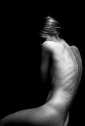
So let's take a look at an older picture of mine. Shot on Tri-X 400, developed like I did back then in HC-110. (this is a scan of the negative - print looks better) Straight grade 2-3 looked good. However, she was lying on a couch and I still had the texture of the couch in there, didn't want that. Wanted to have only blacks around her with no detail.
So there are three (and probably more options on handling this print if I am correct)..?
Option 1: Because I learned, expose for the highlights, use grade to darken the shadows. I grabbed grade 4 so the detail in the couch disappears. Is this the wrong approach? Okay her skintone got affected too, it got more contrast but I liked that side-effect.
Option 2: Burning in those parts are the approach you would take? However, that seems a lot more work than adjusting that grade. I'm not a landscape photographer. I mostly do portraits and now focusing myself on documentary. So I guess it's a different approach for portraits.
Option 3:
"Darkroom dave" told in an article or video. Split grade reduces having the dodge and burn because of the technique. If I wanted the couch to be darker without dodging and burning. I could do a split grade of the print and just lengthen the grade 5 exposure which only affects the shadows/blacks (up to a point)? So the skin tone would stay relatively on grade 2-3 which gives more tonal values?
What I mean is, is it possible with split grade printing to control exposure of the lights and the dark separately? Compared to the single grade exposure at grade 4. Where the couch is darker but the skin tone got more contrast and less tonal values.
Right or is this false?
**** Edit #2: While I'm breaking my head at home thinking about this. This above paragraph doesn't sound right. Because everything you do in split grade (without burning and dodging) should be possible to do in a single grade right. That means if I split graded it like I said, I'd just print it a lower grade eventually if it was a single grade print? So burning in is the only option left? Going to leave my thoughts in here.
****
So with spit grading I didn't had the need to use burning techniques on the couch to make it darker and retain the contrast at a normal grade (2-3) in the skin.
(again) Right?
And if I still wanted a bit more contrast in the skin, I could opt to print at grade 1 for the first exposure instead of grade 0.
(third time) Right?
-- I call this, theoretical printing on APUG

, just to check if I'm getting this stuff right ... I need a workshop ---
Sidequestion:
However, I really like having that high contrast look. The images for my exhibition were first scanned and editted on the computer. I got the look that I wanted as said before. Exposure at skin tones, grade for the blacks/shadows. I'm a fan of that "look" especially for that series. If I wanted to continue working like this (I quit this type of portraits, but let's just assume).. Would it be good to keep printing like this at a higher grade or would you recommend a longer film development for that series? Both have the same effect I guess...
-----
Funny though. But it's like you said: "When starting out, we tend to think of "contrast" as blacks and whites in a print. This is really just the brightness range. Contrast, better understood, is the degree of (density) difference between tones."
I followed a tutorial by accident 2 years ago, by some guy named Taylan on YouTube. He had a darkroom in Turkey. Watching the video learned me only those two things. Expose until the skin tones looked good and adjust the grade if your blacks are too low or too high. Too high: lower contrast. Too low: higher contrast.
So, to recapitulate on the Berlin print which has a not fully bright sky, but rather a light grey sky and a dark foreground. I was not able to get the print I want, unless I printed it at grade 5 (the whole print) and did a burn in exposure at the sky at a lower grade. Follow me here: I chose for grade 5 because I did not get decent blacks until choosing that grade. But a straight grade 2 print of the foreground gave me so much detail in the bushes.. more tonality. So if I wanted that same tonality, I just had to print it at a lower grade and burn in the bushes until I get a decent black?
So confusing this
Compared to digital this is a nightmare to understand, especially if you never lived in the era of film. For you guys it's second nature, for me it's a whole new concept to understand. Maybe I should go back to basics again. Start from the beginning with normal printing and forget about what I know.
Funnily enough I printed 27 fiber prints for my own exhibition which looked great to my eyes. Not sure how I ever did that. Lot of images underexposed due to bad lightning situations. It was a routine, I could always start at grade 4 because all of the pictures were taken inside with the same type of lightning.. different days though. I just used the grade to get the contrast right and the blacks where I wanted. Exposure for the skin tones and that was it. Only had to burn in some corners once, because a higher grade would block my shadow detail. So then I had to print at grade 2 and burned in the corners to get a moody atmosphere.
Thanks once again.
Edit:
One more but pretty important question. This has been the most helpful thread in my life about darkroom printing and it helped me a lot to understand things already.
So, I've talked about film developing and over development to be able to print at grade 2. Now I thought I had to find a development time which will print my negatives almost perfectly on grade 2 without too much problems. But having troubles with the Berlin scene clearly show that it's not possible.
To find out my development time: if I make a straight grade 2 print of a normal scene with correct development. What should it look like? And how can I know when the development time is insufficient or too much?
Or even if the scene is low contrast, is it possible to see if it's developed well?


 .
.