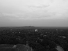
It looks to me like you have a subject that is relatively low in contrast, has a relatively narrow range of brightness and has different light on the foreground than the background (due to atmospheric effects), and you are trying to get something different out of it.
I don't think just adjusting the overall contrast of either the negative or the print is what you need to do to accomplish what you want.
Essentially, you need to print the two sections (the foreground and the sky) separately and then, once you get what you want from each section, figure out how to combine the two on the same print. That will involve using different contrast settings and exposures on different sections. You do this through split filtering techniques and burning and dodging.
You may find that due to the nature of the sky and things like airborne dust and UV in the original, you won't be able to get the sky to look more contrasty, but you will be able to get it darker. To my mind, the foreground would look better and more well defined if it was printed lighter with a lower contrast setting - you need to open up those shadows.
The approach that says use exposure to set the tones for the highlights and adjust contrast to set the darkness of the shadows isn't a bad approach for a lot of things, but it really only works perfectly for evenly lit subjects. In the situation you are working with the lighting on the foreground is different than the distance and the sky, due to things like atmospheric effects, so you need to approach the two parts separately.
-
 I have no experience with that so quite nice that you noticed this. However, when I open up the shadows in the bottom part I get good shadow detail but not really the tones what I'm looking for. I love it that it is so moody.