Reversal RA-4 processing is discussed a little in many threads, but there's quite little definite experimental information available.
I've done my own little research for two years, every now and then when I have something else to do and want to escape from it . I've spent a few nights experimenting. I've thought of making some kind of Reversal RA-4 manual after I've enough results, but as I'm not sure if that day will ever come, I'll start now by giving all these little results I have now, and ask you also to publish your results!
Reversal RA-4 is much fun! I genuinely recommend experimenting a little. You may be surprised how easy it is to get nice positive images, though not flawless.
So, here I go.
Reversal RA-4 processing involves a first developer, basically a BW developer, then wash, light reversal (with room lighting), normal RA-4 color dev and blix and wash.
This will produce usable positive prints from slides, having some inevitable problems, because the RA-4 papers are not designed for this kind of use but for printing negatives, having lower contrast index.
What we want, is a tone scale of about 3.0...3.3 D, or 10 to 11 stops. This is about the tone scale of slides, and has to include the toe and shoulder of the paper to get proper white and black. Some compression of toe and shoulder is inevitable and present in Ilfochrome printing also. So, in practice, we might want to sacrifice some shadow&highlight detail to get more contrast in these areas, so, maybe a tone scale of 2.7D or 9 stops would be quite good for a paper.
I've found that the tone scale of RA-4 paper when reversal processed is about 10-11 stops! It is definitely not too "high in contrast"; but the real problem is the curve shape.
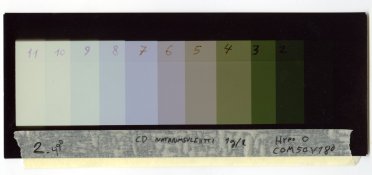
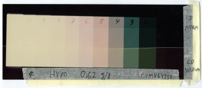
I'll go later to these step wedge tests, but this first example is to show the tone scale problem.
So, I've found that the characteristic problems in reversal RA-4 processing are as follows:
1) Too high contrast in shadows
2) Too low contrast in highlights.
3) Cyan highlights and upper tone scale -- not particularly red-cyan crossover, because shadows are not red and cyan highlights cannot be fixed by filtration.
4) Green-magenta crossover, giving green shadows and magenta highlights.
5) Uneven extra texture in even density.
All of them give a unique look, and while they maybe cannot be solved completely, there may be and there are some tricks how they can be coped with.
I have tried the following:
Paper
- Kodak Supra Endura and Fuji Crystal Archive
First developer modifications:
- Trying different BW paper developers as first dev
- Trying different dilutions
- Adding hydroquinone to make it more active
- Adding sodium thiosulphate (hypo)
Reversal exposure
- Amount of exposure, how much is really needed.
Color developer modifications:
- Adding sulfite (Photo Engineer's tip) to reduce contrast
- Adjusting pH to change color balance
And now, to the results.
The first thing is that many of the problems are not easy to deal with; there are random variations. For example, when I look my tests, the uneven texture problem randomly appears and disappears. Sometimes it's more evident. I've found that adding hydroquinone in FD clearly decreases it but still, I have some examples without added HQ having no texture at all. Similarly, I used more than 10 hours just to try to get rid of cyan highlights by means of filtration and CD pH adjustments, just to find that it isn't crossover problem but the layer just don't develop completely. It's funny, because it's the topmost layer. Then, later, I discovered that well, suddenly I get proper whites just with enough exposure, using quite dilute developer compared to earlier experiments.
Currently I'm confused about a few things and have many directions to go to. But first, some results. I'll post more specific technical information soon.
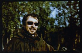
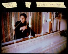
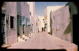
(Sensia 100.) Some of the first experiments. Print number 25 after many modifications.
Quite good, but shows the cyan forehead problem.
First dev: Agfa Neutol 1+3 (normal dilution is 1+7) with 20% of a medium-sized hypo crystal in 500 ml (didn't have scales at that time), 3min30sec
CD: Normal
Filtration: C17 M0 Y140 (on Fujimoto, normal neg filtration about C0 M50 Y100)
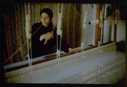
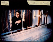
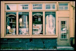
(Sensia 100) Newer experimentation with much less work.
First dev: Dektol 1+2,5 (about normal dilution), no modifications, 2min.
CD: Normal
Filtration: Might have been about C0M50Y180.
So, as you can see, using different first developers affect greatly to the filtration!
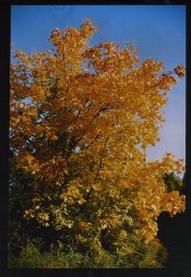
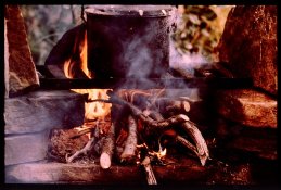
(Velvia 50.) Experimentation with added hydroquinone.
First dev: Neutol 1+3 with huge loads of HQ (I have the amount down somewhere but it is around 30-40 g/liter!!!)
CD: Normal
Filtration: C3 M0 Y146
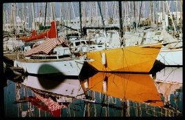
(Sensia 100.)
Same first dev as in the previous example. Quite good. A little cyan problem and the whites could be a little more white, but if exposure is added, they go too low-contrast.
TO BE CONTINUED
PS. And, share your knowledge!!
I've done my own little research for two years, every now and then when I have something else to do and want to escape from it
 . I've spent a few nights experimenting. I've thought of making some kind of Reversal RA-4 manual after I've enough results, but as I'm not sure if that day will ever come, I'll start now by giving all these little results I have now, and ask you also to publish your results!
Reversal RA-4 is much fun! I genuinely recommend experimenting a little. You may be surprised how easy it is to get nice positive images, though not flawless.
So, here I go.
Reversal RA-4 processing involves a first developer, basically a BW developer, then wash, light reversal (with room lighting), normal RA-4 color dev and blix and wash.
This will produce usable positive prints from slides, having some inevitable problems, because the RA-4 papers are not designed for this kind of use but for printing negatives, having lower contrast index.
What we want, is a tone scale of about 3.0...3.3 D, or 10 to 11 stops. This is about the tone scale of slides, and has to include the toe and shoulder of the paper to get proper white and black. Some compression of toe and shoulder is inevitable and present in Ilfochrome printing also. So, in practice, we might want to sacrifice some shadow&highlight detail to get more contrast in these areas, so, maybe a tone scale of 2.7D or 9 stops would be quite good for a paper.
I've found that the tone scale of RA-4 paper when reversal processed is about 10-11 stops! It is definitely not too "high in contrast"; but the real problem is the curve shape.

I'll go later to these step wedge tests, but this first example is to show the tone scale problem.
So, I've found that the characteristic problems in reversal RA-4 processing are as follows:
1) Too high contrast in shadows
2) Too low contrast in highlights.
3) Cyan highlights and upper tone scale -- not particularly red-cyan crossover, because shadows are not red and cyan highlights cannot be fixed by filtration.
4) Green-magenta crossover, giving green shadows and magenta highlights.
5) Uneven extra texture in even density.
All of them give a unique look, and while they maybe cannot be solved completely, there may be and there are some tricks how they can be coped with.
I have tried the following:
Paper
- Kodak Supra Endura and Fuji Crystal Archive
First developer modifications:
- Trying different BW paper developers as first dev
- Trying different dilutions
- Adding hydroquinone to make it more active
- Adding sodium thiosulphate (hypo)
Reversal exposure
- Amount of exposure, how much is really needed.
Color developer modifications:
- Adding sulfite (Photo Engineer's tip) to reduce contrast
- Adjusting pH to change color balance
And now, to the results.
The first thing is that many of the problems are not easy to deal with; there are random variations. For example, when I look my tests, the uneven texture problem randomly appears and disappears. Sometimes it's more evident. I've found that adding hydroquinone in FD clearly decreases it but still, I have some examples without added HQ having no texture at all. Similarly, I used more than 10 hours just to try to get rid of cyan highlights by means of filtration and CD pH adjustments, just to find that it isn't crossover problem but the layer just don't develop completely. It's funny, because it's the topmost layer. Then, later, I discovered that well, suddenly I get proper whites just with enough exposure, using quite dilute developer compared to earlier experiments.
Currently I'm confused about a few things and have many directions to go to. But first, some results. I'll post more specific technical information soon.

(Sensia 100.) Some of the first experiments. Print number 25 after many modifications.
Quite good, but shows the cyan forehead problem.
First dev: Agfa Neutol 1+3 (normal dilution is 1+7) with 20% of a medium-sized hypo crystal in 500 ml (didn't have scales at that time), 3min30sec
CD: Normal
Filtration: C17 M0 Y140 (on Fujimoto, normal neg filtration about C0 M50 Y100)

(Sensia 100) Newer experimentation with much less work.
First dev: Dektol 1+2,5 (about normal dilution), no modifications, 2min.
CD: Normal
Filtration: Might have been about C0M50Y180.
So, as you can see, using different first developers affect greatly to the filtration!

(Velvia 50.) Experimentation with added hydroquinone.
First dev: Neutol 1+3 with huge loads of HQ (I have the amount down somewhere but it is around 30-40 g/liter!!!)
CD: Normal
Filtration: C3 M0 Y146

(Sensia 100.)
Same first dev as in the previous example. Quite good. A little cyan problem and the whites could be a little more white, but if exposure is added, they go too low-contrast.
TO BE CONTINUED
PS. And, share your knowledge!!

Last edited by a moderator:


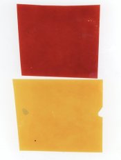
 . I'll find more test strips and my notes and post more results as soon as I find them. This one doesn't show any cyan, just the green-magenta crossover:
  .
.