Reports of (Colour) Kodachrome Home Processing Emerge from Sydney

St. Clair Beach Solitude

D
St. Clair Beach Solitude

  • 8
  • 2
  • 104
Reach for the sky

H
Reach for the sky

  • 3
  • 4
  • 141
Agawa Canyon

A
Agawa Canyon

  • 3
  • 2
  • 174

Recent Classifieds

Forum statistics

Threads
198,873
Messages
2,782,393
Members
99,738
Latest member
fergusfan
Recent bookmarks
0

Photo Engineer

Subscriber
Joined
Apr 19, 2005
Messages
29,018
Location
Rochester, NY
Format
Multi Format
Nzoomed, you are wrong. That is the only way to put it.

The couplers are all of the same families of chemicals, Acetoacetates or the like for yellows, pyrazolones for magenta and phenols or napthols for cyan. Sensitizing dyes are much more complex! Kodachrome couplers dissolve in the developer, while Ektachrome couplers dissolve in oil which is then incorporated into the coating.

From there we wave a magic wand!!!!

Kodakchrome could ruin flesh tones and blacks, muddy greens or make them vibrant and make great reds (with no detail in them). I have pictures of a red knit sweater in which the knitting cannot be seen in Kodachrome but the stitching is clear in Ektachrome. So, the "fine" qualities of Kodachrome are somewhat of an accident. As one of us said, Kodachrome could make a garbage dump look pretty!

PE
 

Athiril

Subscriber
Joined
Feb 6, 2009
Messages
3,062
Location
Tokyo
Format
Medium Format
If I recall correctly, according The Focal Encyclopedia of Photography, probably volume 4 (referencing another source I think but I cant remember what that was), Kodak could tweak the chain length of their couplers and/or dyes, meaning they could specify spectral absorbance range, and spectral output range of the dyes ending up in the film.

So I would say the difference in colour is likely mostly due to improvements in spectral response and output. I'm sure they could have simply made Kodachrome with couplers matching regular Kodachrome's couplers spectral sensitisation, especially if they had decided to stay with the K-14 first developer. That could have greatly simplified the process, but we ended up with E-4 and E-6, with new film design and new emulsions.
 

Roger Cole

Member
Joined
Jan 20, 2011
Messages
6,069
Location
Atlanta GA
Format
Multi Format
PE is explaining the reasons but I agree that Kodachrome often produced striking, but hardly "accurate" results. It does seem to have a look all its own, and it's one I like for many things even if it is inaccurate. It seems to have a "vintage" look like the shot came from the 60s, possibly because so many color photos we've seen from that era where shot on it!
 

Nzoomed

Member
Joined
Mar 30, 2012
Messages
1,259
Format
35mm
IIRC, not only were the color couplers for the dye layers in the color developers, but there were at least two, maybe three different color couplers. I believe one color developer was CD4, and another was CD6 (which was used only for the Kodachrome process, and is no longer made). Somewhere on APUG, PE mentioned that there is a way to turn CD4 into CD6, but I don't recall the exact wording of his post.

C41 uses CD4, and E6 uses CD3, so these couplers are still made. I believe RA4 also uses CD3. I don't remember which color developer PE said that ECN2 uses.

Kodachrome had 3 different dye couplers (one each for C,M,Y) Interesting that you say that the same developer for C41 films was used for one of the developers in kodachrome, were these developers (CD4,CD6 etc) mixed with the special couplers at the time of processing?

Nzoomed, you are wrong. That is the only way to put it.

The couplers are all of the same families of chemicals, Acetoacetates or the like for yellows, pyrazolones for magenta and phenols or napthols for cyan. Sensitizing dyes are much more complex! Kodachrome couplers dissolve in the developer, while Ektachrome couplers dissolve in oil which is then incorporated into the coating.

From there we wave a magic wand!!!!

Kodakchrome could ruin flesh tones and blacks, muddy greens or make them vibrant and make great reds (with no detail in them). I have pictures of a red knit sweater in which the knitting cannot be seen in Kodachrome but the stitching is clear in Ektachrome. So, the "fine" qualities of Kodachrome are somewhat of an accident. As one of us said, Kodachrome could make a garbage dump look pretty!

PE

OK, yes i guess that is what i was trying to get at, i did expect that the couplers were the same family of chemicals, but i expect the molecules were tweaked slightly, while being in the same family, there can be quite a fairly large group of compounds in that group that can be used in place of each other, and im sure we see these differences in the various different films, eg. fuji Velvia and Provia or e100g and e100vs would have different composition.

Anyway, it appears its not the actual K-14 process that made Kodachrome's colours unique, although thats what the media seemed to suggest at the time it was discontinued.
 

Photo Engineer

Subscriber
Joined
Apr 19, 2005
Messages
29,018
Location
Rochester, NY
Format
Multi Format
The K14 process contributed to the color palette. The couplers (3 of them) and the developing agents (CD3 and CD6) were further agents that did this in the process. Finally, the interimage effects completed the color formation process and this took place mainly in the FD.

There were major tweaks to the couplers to try and balance out the problems and thus they ended up with high cyan contrast due to a narrow half band width. (A cyan dye that is very very pure is one way to put it) This gave chalky flesh tones, dark greens, odd neutrals, and very red reds (in some cases).

Dyes are often selected for image stability and hue, but often again, you get what you get. The design process is long and difficult and often you do not see a final image for months into the project. Often you have to rely on computer models such as they are.

Nzoomed, you have no concept of color photography at this level. I suggest that you read that chapter in either Haist or Mees and James. These two books have excellent explanations of what is going on here and also interimage effects. If you want more, try the small chapter by Rodgers and Kapecki in the Encyclopedia of technology (I think I got that right), or an earlier version of the same material by Zwick and Thirtle.

PE
 

falotico

Member
Joined
Aug 31, 2012
Messages
265
Format
35mm
Apparently there will always be fans of the K film. I include myself among them, but I recognize that EK made very superior color films later. Some of the most recent motion picture stock forms unequaled color images. Dr. Hanson once said on a video that the only thing that Kodachrome couldn't photograph was a Kodachrome image. Obviously a process was needed to produce reliable prints. A Spitfire was a great airplane, but you can't compare it to a F 16. K film was great but an immense amount of research has created modern films and they are on a different level of quality.

That being said there are F 16 pilots who would love to fly a Spitfire. K film is a robust design. Couplers which are soluble in aqueous solution will probably always be useful. It provides a great introduction to understanding the later designs.
 

Nzoomed

Member
Joined
Mar 30, 2012
Messages
1,259
Format
35mm
The K14 process contributed to the color palette. The couplers (3 of them) and the developing agents (CD3 and CD6) were further agents that did this in the process. Finally, the interimage effects completed the color formation process and this took place mainly in the FD.

There were major tweaks to the couplers to try and balance out the problems and thus they ended up with high cyan contrast due to a narrow half band width. (A cyan dye that is very very pure is one way to put it) This gave chalky flesh tones, dark greens, odd neutrals, and very red reds (in some cases).

Dyes are often selected for image stability and hue, but often again, you get what you get. The design process is long and difficult and often you do not see a final image for months into the project. Often you have to rely on computer models such as they are.

Nzoomed, you have no concept of color photography at this level. I suggest that you read that chapter in either Haist or Mees and James. These two books have excellent explanations of what is going on here and also interimage effects. If you want more, try the small chapter by Rodgers and Kapecki in the Encyclopedia of technology (I think I got that right), or an earlier version of the same material by Zwick and Thirtle.

PE

OK, that's an interesting read, so as i expected, the K14 process did contribute to the colour palette, but it also appears that the cyan coupler was also responsible for why Kodachrome gave such red reds at times?

So is this also why Kodachrome is said to be more archival than most films; i.e the dyes selected in Kodachrome were more stable at the expense of colour accuracy?
In saying that, it seems most E6 films have held up very well so far, although the older E4 Ektachrome had a terrible cyan colour shift i believe?

Im also interested to see your thoughts on if a modern E6 film could be designed to have the same traits as kodachrome did. Would it be as simple as using a similar cyan dye as what Kodachrome used, or is it alot more complex than that?
Im tending to think that it would be fairly complex, but if it can be pulled off, i think you would agree that such a film would be a popular seller (especially amongst Kodachrome fans)

BTW, thanks for mentioning those books, they look like they are well worth a read and i will see if my library has any copies.
Im quite keen to learn the technical aspects of colour films, its alot different than B&W, thats for sure!
 

Photo Engineer

Subscriber
Joined
Apr 19, 2005
Messages
29,018
Location
Rochester, NY
Format
Multi Format
Nzoomed; An E6 film that looks like Kodachrome could be designed, but it would be a costly project with no guarantee of having good qualities such as grain or sharpness or more importantly, dye stability.

You see, Kodachrome dyes become microcrystalline in the coating after formation, and this helps resist fade. There is also a relief image that forms that assists in sharpness. The crystals are hard to form in E6 and so a design method has to be used to change the dyes to be more stable. The designer must add antioxidants and take other measures. AFAIK, the relief image would be impossible to form for technical reasons that are very complex but lets just say that the actual dye formation where nothing was before causes bumps and bulges in the Kodachrome image area. This is just about impossible in E6.

I suggest you try the books and maybe even look up some patents that describe image formation and image stability.

PE
 

Nzoomed

Member
Joined
Mar 30, 2012
Messages
1,259
Format
35mm
OK, well that sounds like that will be out of the question for any E6 films, i think that Kodak come pretty close with E100G though, the reds are far from accurate, and come out more vibrant than what the subject appears, the AGFA stock is supposed to be the closest film to Kodachrome, but i feel its reds come out more accurate, maybe just a little stronger, the top photo is shot on e100g and the bottom one on Agfa Aviphot chrome 200.
The red pants on the AGFA photo are actually 99.9% close to their real colour, but are significantly different on the Ektachrome stock.
image.jpg
image.jpg
 
Last edited by a moderator:

Nzoomed

Member
Joined
Mar 30, 2012
Messages
1,259
Format
35mm
How about the other colors and the details in the pure red? What is your opinion?

PE

I think the red in the Ektachrome 100g stands out the most, but overall, all the colours are more vibrant or brighter is the best way if describing it, but still remain rather accurate in colour. The details seem fine enough, there is nothing that i cant see thats blotted out in the reds, i can see the sewing on those red pants as clear as a bell, even the texture of the fabric is visible, so its not displaying that particular trait of kodachrome, but the reds do seem alot more intense than other films. I really wonder how much more vibrant e100vs must be!

Those pants are a rather muddy red, almost an orange tone, but look at how red it is in that image.

The agfa stock seems fairly accurate and neutral, it defiantly has a real vintage look to it and it is more grainy.

The skies have quite a different tone between films too, Ektachrome has a very vibrant sky, but more neutral and not so punchy with the agfa stock.
I will try and find some more photos as a comparison.
 

MattKing

Moderator
Moderator
Joined
Apr 24, 2005
Messages
52,983
Location
Delta, BC Canada
Format
Medium Format
I'd be careful about using those examples to evaluate colour accuracy unless you are confident that they were shot using significant UV filtration.
 

Roger Cole

Member
Joined
Jan 20, 2011
Messages
6,069
Location
Atlanta GA
Format
Multi Format
I shot a lot of E100G after Astia went away and still have some frozen. In fact I have two exposed rolls here on my desk now to pack up and send out for processing. It never struck me as looking like Kodachrome, unless by that one means "less saturated and contrasty than most other films after the demise of Astia" (which would also partially describe Kodachrome) but it was certainly an excellent film. I'd be quite happy if the FF product is very similar.
 

Roger Cole

Member
Joined
Jan 20, 2011
Messages
6,069
Location
Atlanta GA
Format
Multi Format
Those two images look horrible and color faded to me.

The bottom one is a bit muted, and maybe with some of the yellow cast we hear about with this film. Actually if the color were more neutral it would tempt me to try some of this - ah, but it's not made in 120 as far as I know. :sad: I'd like to find a muted/pastel saturated film like the old Agfa Portrait 160 neg film, not for everything or even most things but for some things.

The top one looks just like E100G but shot at high altitude - as mentioned above, needing some UV filtration as evidenced by the overall blue and blue snow. E100G is not a particularly cool/blue film. Otherwise it looks fine to me.
 

StoneNYC

Member
Joined
Aug 5, 2012
Messages
8,345
Location
Antarctica
Format
8x10 Format
The bottom one is a bit muted, and maybe with some of the yellow cast we hear about with this film. Actually if the color were more neutral it would tempt me to try some of this - ah, but it's not made in 120 as far as I know. :sad: I'd like to find a muted/pastel saturated film like the old Agfa Portrait 160 neg film, not for everything or even most things but for some things.

The top one looks just like E100G but shot at high altitude - as mentioned above, needing some UV filtration as evidenced by the overall blue and blue snow. E100G is not a particularly cool/blue film. Otherwise it looks fine to me.

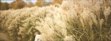
How's this for muted...

ImageUploadedByTapatalk1412536485.687226.jpg
ImageUploadedByTapatalk1412536509.985181.jpg

I did some color experimenting. This is Provia100f

If you time it right, you can pull the film from the CD before it's fully saturated for some "antique" look. No photoshop done here, that's what the slide looks like (panoramic with my Mamiya 7).

Of course PE will have to weigh in on color stability with this method, but I would assume the stability would be the same as "to completion" but again I'm no chemist, just an experimentor :wink:
 

Roger Cole

Member
Joined
Jan 20, 2011
Messages
6,069
Location
Atlanta GA
Format
Multi Format
How's this for muted...

View attachment 95582
View attachment 95583

I did some color experimenting. This is Provia100f

If you time it right, you can pull the film from the CD before it's fully saturated for some "antique" look. No photoshop done here, that's what the slide looks like (panoramic with my Mamiya 7).

Of course PE will have to weigh in on color stability with this method, but I would assume the stability would be the same as "to completion" but again I'm no chemist, just an experimentor :wink:

A little TOO muted but a fascinating idea, thanks.
 

Nzoomed

Member
Joined
Mar 30, 2012
Messages
1,259
Format
35mm
The bottom one is a bit muted, and maybe with some of the yellow cast we hear about with this film. Actually if the color were more neutral it would tempt me to try some of this - ah, but it's not made in 120 as far as I know. :sad: I'd like to find a muted/pastel saturated film like the old Agfa Portrait 160 neg film, not for everything or even most things but for some things.
The top one looks just like E100G but shot at high altitude - as mentioned above, needing some UV filtration as evidenced by the overall blue and blue snow. E100G is not a particularly cool/blue film. Otherwise it looks fine to me.

I dont know much about UV filters and how UV affects film, i didnt think that film was sensitive to UV, anyway, your right the bottom one is a bit muted, because i shot it in a snow cave with no flash! lol I know i had trouble shooting alot of photos in there without a tripod, some of them turned out fuzzy. All i know is i cant attach any filters to my XA3 and i do alot of photography when snowboarding each season, i do alot of outdoor photography too. Anyway, i have got other photos taken outside with the same pants and the red still looks the same on the Agfa stock.

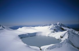
The altitude there would be around 2300m above sea level, and ive successfully shot Ektachrome at the summit at over 2600M above sea level(see shots below) without any ill effect, although im not sure what im supposed to look for in a photo regarding UV exposure, obviously you picked up on it :smile:
crater_800.jpg
I have never had any yellowing with the agfa stock, but here is another sample of the agfa stock, (and yes the digibase and lomography films have this in 120 format!) Lomography claim that none of their stock has the yellowing problem, and Wittner guarantee this too. I think it has more neutral colours and the sky has a more washed out look too, which doesnt bother me. It looks like a real vintage look to me. Its quite pastely i think, those colours dont stand out on the clothing nearly as much as Ektachrome does. I will try and grab more photos to compare when i get a chance.
3.jpg
 

Photo Engineer

Subscriber
Joined
Apr 19, 2005
Messages
29,018
Location
Rochester, NY
Format
Multi Format
All films are most sensitive to UV radiation and the UV must be filtered out by an overcoat. That overcoat is designed for sea level. The higher you go, the more UV filtration you need over the lens. Kodak used to make a set of 3 UV filters, each one good for about 10 or 20,000 ft. I've forgotten, but I have a set of the HA1,2 and 3 filters.

There is a long thread on UV filters going on here on APUG right now. Basically, too much UV makes objects overly blue.

PE
 

StoneNYC

Member
Joined
Aug 5, 2012
Messages
8,345
Location
Antarctica
Format
8x10 Format
A little TOO muted but a fascinating idea, thanks.

Welcome :smile:

I figured it was too muted for what you wanted, you'll just have to test and find a happy medium. You may also have to play with the exposure and development of the first developer stage, depending on how saturated / muted you want everything to be and then it's "vibrancy" in the slide.

I would start by pulling it 30 seconds short of the recommended CD time as an initial test. But again I'm not a chemist.
 

Nzoomed

Member
Joined
Mar 30, 2012
Messages
1,259
Format
35mm
All films are most sensitive to UV radiation and the UV must be filtered out by an overcoat. That overcoat is designed for sea level. The higher you go, the more UV filtration you need over the lens. Kodak used to make a set of 3 UV filters, each one good for about 10 or 20,000 ft. I've forgotten, but I have a set of the HA1,2 and 3 filters.

There is a long thread on UV filters going on here on APUG right now. Basically, too much UV makes objects overly blue.

PE

OK, thats interesting to know, probably explains why i get such a blue sky in those photos, i just thought it was the sheer contrast between the white snow and blue sky.

I take it that blocking 100% of the UV light would give you terrible results?
Also, does infra red affect the image?
 

Photo Engineer

Subscriber
Joined
Apr 19, 2005
Messages
29,018
Location
Rochester, NY
Format
Multi Format
Blocking all UV radiation is a good thing. Blocking all IR is also good, but there is so little IR sensitivity that this is not a problem except maybe with a long red Tungsten film.

PE
 

Rudeofus

Member
Joined
Aug 13, 2009
Messages
5,081
Location
EU
Format
Medium Format
Stone, if you pull E6 film out from CD before time is up, how does this affect darker regions? You may have muted contrast in the brighter regions, but if your rich blacks turn into muddy gray (possibly with some color cast), one of the beauties of slide film may be lost.
 

StoneNYC

Member
Joined
Aug 5, 2012
Messages
8,345
Location
Antarctica
Format
8x10 Format
Stone, if you pull E6 film out from CD before time is up, how does this affect darker regions? You may have muted contrast in the brighter regions, but if your rich blacks turn into muddy gray (possibly with some color cast), one of the beauties of slide film may be lost.

Yes as you can see in the examples, the shadows are not black and go brownish, again this isn't for "perfection" this is for a different look.
 
Photrio.com contains affiliate links to products. We may receive a commission for purchases made through these links.
To read our full affiliate disclosure statement please click Here.

PHOTRIO PARTNERS EQUALLY FUNDING OUR COMMUNITY:


Ilford ADOX Freestyle Photographic Stearman Press Weldon Color Lab Blue Moon Camera & Machine
Top Bottom