• Welcome to Photrio!
    Registration is fast and free. Join today to unlock search, see fewer ads, and access all forum features.
    Click here to sign up

Printing a misty image

1972

A
1972

  • 3
  • 0
  • 0
2break

H
2break

  • 4
  • 2
  • 62

Forum statistics

Threads
202,582
Messages
2,842,677
Members
101,387
Latest member
Vanderast
Recent bookmarks
0

pamphoto

Member
Allowing Ads
Joined
Jan 24, 2023
Messages
189
Location
Texas
Format
Multi Format
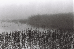
I have several images of a misty day that I am wanting to print in the darkroom soon. I have not printed in 24 years (since college!) so I am hoping that I am not being too ambitious with this project.
What are some tips for printing these well? Or should I not worry about it?

I scanned them in today on the Fuji Frontier and it is easy to enhance the scans in lightroom. I just wonder what I should consider in the darkroom?
Maybe I should wait until a second session to print these misty images? I am excited to get back into the darkroom and want to use my time efficiently.

Thank you for any thoughts, tips and opinions on the mater!
 
Are we talking color or B&W?

I think for misty images the main advice I'd want to share is to ignore any advice or workflow that suggests dialing in contrast so you get a full tonal scale ranging from paper white to pure black. In misty scenes, there's often no black, so resist any urge to seek for it in the print. I would make a couple of test strips or prints at various contrast grades so you get some visual feedback on what's possible with the negatives.

In a way, it helps that you've done the digital editing already so you probably have an idea of where you want to go with these images. But I find that the digital domain often leads me in different directions than the darkroom does, and trying to replicate a digital edit in the darkroom can be (1) frustrating and (2) may not even be the optimal solution, in hindsight.

Maybe I should wait until a second session to print these misty images?
If you're getting back on the horse after a long time, it may make sense to start with some more usual negatives. But hey...it doesn't matter how you get there, as long as you get where you want!

Just take it as it comes and try to get close to what you have in mind; anything goes.
 
Thank you @koraks
It's black and white printing.
I think I'll take the negatives just in case i feel up to trying. I'll keep your tips in mind! Thank you for the notes on contrast, because that's the first thing I wanted to do was increase contrast. I'm hoping a real print of the negatives will read more closely to what it was like that morning.

I'm expecting to use a couple of them for a book I'm working on covering the location. So bring a good print to use is a goal. The fuji scans are too grainy (film is HP5+)
The main issue is, the darkroom is an hour away from me, so it's not somewhere I will get to as often as I'd like.

Thank you again!!
 
I think for misty images the main advice I'd want to share is to ignore any advice or workflow that suggests dialing in contrast so you get a full tonal scale ranging from paper white to pure black. In misty scenes, there's often no black, so resist any urge to seek for it in the print. I would make a couple of test strips or prints at various contrast grades so you get some visual feedback on what's possible with the negatives.

In a way, it helps that you've done the digital editing already so you probably have an idea of where you want to go with these images. But I find that the digital domain often leads me in different directions than the darkroom does, and trying to replicate a digital edit in the darkroom can be (1) frustrating and (2) may not even be the optimal solution, in hindsight.

I've shot a lot of images in mist and quite heavy fog. I totally agree about the contrast, don't increase negative contrast with development and the same when printing.

1767884858574.png


1767885294450.jpeg


Both taken in quite heavy sea mist or fog, the films sees more than we do.


Ian
 
Do a test strip to determine the exposure across the very lightest highlights. Use that exposure fir further test strips at different contrast grades until you get a result that looks about right across all the image tones. Make a full print of the best combination. Then tone (if you intend to) and dry, so that you can reappraise after dry-down. You will very likely find that your favourite pick before drying is no longer satisfactory. It’s normal to need to juggle exposure and contrast grade a little bit more. I find it’s easy to lose sight of the mood you were trying to create, but pinning prints on the wall and trying to catch them by surprise the next day is useful!
 
I think for misty images the main advice I'd want to share is to ignore any advice or workflow that suggests dialing in contrast so you get a full tonal scale ranging from paper white to pure black. In misty scenes, there's often no black, so resist any urge to seek for it in the print. I would make a couple of test strips or prints at various contrast grades so you get some visual feedback on what's possible with the negatives.

This advice mirrors what I experienced recently working with a soft focus lens that has parallels to a misty effect. We may be used to in our standard workflow expanding the range of values from black to white but the approach doesn't necessarily work in all contexts.

In fact I have a contact who almost never has a pure black value in any of their images and their work is quite interesting and powerful to me.
 
Low contrast range, no really dark blacks...essential to preserve
 
Start with contrast setting 2, make a test strip print. ESSENTIAL time and temperature and freshness of developer is very important. At room temperature 68-72°F with Dektol, Ilford RC paper develop 2 minutes with continuous gentle agitation

Keep development time and temperature the same, start a notebook and record your observations.

Nice picture, you do have some blacks in there. Use glossy paper.
 
If you happen to be using split-grade printing techniques, misty or other low contrast subjects are probably best served by reversing the "normal" testing order - dial in the higher contrast first, and then refine the lower contrast.
 
Thank you @Ian Grant
Those are beautiful!
Here's a sample of what I'm talking about. This is a fuji scan without further edits:

Reminds me of Sangamo Weston adverts from the late 1960s.

In some ways the 2 images I posted are the exact opposite, the first is a 10x8 negative, the 2nd 5x4. But then there's more than one approach, it's just finding the right balance.

Ian
 
Low contrast range, no really dark blacks...essential to preserve

It depends on general mist, or parts of the image. No need to drop the contrast too much....the scene is already low contrast. In the end it's like photographing snow....there is an entire range of lighting possible in the scene.
IMG_6510 2 2.jpg
 
Thank you @Ian Grant
Those are beautiful!
Here's a sample of what I'm talking about. This is a fuji scan without further edits:

I am kind of surprised that this is seen as a low contrast image. It has white up in the sky and it has black in the weeds and plenty of midrange tones. I think choosing a paper that will distinguish all those midrange tones is the difficult part, but there are more than six tones (zones) here.
 
I am kind of surprised that this is seen as a low contrast image. It has white up in the sky and it has black in the weeds and plenty of midrange tones. I think choosing a paper that will distinguish all those midrange tones is the difficult part, but there are more than six tones (zones) here.

C, not much choice anymore....it's pretty much either Ilford or Foma.
 
It has white up in the sky and it has black in the weeds
No, this rendition of the scene has that contrast range. Ultimately it's an arbitrary choice how the image is projected onto the tonal range of the output medium. What I said earlier is that there might be a tendency to decide by default that the image needs to occupy the entire tonal range, but for misty scenes like this one, I personally don't think it necessarily works well to have heavy tones dominate the scene. E.g., it might just as well be interpreted along these lines:
1768125442343.png

There's no objective truth here; it's a matter of preference and interpretation. And the tonal scale of the output image (print or digital file) is not in some way embedded in the negative. It never is!
there are more than six tones (zones) here.
In the specific interpretation you were shown in post #6, there might be. But that's not objective, universal truth.

Printing isn't a positivist activity. It's constructivist by default. Otherwise we wouldn't have to worry about different papers, grades, developers etc. We would have just one system with a hardcoded transfer function between luminous range of the original scene to density or tonal range in the output.

I think choosing a paper that will distinguish all those midrange tones is the difficult part
What problem do you foresee? I frankly don't recognize it as I'm not aware of a paper presently being produced that has a flat part in the midtones at a normal contrast (i.e. somewhere between grades 1 and 5). Hence, all papers will show differentiation between tones in the middle of the range in response to variation in densities in the negative.
 
Getting the midtones the way you want them comes down to contrast filter choice and possibly needing to burn in the upper half of the image (depending on what the negative is like). I know I'd be obsessed with trying to get that reflection of the mist in the water (missing from @koraks' version).

1768132843227.png

(crop from Pam's post)
 
Photrio.com contains affiliate links to products. We may receive a commission for purchases made through these links.
To read our full affiliate disclosure statement please click Here.

PHOTRIO PARTNERS EQUALLY FUNDING OUR COMMUNITY:


Ilford ADOX Freestyle Photographic Stearman Press Weldon Color Lab Blue Moon Camera & Machine
Top Bottom