Phoenix II pictures

Im Hip

A
Im Hip

  • 0
  • 0
  • 31
The Hep Kat

A
The Hep Kat

  • 0
  • 0
  • 29
Untitled

A
Untitled

  • 2
  • 1
  • 89
Volcano Vixen

H
Volcano Vixen

  • 0
  • 0
  • 93

Recent Classifieds

Forum statistics

Threads
199,548
Messages
2,793,033
Members
99,941
Latest member
HevalNiko
Recent bookmarks
2

Lachlan Young

Member
Joined
Dec 2, 2005
Messages
4,968
Location
Glasgow
Format
Multi Format
OK, I see. I'm still wondering what explains the contaminated reds on PII that we didn't appear to have (or at least not so much) on PI.

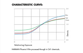
In Phoenix Mk I, one possible answer is M+Y layers inhibiting C + high contrast from a lack of masking = saturated reds.

In Phoenix Mk II, there seems to be better control of contrast and saturation via the magenta component of the masking, which reduces contrast in blue & green, but without the yellow component that should sort out hue shift in magentas and reds & help with saturation of yellows. There's also the high likelihood that interimage effects for more favourable saturation & colour characteristics relative to contrast could be brought to bear.


As for 'improving' Phoenix II's red handling as it stands, I think you'd probably be looking at needing to make separations & manipulate those via masking or retouching etc.
 

koraks

Moderator
Moderator
Joined
Nov 29, 2018
Messages
23,865
Location
Europe
Format
Multi Format
@Lachlan Young thanks; I'd have to think about how that works for a bit. I should sit down with some spectral charts and do some overlays to get a feeling for it.

As to improving Phoenix II...frankly, I'd not bother trying in analog print given what I've seen so far, and just scan & adjust digitally. My comment about using a blank piece of C41 film won't fix the reds; it'll just bring the average color balance closer to where a normal C41 sits, but the idiosyncrasies will still be very much there. Like Phoenix I, there is probably artistic potential in it, anyway.
 

Samu

Member
Joined
Jul 4, 2023
Messages
188
Location
Lithuania
Format
35mm
@Lachlan Young thanks; I'd have to think about how that works for a bit. I should sit down with some spectral charts and do some overlays to get a feeling for it.

As to improving Phoenix II...frankly, I'd not bother trying in analog print given what I've seen so far, and just scan & adjust digitally. My comment about using a blank piece of C41 film won't fix the reds; it'll just bring the average color balance closer to where a normal C41 sits, but the idiosyncrasies will still be very much there. Like Phoenix I, there is probably artistic potential in it, anyway.

Using a piece of film is probably not even necessary. I don´t remember that the filtration needed for printing the first version was anything out of ordinary. Probably a bit more yellow filter was needed, but everything was well within the range of my color head. That said, the colors were ugly, and the contrast was much too high.
 

koraks

Moderator
Moderator
Joined
Nov 29, 2018
Messages
23,865
Location
Europe
Format
Multi Format
It's not necessary, but it can help getting into 'familiar territory'. You can accomplish the same by dialing in a significant amount of yellow and magenta.
 

koraks

Moderator
Moderator
Joined
Nov 29, 2018
Messages
23,865
Location
Europe
Format
Multi Format
I just now received a mailing from a retailer about Phoenix II. Somewhat to my surprise, it features this image:
Caleb-Knueven.jpg

I find this a peculiar choice given that this red hue must have required a hefty dose of digital post processing to render this way. Admittedly, many of the other sample shots show the "Phoenix II reds" that will probably become this film's hallmark.
 

albireo

Member
Joined
Nov 15, 2017
Messages
1,469
Location
Europe
Format
Multi Format
I find this a peculiar choice given that this red hue must have required a hefty dose of digital post processing to render this way

Why? (Genuine question, not being flippant).

The one in the image looks like one of these Canadian grain elevators


They look dark red to me in general, and Phoenix has rendered the one above a lighter red tone/orange, compatible with what we're seeing from the colour checkers?
 
Last edited:

koraks

Moderator
Moderator
Joined
Nov 29, 2018
Messages
23,865
Location
Europe
Format
Multi Format
Why? (Genuine question, not being pedantic).
Because of the peculiar way this film appears to be rendering red; numerous posts on the first two pages of this thread discuss this. I was skeptical at first and blamed @Meinrad for unfortunate post-processing, but by now it's clear also to me that this Phoenix II tends to convert any saturated red into a vivid orange. If you compare the red in this photo to the examples posted in this thread so far by @Meinrad, @chromemax as well as @mshchem you'll notice that it's much richer than in any of 'our own' examples.
 

Lam-Bartll

Member
Joined
Apr 10, 2025
Messages
16
Location
Upstate NY
Format
Multi Format
These are mine, a quick test with flowers of my garden:
View attachment 403323 View attachment 403324 View attachment 403325 View attachment 403326 View attachment 403327 View attachment 403328 View attachment 403329

Color fidelity is better than Phoenix I, look at skins tones on colorcheker (first two top left samples) but there is still some of work to do on reds and magentas. Grain of Phoenix II is much better than Phoenix I, great job done by Mobberley guys, but is still far from the grain of Kodak or Fuji films.

Love this comparison, thanks for putting it together! I really like seeing the exposure latitude of both the negatives and the inversions!
 

albireo

Member
Joined
Nov 15, 2017
Messages
1,469
Location
Europe
Format
Multi Format
Because of the peculiar way this film appears to be rendering red; numerous posts on the first two pages of this thread discuss this. I was skeptical at first and blamed @Meinrad for unfortunate post-processing, but by now it's clear also to me that this Phoenix II tends to convert any saturated red into a vivid orange. If you compare the red in this photo to the examples posted in this thread so far by @Meinrad, @chromemax as well as @mshchem you'll notice that it's much richer than in any of 'our own' examples.

It doesn't look rich to me, it looks like orangey, pleasant enough in this picture you posted, but far from the deep red in the digital images of these grain elevators.

In other words I'm not disagreeing that there is something funny with how Phoenix II renders reds, I'm just not sure that the one in the promotional image is sooo far away from what people have been getting.
 
Last edited:

koraks

Moderator
Moderator
Joined
Nov 29, 2018
Messages
23,865
Location
Europe
Format
Multi Format
I'm just not sure that the one in the promotional image is sooo far away from what people have been getting.

It looks pretty wildly different to me, but YMMV and all that. I'm kind of fussy when it comes to color (which doesn't mean I always get it right, necessarily).
 

BHuij

Member
Joined
Oct 12, 2016
Messages
900
Location
Utah
Format
Multi Format
View attachment 403324

I'm pleasantly surprised to see how good it comes out at box speed. I think the general consensus was that you had to shoot Phoenix I at 100 or 125 or so to get good shadow detail and help prevent too much contrast.

I'm about 6 frames into my first roll of Phoenix II so far, and shooting it at 125. Might actually shoot the next roll at 200 depending on how this comes out. I'm dealing with the further wild card of planning to develop mine in ECN-2 chemistry though, so who knows what the result will be.
 

thinkbrown

Member
Joined
Mar 7, 2025
Messages
133
Location
Boston MA
Format
Analog
View attachment 403324

I'm pleasantly surprised to see how good it comes out at box speed. I think the general consensus was that you had to shoot Phoenix I at 100 or 125 or so to get good shadow detail and help prevent too much contrast.

I'm about 6 frames into my first roll of Phoenix II so far, and shooting it at 125. Might actually shoot the next roll at 200 depending on how this comes out. I'm dealing with the further wild card of planning to develop mine in ECN-2 chemistry though, so who knows what the result will be.

I process all my phoenix (and other color film) in ecn2 and found that 125 was perfect in that developer. Given that the "true" iso of Phoenix II is allegedly about 160, I'm gonna start there and see what I think after the first roll.
 

BHuij

Member
Joined
Oct 12, 2016
Messages
900
Location
Utah
Format
Multi Format
Yeah I think I only shot one roll of Phoenix I, and probably at box speed. I developed in ECN-2. It came out fine. I rather liked the colors (obviously it wasn't particularly realistic), but the dynamic range was ridiculously low, and the halations were pretty extreme.
 

thinkbrown

Member
Joined
Mar 7, 2025
Messages
133
Location
Boston MA
Format
Analog
Yeah I think I only shot one roll of Phoenix I, and probably at box speed. I developed in ECN-2. It came out fine. I rather liked the colors (obviously it wasn't particularly realistic), but the dynamic range was ridiculously low, and the halations were pretty extreme.
I've probably posted this somewhere here before, but I'm really partial to Phoenix at 125 in ecn2. I've joked that it's kind of like ektar where everything except skin tones looks fantastic.

1000009085.jpg
 

dcy

Subscriber
Joined
May 9, 2025
Messages
667
Location
New Mexico, USA
Format
35mm
I've probably posted this somewhere here before, but I'm really partial to Phoenix at 125 in ecn2.

YouTuber Shaka1277 is a huge proponent of ECN-2 for Phoenix I. In this video he says that Phoenix II is also a good candidate for ECN-2. "Images come out very warm and pinkish with a tone of red in the image though that is fixed relatively easily in post".


I've joked that it's kind of like ektar where everything except skin tones looks fantastic.

In the image you posted the skin tones look fine to me. What's wrong with them? I think the whole image looks great.
 

thinkbrown

Member
Joined
Mar 7, 2025
Messages
133
Location
Boston MA
Format
Analog
YouTuber Shaka1277 is a huge proponent of ECN-2 for Phoenix I. In this video he says that Phoenix II is also a good candidate for ECN-2. "Images come out very warm and pinkish with a tone of red in the image though that is fixed relatively easily in post".


In the image you posted the skin tones look fine to me. What's wrong with them? I think the whole image looks great.

Everyone comes out looking kind of jaundiced. That photo isn't especially bad but it gets far worse.
 

albireo

Member
Joined
Nov 15, 2017
Messages
1,469
Location
Europe
Format
Multi Format
It looks pretty wildly different to me, but YMMV and all that. I'm kind of fussy when it comes to color (which doesn't mean I always get it right, necessarily).

We're not really understanding each other. I am also quite fussy with colour (I have started a thread to optimise my C41 development chain because going 'by the book' I was getting unpleasant crossovers, and I hate them).

What I'm saying is, that unpleasant shade of 'orange' red comes through strongly even in that promotional image.

Anyhow, not a fan of Phoenix II based on what I'm seeing so far in general.

Incidentally, I'm shooting a lot of Opticolour 200 (Orwo NC200). I know we can't do direct comparisons to Phoenix II as the latter is a totally new film and yadda yadda, but the Orwo NC200 is a much more mature product. Especially beautiful in 120. People should really give it a go.
 

dcy

Subscriber
Joined
May 9, 2025
Messages
667
Location
New Mexico, USA
Format
35mm
Incidentally, I'm shooting a lot of Opticolour 200 (Orwo NC200). I know we can't do direct comparisons to Phoenix II as the latter is a totally new film and yadda yadda, but the Orwo NC200 is a much more mature product. Especially beautiful in 120. People should really give it a go.

I will definitely be buying OptoColour 200 / Orwo NC 200 as soon as it becomes available here.
 

koraks

Moderator
Moderator
Joined
Nov 29, 2018
Messages
23,865
Location
Europe
Format
Multi Format
What I'm saying is, that unpleasant shade of 'orange' red comes through strongly even in that promotional image.
It's a very different shade of orange, though. Whether it's pleasant or not is entirely personal; I'm referring specifically to the hue.
1753183296627.png

Top row are samples of the 'red' as shown in scans posted by @Meinrad, @chromemax and @mshchem . Bottom row is a sample from the example image I posted. It has a higher saturation on a* (in Lab) and is overall just more red while the other samples are more pale and/or more orange. This difference is quite consistent if you also include other examples posted e.g. on Harman's own website.

I can only explain this by the red in the grain elevator image being shifted in hue in digital post processing to make it appear closer to an actual red.
 

thinkbrown

Member
Joined
Mar 7, 2025
Messages
133
Location
Boston MA
Format
Analog
he does discuss the basics of his scanning process and confirms that he's shooting phoenix 2 at 125 ISO. The video also shows that the barn looks much more deep red in reality than it does on phoenix
 

albireo

Member
Joined
Nov 15, 2017
Messages
1,469
Location
Europe
Format
Multi Format
It's a very different shade of orange, though. Whether it's pleasant or not is entirely personal; I'm referring specifically to the hue.
View attachment 403677
Top row are samples of the 'red' as shown in scans posted by @Meinrad, @chromemax and @mshchem . Bottom row is a sample from the example image I posted. It has a higher saturation on a* (in Lab) and is overall just more red while the other samples are more pale and/or more orange. This difference is quite consistent if you also include other examples posted e.g. on Harman's own website.

I can only explain this by the red in the grain elevator image being shifted in hue in digital post processing to make it appear closer to an actual red.

Ah, but that shows it well.

Fine. You win, phoenix II is only able to represent all reds, any red, reproduced at any time of the day, only a pale hue of orange and Harman has hired an army of basement hackers to systematically make those ugly oranges a slightly more saturated tone of ugly red.

If we don't stop them, they'll turn to green, next, with Phoenix III !!¡¡
 
  • koraks
  • koraks
  • Deleted
  • Reason: .

koraks

Moderator
Moderator
Joined
Nov 29, 2018
Messages
23,865
Location
Europe
Format
Multi Format
and Harman has hired an army of basement hackers to systematically make those ugly oranges a slightly more saturated tone of ugly red.
I did not suggest or mean to imply who color graded that particular image. If I were to guess, I'd say the photographer did it himself.
I made two observations:
* The red in that photo looks richer to me than any other red I've seen from PII so far.
* Harman selected this photo, among others to feature on one of their webpages, and the retailer who did the mailing (unrelated to Harman) selected this specific image for their mailing.
That's literally all I did - share two observations. There's no ulterior motive, implied judgement etc.
 

pentaxuser

Member
Joined
May 9, 2005
Messages
20,074
Location
Daventry, No
Format
35mm
I looked at a video again on Phoenix II done by someone who calls his site SFLAB ( Shoot Film Like A Boss) He was sent Phoenix II in advance by Harman as part of their announcement of Phoenix II and publicity for it . He then chose to sent his negs back to Harman who did the scanning

In that video there were no shots with reds and oranges in the same picture to compare but having seen Meinrad's thread and the discussion I realised that what looked orange to me in the video may well have been red

The slight exception was the FORD sign on the front of a tractor where the letters were a pale red or at least were not an obvious orange colour

pentaxuser
 

lancewielder

Member
Joined
Jul 15, 2024
Messages
7
Location
Singapore
Format
35mm
I've been scrolling through some reviews of Phoenix II while I wait for my rolls to show up, and noticed this graph in JCH's review:

This graph is absent from the official Phoenix II datasheet, but the formatting is consistent with Harman / Ilford's style. Unless I'm very wrong, this indicates that Phoenix II has a serious magenta/green crossover problem. Has anyone noticed this issue when scanning / printing?

Some example shots I saw online definitely have green shadows and magenta highlights but it could be explained by scanner software not handling the magenta base correctly.
 

Attachments

  • Screenshot-2025-07-14-at-15.49.04.png
    Screenshot-2025-07-14-at-15.49.04.png
    42 KB · Views: 41

mshchem

Subscriber
Joined
Nov 26, 2007
Messages
14,906
Location
Iowa City, Iowa USA
Format
Medium Format
Youtubers are full of crap. I wonder if they have ever had a real job? Or a girlfriend (boyfriend)? Oh my!
I apologize to Analogue Andy, I don't mean to lump you in, clearly you have had a job (career) and have a lovely wife 😊

Sorry I just snapped 😳
 
Photrio.com contains affiliate links to products. We may receive a commission for purchases made through these links.
To read our full affiliate disclosure statement please click Here.

PHOTRIO PARTNERS EQUALLY FUNDING OUR COMMUNITY:


Ilford ADOX Freestyle Photographic Stearman Press Weldon Color Lab Blue Moon Camera & Machine
Top Bottom