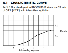
Somehow, I managed to ruin the attached characteristic curve graph in my previous post. Here we go again, PanF+ developed in ID11, according to Ilford (datasheet dated probably 3/1996):

I didn't make myself clear. Indeed, there has to be a shoulder, but it's not always included in a characteristic curve provided in a datasheet. In the current datasheet, the curve is for PanF+ developed in Ilfotec HC, which doesn't show much/any shoulder at the same exposure levels.
I don't disagree with you. I was merely pointing out that developer choice (and dilution, agitation) can affect the shape of the characteristic curve. Regardless of that, just because there is a shoulder, it doesn't mean that highlights are blown out, or you don't get graduation. It means that the contrast of the highlights is lower that that of the midtones. If you get too far, then you'll reach the point of no graduation (flat curve), as Gerald points out. In any point, a more upswept curve means more contrast and vice versa. So, there is detail, but getting it on print could be tricky. Or you just don't care and everything is fine.
Sorry but there has to be a shoulder; the characteristic curve cannot continue rising to infinity. Actually the term shoulder is a poor one when describing a curve. The correct mathematical term is inflection point. As previously pointed out the curve will always level out and then turn downwards. All characteristic curves have the same general shape regardless of the film or developer. (A graph showing the entire curve is often included in books on photographic development theory.) You can see from Ilford's documentation the curve is beginning to turn horizontal but Ilford truncates the curve just after this point. Kodak does the same thing for its HC-110 developer. Really a poor thing to do as it leads to confusion.
I didn't make myself clear. Indeed, there has to be a shoulder, but it's not always included in a characteristic curve provided in a datasheet. In the current datasheet, the curve is for PanF+ developed in Ilfotec HC, which doesn't show much/any shoulder at the same exposure levels.
My PanF+ bulk best before date was '04, I still get graduation in high lights.
On a 8x10 Delta100 and PanF+ similar...
I don't disagree with you. I was merely pointing out that developer choice (and dilution, agitation) can affect the shape of the characteristic curve. Regardless of that, just because there is a shoulder, it doesn't mean that highlights are blown out, or you don't get graduation. It means that the contrast of the highlights is lower that that of the midtones. If you get too far, then you'll reach the point of no graduation (flat curve), as Gerald points out. In any point, a more upswept curve means more contrast and vice versa. So, there is detail, but getting it on print could be tricky. Or you just don't care and everything is fine.