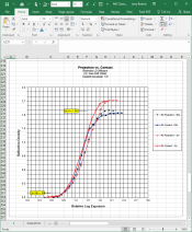
I'm developing in LPD. Both of those papers, classic and cooltone have wonky curves IMO where the blacks are fat and lacking contrast especially at higher grades. This is far from a paper like MGWT where the blacks have great micro-contrast all through the grades.
Could you elaborate on the link between HP5 and classic? HP5 (120) is my main film.
MG Classic has a softer toe than MGIV, more linear curves at lower grades, beautiful separation into the low mids in a way that is harder to achieve with MGIV. Less dry-down too.
Neither is lacking in contrast - Cooltone is a fast, crisp, brutally punchy paper. 5K MG Classic is one of the most beautiful papers around.
If anything, they now make more of a coherent family of papers between the 3 emulsion sets. I understand they are all now made on the same emulsion plant as the Delta films. It would not surprise me if they share similarly high tech controlled crystal growth technologies.
Regarding the greenishness, I have seen hints of it - usually from PQ Universal that has had quite a bit of paper put through it - bromide build up seems a likely suspect. Don't forget that finer grain in paper tends to make it look warmer and coarser grain tends to make it look colder. Choices of & quantities of restrainer will affect this.


