• Welcome to Photrio!
    Registration is fast and free. Join today to unlock search, see fewer ads, and access all forum features.
    Click here to sign up

Macbook to P600 Mystery (lack of separation in argyrotype highlights)

sentinels of the door

A
sentinels of the door

  • 3
  • 0
  • 33
Sycamore Fruits

H
Sycamore Fruits

  • 0
  • 0
  • 21

Forum statistics

Threads
201,696
Messages
2,828,717
Members
100,894
Latest member
picpete
Recent bookmarks
0

MurrayMinchin

Membership Council
Subscriber
Allowing Ads
Joined
Jan 9, 2005
Messages
5,604
Location
North Coast BC Canada
Format
Hybrid
I'm confused.

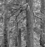
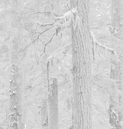
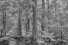
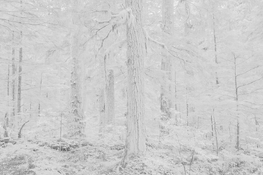
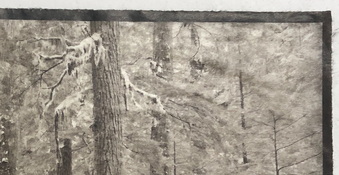
The images below are a Capture One screen shot of the top portion of a photo and an Argyrotype.

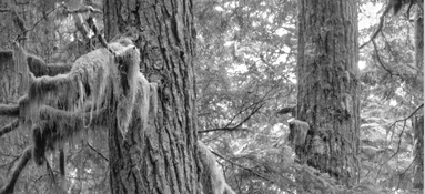
In Capture One, I've brought down the larger sky areas between the trees to about a Zone IX 1/2 print value (RGB 240) and the moss on the larger branches is RGB 181 so should print as a Zone VII+ print value. These RGB to print values have been confirmed by printing step tablets.

For some unknown reason the mossy branches are blown out and the sky is where it should be when the Argyrotype is printed. Weird.

I export the edited B&W files from Capture One as 16 bit TIFF's to a folder on my MacBook, then send them to QTR's Print Tool to be printed as negatives on an Epson P600.

Epson ABW mode is checked.
Black point compensation is checked.
Generic Gray Gamma 2.2
Relative Intent
Print Tool Managed. (This might be where the issue is?)

In Capture One, I used the green & yellow sliders to lighten foliage lower in the photograph...somewhere in the background, are these being added again so that they become textureless and blown out?
Screen Shot 2026-01-11 at 10.28.19 AM.jpeg IMG_0803 (1).jpeg
 
Last edited:
OP
OP
MurrayMinchin

MurrayMinchin

Membership Council
Subscriber
Allowing Ads
Joined
Jan 9, 2005
Messages
5,604
Location
North Coast BC Canada
Format
Hybrid
Using perpetual license Capture One 22 and Luma Curve for the Argyrotype adjustment curve.

Colour editing done in RGB 1998.
 
Last edited:

koraks

Moderator
Moderator
Joined
Nov 29, 2018
Messages
26,716
Location
Europe
Format
Multi Format
For some unknown reason the mossy branches are blown out and the sky is where it should be when the Argyrotype is printed.
I'm not sure if I see what you mean. What I see in the snippet of the argyrotype included in your post is a severe compression of the highlights and upper midtones and possibly fogging, so it basically all bunches together into unseparated tonality. The background of the branches against the sky shows very distinct separation in your digital version, but on the actual print, it's all very closely spaced tones.

I would expect the main issue is either in the printing process, which may not yield good highlight separation due to fogging (e.g. parts of the sensitizer not washing out well), and/or problems with the adjustment curve (i.e. not linearized well for this paper/process combination).

PS: I've taken the liberty to include something about the lack of separation of highlight tones in the title of your thread.
 

nmp

Member
Allowing Ads
Joined
Jan 20, 2005
Messages
2,088
Location
Maryland USA
Format
35mm
Perhaps this is some kind of proximity effect - i.e. bleeding of the surrounding darker areas into the highlights. I have seen it happening in cyanotypes. Not sure if that is a thing in kallitype or not, but presumably during development, some of the Fe(2)'s flow over to the neighboring bright areas where there is much less or none and create greater density than expected. When the densities are relatively similar, the effect is not as pronounced such as in the case of mossy branches, Step tablet wouldn't show this if the blocks are large enough and you are measuring the middle portion.

:Niranjan.
 
OP
OP
MurrayMinchin

MurrayMinchin

Membership Council
Subscriber
Allowing Ads
Joined
Jan 9, 2005
Messages
5,604
Location
North Coast BC Canada
Format
Hybrid
I'm not sure if I see what you mean. What I see in the snippet of the argyrotype included in your post is a severe compression of the highlights and upper midtones and possibly fogging, so it basically all bunches together into unseparated tonality. The background of the branches against the sky shows very distinct separation in your digital version, but on the actual print, it's all very closely spaced tones.

I would expect the main issue is either in the printing process, which may not yield good highlight separation due to fogging (e.g. parts of the sensitizer not washing out well), and/or problems with the adjustment curve (i.e. not linearized well for this paper/process combination).

PS: I've taken the liberty to include something about the lack of separation of highlight tones in the title of your thread.

Perhaps this is some kind of proximity effect - i.e. bleeding of the surrounding darker areas into the highlights. I have seen it happening in cyanotypes. Not sure if that is a thing in kallitype or not, but presumably during development, some of the Fe(2)'s flow over to the neighboring bright areas where there is much less or none and create greater density than expected. When the densities are relatively similar, the effect is not as pronounced such as in the case of mossy branches, Step tablet wouldn't show this if the blocks are large enough and you are measuring the middle portion.

:Niranjan.

Thanks for chiming in.

Pretty sure the problem is somewhere in the digital realm. I develop Argyrotypes face down for the first minute which is supposed to alleviate the Fe(2) staining problem, but I will do some more tests to ensure the very highest print tones have good separation.

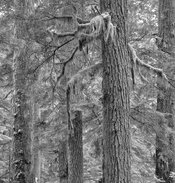
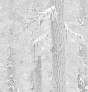
These should better show my issue (the problem is occurring before negative are made)

1) No yellow adjustment, moss RGB 176, Zone VII
2) Same with curve applied...moss has density

_MXT4186 7.jpg _MXT4186 9.jpg


3) +50 yellow, moss RGB 198, almost Zone VIII, moss has texture
4) Same with curve applied...moss RGB 255 and blown out but sky 'blobs' stay the same.

_MXT4186 8.jpg _MXT4186 10.jpg

I understand and appreciate how using digital colour sliders in B&W mode helps change images. My conundrum is why the yellow is having such a dramatic effect...I thought the whole reason for Luma Curves in Capture One was to change just the luminance, not saturation of colours.

One good thing...making these examples for this thread has taught me to inspect the curve images on screen before making negatives!
 
Last edited:

koraks

Moderator
Moderator
Joined
Nov 29, 2018
Messages
26,716
Location
Europe
Format
Multi Format
3) +50 yellow, moss RGB 198, almost Zone VIII, moss has texture

Ok, so the problem is you're blowing out the highlights on the moss. The correction you apply is too drastic. This is largely due to the extreme adjustment curve you appear to be using for your argyrotypes. In your place, I'd go back to the linearization process and re-do that from the start. The snippets with the adjustment curves applied to them show a dramatically reduced tonal scale which is likely to get you into trouble at some stage, and posterization and loss of highlights or shadows are only to be expected.

The root cause of this IMO is to be found in the print settings you're using for the negatives. Are you using QTR or the Epson drivers (I vaguely recall you use an Epson printer...)?
 
OP
OP
MurrayMinchin

MurrayMinchin

Membership Council
Subscriber
Allowing Ads
Joined
Jan 9, 2005
Messages
5,604
Location
North Coast BC Canada
Format
Hybrid
Ok, so the problem is you're blowing out the highlights on the moss. The correction you apply is too drastic. This is largely due to the extreme adjustment curve you appear to be using for your argyrotypes. In your place, I'd go back to the linearization process and re-do that from the start. The snippets with the adjustment curves applied to them show a dramatically reduced tonal scale which is likely to get you into trouble at some stage, and posterization and loss of highlights or shadows are only to be expected.

The root cause of this IMO is to be found in the print settings you're using for the negatives. Are you using QTR or the Epson drivers (I vaguely recall you use an Epson printer...)?

Respectfully (and I really mean that!) I beg to differ. The problem is occurring before the negative is even made.

1) The sky 'blobs' (RGB 240 in the positive) stay the same in both examples, coming in at about Zone IX 1/2 when printed. This tells me the top end of things are okay.

2) In the first pair of screenshots above, the moss has texture & density in both the positive and curve applied images.

3) In the second pair of screenshots, the positive one has texture and density in the moss having been raised less than one Zone. When the curve is applied, it gets blown out and reads RGB 255. The moss was raised by less than one Zone in the positive, but resulted in over a two Zone jump in the curve applied image. The sky blobs do not change.

This tells me there is some additive weirdness going on when using colour sliders in B&W mode with Capture One 22, even though I'm using a Luma Curve which (in theory) only affects luminance and not colour.

I'm not using QTR. I'm using an Epson P600 in Advance Black and White (ABW) mode, set on Darkest, with 20Y, and 5% added colour density. I make negatives via QTR's Print Tool with Print Color Management settings:

Epson ABW mode is checked.
Black point compensation is checked.
Generic Gray Gamma 2.2
Relative Intent
Print Tool Managed.
 
Last edited:

koraks

Moderator
Moderator
Joined
Nov 29, 2018
Messages
26,716
Location
Europe
Format
Multi Format
The problem is occurring before the negative is even made.
I'm not suggesting otherwise.

I think the main problem is the fact that at some stage in the process, you need a curve adjustment that basically smashes most of the tonal scale together in a relatively small part of the tonal scale. This exacerbates any potential issues with stacked adjustments also if these precede the final adjustment curve.

I can't tell for sure what's happening in your workflow since I don't use Capture One, and all I have here is 8-bit renditions of your images. I assume/hope you're doing all these edits in a higher bit depth, otherwise it's a sure-fire path towards failure to begin with. At the end of the line, things will likely get smashed flat into 8 bits at the printer driver stage, but that's basically a black box. I'd ensure that everything up to that point is 16 bit.

You may be able to get things to work even with this extreme curve, but you'd still be running a large risk of poor tonality at the upper part of the curve due to posterization. If you take a look at the histogram of your example #4, you'll notice that a significant part of the image data is lopped off and that evidently wasn't the case in #3.
 
OP
OP
MurrayMinchin

MurrayMinchin

Membership Council
Subscriber
Allowing Ads
Joined
Jan 9, 2005
Messages
5,604
Location
North Coast BC Canada
Format
Hybrid
I'm not suggesting otherwise.

I think the main problem is the fact that at some stage in the process, you need a curve adjustment that basically smashes most of the tonal scale together in a relatively small part of the tonal scale. This exacerbates any potential issues with stacked adjustments also if these precede the final adjustment curve.

I can't tell for sure what's happening in your workflow since I don't use Capture One, and all I have here is 8-bit renditions of your images. I assume/hope you're doing all these edits in a higher bit depth, otherwise it's a sure-fire path towards failure to begin with. At the end of the line, things will likely get smashed flat into 8 bits at the printer driver stage, but that's basically a black box. I'd ensure that everything up to that point is 16 bit.

You may be able to get things to work even with this extreme curve, but you'd still be running a large risk of poor tonality at the upper part of the curve due to posterization. If you take a look at the histogram of your example #4, you'll notice that a significant part of the image data is lopped off and that evidently wasn't the case in #3.

16 bit TIFF's sent to folder, then to P600.

Yes, I know #4 is gonzo whacky bad, but the Zone IX 1/2 'sky blobs' stayed steady through all examples, and they print as a very light print value in the Argyrotype. The 'sky blobs' have to print as less than pure white because there are a few leaves lower in the photograph I want pure white, and I don't want the sky blobs to be a distraction from them.

I can lower the yellow slider in Capture One's Luma Curve and watch (in the correction curve applied image) in real time as density comes back to the mossy branches. What I'm shooting for here is as close to WYSIWYG as I can get. I don't want to be modifying images after the correction curve has been applied.

Life will be interfering for a couple days. Hope to come back with a solution...
 
OP
OP
MurrayMinchin

MurrayMinchin

Membership Council
Subscriber
Allowing Ads
Joined
Jan 9, 2005
Messages
5,604
Location
North Coast BC Canada
Format
Hybrid
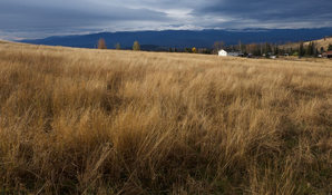
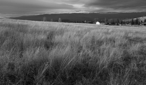
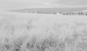
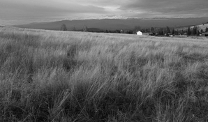
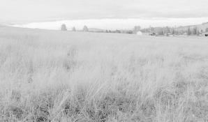
Bit of a test regarding colour sliders and correction curves.

Quick slap dash jpeg.

No editing of original and B&W:

F7913295-ABEC-4609-AB2D-6345232CD0E8_1_105_c.jpg F7913295-ABEC-4609-AB2D-6345232CD0E8_1_105_c 1.jpg

Unedited B&W and with curve applied:

F7913295-ABEC-4609-AB2D-6345232CD0E8_1_105_c 1.jpg F7913295-ABEC-4609-AB2D-6345232CD0E8_1_105_c 2.jpg

Blue slider used to lighten distant mountains and then with curve applied:

F7913295-ABEC-4609-AB2D-6345232CD0E8_1_105_c 3.jpg F7913295-ABEC-4609-AB2D-6345232CD0E8_1_105_c 4.jpg

In the forest photo, the moss RGB values were between Zones VII & VIII and were yellowish in the original photo. This example romps from about Zone III to Zone IX using the blue slider...egad!

There are lots of areas in the grass about the same RGB values as the distant mountains yet only the mountains change.

This tells me it's more about the colour slider issue than my curve.
 
Last edited:
Photrio.com contains affiliate links to products. We may receive a commission for purchases made through these links.
To read our full affiliate disclosure statement please click Here.

PHOTRIO PARTNERS EQUALLY FUNDING OUR COMMUNITY:


Ilford ADOX Freestyle Photographic Stearman Press Weldon Color Lab Blue Moon Camera & Machine
Top Bottom