


oneeyedpainter
Member
Hello,
I know that putting together macro, flowers, and B/W is usually a perfect way of asking for trouble The picture I am seeking critique about is below:
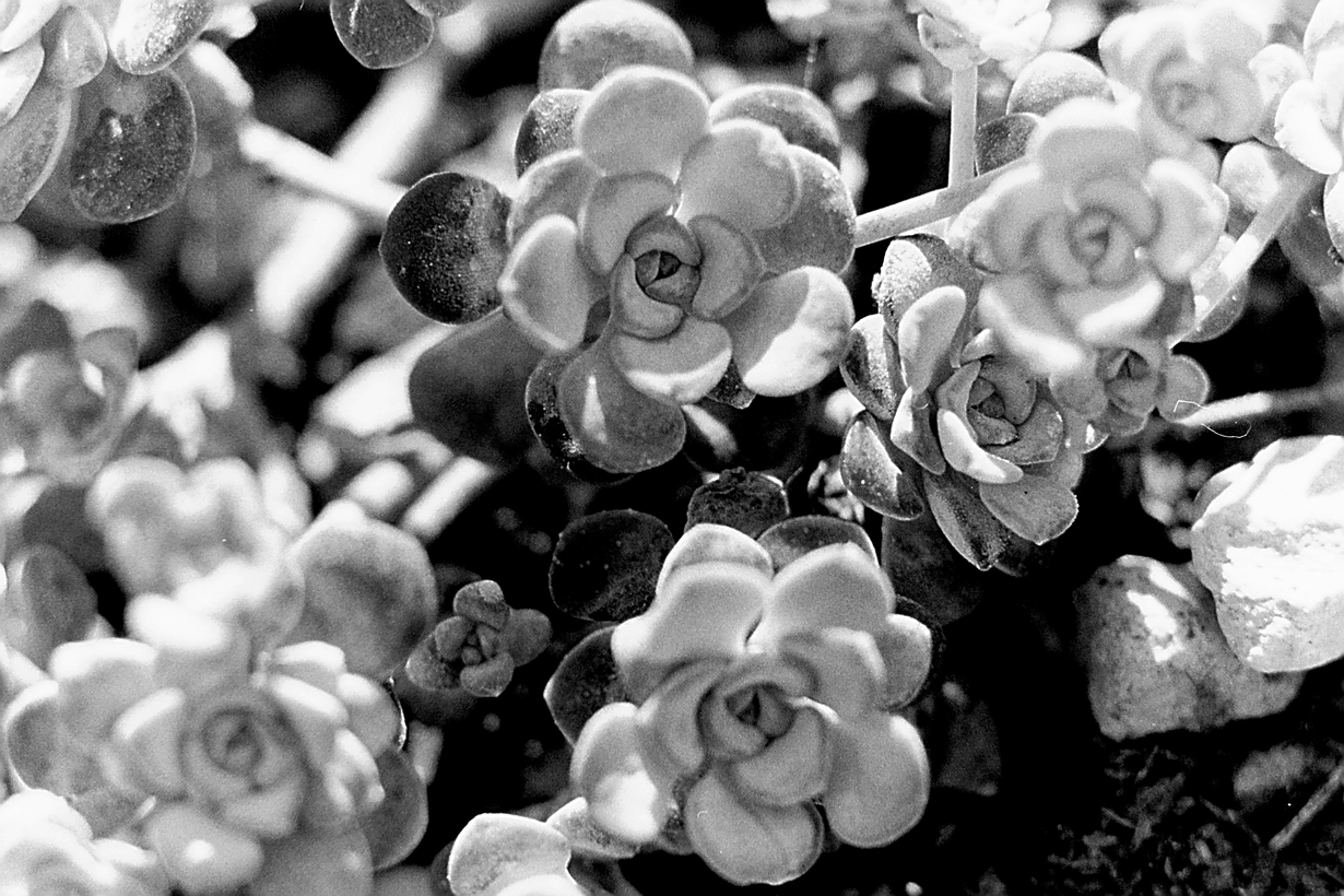
This is a 1:1 macro of a minuscule succulent in my garden (technical data in the Gallery entry). I had shot the same plant several months ago (at that point I was using a digital camera), keeping most of the flowers in sharp focus, but the resulting image looked quite flat and uninteresting. So I decided to experiment with leading the eye of the viewer through selective DOF. The obvious trick here is that the only flower in sharp focus is the medium-sized one on the right-hand side of the shot, while none of the other ones are perfectly focused. The effect on me is that the eye wanders a bit around the frame, starting from the centre, where the big flower not-in-sharp-focus is located, then it notices all the remaining out-of-focus stuff, and keeps looking until it finds the "shy" flower that is in focus. At that point, the eye comes back to each of the other flowers, recognising that their shape is an extremely close reproduction of the shy, in-focus one. To my eye, the picture becomes a dynamic pattern only by finding those implied similarities, and at that point I am content to note that the same exact form is also discernible in the smaller flowers on the left-hand side of the picture, although they are very blurred and rendered almost at the same bouquet-like level of the background.
I wonder whether the picture stimulates any similar dynamics in other viewers. I am interested in whether the pattern constuction mechanism based on the comparison with the only in-focus element is elicited in other viewers as well. I am fine with hearing also some blunt "look mate, honestly, this stuff just sucks!", as I understand that the whole reasoning behind the composition might not have been conveyed clearly by the choices made in constructing the shot. I am sure some good lessons will come out of this experiment Worst of all, it would be another "meh" one to add to that big pile I got already
Thanks in advance for your comments.
OneEyedPainter
I know that putting together macro, flowers, and B/W is usually a perfect way of asking for trouble
The picture I am seeking critique about is below:
Shy
1:1 macro of a tiny succulent - Seeking some honest critique on the composition and overall...
This is a 1:1 macro of a minuscule succulent in my garden (technical data in the Gallery entry). I had shot the same plant several months ago (at that point I was using a digital camera), keeping most of the flowers in sharp focus, but the resulting image looked quite flat and uninteresting. So I decided to experiment with leading the eye of the viewer through selective DOF. The obvious trick here is that the only flower in sharp focus is the medium-sized one on the right-hand side of the shot, while none of the other ones are perfectly focused. The effect on me is that the eye wanders a bit around the frame, starting from the centre, where the big flower not-in-sharp-focus is located, then it notices all the remaining out-of-focus stuff, and keeps looking until it finds the "shy" flower that is in focus. At that point, the eye comes back to each of the other flowers, recognising that their shape is an extremely close reproduction of the shy, in-focus one. To my eye, the picture becomes a dynamic pattern only by finding those implied similarities, and at that point I am content to note that the same exact form is also discernible in the smaller flowers on the left-hand side of the picture, although they are very blurred and rendered almost at the same bouquet-like level of the background.
I wonder whether the picture stimulates any similar dynamics in other viewers. I am interested in whether the pattern constuction mechanism based on the comparison with the only in-focus element is elicited in other viewers as well. I am fine with hearing also some blunt "look mate, honestly, this stuff just sucks!", as I understand that the whole reasoning behind the composition might not have been conveyed clearly by the choices made in constructing the shot. I am sure some good lessons will come out of this experiment
Worst of all, it would be another "meh" one to add to that big pile I got already Thanks in advance for your comments.
OneEyedPainter
