Increasing contrast in Kallitypes -- dichromate or photoshop?

Boys on the block

A
Boys on the block

  • 1
  • 1
  • 48
Sonia..jpg

A
Sonia..jpg

  • 2
  • 1
  • 189
A young woman

A
A young woman

  • 4
  • 4
  • 169
sketch

A
sketch

  • 4
  • 0
  • 173
Foucaultery

D
Foucaultery

  • 1
  • 1
  • 132

Forum statistics

Threads
188,092
Messages
2,622,294
Members
96,920
Latest member
Luc_b
Recent bookmarks
0
OP
OP
Rolleiflexible

Rolleiflexible

Subscriber
Joined
Mar 22, 2005
Messages
1,963
Location
Mars Hill, NC
Format
Multi Format
FWIW, Melanie's eyes work their wonders in every example you have posted!
I hope that both of you are well.

Matt, thanks for the good wishes and the compliment. Although the bleached version is not at all what I was trying to achieve, it is still interesting for the way it isolates her eyes in the print.

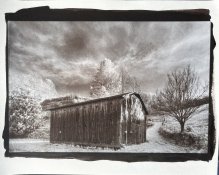
I'm going to start printing some of the landscapes in larger formats now. Wish me luck.
 

nmp

Member
Joined
Jan 20, 2005
Messages
1,828
Location
Maryland USA
Format
35mm
Update: I shortened the two citric acid clearing bath times from five to two minutes each, and used a dilute (1:6) TF-4 fixer. And relinearized the curve (again) to reflect the changes. And reprinted the negative with the new curve, darkening gamma a wee bit.

It worked!

Lessons learned:

Use ferric oxalate in solution within a few days of mixing it.

Use an alkaline fixer.

Modest changes to midtone balance can improve the printed image, even with a properly-linearized print curve.

Wonderful....I am glad it all worked out to your liking. I always add some contrast to the final digital image before applying the correction curve to give it more "perceived" final contrast in the print to counter the loss of contrast by way of weakened Dmax and Dmin that are inherent in all alternative processes - as discussed here:


I am surprised at the longevity (or lack thereof) of the FO solution - would have expected much longer storage life out of it. B&S for example states their pre-made solutions have "1-2 years of shelf life." It would be bummer if you had to make a new one every couple of weeks. The only thing I can think of could happen on storage is formation of ferrous which would tend to give a foggy print. You can check if that happened by using potassium ferricynaide and see if it develops blue color when mixed with the FO, a la cyanotype. May be other more regular kallitype/Pt-Pd printers can chime in.

:Niranjan.
 
OP
OP
Rolleiflexible

Rolleiflexible

Subscriber
Joined
Mar 22, 2005
Messages
1,963
Location
Mars Hill, NC
Format
Multi Format
I always add some contrast to the final digital image before applying the correction curve to give it more "perceived" final contrast in the print to counter the loss of contrast by way of weakened Dmax and Dmin that are inherent in all alternative processes

In my very short time printing Kallitypes I am coming to understand that the science of getting a linear translation from digital file to negative is the essential beginning of the process, but not the end of it. The nature of the media is completely different -- a computer screen emits light, an image on paper reflects it.

My initial experience is that this is something I will need to vary from print to print -- I don't think that there is some magic way to adjust the curve that works in all cases. For example, I needed to darken the image of Melanie to get it close to what I wanted. But I just printed a landscape, toned in gold, that needs lightening, not darkening. What looked like an early evening scene on the computer screen looks ominous on paper -- I'm attaching a scan. I am reprinting the negative with substantially lighter tones and some clipped highlights shadows to see how that affects the final print. When I get it right, I'll post it to my IG.

Sanders
www.instagram.com/sandersnyc
 

Attachments

  • 52141687786_ff75640c38_o.jpg
    52141687786_ff75640c38_o.jpg
    1.4 MB · Views: 96

Tom Taylor

Member
Joined
Jul 10, 2005
Messages
491
Location
California
Format
Multi Format
I am surprised at the longevity (or lack thereof) of the FO solution - would have expected much longer storage life out of it. B&S for example states their pre-made solutions have "1-2 years of shelf life." It would be bummer if you had to make a new one every couple of weeks. The only thing I can think of could happen on storage is formation of ferrous which would tend to give a foggy print. You can check if that happened by using potassium ferricynaide and see if it develops blue color when mixed with the FO, a la cyanotype. May be other more regular kallitype/Pt-Pd printers can chime in.

:Niranjan.

I printed a pt toned Kallitype over the weekend using FO that I originally mixed on 11/2/2021 - 7 months earlier. Print turned out well. Out of curiosity I tried the Pot. Ferri test mentioned above and the drop turned brown as it hit the bottom of the small beaker. I've been printing kallitypes for some time now and never had a batch go bad yet. I always write the mix date on the label.

Thomas
 

nmp

Member
Joined
Jan 20, 2005
Messages
1,828
Location
Maryland USA
Format
35mm
In my very short time printing Kallitypes I am coming to understand that the science of getting a linear translation from digital file to negative is the essential beginning of the process, but not the end of it. The nature of the media is completely different -- a computer screen emits light, an image on paper reflects it.

My initial experience is that this is something I will need to vary from print to print -- I don't think that there is some magic way to adjust the curve that works in all cases. For example, I needed to darken the image of Melanie to get it close to what I wanted. But I just printed a landscape, toned in gold, that needs lightening, not darkening. What looked like an early evening scene on the computer screen looks ominous on paper -- I'm attaching a scan. I am reprinting the negative with substantially lighter tones and some clipped highlights shadows to see how that affects the final print. When I get it right, I'll post it to my IG.

Sanders
www.instagram.com/sandersnyc

Saw the picture on your IG that I am assuming is that of the new print....does look much better. Looks like you had some funky split tone going on with the earlier version that went away too. Or may it was in the scanner.

Look forward to seeing more...


:Niranjan.
 

tnp651

Subscriber
Joined
Jan 9, 2017
Messages
150
Location
St. Paul, Minnesota, USA
Format
4x5 Format
Using a sensitizer of ferric oxalate and silver nitrate, I have established maximum blacks, and blocking values, and linearized the curve for printing negatives using QuadToneRIP. And I do double-coat the paper, and am toning with platinum. Today, I am going to reprint the negatives with darker midtones, to see if that results in a better distribution of tone values in the prints.

Adjusting the negative is an easy fix. HOWEVER, all it can accomplish is redistribute the tones within the range provided by the chemistry. QUERY: Will the addition of a dichromate (potassium or ammonium) to the sensitized actually expand the tonal range of the print? If so, how so? Deeper blacks?

I tried doubling the dichromate (2 drops instead of 1) and didn't see deeper blacks. I've been meaning to do a more scientific test. Meanwhile, I've found that gold toner gives the deepest blacks (but is too neutral-tone for my taste).
 

tnp651

Subscriber
Joined
Jan 9, 2017
Messages
150
Location
St. Paul, Minnesota, USA
Format
4x5 Format
I am getting black values that are similar to what I have gotten with palladium prints. I experimented with longer exposures but got solarization, not deeper blacks. I did test for max black through a sheet of film. Highlights are not paper-white, but close. I am using Richard Boutwell's program, QuadToneProfiler, to linearize the QTR curve. I'll attach a shot of the last print, of an old photo I posted to APUG ages ago:


As you will see, the Pt/Kallitype lacks sufficient contrast between skintones and background, and also among skin tones in hands and shoulders. I think I can balance it out by darkening midtones with the gamma slider and reprinting the negative, but it does make me wonder whether I am missing something for the tones to diverge this much from the original file.
That's not a very deep black, all right. Look at my gallery page to see what I'm getting.

It sounds like you're doing everything right. I haven't tried platinum toning but the rest of my technique is similar to yours (but not using QTR). I'm also using Hahnemühle Platinum Rag paper.

Tom Nelson
 
OP
OP
Rolleiflexible

Rolleiflexible

Subscriber
Joined
Mar 22, 2005
Messages
1,963
Location
Mars Hill, NC
Format
Multi Format
That's not a very deep black, all right. Look at my gallery page to see what I'm getting.

The problem with looking at scans, of course, is that the scan is a poor facsimile of the print.

The more I print, the more I learn. I figure out blacks, and then I have to sort out transitions. And then which toner? And and and. Things that seemed solved, turn out to be a function of the process I was following at the time. Change one variable, and all the others move too.

Example: I started to see some banding in my negatives. Nozzle check. Clogged nozzles in the gray and yellow channels. Run a couple of cleaning cycles: Now all of my prints are washed out, because I linearized with clogged jets. Clean the jets = more ink = denser negatives = washed out prints. Back to test charts and spectrophotometers.

Anyway: At this point, I feel as if I am pulling as much contrast from the process as it is capable of giving me. I feel as if I have my arms (more or less) around the process. But I am sure that feeling will pass. :smile:
 
Photrio.com contains affiliate links to products. We may receive a commission for purchases made through these links.
To read our full affiliate disclosure statement please click Here.

PHOTRIO PARTNERS EQUALLY FUNDING OUR COMMUNITY:


Ilford ADOX Freestyle Photographic Stearman Press Weldon Color Lab Blue Moon Camera & Machine
Top Bottom